
More Related Content
Similar to Scatter Diagrams.ppt
Similar to Scatter Diagrams.ppt (20)
Recently uploaded
Recently uploaded (20)
Scatter Diagrams.ppt
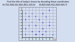
- 1. A S C T E R E P H B G D F I J K L M N O R U V W 1 2 3 4 5 6 7 8 9 0 1 2 3 4 5 6 7 8 9 Y X Find the title of today's lesson by decoding these coordinates: (4,7)(2,4)(6,5)(1,8)(1,8)(1,1)(5,6) (6,8)(5,6)(6,5)(1,6)(4,4)(4,7)
- 2. Lesson Objective • To be able to draw a Scatter Diagram
- 3. Key Words Today’s key words Variable - a quantity that may change in a given context Scatter graph - uses dots to represent values for two different numeric variables. The position of each dot on the horizontal and vertical axis indicates values for an individual data point. Scatter Graphs
- 5. Scatter Diagrams A Scatter Diagram is a graph of unconnected points When drawing graphs, we must remember to do the following things: 1. Always give the graph a title 2. Always label both axis, including correct units 3. Choose a sensible scale 4. Plot your points carefully (x first, y second)
- 8. Plenary Scatter Graphs The table shows the age and value of a car. Age of Car (Years) 2 4 6 8 10 Value of Car (£s) 7500 6250 4000 3500 2500 Complete the sentence, As the age of the car __________, the value of the car ___________. Do you think this will always be true? Explain your answer.
- 9. A graph to show the relationship between pints of lager drunk and books marked 0 20 40 60 80 0 5 10 15 pints of lager books marked
- 10. A graph to showthe realtionshipbetween the number of goals PNEconcede at the number of pupils Iput in detention 0 5 10 15 0 1 2 3 4 5 6 goals conceded pupils in detention
- 11. A graph to showthe relationshipbetween the temperature in Alaska andthe money in my bank -300 -200 -100 0 100 200 300 -30 -20 -10 0 10 20 temperature in Alaska (degrees Celcius) money in ym bank (£)
- 12. Scatter Diagrams Part Two: Interpreting Them
- 13. Lesson Objective • To be able to interpret Scatter Diagrams • To understand the terms Correlation and the Line of Best Fit
- 14. A graph to show the relationship between pints of lager drunk and books marked 0 20 40 60 80 0 5 10 15 pints of lager books marked
- 15. A graph to show the relationship between pints of lager drunk and books marked 0 20 40 60 80 0 5 10 15 pints of lager books marked
- 16. A graph to showthe realtionshipbetween the number of goals PNEconcede at the number of pupils Iput in detention 0 5 10 15 0 1 2 3 4 5 6 goals conceded pupils in detention
- 17. A graph to showthe realtionshipbetween the number of goals PNEconcede at the number of pupils Iput in detention 0 5 10 15 0 1 2 3 4 5 6 goals conceded pupils in detention
- 18. A graph to showthe relationshipbetween the temperature in Alaska andthe money in my bank -300 -200 -100 0 100 200 300 -30 -20 -10 0 10 20 temperature in Alaska (degrees Celcius) money in ym bank (£)
- 19. A graph to show the relationship between the temperature in Alaska and the money in my bank -300 -200 -100 0 100 200 300 -30 -20 -10 0 10 20 temperature in Alaska (degrees Celcius) money in ym bank (£)
- 20. • The relationship between two variables is called a Correlation • A line of best-fit is a line which helps us to identify the type of correlation (positive, negative, no correlation) & make predictions • The line of best fit is drawn so that the points are evenly distributed on either side of the line • The closer the dots to the line, the stronger the correlation Remember: 1. The line of best fit is a STRAIGHT LINE 2. It DOES NOT have to pass through the origin 3. It DOES NOT have to go through each point Interpreting Scatter Diagrams
- 21. Correlation can be strong or weak Strong Positive Correlation All the points lie close to the line of best fit Weak Positive Correlation The points are well spread out from the line of best fit but still follow the trend
- 22. A bit of work… Exercise 10:2B, Page 229 Q1 - 3