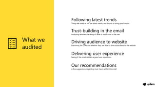
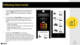
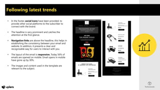
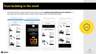
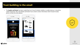
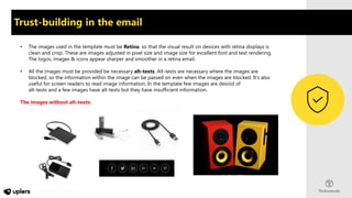
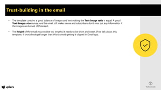
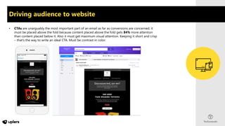
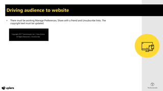
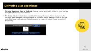
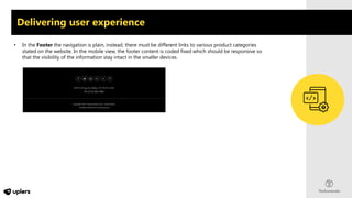
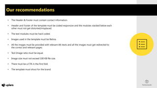
EMAIL TEMPLATE AUDIT
BY
What we
audited
Following latest trends
Things we loved as per the latest trends, and bound to bring good results
Trust-building in the email
Analyzing whether the design is able to instill trust in the user
Driving audience to website
Examining the CTAs and whether they are able to drive subscribers to the website
Delivering user experience
Seeing if the email delivers a good user experience
Our recommendations
A few suggestions regarding must-haves within the email
Following latest trends
• The content of the template has been designed and
coded in 640px width, which falls under the ideal
range of width for the email templates, i.e. 600px to
650px.
• The template has View Online link at the top. This link
will help in the situations where subscribers have
trouble viewing your email campaign in their inbox
when,
a) they've turned off the feature that lets them see
images and graphics
b) their email provider does not allow graphics and
images to appear in emails.
c) Their email clients lacks compatibility of HTML
email.
• The email has Pre-header text at the top.
A pre-header is a short summary that follows the
subject line when an email is viewed in the inbox. Many
mobile, desktop and web email clients provide them to
tip you off on what the email contains before you open
it. This might help to increase the 'Open Rate' of the
email.
• In the footer, social icons have been provided, to
provide other social platforms to the subscriber to
connect with the brand.
• The headline is very prominent and catches the
attention at the first glance.
• Navigation links are above the headline, this helps in
establishing the consistency between your email and
website. In addition, it presents a clear and
recognizable way for users to interact with you.
• The layout of the email is responsive. Today 56% of
emails are opened on mobile. Email opens in mobile
have gone up by 30%.
• The images and content used in the template are
relevant to the subject.
Following latest trends
Trust-building in the email
• The layout has been coded responsive, but there are a few modules getting distorted and misplaced in a
few email clients of mobile version, smaller screens. Please check the screenshots below:
Trust-building in the email
• The header and footer has been coded fixed as of now, for better visibility in smaller devices, it should be
coded responsive. Also, the Header and footer must contain contact information which should include,
phone number & email address.
Trust-building in the email
• The images used in the template must be Retina. so that the visual result on devices with retina displays is
clean and crisp. These are images adjusted in pixel size and image size for excellent font and text rendering.
The logos, images & icons appear sharper and smoother in a retina email.
• All the images must be provided be necessary alt-texts. Alt-texts are necessary where the images are
blocked, so the information within the image can be passed on even when the images are blocked. It’s also
useful for screen readers to read image information. In the template few images are devoid of
alt-texts and a few images have alt-texts but they have insufficient information.
The images without alt-texts:
Trust-building in the email
• The template contains a good balance of images and text making the Text-Image ratio is equal. A good
Text-Image ratio makes sure the email still makes sense and subscribers don’t miss out any information if
the images are turned off/blocked .
• The height of the email must not be too lengthy. It needs to be short and sweet. If we talk about this
template, it should not get longer than this to avoid getting it clipped in Gmail app.
Driving audience to website
• CTAs are unarguably the most important part of an email as far as conversions are concerned, it
must be placed above the fold because content placed above the fold gets 84% more attention
than content placed below it. Also it must get maximum visual attention. Keeping it short and crisp
– that’s the way to write an ideal CTA. Must be contrast in color.
Driving audience to website
• There must be working Manage Preferences, Share with a friend and Unsubscribe links. The
copyright text must be updated.
Delivering user experience
• The email design must shout for the Brand. The email must be recognizable without the use of logo, just
through Brand colors and brand elements.
• The Header of the template has been provided with necessary information, in terms of alignment, the
placement of Pre-header and View online link can be adjusted so that the header look balanced. Also, the
color of the header must match with the darker shade of grey as per the website’s header to match with
the branding.
Delivering user experience
• In the Footer the navigation is plain, instead, there must be different links to various product categories
stated on the website. In the mobile view, the footer content is coded fixed which should be responsive so
that the visibility of the information stay intact in the smaller devices.
Our recommendations
• The Header & Footer must contain contact information.
• Header and Footer of the template must be coded responsive and the modules stacked below each
other must not get distorted/misplaced.
• The text modules must be hard coded.
• Images used in the template must be Retina.
• All the images must be provided with relevant Alt-texts and all the images must get redirected to
the correct and relevant pages.
• Text-Image ratio must be equal.
• Image size must not exceed 100 KB file size.
• There must be a CTA in the first fold.
• The template must shout for the brand.
Thank You

Sample email template audit report

  • 1.
  • 2.
    What we audited Following latesttrends Things we loved as per the latest trends, and bound to bring good results Trust-building in the email Analyzing whether the design is able to instill trust in the user Driving audience to website Examining the CTAs and whether they are able to drive subscribers to the website Delivering user experience Seeing if the email delivers a good user experience Our recommendations A few suggestions regarding must-haves within the email
  • 3.
    Following latest trends •The content of the template has been designed and coded in 640px width, which falls under the ideal range of width for the email templates, i.e. 600px to 650px. • The template has View Online link at the top. This link will help in the situations where subscribers have trouble viewing your email campaign in their inbox when, a) they've turned off the feature that lets them see images and graphics b) their email provider does not allow graphics and images to appear in emails. c) Their email clients lacks compatibility of HTML email. • The email has Pre-header text at the top. A pre-header is a short summary that follows the subject line when an email is viewed in the inbox. Many mobile, desktop and web email clients provide them to tip you off on what the email contains before you open it. This might help to increase the 'Open Rate' of the email.
  • 4.
    • In thefooter, social icons have been provided, to provide other social platforms to the subscriber to connect with the brand. • The headline is very prominent and catches the attention at the first glance. • Navigation links are above the headline, this helps in establishing the consistency between your email and website. In addition, it presents a clear and recognizable way for users to interact with you. • The layout of the email is responsive. Today 56% of emails are opened on mobile. Email opens in mobile have gone up by 30%. • The images and content used in the template are relevant to the subject. Following latest trends
  • 5.
    Trust-building in theemail • The layout has been coded responsive, but there are a few modules getting distorted and misplaced in a few email clients of mobile version, smaller screens. Please check the screenshots below:
  • 6.
    Trust-building in theemail • The header and footer has been coded fixed as of now, for better visibility in smaller devices, it should be coded responsive. Also, the Header and footer must contain contact information which should include, phone number & email address.
  • 7.
    Trust-building in theemail • The images used in the template must be Retina. so that the visual result on devices with retina displays is clean and crisp. These are images adjusted in pixel size and image size for excellent font and text rendering. The logos, images & icons appear sharper and smoother in a retina email. • All the images must be provided be necessary alt-texts. Alt-texts are necessary where the images are blocked, so the information within the image can be passed on even when the images are blocked. It’s also useful for screen readers to read image information. In the template few images are devoid of alt-texts and a few images have alt-texts but they have insufficient information. The images without alt-texts:
  • 8.
    Trust-building in theemail • The template contains a good balance of images and text making the Text-Image ratio is equal. A good Text-Image ratio makes sure the email still makes sense and subscribers don’t miss out any information if the images are turned off/blocked . • The height of the email must not be too lengthy. It needs to be short and sweet. If we talk about this template, it should not get longer than this to avoid getting it clipped in Gmail app.
  • 9.
    Driving audience towebsite • CTAs are unarguably the most important part of an email as far as conversions are concerned, it must be placed above the fold because content placed above the fold gets 84% more attention than content placed below it. Also it must get maximum visual attention. Keeping it short and crisp – that’s the way to write an ideal CTA. Must be contrast in color.
  • 10.
    Driving audience towebsite • There must be working Manage Preferences, Share with a friend and Unsubscribe links. The copyright text must be updated.
  • 11.
    Delivering user experience •The email design must shout for the Brand. The email must be recognizable without the use of logo, just through Brand colors and brand elements. • The Header of the template has been provided with necessary information, in terms of alignment, the placement of Pre-header and View online link can be adjusted so that the header look balanced. Also, the color of the header must match with the darker shade of grey as per the website’s header to match with the branding.
  • 12.
    Delivering user experience •In the Footer the navigation is plain, instead, there must be different links to various product categories stated on the website. In the mobile view, the footer content is coded fixed which should be responsive so that the visibility of the information stay intact in the smaller devices.
  • 13.
    Our recommendations • TheHeader & Footer must contain contact information. • Header and Footer of the template must be coded responsive and the modules stacked below each other must not get distorted/misplaced. • The text modules must be hard coded. • Images used in the template must be Retina. • All the images must be provided with relevant Alt-texts and all the images must get redirected to the correct and relevant pages. • Text-Image ratio must be equal. • Image size must not exceed 100 KB file size. • There must be a CTA in the first fold. • The template must shout for the brand.
  • 14.