Download as PDF, PPTX
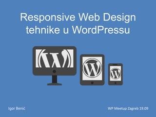
![Slike u RWD-u – PictureFill 2.0
<picture>
<!--[if IE 9]><video style="display: none;"><![endif]-->
<source srcset="examples/images/extralarge.jpg" media="(min-
width: 1000px)">
<source srcset="examples/images/large.jpg" media="(min-width:
800px)">
<source srcset="examples/images/large@2.jpg" media="(min-
width: 800px) and (-webkit-min-device-pixel-ratio: 2)">
<!--[if IE 9]></video><![endif]-->
<img srcset="examples/images/medium.jpg" alt="A giant stone
face at The Bayon temple in Angkor Thom, Cambodia">
</picture>](https://image.slidesharecdn.com/responsivewebdesigntehnikeuwordpressu-150325041619-conversion-gate01/85/Responsive-Web-Design-tehnike-u-WordPress-u-9-320.jpg)
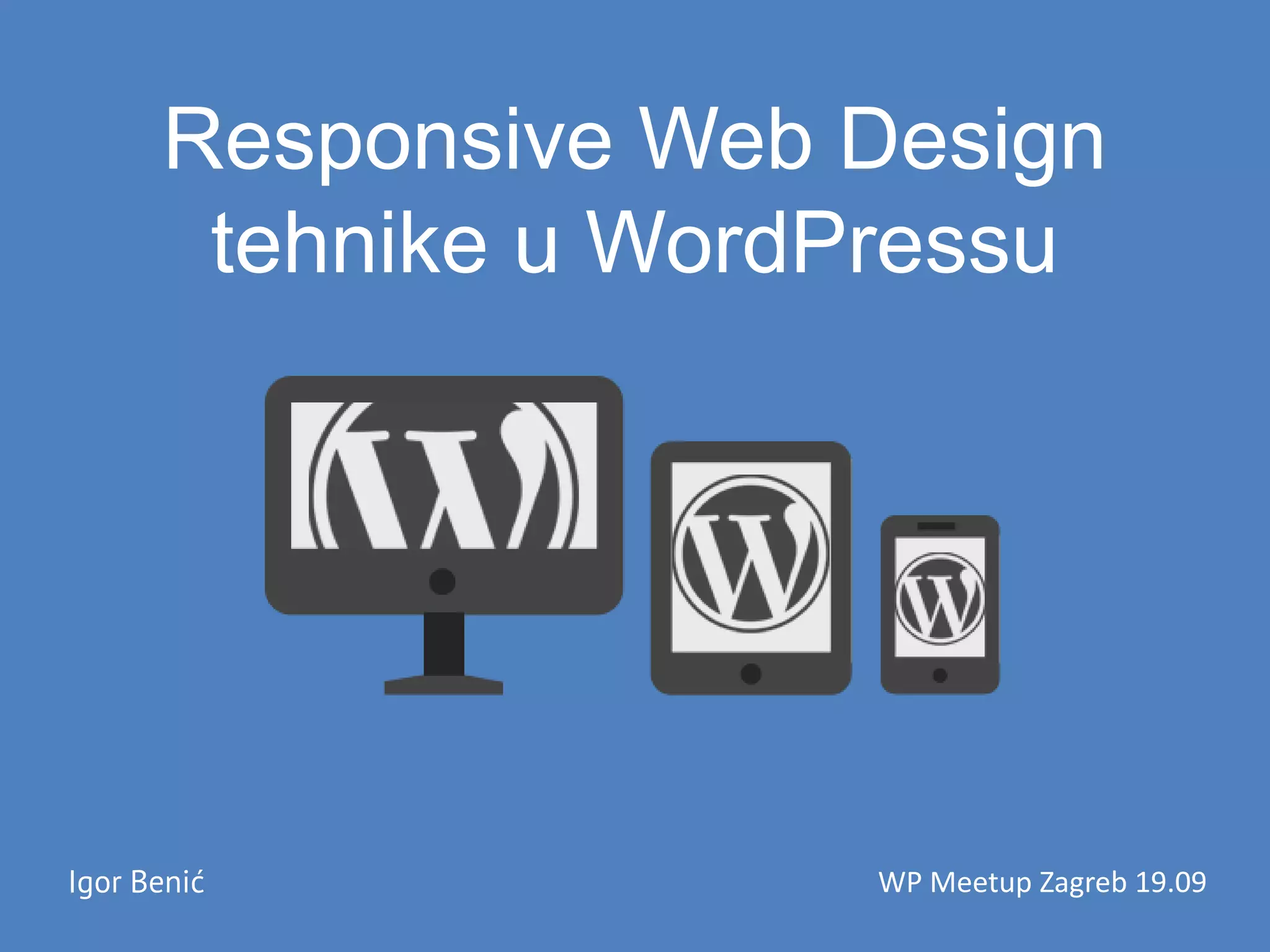
![Slike u WordPress-u
• Različite verzije za istu sliku
– add_image_size(“verzija”, širina, visina, [true |
false]);
• add_filter(“post_thumbnail”,
funkcija_za_promjenu);](https://image.slidesharecdn.com/responsivewebdesigntehnikeuwordpressu-150325041619-conversion-gate01/85/Responsive-Web-Design-tehnike-u-WordPress-u-12-320.jpg)
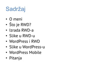
![Slike u WordPress-u - Thumbnailovifunction wpb3_thumbnail_html($html, $post_id, $aid, $sizeThumb, $attr){
if($sizeThumb == "slika-clanka"){
$sizes = array('slika-clanka‘, 'slika-clanka-md‘, 'slika-clanka-sm‘, 'slika-clanka-xs’);
$img = "<img class='bttrLazyLoading img-responsive' alt='".get_the_title()."'";
$sizeBttr = "";
$width = "";
$height = "";
$aid = (!$aid) ? get_post_thumbnail_id() : $aid;
foreach ( $sizes as $size ) {
$url = wp_get_attachment_image_src( $aid, $size );
switch ($size) {
case 'slika-clanka':
$sizeBttr = "lg";
$width = "750";
$height= "353";
break;
...
}
$img .= " data-bttrlazyloading-".$sizeBttr."-src='". $url[0] ."' ";
$img .= " data-bttrlazyloading-".$sizeBttr."-width='". $width ."' ";
$img .= " data-bttrlazyloading-".$sizeBttr."-height='". $height ."' ";
}
$img .= " />";
return $img;
}
return $html;
}
add_filter(
'post_thumbnail_html',
'wpb3_thumbnail_html', 10, 5);](https://image.slidesharecdn.com/responsivewebdesigntehnikeuwordpressu-150325041619-conversion-gate01/85/Responsive-Web-Design-tehnike-u-WordPress-u-13-320.jpg)
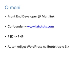
![Slike u WordPress-u - Content
• Filtrirati slike prilikom ispisa ili obrisati (na mobitelima)
– add_filter(‘the_content’, ‘funkcija za filtriranje slika’)
• CSS:
– .post img {max-width:100%;height:auto;}
function slike_u_content() {
global $post;
$html = preg_replace_callback( '#(<imgs[^>]*src)="([^"]+)"#', "callback_img",
get_the_content($post->ID) );
return $html;
}
function callback_img($match) {
list(, $img, $src) = $match;
$url = get_stylesheet_directory_uri().'/img_placeholder.gif';
return "$img="$url" data-href="$src" ";
}](https://image.slidesharecdn.com/responsivewebdesigntehnikeuwordpressu-150325041619-conversion-gate01/85/Responsive-Web-Design-tehnike-u-WordPress-u-14-320.jpg)
![Slike u WordPress-u - LakoTuts
• Filtrirati slike prilikom ispisa
– add_filter(‘the_content’, ‘funkcija za filtriranje slika’)
• CSS:
– .post img {max-width:100%;height:auto;}
$attachment_id = lakotuts_get_attachment_id_from_url($header_image);
$image480 = wp_get_attachment_image_src( $attachment_id, 'image480' );
$image768 = wp_get_attachment_image_src( $attachment_id, 'image768' );
$image1024 = wp_get_attachment_image_src( $attachment_id, 'image1024' );
$image1920 = wp_get_attachment_image_src( $attachment_id, 'image1920' );
echo ‘ #masthead { background-image: url(''. $image768[0] .''); } ';
echo '@media (min-width:768px) { #masthead { background-image: url(''. $image768[0] .''); }}';
echo '@media (min-width:1024px) { #masthead { background-image: url(''. $image1024[0] .''); }}';
echo '@media (min-width:1200px) { #masthead { background-image: url(''. $image1920[0] .''); }}';](https://image.slidesharecdn.com/responsivewebdesigntehnikeuwordpressu-150325041619-conversion-gate01/85/Responsive-Web-Design-tehnike-u-WordPress-u-15-320.jpg)


The document discusses responsive web design (RWD) techniques in WordPress, highlighting the importance of content adaptation to various screen sizes. It covers the creation of RWD using frameworks like Bootstrap, handling images effectively for different devices, and implementing WordPress functionalities for mobile responsiveness. Key topics include the use of lazy loading for images, server-side content adaptation, and filtering images in WordPress to ensure proper display on mobile devices.


![Getting Started with Apache Spark: Big Data Made Simple [Free Meetup]](https://cdn.slidesharecdn.com/ss_thumbnails/apachesparkgettingstarted-260203175547-8361bcc3-thumbnail.jpg?width=640&height=640&fit=bounds)


