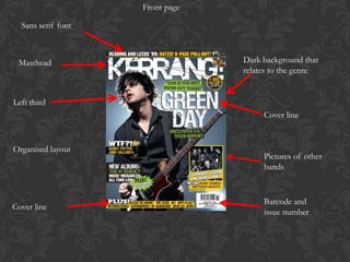
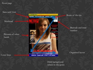
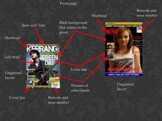
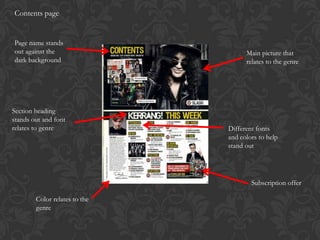
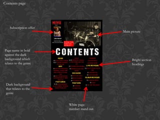
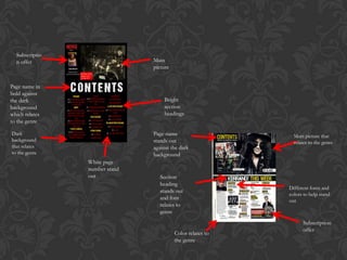
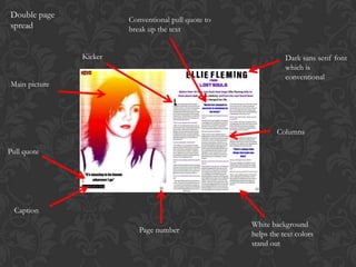
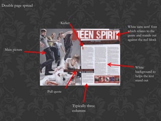
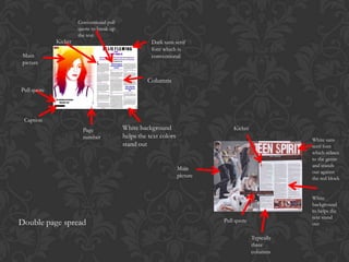
Conventions
Front page

  Sans serif font


 Masthead                        Dark background that
                                 relates to the genre


Left third
                                      Cover line


Organised layout
                                      Pictures of other
                                      bands


                                      Barcode and
Cover line
                                      issue number
Front page


 Sans-serif font
                                              Route of the eye

   Masthead

                                                  Barcode and issue
                                                  number
   Pictures of other
   bands


                                                 Organised layout
Cover lines

                       Dark background
                       relates to the genre
Front page
                                                                                   Barcode and
                                                            Masthead               issue number
                                     Dark background
             Sans serif font
                                     that relates to the
                                     genre
Masthead


Left third


                                              Cover line
Organised
layout
                                              Pictures of              Organised
                                              other bands              layout

   Cover line                  Barcode and
                               issue number
Contents page


Page name stands
out against the                      Main picture that
dark background                      relates to the genre


Section heading
stands out and font
relates to genre               Different fonts
                               and colors to help
                               stand out


                                       Subscription offer

        Color relates to the
        genre
Contents page


   Subscription offer
                                           Main picture


Page name in bold
against the dark
background which                                 Bright section
relates to the genre                             headings


 Dark background
 that relates to the
 genre


                        White page
                        number stand out
Subscriptio
  n offer                      Main
                               picture


Page name in
bold against
the dark                           Bright
background                         section
which relates                      headings
to the genre

Dark                           Page name                      Main picture that
background                     stands out                     relates to the genre
that relates                   against the dark
to the genre                   background
                White page
                number stand
                out               Section
                                  heading
                                                            Different fonts and
                                  stands out
                                                            colors to help stand
                                  and font                  out
                                  relates to
                                  genre
                                                                  Subscription
                                                                  offer
                                         Color relates to
                                         the genre
Double page
                        Conventional pull quote to
spread                  break up the text


               Kicker                                           Dark sans serif font
                                                                which is
                                                                conventional
Main picture


                                                             Columns

Pull quote


  Caption
                                                     White background
                           Page number               helps the text colors
                                                     stand out
Double page spread


                              Kicker
                                                         White sans serif font
                                                         which relates to the
                                                         genre and stands out
                                                         against the red block

 Main picture


                                                              White
                                                              background to
                                                              helps the text
                                                              stand out


                     Pull quote


                                       Typically three
                                       columns
Conventional pull
                      quote to break up
                      the text
             Kicker                                  Dark sans serif
                                                     font which is
 Main                                                conventional
 picture


                                                   Columns
Pull quote


 Caption
                        Page              White background                      Kicker
                        number            helps the text colors
                                                                                                     White sans
                                          stand out                                                  serif font
                                                                                                     which relates
                                                                                                     to the genre
                                                                                                     and stands
                                                                  Main
                                                                                                     out against
                                                                  picture                            the red block


                                                                                                     White
                                                                                                     background
                                                                                                     to helps the
                                                                                                     text stand
Double page spread                                                          Pull quote
                                                                                                     out

                                                                                         Typically
                                                                                         three
                                                                                         columns
GENRE


 The conventions that I have pointed out in this presentation are typical for my genre
 of magazine. One way they are typical for my genre is that I used sans serif fonts in
    my magazine. This is typical of the genre because it shows aggression or anger.
 Another way I used conventions typical of my genre is by using quite dark colors or
colors that are typical of a rock magazine. These colors are red, white and black mostly
  but can also include yellow and purple. These colors are conventional because they
  convey different emotions with each color. For example red is anger. A third way I
  used conventions that are typical to my genre is by using the same type of layout as
 other rock magazines. This typical layout is having one main image and other images
around the outside of this. The route of the eye is used to highlight the main pieces in
the page and around the main picture there are usually a few cover lines to go with the
                                     other pictures.

Conventions

  • 1.
  • 2.
    Front page Sans serif font Masthead Dark background that relates to the genre Left third Cover line Organised layout Pictures of other bands Barcode and Cover line issue number
  • 3.
    Front page Sans-seriffont Route of the eye Masthead Barcode and issue number Pictures of other bands Organised layout Cover lines Dark background relates to the genre
  • 4.
    Front page Barcode and Masthead issue number Dark background Sans serif font that relates to the genre Masthead Left third Cover line Organised layout Pictures of Organised other bands layout Cover line Barcode and issue number
  • 5.
    Contents page Page namestands out against the Main picture that dark background relates to the genre Section heading stands out and font relates to genre Different fonts and colors to help stand out Subscription offer Color relates to the genre
  • 6.
    Contents page Subscription offer Main picture Page name in bold against the dark background which Bright section relates to the genre headings Dark background that relates to the genre White page number stand out
  • 7.
    Subscriptio noffer Main picture Page name in bold against the dark Bright background section which relates headings to the genre Dark Page name Main picture that background stands out relates to the genre that relates against the dark to the genre background White page number stand out Section heading Different fonts and stands out colors to help stand and font out relates to genre Subscription offer Color relates to the genre
  • 8.
    Double page Conventional pull quote to spread break up the text Kicker Dark sans serif font which is conventional Main picture Columns Pull quote Caption White background Page number helps the text colors stand out
  • 9.
    Double page spread Kicker White sans serif font which relates to the genre and stands out against the red block Main picture White background to helps the text stand out Pull quote Typically three columns
  • 10.
    Conventional pull quote to break up the text Kicker Dark sans serif font which is Main conventional picture Columns Pull quote Caption Page White background Kicker number helps the text colors White sans stand out serif font which relates to the genre and stands Main out against picture the red block White background to helps the text stand Double page spread Pull quote out Typically three columns
  • 11.
    GENRE The conventionsthat I have pointed out in this presentation are typical for my genre of magazine. One way they are typical for my genre is that I used sans serif fonts in my magazine. This is typical of the genre because it shows aggression or anger. Another way I used conventions typical of my genre is by using quite dark colors or colors that are typical of a rock magazine. These colors are red, white and black mostly but can also include yellow and purple. These colors are conventional because they convey different emotions with each color. For example red is anger. A third way I used conventions that are typical to my genre is by using the same type of layout as other rock magazines. This typical layout is having one main image and other images around the outside of this. The route of the eye is used to highlight the main pieces in the page and around the main picture there are usually a few cover lines to go with the other pictures.