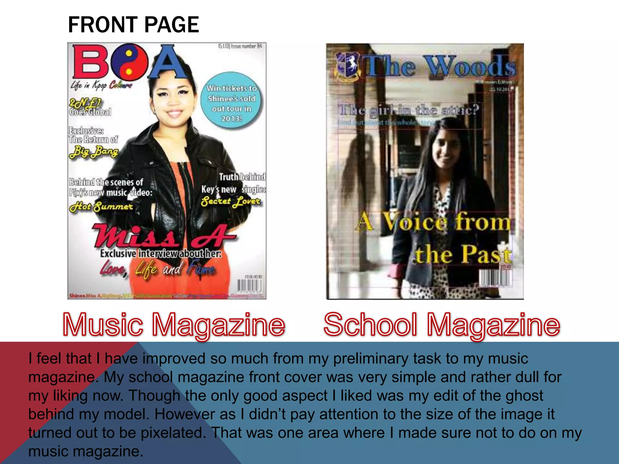
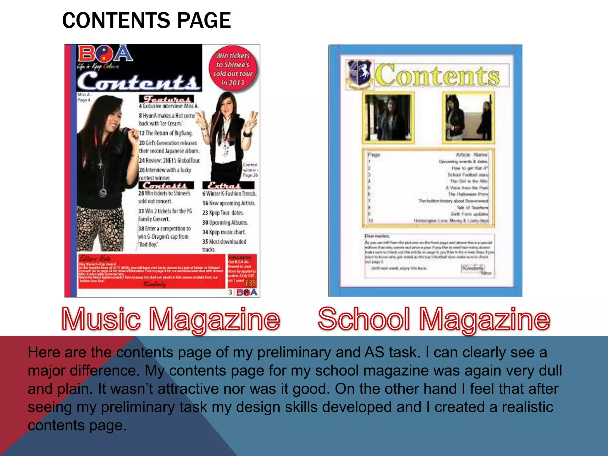
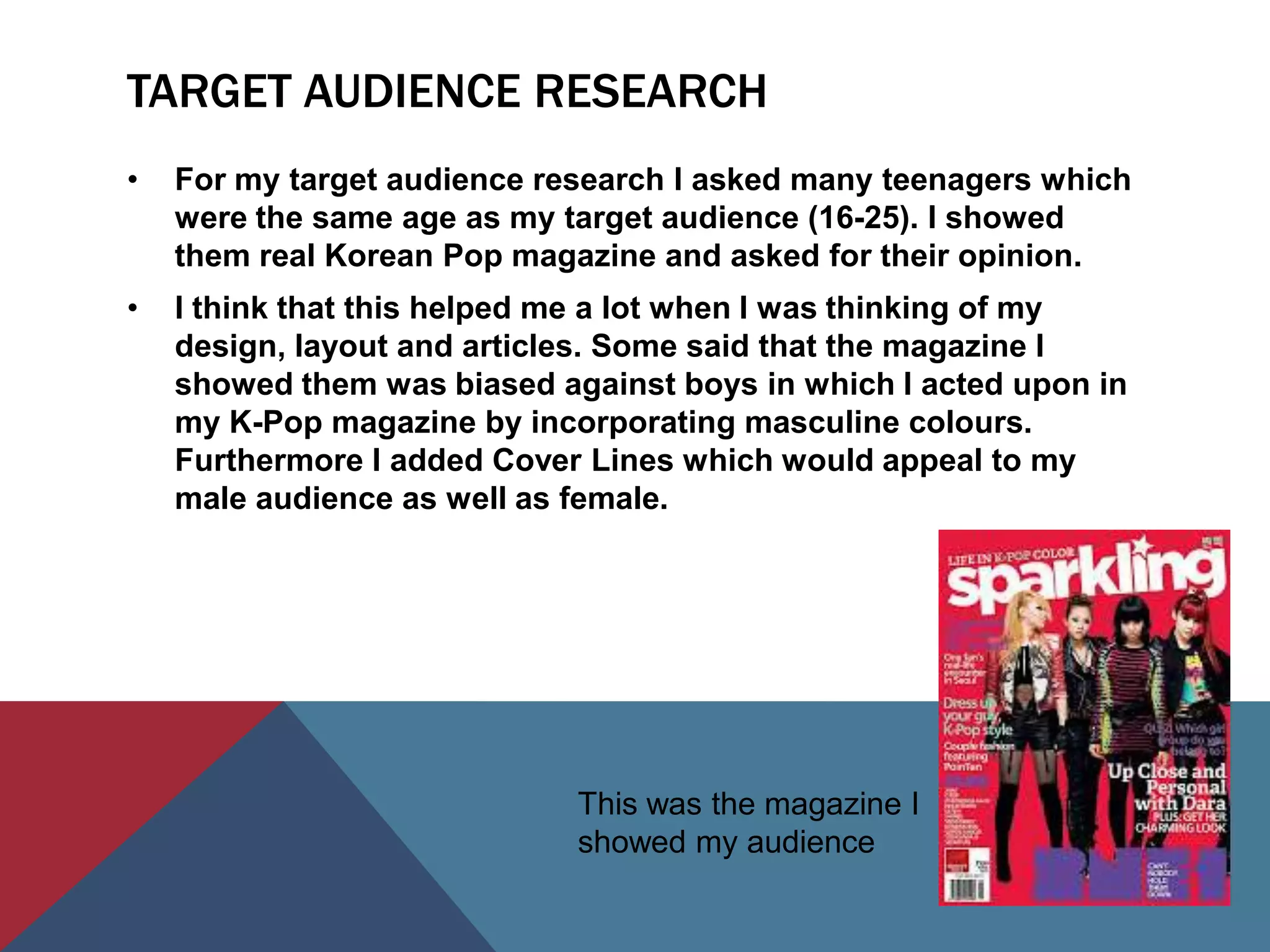
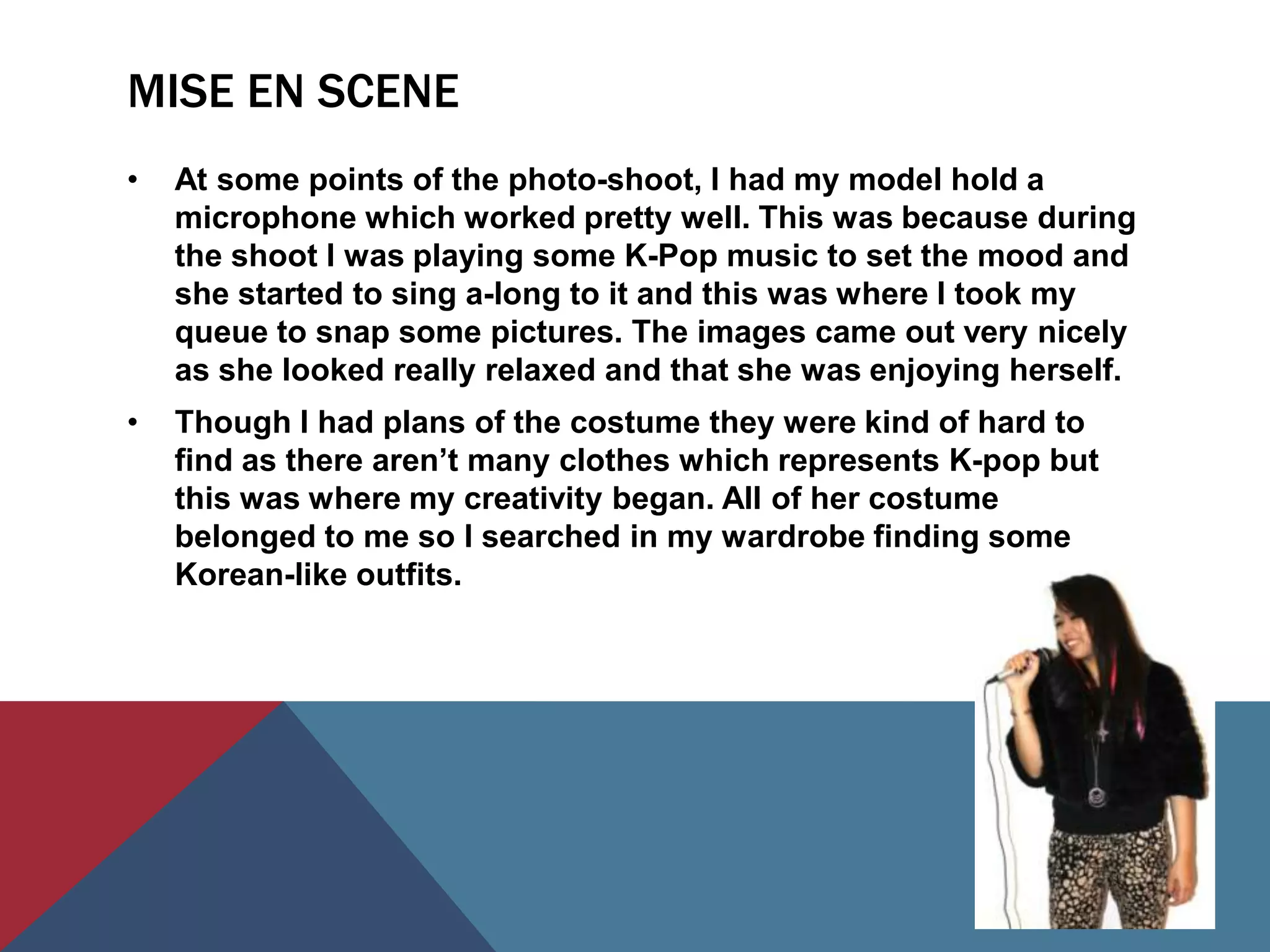
FRONT PAGE


I feel that I have improved so much from my preliminary task to my music
magazine. My school magazine front cover was very simple and rather dull for
my liking now. Though the only good aspect I liked was my edit of the ghost
behind my model. However as I didn’t pay attention to the size of the image it
turned out to be pixelated. That was one area where I made sure not to do on my
music magazine.
CONTENTS PAGE


Here are the contents page of my preliminary and AS task. I can clearly see a
major difference. My contents page for my school magazine was again very dull
and plain. It wasn’t attractive nor was it good. On the other hand I feel that after
seeing my preliminary task my design skills developed and I created a realistic
contents page.
TIME MANAGEMENT
•   Through out my AS task I made sure to keep a tight schedule
    every week whether it was to do research or constructing and
    editing. By having a schedule I was able to finish my magazine
    at an earlier date and had time to make any changes and
    improvements.
•   While I was in school I made sure to spend as much time in the
    media suite as I could this is because I didn’t have the software
    at home.
•   Though I had a schedule I didn’t feel that it was a burden to my
    usual life I just simply thought if it as a task I had to finish and I
    guess that helped me a lot during these times.
PROGRAM
•   As you saw earlier my preliminary task wasn’t as great as my
    AS task this was because I wasn’t comfortable and confident in
    using the software as I was scared that I wouldn't be able to
    undo mistakes but I later found out that I could.
•   As I progressed onto my AS work I took some time to develop
    and deepen my skills on InDesign. I think that by doing that at
    the very beginning I was able to show some of my potential in
    using this soft ware.
EDITING
•   I feel that editing was one of the key aspects of my magazine. I
    wasn’t able to use Photoshop as I didn’t have it at home. So I
    used a website called ‘Picmonkey’. I was confident in using this
    editing site as I know my way around it pretty well as I use it to
    edit my own pictures too.
•   One thing I tries to keep an eye out for the was pixel sizes of
    each image I edited as I didn’t want them to turn out like my
    preliminary task, blurry and pixelated.
•   In my point of view I have succeeded in doing that as my
    images did not turn out that way.
TARGET AUDIENCE RESEARCH
•   For my target audience research I asked many teenagers which
    were the same age as my target audience (16-25). I showed
    them real Korean Pop magazine and asked for their opinion.
•   I think that this helped me a lot when I was thinking of my
    design, layout and articles. Some said that the magazine I
    showed them was biased against boys in which I acted upon in
    my K-Pop magazine by incorporating masculine colours.
    Furthermore I added Cover Lines which would appeal to my
    male audience as well as female.


                             This was the magazine I
                             showed my audience
MISE EN SCENE
•   At some points of the photo-shoot, I had my model hold a
    microphone which worked pretty well. This was because during
    the shoot I was playing some K-Pop music to set the mood and
    she started to sing a-long to it and this was where I took my
    queue to snap some pictures. The images came out very nicely
    as she looked really relaxed and that she was enjoying herself.
•   Though I had plans of the costume they were kind of hard to
    find as there aren’t many clothes which represents K-pop but
    this was where my creativity began. All of her costume
    belonged to me so I searched in my wardrobe finding some
    Korean-like outfits.

Question 7

  • 2.
    FRONT PAGE I feelthat I have improved so much from my preliminary task to my music magazine. My school magazine front cover was very simple and rather dull for my liking now. Though the only good aspect I liked was my edit of the ghost behind my model. However as I didn’t pay attention to the size of the image it turned out to be pixelated. That was one area where I made sure not to do on my music magazine.
  • 3.
    CONTENTS PAGE Here arethe contents page of my preliminary and AS task. I can clearly see a major difference. My contents page for my school magazine was again very dull and plain. It wasn’t attractive nor was it good. On the other hand I feel that after seeing my preliminary task my design skills developed and I created a realistic contents page.
  • 4.
    TIME MANAGEMENT • Through out my AS task I made sure to keep a tight schedule every week whether it was to do research or constructing and editing. By having a schedule I was able to finish my magazine at an earlier date and had time to make any changes and improvements. • While I was in school I made sure to spend as much time in the media suite as I could this is because I didn’t have the software at home. • Though I had a schedule I didn’t feel that it was a burden to my usual life I just simply thought if it as a task I had to finish and I guess that helped me a lot during these times.
  • 5.
    PROGRAM • As you saw earlier my preliminary task wasn’t as great as my AS task this was because I wasn’t comfortable and confident in using the software as I was scared that I wouldn't be able to undo mistakes but I later found out that I could. • As I progressed onto my AS work I took some time to develop and deepen my skills on InDesign. I think that by doing that at the very beginning I was able to show some of my potential in using this soft ware.
  • 6.
    EDITING • I feel that editing was one of the key aspects of my magazine. I wasn’t able to use Photoshop as I didn’t have it at home. So I used a website called ‘Picmonkey’. I was confident in using this editing site as I know my way around it pretty well as I use it to edit my own pictures too. • One thing I tries to keep an eye out for the was pixel sizes of each image I edited as I didn’t want them to turn out like my preliminary task, blurry and pixelated. • In my point of view I have succeeded in doing that as my images did not turn out that way.
  • 7.
    TARGET AUDIENCE RESEARCH • For my target audience research I asked many teenagers which were the same age as my target audience (16-25). I showed them real Korean Pop magazine and asked for their opinion. • I think that this helped me a lot when I was thinking of my design, layout and articles. Some said that the magazine I showed them was biased against boys in which I acted upon in my K-Pop magazine by incorporating masculine colours. Furthermore I added Cover Lines which would appeal to my male audience as well as female. This was the magazine I showed my audience
  • 8.
    MISE EN SCENE • At some points of the photo-shoot, I had my model hold a microphone which worked pretty well. This was because during the shoot I was playing some K-Pop music to set the mood and she started to sing a-long to it and this was where I took my queue to snap some pictures. The images came out very nicely as she looked really relaxed and that she was enjoying herself. • Though I had plans of the costume they were kind of hard to find as there aren’t many clothes which represents K-pop but this was where my creativity began. All of her costume belonged to me so I searched in my wardrobe finding some Korean-like outfits.