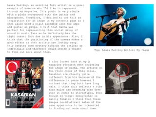
2) How does your media product represent
particular social groups?
The demographic for my magazine is mainly females aged from
16-30 years old. It is likely that a large majority of my
target audience have jobs so I think that the issues of my
magazine, for example, Glastonbury and purchasing new music
are suitable because they are likely to be able to afford
these things.
My magazine represents the social
groups of my demographic through the
use of props and images. I think
that the whole of my demographic fit
into a casual and laid back social
group. The idea of going to
festivals is very exciting for my
target audience suggesting they’re
carefree and are always seeking fun
things to pursue. Therefore, the use
of images on my front cover showing
artists performing live will attract
them immediately.
All of these images
have been used
throughout my
magazine.
My audience are clearly going to be
fans of the Folk music genre. I
noticed that after completing my
magazine the majority of my images
had guitars in them. This fits into
the social group of my readers
because it is possible that some of
them play an instrument themselves
and the fact that the guitars used
are acoustic, it fits into the
genre.
Next, I decided to compare my completed front cover with existing front covers to
see how both attract particular social groups.
I took one of the front covers from my
research posts at the start of my blog
to use as a comparison for FORTE’s
front cover. Laura Marling is the
artist I used as inspiration. In Q’s
issue they would clearly be attracting
folk music fans as Laura is from that
specific genre so I think this cover
was good to base mine on. Alyx is
using a similar stance to Laura with
the look over the shoulder and I have
also noticed that the fonts used to
write the artists’ names are specific
to themselves.
Both of these artists are female and look quite calm and
comfortable in their position of music which I think attracts a
particular social culture of young women who are into the more
softer side of music which folk is a good example of. A
contrast of this would be magazines such as Kerrang! as the
artists on their front covers show attitude and confidence. For
example, I looked back to my research into Kerrang! magazine
and found this front cover featuring All Time Low. They use
more costumes to portray their artists. Therefore, this is why
I didn’t use Kerrang! as a style model because the magazine has
different ambitions to mine.
The first image is from the double page spread of Laura’s Q magazine
issue. I have compared this with my double page spread to see how we
have both attracted a particular audience. Both artists have a quite
serious look on their faces and the setting of the shoot is simple.
I also noticed that both Alyx and Laura are crossing their arms on
some form of way which I think reflects the subject matter of the
interview as Alyx’s is about overcoming her anxiety so has been
quite a closed person in the past. I think that this is suitable for
the demographic because they are old enough to understand these
issues and process them therefore the image is reflecting the
seriousness.
Laura Marling, an existing folk artist is a great
example of someone who I’d like to represent
through my magazine. This photo is very simple
with a plain background with the guitar and
microphone. Therefore, I decided to use this as
inspiration for an image in my contents page as I
once again used a plain backdrop used the amps
and guitar as props. I felt that Sacha was
perfect for representing this social group of
acoustic music fans as he definitely has the
right casual look due to his appearance. Also, I
think that the positioning of the camera makes a
good effect as both artists are looking away.
This creates some mystery towards the artists as
individuals and therefore could invite a reader
to find out more about them.
Top: Laura Marling Bottom: My Image
I also looked back at my Q
magazine research when analysing
the image of Sacha. The artists on
the front cover of this issue,
Kasabian are clearly quite
different from him because of the
difference in genre however I
noticed that they both have long
hair. I think this reflects a vibe
that males are becoming care free
when it comes to stereotypes. Even
though my target demographic is
mainly females I think that these
images could attract males of the
same appearance to be interested
in finding out more about them.

Question 2

  • 1.
    2) How doesyour media product represent particular social groups? The demographic for my magazine is mainly females aged from 16-30 years old. It is likely that a large majority of my target audience have jobs so I think that the issues of my magazine, for example, Glastonbury and purchasing new music are suitable because they are likely to be able to afford these things.
  • 2.
    My magazine representsthe social groups of my demographic through the use of props and images. I think that the whole of my demographic fit into a casual and laid back social group. The idea of going to festivals is very exciting for my target audience suggesting they’re carefree and are always seeking fun things to pursue. Therefore, the use of images on my front cover showing artists performing live will attract them immediately. All of these images have been used throughout my magazine. My audience are clearly going to be fans of the Folk music genre. I noticed that after completing my magazine the majority of my images had guitars in them. This fits into the social group of my readers because it is possible that some of them play an instrument themselves and the fact that the guitars used are acoustic, it fits into the genre.
  • 3.
    Next, I decidedto compare my completed front cover with existing front covers to see how both attract particular social groups. I took one of the front covers from my research posts at the start of my blog to use as a comparison for FORTE’s front cover. Laura Marling is the artist I used as inspiration. In Q’s issue they would clearly be attracting folk music fans as Laura is from that specific genre so I think this cover was good to base mine on. Alyx is using a similar stance to Laura with the look over the shoulder and I have also noticed that the fonts used to write the artists’ names are specific to themselves. Both of these artists are female and look quite calm and comfortable in their position of music which I think attracts a particular social culture of young women who are into the more softer side of music which folk is a good example of. A contrast of this would be magazines such as Kerrang! as the artists on their front covers show attitude and confidence. For example, I looked back to my research into Kerrang! magazine and found this front cover featuring All Time Low. They use more costumes to portray their artists. Therefore, this is why I didn’t use Kerrang! as a style model because the magazine has different ambitions to mine.
  • 4.
    The first imageis from the double page spread of Laura’s Q magazine issue. I have compared this with my double page spread to see how we have both attracted a particular audience. Both artists have a quite serious look on their faces and the setting of the shoot is simple. I also noticed that both Alyx and Laura are crossing their arms on some form of way which I think reflects the subject matter of the interview as Alyx’s is about overcoming her anxiety so has been quite a closed person in the past. I think that this is suitable for the demographic because they are old enough to understand these issues and process them therefore the image is reflecting the seriousness.
  • 5.
    Laura Marling, anexisting folk artist is a great example of someone who I’d like to represent through my magazine. This photo is very simple with a plain background with the guitar and microphone. Therefore, I decided to use this as inspiration for an image in my contents page as I once again used a plain backdrop used the amps and guitar as props. I felt that Sacha was perfect for representing this social group of acoustic music fans as he definitely has the right casual look due to his appearance. Also, I think that the positioning of the camera makes a good effect as both artists are looking away. This creates some mystery towards the artists as individuals and therefore could invite a reader to find out more about them. Top: Laura Marling Bottom: My Image I also looked back at my Q magazine research when analysing the image of Sacha. The artists on the front cover of this issue, Kasabian are clearly quite different from him because of the difference in genre however I noticed that they both have long hair. I think this reflects a vibe that males are becoming care free when it comes to stereotypes. Even though my target demographic is mainly females I think that these images could attract males of the same appearance to be interested in finding out more about them.