Download to read offline
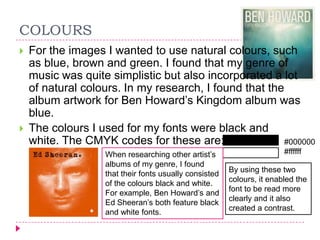
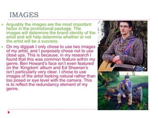
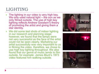
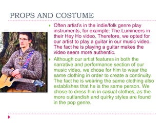

The document discusses the effectiveness of the house style, colors, fonts, images, lighting, props, costumes, visual themes, and theory used in a promotional package for an indie/folk musician. The house style creates continuity through consistent use of colors, fonts, layouts and images to make the product identifiable. Audience feedback confirmed the house style successfully reflected the chosen genre. Natural colors like blue, brown and green were used for images to reflect the genre. Black and white fonts ensured readability and contrast. Simple, clearly readable fonts from the genre were also used. Outdoor images of the artist in natural settings were chosen over close-ups to reflect the genre's redundancy. Lighting also used natural


