Falcon Invoice Discounting: Empowering Your Business Growth
Question 1 front cover
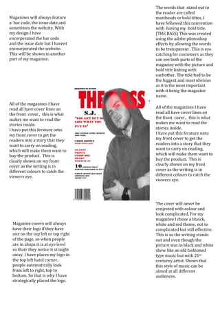
1. The words that stand out to
the reader are called
Magazines will always feature mastheads or bold tiltes. I
a bar code, the issue date and have followed this convention
sometimes the website. With with having my bold title.
my design I have (THE BASS) This was created
encorperated the bar code using the adobe photoshop
and the issue date but I havent effects by allowing the words
encourperated the website. to be transparent . This is eye
This will be shown in another catching for customers as they
part of my magazine. can see both parts of the
magazine with the picture and
bold title linking with
eachother. The title had to be
the biggest and most obvious
as it is the most important
with it being the magazine
name.
All of the magazines I have
read all have cover lines on All of the magazines I have
the front cover., this is what read all have cover lines on
makes me want to read the the front cover., this is what
stories inside. makes me want to read the
I have put this ferature onto stories inside.
my front cover to get the I have put this ferature onto
readers into a story that they my front cover to get the
want to carry on reading, readers into a story that they
which will make them want to want to carry on reading,
buy the product. This is which will make them want to
clearly shown on my front buy the product. This is
cover as the writing is in clearly shown on my front
different colours to catch the cover as the writing is in
viewers eye. different colours to catch the
viewers eye.
The cover will never be
conjested with colour and
look complicated, For my
magazine I chose a blasck,
Magazine covers will always white and red theme, not to
have their logo if they have complicated but still effective.
one on the top left or top right This is so the writing stands
of the page, so when people out and even though the
are in shops it is at eye level picture was in black and white
so thatr they notice it straight show like an old fashioned
away. I have places my logo in type music but with 21st
the top left hand corner, centurey artist. Shows that
people automatically look this style of music can be
from left to right, top to aimed at all different
bottom. So that is why I have audiences.
strategically placed the logo.