This document discusses how the media product challenges conventions of typical pop music genres. It summarizes:
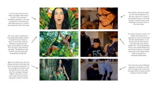
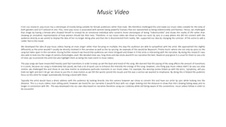
1) The music video uses close-ups and natural lighting/costumes to contrast with typical pop videos' sexualization and unrealistic portrayals. Locations are everyday instead of exotic.
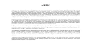
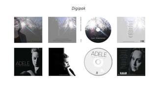
2) The digipak uses dark colors instead of bright tones and focuses on scenery over the artist. Fonts are simple to highlight the music.
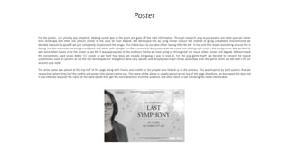
3) The poster desaturates an outdoor photo instead of using bright colors. Credits are centered at the top like typical posters to draw attention. Overall, the products strive for a unique acoustic-pop style rather than conforming to pop stereotypes.