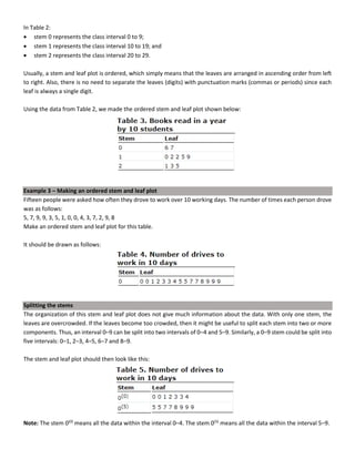
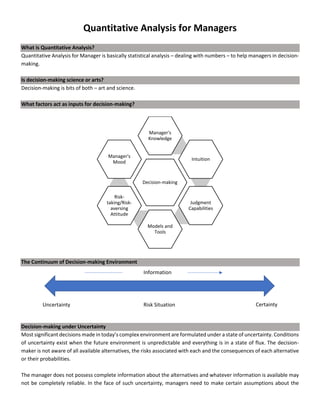
This document discusses quantitative analysis and decision-making under conditions of uncertainty, risk, and certainty. It provides examples of how expected value, opportunity loss, and incremental analysis can be used to determine the optimal production level for a bread manufacturing company given demand probabilities. Under absolute uncertainty with no demand information, the optimal decision balances risk and potential loss. With some demand information, expected value analysis indicates producing 42 units. And with full certainty of demands, opportunity loss is minimized at 42 units as well. Quantitative methods can help decision-making even if outcomes may initially differ from reality in the short-term.

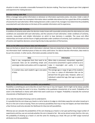
![“There’s a 90% chance it will rain tomorrow.” – what does it mean?
It means that out of 10 days, it will rain 9 days and out of 100 days, it will rain 90 days.
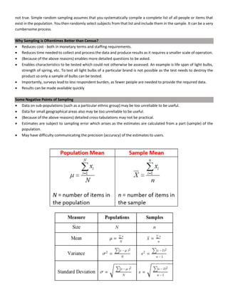
Decision-making
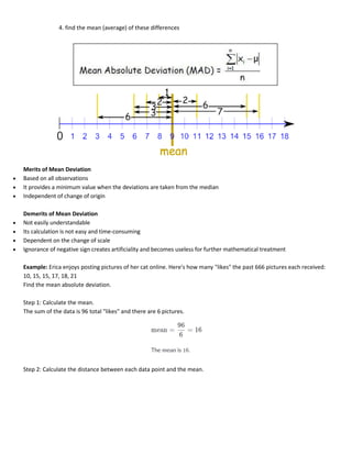
For ABC Bread Manufacturing Company (the significance of bread here is that it is a perishable good; if 42 units are
produced while there is a demand for 40, 2 units will be wasted as they cannot be stored for sales the next day),
Demand = 40 – 44 units [25 different outcomes e.g. demand for 40 units and production of 40 units of bread is one
outcome]
Selling Price = $38/unit
Variable Cost = $25/unit
Fixed Cost = $200/day
Question: How many units should be produced?
Solution
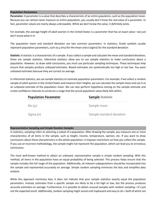
Method 1: Payoff Matrix/Profit Matrix
Decision-making under Absolute Uncertainty
ABC is a new bread manufacturing company and they have absolutely no information regarding the market except that
the range of demand will be 40 units to 44 units.
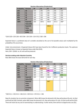
Decision Alternatives (Productions)
Demand 40 41 42 43 44
40 320* 295 270 245 220
41 320 333 308 283 258
42 320 333 346 321 296
43 320 333 346 359 334
44 320 333 346 359 372
*Revenue = 40 X 38 = $1520
(-) Variable Cost = 40 X 25 = $1000
(-) Fixed Cost = $200
Profit = $320
The decision to manufacture can be anything from 40 units to 44 units, depending on the producer/manager.
• The manager who chooses to produce 40 units of bread has a highly risk-averting attitude.
• The manager who chooses to produce 44 units of bread has a highly risk-taking attitude.
• The manager who chooses to produce 42 units of bread does so because while his profit is not maximized, his loss
isn’t maximized either.
Decision-making under Risk
Now ABC has been in the market for some time and so, has some information regarding demands of their customers.](https://image.slidesharecdn.com/quantitativeanalysisformanagersnotes-240310183821-e1e92ddc/85/Quantitative-Analysis-for-Managers-Notes-pdf-4-320.jpg)