
Recommended
More Related Content
What's hot
What's hot (19)
Similar to Q.2 representation
Similar to Q.2 representation (20)
Q.2 representation
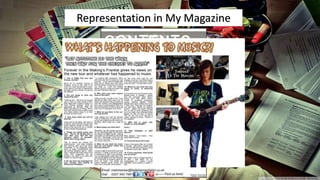
- 1. A lot of the time rock music is mistakenly associated with and represented by animosity and malevolent... Like so: Representation in My Magazine
- 2. A lot of the time rock music is (in my opinion) mistakenly associated with and represented by animosity and malevolence... Like so:
- 3. Though, as I’ve said I don’t really think that this is fair and that it’s overly stereotypical so I, for two reasons, opted for a counter-stereotypical representation by silencing the model with tape which also helps to assert the preferred reading. The first of which: 1. The magazine is about being silenced. 2. The humbled model shows no signs of violence, anger or any general shoutiness.
- 4. Representation is one of the trickiest parts of the media, if done without delicacy can have such an enormous affect so I followed KC&C and used my photography appropriately to draw out the target audience… Judging by the general genre of the magazine and more importantly the theme of this one more importantly I have a good idea of the psychographic audience. I believe that the groups venture through 'reformers' and 'explorers'. In terms of socio-economic groups I think I'll be able to draw a wide range of people - one of the beauties of music is that it's really for anyone and brings people together; in this instance: people spanning for groups B through to D... But for now I'll analyse how the front cover helps that along. To begin; the model is young, but not too young - about 17-19. He has dyed green streaks in his hair and has his top button done up though he's not at a formal event... He just likes it done up, this all describes someone who doesn't like to be generic. He stands out from a crowd (some people would say 'hipster').
- 5. Through the eyes of the theorists… The final form of representation is to consider how your media text/product is seen by theorists and how your text conforms or defies their opinions. In terms of Laura Mulvey’s ‘male gaze’ theory this magazine does not aid it whatsoever, this magazine doesn’t use sexualized females to sell due to the focus on musical content and the fact that I think it’s wrong. The magazine also doesn’t really connect with Dick Hebdige’s ‘youth as fun/trouble’ as the model is muted therefore has no expression so you can’t really interpet whether the young male is fun/trouble. When concerned by uses and gratifications theory this is to be used as ‘surveillance’ due to it’s informative nature.
- 6. Now, onto the contents page Unintentionally my representation of race ended up quite slim as I only actually used two different models (as they’re two people I know personally in music) and they’re both suited to the same demographic groups 'reformers' and 'explorers‘ due to the same reasons too; such as their stereo- typical floppy hair, facial piercings and quirky dress sense. The photos used don’t exactly help to fight the ‘aggressive’ stereotypes as the centrally framed model appears to be shouting at the audience which could taint the preferred reading but I think that it goes with the whole ‘oppressive’ media story and makes for good direct mode of address.
- 7. Double Page Spread Finally, the double page spread. I think what I said previously about uses and gratifications theory (surveillance) is applicable here more than ever due to the knowledge we obtain about this pseudo-celebrity’s life and opinions.
- 8. That is the end of representation in my blog.