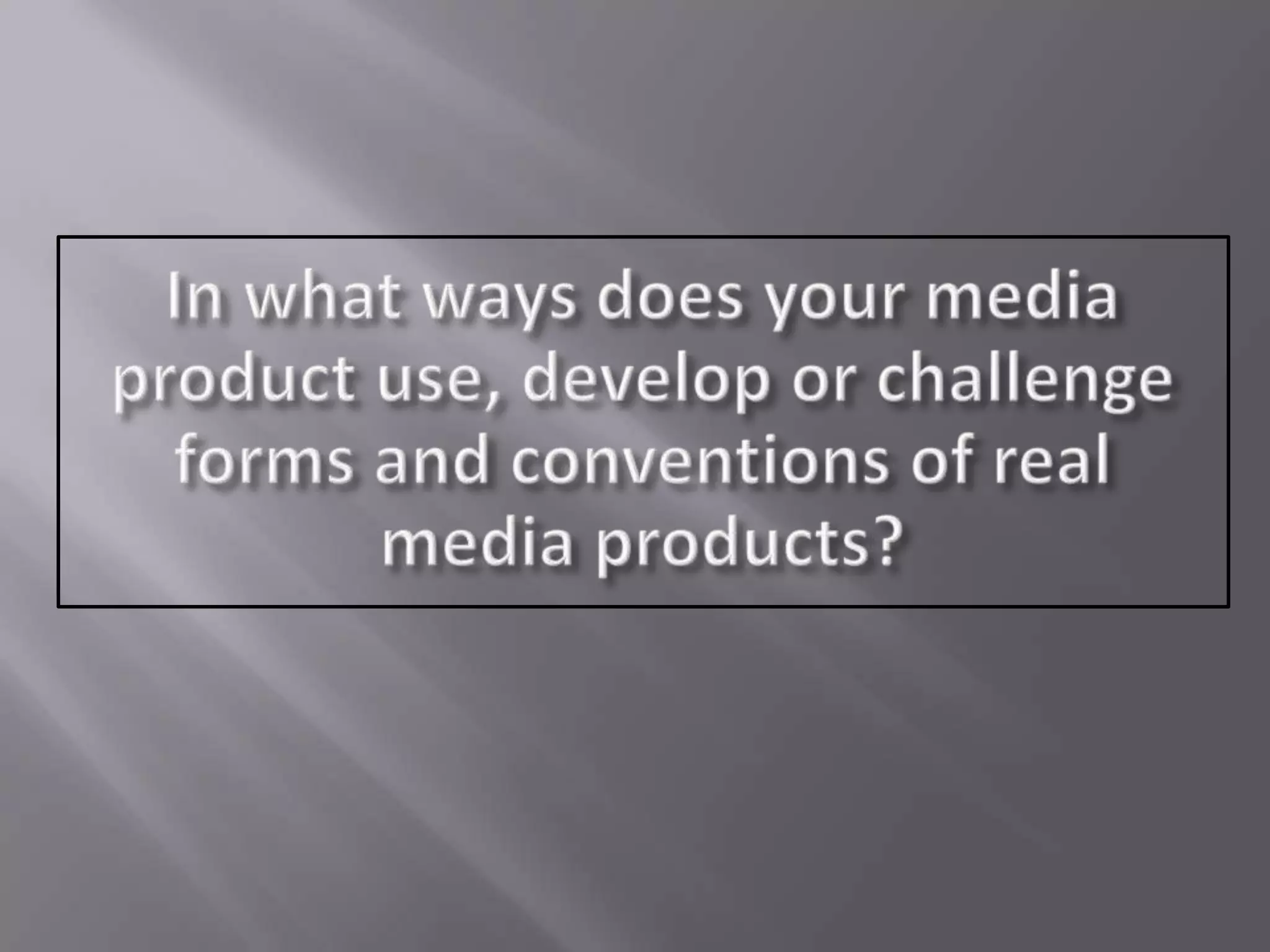
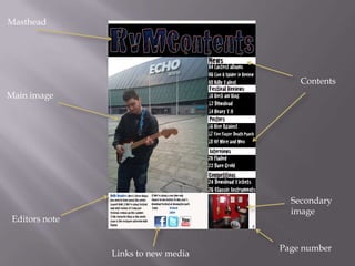
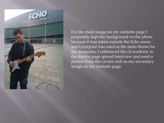
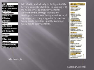
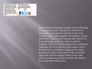
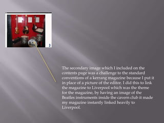
Masthead
Contents
Editors note
Main image
Secondary
image
Page number
Links to new media
For the contents page masthead I challenged a
convention of a typical kerrang contents page by
keeping the font of the masthead the same as the font
on the front cover, whereas the font for the masthead of
kerrang front cover is different to the font on the
kerrang contents page. I kept the font the same because
I felt it would help to keep the house style consistent
and make the contents instantly recognizable against
the front cover.
For the main image on my contents page I
purposely kept the background on the photo
because it was taken outside the Echo arena
and Liverpool was used as the main theme for
my magazine, I referenced the o2 academy in
the double page spread interview and used a
picture from the cavern club as my secondary
image on my contents page.
My Contents
Kerrang Contents
I decided to stick closely to the layout of the
Kerrang contents whilst still in-keeping with
my house style. To make my contents
different from Kerrang I changed the
headings to better suit the style and focus of
my magazine i.e. my magazine focuses on
heavy bands therefore I put the names of
heavy bands in my contents.
Due to the fact that each weekly issue of kerrang
has an editors note I decided it would be an
important convention to include in my own
contents page, following the conventions I used
small text which is used because the contents is
an inside page so the text doesn’t need to
instantly stand out it just needs to be readable, to
challenge the conventions of the editors note I
decided not to include an image of the editor
because it is only really used to take up blank
space but I had an image of the cavern club
which I wanted to include and also the links to
the social networking sites.
The secondary image which I included on the
contents page was a challenge to the standard
conventions of a kerrang magazine because I put it
in place of a picture of the editor. I did this to link
the magazine to Liverpool which was the theme
for the magazine, by having an image of the
Beatles instruments inside the cavern club it made
my magazine instantly linked heavily to
Liverpool.
As new media and the convergence of platforms is becoming more and
more common I thought it would be a good idea to include links to social
networking sites, these were: Facebook, Twitter and Youtube. This helped to
make my magazine look more modern and up to date with the current
changes in media and technology.
As a common convention of all magazines in general I
included page numbers on both my contents page and
my double page spread.

Q1 contents

  • 2.
  • 3.
    For the contentspage masthead I challenged a convention of a typical kerrang contents page by keeping the font of the masthead the same as the font on the front cover, whereas the font for the masthead of kerrang front cover is different to the font on the kerrang contents page. I kept the font the same because I felt it would help to keep the house style consistent and make the contents instantly recognizable against the front cover.
  • 4.
    For the mainimage on my contents page I purposely kept the background on the photo because it was taken outside the Echo arena and Liverpool was used as the main theme for my magazine, I referenced the o2 academy in the double page spread interview and used a picture from the cavern club as my secondary image on my contents page.
  • 5.
    My Contents Kerrang Contents Idecided to stick closely to the layout of the Kerrang contents whilst still in-keeping with my house style. To make my contents different from Kerrang I changed the headings to better suit the style and focus of my magazine i.e. my magazine focuses on heavy bands therefore I put the names of heavy bands in my contents.
  • 6.
    Due to thefact that each weekly issue of kerrang has an editors note I decided it would be an important convention to include in my own contents page, following the conventions I used small text which is used because the contents is an inside page so the text doesn’t need to instantly stand out it just needs to be readable, to challenge the conventions of the editors note I decided not to include an image of the editor because it is only really used to take up blank space but I had an image of the cavern club which I wanted to include and also the links to the social networking sites.
  • 7.
    The secondary imagewhich I included on the contents page was a challenge to the standard conventions of a kerrang magazine because I put it in place of a picture of the editor. I did this to link the magazine to Liverpool which was the theme for the magazine, by having an image of the Beatles instruments inside the cavern club it made my magazine instantly linked heavily to Liverpool.
  • 8.
    As new mediaand the convergence of platforms is becoming more and more common I thought it would be a good idea to include links to social networking sites, these were: Facebook, Twitter and Youtube. This helped to make my magazine look more modern and up to date with the current changes in media and technology. As a common convention of all magazines in general I included page numbers on both my contents page and my double page spread.