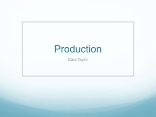
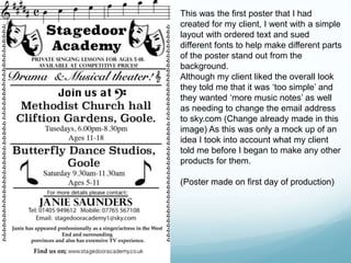
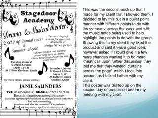
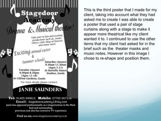
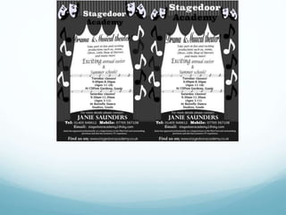
Production
Cara Taylor
This was the first poster that I had
created for my client, I went with a simple
layout with ordered text and sued
different fonts to help make different parts
of the poster stand out from the
background.
Although my client liked the overall look
they told me that it was ‘too simple’ and
they wanted ‘more music notes’ as well
as needing to change the email address
to sky.com (Change already made in this
image) As this was only a mock up of an
idea I took into account what my client
told me before I began to make any other
products for them.
(Poster made on first day of production)
This was the second mock up that I
made for my client that I showed them, I
decided to lay this out in a bullet point
manner with different points to do with
the company across the page and with
the music notes being used to help
highlight the points to do with the group.
Showing this to my client they liked the
product and said it was a good idea,
however asked if I could give it a few
more changes wanting it to be more
‘theatrical’ upon further discussion they
told me that they wanted ‘curtains
across the page’ which I took into
account as I talked further with my
client.
This poster was drafted up on the
second day of production before my
meeting with my client.
This is the third poster that I made for my
client, taking into account what they had
asked me to create I was able to create
a poster that used a pair of stage
curtains along with a stage to make it
appear more theatrical like my client
wanted it to. I continued to use the other
items that my client had asked for in the
brief such as the theater masks and
music notes. However in this image I
chose to re-shape and position them.
Production
Production

Production

  • 1.
  • 2.
    This was thefirst poster that I had created for my client, I went with a simple layout with ordered text and sued different fonts to help make different parts of the poster stand out from the background. Although my client liked the overall look they told me that it was ‘too simple’ and they wanted ‘more music notes’ as well as needing to change the email address to sky.com (Change already made in this image) As this was only a mock up of an idea I took into account what my client told me before I began to make any other products for them. (Poster made on first day of production)
  • 3.
    This was thesecond mock up that I made for my client that I showed them, I decided to lay this out in a bullet point manner with different points to do with the company across the page and with the music notes being used to help highlight the points to do with the group. Showing this to my client they liked the product and said it was a good idea, however asked if I could give it a few more changes wanting it to be more ‘theatrical’ upon further discussion they told me that they wanted ‘curtains across the page’ which I took into account as I talked further with my client. This poster was drafted up on the second day of production before my meeting with my client.
  • 4.
    This is thethird poster that I made for my client, taking into account what they had asked me to create I was able to create a poster that used a pair of stage curtains along with a stage to make it appear more theatrical like my client wanted it to. I continued to use the other items that my client had asked for in the brief such as the theater masks and music notes. However in this image I chose to re-shape and position them.