Download to read offline


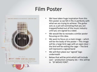


The document discusses plans for a film poster and magazine spread promoting a documentary called "SIGNED". For the poster, they will recreate a similar style to an inspiration poster showing a bird exiting a cage to represent a signed band. The magazine spread will have the title "SIGNED" at the top left with a review underneath. The two-page spread will include images and text reviewing the narrative and quality of the documentary production.