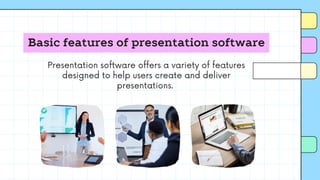
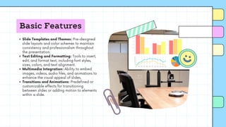
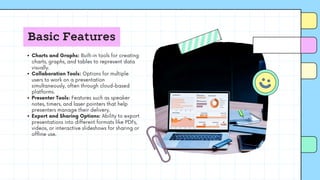
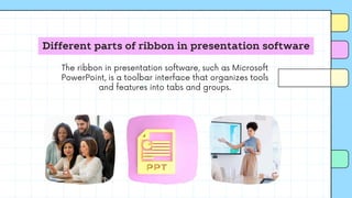
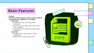
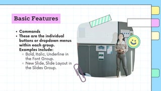
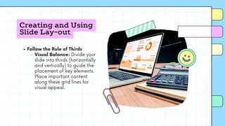
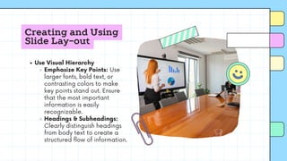
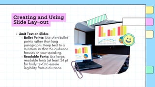
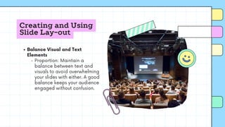
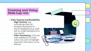
Presentation
Software
ELEC201
Basic features of presentation software
Presentation software offers a variety of features
designed to help users create and deliver
presentations.
Basic Features
Slide Templates and Themes: Pre-designed
slide layouts and color schemes to maintain
consistency and professionalism throughout
the presentation.
Text Editing and Formatting: Tools to insert,
edit, and format text, including font styles,
sizes, colors, and text alignment.
Multimedia Integration: Ability to embed
images, videos, audio files, and animations to
enhance the visual appeal of slides.
Transitions and Animations: Predefined or
customizable effects for transitioning
between slides or adding motion to elements
within a slide.
Basic Features
Charts and Graphs: Built-in tools for creating
charts, graphs, and tables to represent data
visually.
Collaboration Tools: Options for multiple
users to work on a presentation
simultaneously, often through cloud-based
platforms.
Presenter Tools: Features such as speaker
notes, timers, and laser pointers that help
presenters manage their delivery.
Export and Sharing Options: Ability to export
presentations into different formats like PDFs,
videos, or interactive slideshows for sharing or
offline use.
Basic Features
Slide Navigation and Overview: Slide sorter
or overview mode to organize, preview, and
navigate between slides easily.
Spell Check and Grammar Tools: Built-in
tools to ensure proper spelling and grammar
across the presentation.
These features make it easier to create
engaging, professional presentations for various
audiences and purposes.
Different parts of ribbon in presentation software
The ribbon in presentation software, such as Microsoft
PowerPoint, is a toolbar interface that organizes tools
and features into tabs and groups.
Basic Features
Tabs
Each tab contains related groups of commands and
is typically organized by function. Common tabs
include:
Home: Basic formatting tools (text, fonts,
alignment, clipboard).
Insert: Tools for adding objects (images, charts,
tables, shapes, text boxes).
Design: Options for slide themes, layouts, and
background styles.
Transitions: Controls for applying slide transition
effects.
Animations: Options to animate objects within a
slide.
Slide Show: Settings for starting and customizing
the presentation flow.
Review: Proofing tools like spell check, comments,
and language settings.
View: Tools for changing slide views, zooming, or
toggling different panels.
Basic Features
Groups
Each tab contains groups, which organize related
commands into categories. For example:
Home Tab:
Clipboard Group: Cut, Copy, Paste
commands.
Font Group: Font styles, sizes, colors, bold,
italic, underline.
Paragraph Group: Alignment, bullet points,
indentation.
Insert Tab:
Images Group: Insert pictures, clipart,
screenshots.
Media Group: Insert videos, audio.
Basic Features
Commands
These are the individual
buttons or dropdown menus
within each group.
Examples include:
Bold, Italic, Underline in
the Font Group.
New Slide, Slide Layout in
the Slides Group.
Basic Features
Dialog Box Launcher
In the bottom-right
corner of some
groups, a small arrow
(called a dialog box
launcher) appears.
Clicking it opens a
more detailed
settings panel or
window related to
that group.
Basic Features
Quick Access Toolbar
Located above the
ribbon, this toolbar
offers frequently used
commands such as
Save, Undo, Redo,
and can be
customized by the
user.
Basic Features
File Tab (Backstage View)
The File tab (sometimes
in place of a traditional
ribbon tab) opens the
Backstage View, where
users can access file-
related commands such
as Save, Print, Export,
and Share.
Basic Features
These parts together help
users quickly find the tools
they need to create, edit,
and enhance presentations.
Creating and Using Slide Lay-out
Creating and using effective slide layouts is crucial for
delivering a clear and engaging presentation.
Creating and Using
Slide Lay-out
Keep It Simple
Minimalism: Avoid clutter
by keeping text and
visuals minimal. Aim for
one key point per slide.
Whitespace: Leave
enough blank space to
avoid overwhelming the
audience. It improves
readability and focus.
Creating and Using
Slide Lay-out
Use Consistent Layouts
Uniform Design: Use
consistent slide layouts
throughout the presentation
to create visual harmony.
Stick to the same font style,
size, and color palette.
Master Slides: Use master
slides or slide templates to
ensure uniformity in fonts,
colors, and design elements
across all slides.
Creating and Using
Slide Lay-out
Follow the Rule of Thirds
Visual Balance: Divide your
slide into thirds (horizontally
and vertically) to guide the
placement of key elements.
Place important content
along these grid lines for
visual appeal.
Creating and Using
Slide Lay-out
Use Visual Hierarchy
Emphasize Key Points: Use
larger fonts, bold text, or
contrasting colors to make
key points stand out. Ensure
that the most important
information is easily
recognizable.
Headings & Subheadings:
Clearly distinguish headings
from body text to create a
structured flow of information.
Creating and Using
Slide Lay-out
Limit Text on Slides
Bullet Points: Use short bullet
points rather than long
paragraphs. Keep text to a
minimum so that the audience
focuses on your speaking.
Readable Fonts: Use large,
readable fonts (at least 24 pt
for body text) to ensure
legibility from a distance.
Creating and Using
Slide Lay-out
Use High-Quality Visuals
Images & Icons: Use relevant,
high-resolution images and
icons that enhance your
message. Avoid generic stock
images that don’t add value.
Graphs & Charts: When
displaying data, use clean
and simple graphs or charts
to communicate information
visually. Avoid overly complex
visuals.
Creating and Using
Slide Lay-out
Balance Visual and Text
Elements
Proportion: Maintain a
balance between text and
visuals to avoid overwhelming
your slides with either. A good
balance keeps your audience
engaged without confusion.
Creating and Using
Slide Lay-out
Color Contrast and Readability
High Contrast: Use
contrasting colors for
background and text to
ensure readability (e.g., dark
text on a light background or
vice versa).
Color Consistency: Limit your
color palette to 2-3 main
colors. Use color to highlight
important information, not to
distract.
Creating and Using
Slide Lay-out
Use Alignment for Neatness
Grid Alignment: Align text
and visuals properly to give
the slide a professional,
organized look. Tools like
"Align" or "Distribute" in your
presentation software help
ensure symmetry.
Centering Key Elements:
Place critical content in the
center of the slide for
maximum impact.
Creating and Using
Slide Lay-out
Make Use of Slide Layout Options
Built-In Layouts: Choose
appropriate pre-designed slide
layouts (e.g., Title Slide, Title and
Content, Two Content) for
different purposes. Modify as
needed but avoid changing the
basic structure.
Custom Layouts: If necessary,
create custom layouts that fit
your presentation’s specific
needs while maintaining visual
consistency.
Creating and Using
Slide Lay-out
Leverage Transitions and
Animations Sparingly
Subtle Transitions: Use subtle
slide transitions for smooth flow.
Overusing animations can
distract from your message.
Purposeful Animations: Apply
animations to focus attention on
specific points but avoid
excessive motion effects, which
can look unprofessional.
Creating and Using
Slide Lay-out
Test on Different Screens
Screen Compatibility: Check
how your slides look on different
screens or projectors. Some
colors and fonts might look
different, so ensure your layout
works well across devices.
Creating and Using
Slide Lay-out
By following these tips, you'll create
professional, engaging slide layouts
that enhance your presentation
rather than distract from it.

Presentation-Software.pdf for your educational purposes

  • 1.
  • 2.
    Basic features ofpresentation software Presentation software offers a variety of features designed to help users create and deliver presentations.
  • 3.
    Basic Features Slide Templatesand Themes: Pre-designed slide layouts and color schemes to maintain consistency and professionalism throughout the presentation. Text Editing and Formatting: Tools to insert, edit, and format text, including font styles, sizes, colors, and text alignment. Multimedia Integration: Ability to embed images, videos, audio files, and animations to enhance the visual appeal of slides. Transitions and Animations: Predefined or customizable effects for transitioning between slides or adding motion to elements within a slide.
  • 4.
    Basic Features Charts andGraphs: Built-in tools for creating charts, graphs, and tables to represent data visually. Collaboration Tools: Options for multiple users to work on a presentation simultaneously, often through cloud-based platforms. Presenter Tools: Features such as speaker notes, timers, and laser pointers that help presenters manage their delivery. Export and Sharing Options: Ability to export presentations into different formats like PDFs, videos, or interactive slideshows for sharing or offline use.
  • 5.
    Basic Features Slide Navigationand Overview: Slide sorter or overview mode to organize, preview, and navigate between slides easily. Spell Check and Grammar Tools: Built-in tools to ensure proper spelling and grammar across the presentation. These features make it easier to create engaging, professional presentations for various audiences and purposes.
  • 6.
    Different parts ofribbon in presentation software The ribbon in presentation software, such as Microsoft PowerPoint, is a toolbar interface that organizes tools and features into tabs and groups.
  • 7.
    Basic Features Tabs Each tabcontains related groups of commands and is typically organized by function. Common tabs include: Home: Basic formatting tools (text, fonts, alignment, clipboard). Insert: Tools for adding objects (images, charts, tables, shapes, text boxes). Design: Options for slide themes, layouts, and background styles. Transitions: Controls for applying slide transition effects. Animations: Options to animate objects within a slide. Slide Show: Settings for starting and customizing the presentation flow. Review: Proofing tools like spell check, comments, and language settings. View: Tools for changing slide views, zooming, or toggling different panels.
  • 8.
    Basic Features Groups Each tabcontains groups, which organize related commands into categories. For example: Home Tab: Clipboard Group: Cut, Copy, Paste commands. Font Group: Font styles, sizes, colors, bold, italic, underline. Paragraph Group: Alignment, bullet points, indentation. Insert Tab: Images Group: Insert pictures, clipart, screenshots. Media Group: Insert videos, audio.
  • 9.
    Basic Features Commands These arethe individual buttons or dropdown menus within each group. Examples include: Bold, Italic, Underline in the Font Group. New Slide, Slide Layout in the Slides Group.
  • 10.
    Basic Features Dialog BoxLauncher In the bottom-right corner of some groups, a small arrow (called a dialog box launcher) appears. Clicking it opens a more detailed settings panel or window related to that group.
  • 11.
    Basic Features Quick AccessToolbar Located above the ribbon, this toolbar offers frequently used commands such as Save, Undo, Redo, and can be customized by the user.
  • 12.
    Basic Features File Tab(Backstage View) The File tab (sometimes in place of a traditional ribbon tab) opens the Backstage View, where users can access file- related commands such as Save, Print, Export, and Share.
  • 13.
    Basic Features These partstogether help users quickly find the tools they need to create, edit, and enhance presentations.
  • 14.
    Creating and UsingSlide Lay-out Creating and using effective slide layouts is crucial for delivering a clear and engaging presentation.
  • 15.
    Creating and Using SlideLay-out Keep It Simple Minimalism: Avoid clutter by keeping text and visuals minimal. Aim for one key point per slide. Whitespace: Leave enough blank space to avoid overwhelming the audience. It improves readability and focus.
  • 16.
    Creating and Using SlideLay-out Use Consistent Layouts Uniform Design: Use consistent slide layouts throughout the presentation to create visual harmony. Stick to the same font style, size, and color palette. Master Slides: Use master slides or slide templates to ensure uniformity in fonts, colors, and design elements across all slides.
  • 17.
    Creating and Using SlideLay-out Follow the Rule of Thirds Visual Balance: Divide your slide into thirds (horizontally and vertically) to guide the placement of key elements. Place important content along these grid lines for visual appeal.
  • 18.
    Creating and Using SlideLay-out Use Visual Hierarchy Emphasize Key Points: Use larger fonts, bold text, or contrasting colors to make key points stand out. Ensure that the most important information is easily recognizable. Headings & Subheadings: Clearly distinguish headings from body text to create a structured flow of information.
  • 19.
    Creating and Using SlideLay-out Limit Text on Slides Bullet Points: Use short bullet points rather than long paragraphs. Keep text to a minimum so that the audience focuses on your speaking. Readable Fonts: Use large, readable fonts (at least 24 pt for body text) to ensure legibility from a distance.
  • 20.
    Creating and Using SlideLay-out Use High-Quality Visuals Images & Icons: Use relevant, high-resolution images and icons that enhance your message. Avoid generic stock images that don’t add value. Graphs & Charts: When displaying data, use clean and simple graphs or charts to communicate information visually. Avoid overly complex visuals.
  • 21.
    Creating and Using SlideLay-out Balance Visual and Text Elements Proportion: Maintain a balance between text and visuals to avoid overwhelming your slides with either. A good balance keeps your audience engaged without confusion.
  • 22.
    Creating and Using SlideLay-out Color Contrast and Readability High Contrast: Use contrasting colors for background and text to ensure readability (e.g., dark text on a light background or vice versa). Color Consistency: Limit your color palette to 2-3 main colors. Use color to highlight important information, not to distract.
  • 23.
    Creating and Using SlideLay-out Use Alignment for Neatness Grid Alignment: Align text and visuals properly to give the slide a professional, organized look. Tools like "Align" or "Distribute" in your presentation software help ensure symmetry. Centering Key Elements: Place critical content in the center of the slide for maximum impact.
  • 24.
    Creating and Using SlideLay-out Make Use of Slide Layout Options Built-In Layouts: Choose appropriate pre-designed slide layouts (e.g., Title Slide, Title and Content, Two Content) for different purposes. Modify as needed but avoid changing the basic structure. Custom Layouts: If necessary, create custom layouts that fit your presentation’s specific needs while maintaining visual consistency.
  • 25.
    Creating and Using SlideLay-out Leverage Transitions and Animations Sparingly Subtle Transitions: Use subtle slide transitions for smooth flow. Overusing animations can distract from your message. Purposeful Animations: Apply animations to focus attention on specific points but avoid excessive motion effects, which can look unprofessional.
  • 26.
    Creating and Using SlideLay-out Test on Different Screens Screen Compatibility: Check how your slides look on different screens or projectors. Some colors and fonts might look different, so ensure your layout works well across devices.
  • 27.
    Creating and Using SlideLay-out By following these tips, you'll create professional, engaging slide layouts that enhance your presentation rather than distract from it.