Presentation design tips contrast
•
0 likes•49 views
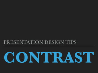
This document discusses contrast in presentation design. It defines contrast as drawing the eye to elements that are noticeably different from their surroundings. Contrast is an important principle as the human eye is constantly looking for similarities and differences. The document provides tips on using contrast through size, color, and accounting for how projector displays can alter colors. It recommends using colors opposite each other on the color wheel for highest contrast.
Report
Share
Report
Share
Download to read offline

Recommended
Design thinking by Developer Students Clubs
Design thinking refers to creative strategies designers use during the process of designing.It has also been developed as an approach to resolve issues outside of professional design practice, such as in business and social contexts.
The Shared Product Mindset as the next level of the innovation-driven organiz...
The digitlal world is ever-changing and the change is getting faster and more disruptive by minute. The solution for digital organization was to go through an agile transition, to adopt agile workflows and to change the way products are developed.
But what if this is not enough to remain competitive and innovative? What happens after an organsation prides itself upon their agile product development? What is the future in organizational development?
The solution is short: The Shared Product Mindset.
It is the next logical and necessary step: the evolution of an agile product management into a product-driven organization. Only when the whole organzation, every team and every colleague is developing a Shared Product Mindset for what it is doing and for the things it is creating, the true potential of innovation within the organisation can be leveraged. This doesn't mean that the product managers and product owners will be cut back in their role. No, their role within such an organization is more crucial and diverse than ever.
How to colour your kitchen
The step by step guide of how to paint your kitchen and also the ideas of decorating it. The easy and handy guide for your kitchen design and decoration.
What mindset is needed for Design Thinking?
Facilitators: Lawrence Neeley (Olin College) and Leticia Britos Cavagnaro (Stanford University)
Design Thinking is a method for the practical and creative resolution of problems through design with a comprehensive understanding of stakeholders, users, or customers. There has been significant coverage in the literature on this method, much in connection to Stanford’s d.school. This widely adopted method has direct application in engineering. Through this breakout, participants will learn some of the core concepts of design thinking and available resources. Participants will discuss how to leverage the overlap of design thinking and entrepreneurial mindset.
Stop, Collaborate, and Listen - Dean Hudson
Atlassian is growing at a phenomenal rate. As the company scales, how will we continue to deliver great user experiences? Looking at the tools and techniques used by the JIRA Design Team, we'll cover ideas and strategies that you can build into your own processes to collaborate as an experience-lead team.
d.school Bootcamp Bootleg
d.school Bootcamp Bootleg, as generously created and offered (under Creative Commons license) by the Stanford d.school: http://dschool.typepad.com/news/2009/12/the-bootcamp-bootleg-is-here.html
Designing with style: Using style tiles in responsive design
This talk is to serve as an introduction/overview into the world of Style Guides for web projects, instead of relying on pages & pages of static design mockups. We’re going learn why static mockups don’t always work, why they don’t scale, and why it’s better to develop reusable components in defining your responsive visual design language.
– Why are style tiles/guides needed? What problems do they solve?
– What are the core components of a style tile?
– How do they fit into a design process?
– How do they benefit project stakeholders such as clients, developers, project managers?
O.I.A Portfolio
Omar Andrade is a UX designer who helps organizations solve problems and find opportunities for innovation. He uses various techniques like sketching, user research, idea synthesis and prototyping. Omar also has experience in product management, working in an agile environment, and running a food tech startup. He aims to visualize problems, generate insights, develop compelling solutions, and effectively communicate with stakeholders.
Bootcampbootleg2010v2slim 1
This document provides an overview of a design thinking toolkit called the "d.school bootcamp bootleg." It outlines human-centered design processes and specific methods that support seven core mindsets of design thinking. The bootleg captures teachings from the d.school's foundation course and includes updated and new methods based on teaching experiences. The methods come from a wide range of design experts at the d.school and beyond. The document is shared freely under a Creative Commons license for others to use and improve upon, and feedback is welcomed.
Experience design through the lens of creativity
Experience design through creative techniques like customer journey maps and service blueprints, with a focus on Facilitated Ideation, How Might We and Role-Playing.
Benefits of Choosing a Creative agency than employing an inhouse designer
From setting brand guidelines to expert feedback, numerous elements create engaging designs. A Creative Agency is THE solution to enhance brand recognition and build goodwill amongst the audience when it comes to early-stage start-ups.
We at 7 Frames help start-ups and organizations generate value through marketing with our content, design, and social media services.
Visit www.7frames.in for more information or shoot a mail at connect@7frames.in
How Product Managers Can Shape Inclusive Futures with UX
We all want a world where everyone has equal access to digital information, just as we want all online experiences to be equitable. UX has a critical role in making that future possible. Many in the UX space reiterate that “knowing your audience” is paramount to developing great user experience, and that empathy is the cornerstone of UX. But in a world where profits often matter more than people, how can we personally build a nuanced understanding of inclusive design and get our teams to commit to it?
Join Bronwen Rees, Author and Lead Product Designer at Xero, for a conversation that digs deeper than the recycled buzzwords. This session will cover:
• What inclusive design is, and why it's important
• What biases are and how to avoid them
• Ways to practice inclusivity within design
• What you can do on both an individual level and a community level to promote inclusion
Design Thinking for Library Innovation Workshop Slides
Design Concepts, a product design and innovation consulting firm based in Madison, is pleased to partner with WiLS to present a Design Thinking for Library Innovation workshop at WiLS World 2016. Design Thinking is a creative approach to solving problems in a holistic and human-centered way. In this hands-on workshop, we will apply Design Thinking methods to address the challenges facing libraries. Participants will gain an understanding of a framework and process for innovation, and practice techniques including research, analysis, brainstorming, and storytelling to generate inspired solutions.
[DSC Europe 22] Why is a good data scientist a package of professions? - Neza...
[DSC Europe 22] Why is a good data scientist a package of professions? - Neza...DataScienceConferenc1
Working with data isn’t just a technical challenge. Once you exit the safe nest of your data science department, you often need to act as a lawyer, therapist, writer or creative director. Storytelling turns out to be one of the key skills when explaining data to others. How not to overburden product managers with data and how to present findings in an understandable way? We will discuss about ways to hack the counterproductive nature of two professions, data scientist and product manager, where one is experimenting while the other is boxing it in. This talk will be about how this collaboration can be pushed to the next level and how a data scientist can expand her skill sets beyond just technical proficiency and critical thinking.dschool_toolkit
This document provides an overview of the d.school bootcamp bootleg, which is intended as an active toolkit to support design thinking practice. It outlines the human-centered design process and describes specific methods that can be used at each stage. The bootleg captures some of the teachings from the d.school's foundation course on design thinking and includes updated and new methods based on lessons learned. The methods presented were culled from various individuals and organizations to impart design thinking. The document is shared freely under a Creative Commons license and feedback is welcomed.
Bootcamp_bootleg
Design Thinking ist eine neuartige Methode zur Entwicklung innovativer Ideen in allen Lebensbereichen. Das Konzept basiert auf der Überzeugung, dass wahre Innovation nur dann geschehen kann, wenn starke multidisziplinäre Gruppen sich zusammenschließen, eine gemeinschaftliche Kultur bilden und die Schnittstellen der unterschiedlichen Meinungen und Perspektiven erforschen.
Methodcards v3-slim (1)
The document provides an overview of the d.school's design thinking bootcamp bootleg guide. It outlines the human-centered design process modes of empathize, define, ideate, prototype, and test. It then describes dozens of specific methods that can be used within each mode, such as assuming a beginner's mindset, using what/how/why questions, and conducting user camera studies and interview preparation. The bootleg is intended as an active toolkit for practitioners to try these tools and share their experiences using the methods.
Just Make Me a Dashboard!
Up Leveling Enterprise Data Visualization
Watch the Enterprise X Insider talk here: https://vimeo.com/331014279
A non designers guide to creating memorable visual slides by visme
This document provides an overview of how to plan and structure an effective presentation. It discusses:
1) The importance of starting with brainstorming your key message and ideas on paper before beginning your slides, in order to generate creative ideas freely without constraints.
2) Ways to weave facts and stories into your narrative by alternating between "what is" and "what could be" to create suspense and inspire your audience. This follows a three-act story structure with a beginning, middle, and end.
3) The four main purposes of communication - to inform, entertain, inspire, or persuade - and how presentations can accomplish more than one objective by combining storytelling and factual information.
A non designer's guide to creating memorable visual slides
A non designeris guide to creating memorable visual slides.
If you’re like most people, you’ve probably created dozens of presentations in your lifetime, and many of these in just under a few hours. But ask yourself: Do you really know how to design a memorable presentation that will stick in your viewers’ minds for months, even years to come?
The answer is probably no. Most of us have never actually learned the design principles necessary to impact audiences through visual storytelling. Perhaps the closest we have ever come to crafting a visual message is a PowerPoint presentation full of bullet points, overused stock photos and bland color schemes.
But these kinds of presentations rarely inspire real change, especially in this new age of visual communication.
Design Drivers
The document discusses "Design Drivers", which are provocative headings and imagery used to define aspirations and provide a vision for product design. Design Drivers help structure ideas generated during brainstorming and provide goals to measure designs against. They describe what is wanted from a product in an emotive way to inspire divergent thinking beyond just meeting requirements. Examples discussed include drivers for a wearable injector like "invisible beneath clothing" and for a device worn on the skin like "comfortable against the skin". Design Drivers are useful for agreeing on a design vision, establishing design direction, and keeping projects on track.
Evolving the Creative Process
1) The document discusses building agile creative teams and outlines foundational beliefs for collaborative creative processes. It emphasizes listening to all team members, respecting others' opinions, and avoiding ego.
2) An agile approach is recommended, allowing creative guardrails instead of rigid rules to provide flexibility for different projects, clients, and users. The core elements of discovery, creative work, and coding should still be included.
3) Discovery is an important phase to understand the audience and objectives. Tools can help identify project details and learn about the users to ensure the design meets their needs.
3 Habits of Highly Effective Designers
The document outlines 3 habits of highly effective designers: 1) Empathizing with customers by understanding them through personas, segmentation, and executive alignment. 2) Solving problems visually by mapping customer journeys, pain points, and dependencies. 3) Designing together through collaborative sketching, idea generation, and prioritizing features. It also discusses 3 behaviors for effective organizations: confidence, clarity, and consistency.
From idea to concept - webinar by Michał Krochecki
This presentation will help you make your first steps when creating an application. You will be able to painlessly prepare a brief that could be used in multiple situations. Most importantly, you will be better organized and have a clear path towards the final goal.
The presentation was used to conduct a webinar - follow our facebook page to be informed about upcoming webinars.
Key Themes from Front End Innovation 2018
A summary of key takeaways, themes and favorite sound bites from this years 2018 Front End Innovation conference. By Sasha McCune, Director of Design at Conifer Research.
D school bootcamp bootleg
This document provides an overview of the design thinking process used at the d.school at Stanford University. It outlines the main modes of the process - Empathize, Define, Ideate, and Prototype. For each mode, it describes what the mode is and why it is important. It also lists specific methods that can be used in each mode to do design work. The document is intended as a toolkit for practitioners to support their use of a human-centered design process.
Customer-centered design: Implementation WIOA - With the Customer in the Cent...
Presentation by Virginia HAMILTON, Workforce practitioner, United States from the OECD capacity building seminar “A workforce for the future - Designing strong local strategies for better jobs and skills”, 28-29 Nov 2017, Venice, Italy.
More information: http://oe.cd/CBSVenice2018
2014 Evolving Your UX Process 1up
Tom Brinck discusses evolving UX processes to be more adaptive, streamlined, optimized, innovative, collaborative, and concrete. He advocates experimenting with process changes and adopting those that work while abandoning those that don't. Brinck also presents a UX capabilities model that outlines increasing levels of capability from reactive to transformative.
Technoblade The Legacy of a Minecraft Legend.
Technoblade, born Alex on June 1, 1999, was a legendary Minecraft YouTuber known for his sharp wit and exceptional PvP skills. Starting his channel in 2013, he gained nearly 11 million subscribers. His private battle with metastatic sarcoma ended in June 2022, but his enduring legacy continues to inspire millions.
More Related Content
Similar to Presentation design tips contrast
Bootcampbootleg2010v2slim 1
This document provides an overview of a design thinking toolkit called the "d.school bootcamp bootleg." It outlines human-centered design processes and specific methods that support seven core mindsets of design thinking. The bootleg captures teachings from the d.school's foundation course and includes updated and new methods based on teaching experiences. The methods come from a wide range of design experts at the d.school and beyond. The document is shared freely under a Creative Commons license for others to use and improve upon, and feedback is welcomed.
Experience design through the lens of creativity
Experience design through creative techniques like customer journey maps and service blueprints, with a focus on Facilitated Ideation, How Might We and Role-Playing.
Benefits of Choosing a Creative agency than employing an inhouse designer
From setting brand guidelines to expert feedback, numerous elements create engaging designs. A Creative Agency is THE solution to enhance brand recognition and build goodwill amongst the audience when it comes to early-stage start-ups.
We at 7 Frames help start-ups and organizations generate value through marketing with our content, design, and social media services.
Visit www.7frames.in for more information or shoot a mail at connect@7frames.in
How Product Managers Can Shape Inclusive Futures with UX
We all want a world where everyone has equal access to digital information, just as we want all online experiences to be equitable. UX has a critical role in making that future possible. Many in the UX space reiterate that “knowing your audience” is paramount to developing great user experience, and that empathy is the cornerstone of UX. But in a world where profits often matter more than people, how can we personally build a nuanced understanding of inclusive design and get our teams to commit to it?
Join Bronwen Rees, Author and Lead Product Designer at Xero, for a conversation that digs deeper than the recycled buzzwords. This session will cover:
• What inclusive design is, and why it's important
• What biases are and how to avoid them
• Ways to practice inclusivity within design
• What you can do on both an individual level and a community level to promote inclusion
Design Thinking for Library Innovation Workshop Slides
Design Concepts, a product design and innovation consulting firm based in Madison, is pleased to partner with WiLS to present a Design Thinking for Library Innovation workshop at WiLS World 2016. Design Thinking is a creative approach to solving problems in a holistic and human-centered way. In this hands-on workshop, we will apply Design Thinking methods to address the challenges facing libraries. Participants will gain an understanding of a framework and process for innovation, and practice techniques including research, analysis, brainstorming, and storytelling to generate inspired solutions.
[DSC Europe 22] Why is a good data scientist a package of professions? - Neza...
[DSC Europe 22] Why is a good data scientist a package of professions? - Neza...DataScienceConferenc1
Working with data isn’t just a technical challenge. Once you exit the safe nest of your data science department, you often need to act as a lawyer, therapist, writer or creative director. Storytelling turns out to be one of the key skills when explaining data to others. How not to overburden product managers with data and how to present findings in an understandable way? We will discuss about ways to hack the counterproductive nature of two professions, data scientist and product manager, where one is experimenting while the other is boxing it in. This talk will be about how this collaboration can be pushed to the next level and how a data scientist can expand her skill sets beyond just technical proficiency and critical thinking.dschool_toolkit
This document provides an overview of the d.school bootcamp bootleg, which is intended as an active toolkit to support design thinking practice. It outlines the human-centered design process and describes specific methods that can be used at each stage. The bootleg captures some of the teachings from the d.school's foundation course on design thinking and includes updated and new methods based on lessons learned. The methods presented were culled from various individuals and organizations to impart design thinking. The document is shared freely under a Creative Commons license and feedback is welcomed.
Bootcamp_bootleg
Design Thinking ist eine neuartige Methode zur Entwicklung innovativer Ideen in allen Lebensbereichen. Das Konzept basiert auf der Überzeugung, dass wahre Innovation nur dann geschehen kann, wenn starke multidisziplinäre Gruppen sich zusammenschließen, eine gemeinschaftliche Kultur bilden und die Schnittstellen der unterschiedlichen Meinungen und Perspektiven erforschen.
Methodcards v3-slim (1)
The document provides an overview of the d.school's design thinking bootcamp bootleg guide. It outlines the human-centered design process modes of empathize, define, ideate, prototype, and test. It then describes dozens of specific methods that can be used within each mode, such as assuming a beginner's mindset, using what/how/why questions, and conducting user camera studies and interview preparation. The bootleg is intended as an active toolkit for practitioners to try these tools and share their experiences using the methods.
Just Make Me a Dashboard!
Up Leveling Enterprise Data Visualization
Watch the Enterprise X Insider talk here: https://vimeo.com/331014279
A non designers guide to creating memorable visual slides by visme
This document provides an overview of how to plan and structure an effective presentation. It discusses:
1) The importance of starting with brainstorming your key message and ideas on paper before beginning your slides, in order to generate creative ideas freely without constraints.
2) Ways to weave facts and stories into your narrative by alternating between "what is" and "what could be" to create suspense and inspire your audience. This follows a three-act story structure with a beginning, middle, and end.
3) The four main purposes of communication - to inform, entertain, inspire, or persuade - and how presentations can accomplish more than one objective by combining storytelling and factual information.
A non designer's guide to creating memorable visual slides
A non designeris guide to creating memorable visual slides.
If you’re like most people, you’ve probably created dozens of presentations in your lifetime, and many of these in just under a few hours. But ask yourself: Do you really know how to design a memorable presentation that will stick in your viewers’ minds for months, even years to come?
The answer is probably no. Most of us have never actually learned the design principles necessary to impact audiences through visual storytelling. Perhaps the closest we have ever come to crafting a visual message is a PowerPoint presentation full of bullet points, overused stock photos and bland color schemes.
But these kinds of presentations rarely inspire real change, especially in this new age of visual communication.
Design Drivers
The document discusses "Design Drivers", which are provocative headings and imagery used to define aspirations and provide a vision for product design. Design Drivers help structure ideas generated during brainstorming and provide goals to measure designs against. They describe what is wanted from a product in an emotive way to inspire divergent thinking beyond just meeting requirements. Examples discussed include drivers for a wearable injector like "invisible beneath clothing" and for a device worn on the skin like "comfortable against the skin". Design Drivers are useful for agreeing on a design vision, establishing design direction, and keeping projects on track.
Evolving the Creative Process
1) The document discusses building agile creative teams and outlines foundational beliefs for collaborative creative processes. It emphasizes listening to all team members, respecting others' opinions, and avoiding ego.
2) An agile approach is recommended, allowing creative guardrails instead of rigid rules to provide flexibility for different projects, clients, and users. The core elements of discovery, creative work, and coding should still be included.
3) Discovery is an important phase to understand the audience and objectives. Tools can help identify project details and learn about the users to ensure the design meets their needs.
3 Habits of Highly Effective Designers
The document outlines 3 habits of highly effective designers: 1) Empathizing with customers by understanding them through personas, segmentation, and executive alignment. 2) Solving problems visually by mapping customer journeys, pain points, and dependencies. 3) Designing together through collaborative sketching, idea generation, and prioritizing features. It also discusses 3 behaviors for effective organizations: confidence, clarity, and consistency.
From idea to concept - webinar by Michał Krochecki
This presentation will help you make your first steps when creating an application. You will be able to painlessly prepare a brief that could be used in multiple situations. Most importantly, you will be better organized and have a clear path towards the final goal.
The presentation was used to conduct a webinar - follow our facebook page to be informed about upcoming webinars.
Key Themes from Front End Innovation 2018
A summary of key takeaways, themes and favorite sound bites from this years 2018 Front End Innovation conference. By Sasha McCune, Director of Design at Conifer Research.
D school bootcamp bootleg
This document provides an overview of the design thinking process used at the d.school at Stanford University. It outlines the main modes of the process - Empathize, Define, Ideate, and Prototype. For each mode, it describes what the mode is and why it is important. It also lists specific methods that can be used in each mode to do design work. The document is intended as a toolkit for practitioners to support their use of a human-centered design process.
Customer-centered design: Implementation WIOA - With the Customer in the Cent...
Presentation by Virginia HAMILTON, Workforce practitioner, United States from the OECD capacity building seminar “A workforce for the future - Designing strong local strategies for better jobs and skills”, 28-29 Nov 2017, Venice, Italy.
More information: http://oe.cd/CBSVenice2018
2014 Evolving Your UX Process 1up
Tom Brinck discusses evolving UX processes to be more adaptive, streamlined, optimized, innovative, collaborative, and concrete. He advocates experimenting with process changes and adopting those that work while abandoning those that don't. Brinck also presents a UX capabilities model that outlines increasing levels of capability from reactive to transformative.
Similar to Presentation design tips contrast (20)
Benefits of Choosing a Creative agency than employing an inhouse designer
Benefits of Choosing a Creative agency than employing an inhouse designer
How Product Managers Can Shape Inclusive Futures with UX
How Product Managers Can Shape Inclusive Futures with UX
Design Thinking for Library Innovation Workshop Slides
Design Thinking for Library Innovation Workshop Slides
[DSC Europe 22] Why is a good data scientist a package of professions? - Neza...
[DSC Europe 22] Why is a good data scientist a package of professions? - Neza...
A non designers guide to creating memorable visual slides by visme
A non designers guide to creating memorable visual slides by visme
A non designer's guide to creating memorable visual slides
A non designer's guide to creating memorable visual slides
From idea to concept - webinar by Michał Krochecki
From idea to concept - webinar by Michał Krochecki
Customer-centered design: Implementation WIOA - With the Customer in the Cent...
Customer-centered design: Implementation WIOA - With the Customer in the Cent...
Recently uploaded
Technoblade The Legacy of a Minecraft Legend.
Technoblade, born Alex on June 1, 1999, was a legendary Minecraft YouTuber known for his sharp wit and exceptional PvP skills. Starting his channel in 2013, he gained nearly 11 million subscribers. His private battle with metastatic sarcoma ended in June 2022, but his enduring legacy continues to inspire millions.
Connect Conference 2022: Passive House - Economic and Environmental Solution...
Passive House: The Economic and Environmental Solution for Sustainable Real Estate. Lecture by Tim Eian of TE Studio Passive House Design in November 2022 in Minneapolis.
- The Built Environment
- Let's imagine the perfect building
- The Passive House standard
- Why Passive House targets
- Clean Energy Plans?!
- How does Passive House compare and fit in?
- The business case for Passive House real estate
- Tools to quantify the value of Passive House
- What can I do?
- Resources
International Upcycling Research Network advisory board meeting 4
Slides used for the International Upcycling Research Network advisory board 4 (last one). The project is based at De Montfort University in Leicester, UK, and funded by the Arts and Humanities Research Council.
Heuristics Evaluation - How to Guide.pdf
This guide helps identify potential issues related to navigation, clarity, consistency, and other factors that can affect user experience.
Impact of Fonts: in Web and Apps Design
Fonts play a crucial role in both User Interface (UI) and User Experience (UX) design. They affect readability, accessibility, aesthetics, and overall user perception.
哪里办理美国中央华盛顿大学毕业证双学位证书原版一模一样
原版一模一样【微信:741003700 】【美国中央华盛顿大学毕业证双学位证书】【微信:741003700 】学位证,留信认证(真实可查,永久存档)offer、雅思、外壳等材料/诚信可靠,可直接看成品样本,帮您解决无法毕业带来的各种难题!外壳,原版制作,诚信可靠,可直接看成品样本。行业标杆!精益求精,诚心合作,真诚制作!多年品质 ,按需精细制作,24小时接单,全套进口原装设备。十五年致力于帮助留学生解决难题,包您满意。
本公司拥有海外各大学样板无数,能完美还原海外各大学 Bachelor Diploma degree, Master Degree Diploma
1:1完美还原海外各大学毕业材料上的工艺:水印,阴影底纹,钢印LOGO烫金烫银,LOGO烫金烫银复合重叠。文字图案浮雕、激光镭射、紫外荧光、温感、复印防伪等防伪工艺。材料咨询办理、认证咨询办理请加学历顾问Q/微741003700
留信网认证的作用:
1:该专业认证可证明留学生真实身份
2:同时对留学生所学专业登记给予评定
3:国家专业人才认证中心颁发入库证书
4:这个认证书并且可以归档倒地方
5:凡事获得留信网入网的信息将会逐步更新到个人身份内,将在公安局网内查询个人身份证信息后,同步读取人才网入库信息
6:个人职称评审加20分
7:个人信誉贷款加10分
8:在国家人才网主办的国家网络招聘大会中纳入资料,供国家高端企业选择人才
定制美国西雅图城市大学毕业证学历证书原版一模一样
原版一模一样【微信:741003700 】【美国西雅图城市大学毕业证学历证书】【微信:741003700 】学位证,留信认证(真实可查,永久存档)offer、雅思、外壳等材料/诚信可靠,可直接看成品样本,帮您解决无法毕业带来的各种难题!外壳,原版制作,诚信可靠,可直接看成品样本。行业标杆!精益求精,诚心合作,真诚制作!多年品质 ,按需精细制作,24小时接单,全套进口原装设备。十五年致力于帮助留学生解决难题,包您满意。
本公司拥有海外各大学样板无数,能完美还原海外各大学 Bachelor Diploma degree, Master Degree Diploma
1:1完美还原海外各大学毕业材料上的工艺:水印,阴影底纹,钢印LOGO烫金烫银,LOGO烫金烫银复合重叠。文字图案浮雕、激光镭射、紫外荧光、温感、复印防伪等防伪工艺。材料咨询办理、认证咨询办理请加学历顾问Q/微741003700
留信网认证的作用:
1:该专业认证可证明留学生真实身份
2:同时对留学生所学专业登记给予评定
3:国家专业人才认证中心颁发入库证书
4:这个认证书并且可以归档倒地方
5:凡事获得留信网入网的信息将会逐步更新到个人身份内,将在公安局网内查询个人身份证信息后,同步读取人才网入库信息
6:个人职称评审加20分
7:个人信誉贷款加10分
8:在国家人才网主办的国家网络招聘大会中纳入资料,供国家高端企业选择人才
一比一原版(UW毕业证)西雅图华盛顿大学毕业证如何办理
UW毕业证学历书【微信95270640】做UW文凭、办UW文凭、买UW文凭Q微信95270640买办国外文凭UW毕业证买学历咨询/代办美国毕业证成绩单文凭、办澳洲文凭毕业证、办加拿大大学毕业证文凭英国毕业证学历认证-毕业证文凭成绩单、假文凭假毕业证假学历书制作仿制、改成绩、教育部学历学位认证、毕业证、成绩单、文 凭、UW学历文凭、UW假学位证书、毕业证文凭、、文凭毕业证、毕业证认证、留服认证、使馆认证、使馆证明 、使馆留学回国人员证明、留学生认证、学历认证、文凭认证、学位认证
(诚招代理)办理国外高校毕业证成绩单文凭学位证,真实使馆公证(留学回国人员证明)真实留信网认证国外学历学位认证雅思代考国外学校代申请名校保录开请假条改GPA改成绩ID卡
1.高仿业务:【本科硕士】毕业证,成绩单(GPA修改),学历认证(教育部认证),大学Offer,,ID,留信认证,使馆认证,雅思,语言证书等高仿类证书;
2.认证服务: 学历认证(教育部认证),大使馆认证(回国人员证明),留信认证(可查有编号证书),大学保录取,雅思保分成绩单。
3.技术服务:钢印水印烫金激光防伪凹凸版设计印刷激凸温感光标底纹镭射速度快。
办理西雅图华盛顿大学西雅图华盛顿大学毕业证假文凭流程:
1客户提供办理信息:姓名生日专业学位毕业时间等(如信息不确定可以咨询顾问:我们有专业老师帮你查询);
2开始安排制作毕业证成绩单电子图;
3毕业证成绩单电子版做好以后发送给您确认;
4毕业证成绩单电子版您确认信息无误之后安排制作成品;
5成品做好拍照或者视频给您确认;
6快递给客户(国内顺丰国外DHLUPS等快读邮寄)
-办理真实使馆公证(即留学回国人员证明)
-办理各国各大学文凭(世界名校一对一专业服务,可全程监控跟踪进度)
-全套服务:毕业证成绩单真实使馆公证真实教育部认证。让您回国发展信心十足!
(详情请加一下 文凭顾问+微信:95270640)欢迎咨询!实伙伴平时山娃上学阿黑也摇头晃脑地跟去暑假用不着上学阿黑更是天天围着山娃转山娃上山除了察看埋下的野兽铁夹子看护早上逐上山的大黄牛外也觅着采草药摘红菇积攒起来拿到镇上卖山娃知道母亲身体不好家里盖新房也欠了不少钱总想趁假期赚点钱在校寄宿时用不着老向爷爷奶奶要盛夏的乡村仍旧清凉清清爽爽的山娃也过得自由自在不知为啥山娃总情不自禁地思念起城里的父亲每年暑假瞅见远乡近邻的小伙伴都争先恐后地往城里跑山娃就更思片
ARENA - Young adults in the workplace (Knight Moves).pdf
Presentations of Bavo Raeymaekers (Project lead youth unemployment at the City of Antwerp), Suzan Martens (Service designer at Knight Moves) and Adriaan De Keersmaeker (Community manager at Talk to C)
during the 'Arena • Young adults in the workplace' conference hosted by Knight Moves.
AHMED TALAAT ARCHITECTURE PORTFOLIO .pdf
Architectural and constructions management experience since 2003 including 18 years located in UAE.
Coordinate and oversee all technical activities relating to architectural and construction projects,
including directing the design team, reviewing drafts and computer models, and approving design
changes.
Organize and typically develop, and review building plans, ensuring that a project meets all safety and
environmental standards.
Prepare feasibility studies, construction contracts, and tender documents with specifications and
tender analyses.
Consulting with clients, work on formulating equipment and labor cost estimates, ensuring a project
meets environmental, safety, structural, zoning, and aesthetic standards.
Monitoring the progress of a project to assess whether or not it is in compliance with building plans
and project deadlines.
Attention to detail, exceptional time management, and strong problem-solving and communication
skills are required for this role.
PDF SubmissionDigital Marketing Institute in Noida
https://www.safalta.com/online-digital-marketing/advance-digital-marketing-training-in-noidaTop Digital Marketing Institute in Noida: Boost Your Career Fast
[3:29 am, 30/05/2024] +91 83818 43552: Safalta Digital Marketing Institute in Noida also provides advanced classes for individuals seeking to develop their expertise and skills in this field. These classes, led by industry experts with vast experience, focus on specific aspects of digital marketing such as advanced SEO strategies, sophisticated content creation techniques, and data-driven analytics.
Top Interior Designers in Bangalore.pdf1
Decormart Studio is widely recognized as one of the best interior designers in Bangalore, known for their exceptional design expertise and ability to create stunning, functional spaces. With a strong focus on client preferences and timely project delivery, Decormart Studio has built a solid reputation for their innovative and personalized approach to interior design.
Timeless Principles of Good Design
Timeless Principles of Good Design from my 2015 Presentation at TYPO SF
Game Concept Presentation for Ukrainian Mythology Based Game With Designs
The Game Concept created as a Final Project piece for college. Creative Media year 2 student
Storytelling For The Web: Integrate Storytelling in your Design Process
In this slides I explain how I have used storytelling techniques to elevate websites and brands and create memorable user experiences. You can discover practical tips as I showcase the elements of good storytelling and its applied to some examples of diverse brands/projects..
Graphic Design Tools and Software .pptx
Explore the essential graphic design tools and software that can elevate your creative projects. Discover industry favorites and innovative solutions for stunning design results.
Recently uploaded (20)
Virtual Tour Application Powerpoint for museum of edinburgh
Virtual Tour Application Powerpoint for museum of edinburgh
Connect Conference 2022: Passive House - Economic and Environmental Solution...
Connect Conference 2022: Passive House - Economic and Environmental Solution...
International Upcycling Research Network advisory board meeting 4
International Upcycling Research Network advisory board meeting 4
ARENA - Young adults in the workplace (Knight Moves).pdf
ARENA - Young adults in the workplace (Knight Moves).pdf
PDF SubmissionDigital Marketing Institute in Noida
PDF SubmissionDigital Marketing Institute in Noida
Game Concept Presentation for Ukrainian Mythology Based Game With Designs
Game Concept Presentation for Ukrainian Mythology Based Game With Designs
Storytelling For The Web: Integrate Storytelling in your Design Process
Storytelling For The Web: Integrate Storytelling in your Design Process
Presentation design tips contrast
- 2. DEFINITION ▸ Contrast ensures our eyes are drawn to something that is different ▸ The principle of contrast is dependent upon the surrounding elements being noticeably different from the focal point.
- 3. “ We are not conscious of it, but we are scanning and looking for similarities and differences all the time.”
- 4. WAYS OF PRACTICES ▸ source: Duarte
- 5. WAYS OF PRACTICES - SIZE
- 6. WAYS OF PRACTICES - COLOR
- 7. KEY POINTS WHEN RESOURCING ▸ Presenter must take advantage of this by guiding your audience into thinking of your core message ▸ Presenter should be careful of not mistakenly provide two distinct contrasts; misleading the audience into thinking which among the two
- 8. KEY POINTS WHEN RESOURCING ▸ When using projectors and LCD, their displays can significantly lighten or even alter the colors of slides when they’re projected ▸ Utilize a color wheel, colors on opposite sides of the wheel will have the most contrast
- 9. REFERENCES ▸ Duarte. “ Using Contrast in Presentation Design” ▸ https://www.duarte.com/using-contrast-in-presentations/ ▸ Powerpoint Ninja. “ Powerpoint Design Principles #3 - Contrast” ▸ http://www.powerpointninja.com/design-tips/powerpoint-design-principle-3-contrast-2/