
Recommended
More Related Content
Viewers also liked
Viewers also liked (19)
More from danielleedaviess
More from danielleedaviess (16)
Poster difference
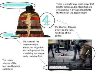
- 1. The Channel 4 logo is always on the right hand side of the poster. The name of the documentary is always in a larger font with a slogan and the scheduling in a simple easily readable font. There is a single large main image that fills the screen and is interesting and eye catching. It gives an insight into the theme of the documentary The colour scheme of the fonts and boxes is consistent.