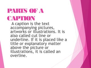
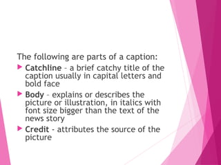
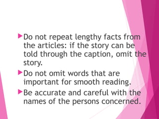
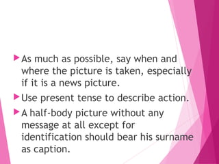
This document discusses photography for publications. It explains that photojournalism combines photography with written words to tell stories and provide information. Key aspects of selecting photos for publications are technical quality, editorial value in telling a story, and attracting attention or illustrating a point. A good photojournalist needs skills with cameras and composition as well as the ability to find compelling stories and understand legal issues. Captions should concisely describe photos using short sentences. Series of photos can be used to tell picture stories or illustrate how-to articles. Proper placement and framing of subjects in photos is also discussed.
Apart from the composition and lighting, what is the other thing that draws viewers into the frame and makes them think deeper? It’s the storytelling elements in your picture. Storytelling is one of the important aspects of photography. But do your pictures tell a story?
This document provides guidance on digital photojournalism techniques. It discusses that photojournalism involves using photographs to tell news stories objectively. Photos can stand alone, be part of an essay, or accompany written stories. Photos serve to communicate information quickly, lend credibility to stories, and attract readers visually. Composition techniques include following the rule of thirds for subject placement, filling the frame, considering backgrounds and foregrounds, using different angles and viewpoints, incorporating leading lines, capturing action, using color contrast, lines and texture, size indicators, avoiding large posed groups, incorporating silhouettes and reflections, and using artificial and natural framing.
Photojournalism involves using photographs to tell news stories or document events. There are two main types - images that illustrate written articles, and images that tell stories on their own without words. A key skill for photojournalists is being able to quickly react to potentially newsworthy scenes. Effective photos have qualities like prominence, timeliness, action, and human interest. Captions are brief text descriptions that accompany photos and provide context, while cutlines describe photos underneath in publications. Captions should be concise yet explanatory and include who, what, when details about the photo.
A photographic essay tells a story or evokes emotions through a series of photographs. It can convey more than a single image. Photographic essays can be purely photographic or can include captions or text. They can have a narrative structure and tell a story chronologically, or they can have a thematic structure and address a particular topic or issue. Effective photographic essays consider themes, subjects, structures, and techniques to craft a coherent narrative and evoke specific emotions in the viewer.
Major forms of photography include single photos, picture groups, sequences, series, and photo essays. Photo essays allow photographers to explore stories in more depth than single photos by depicting concepts or themes over longer periods of time with multiple related photos and a personal viewpoint. Effective picture stories include 4+ photos accompanied by text to tell about a subject, with all photos relating to each other and the broader story. Photographers are advised to thoroughly research and document subjects to effectively capture and sequence photos that clearly and cohesively tell the story.
The document discusses photo essays, which tell visual stories through a series of photographs. Photo essays can cover a wide range of topics and emotions. They use images and text together to engage the reader and allow the story to be understood with or without reading the captions. Effective photo essays employ titles, introductions, transitions between photos and a conclusion to provide context and guide the viewer's interpretation. The blending of photos and words creates an impactful narrative format.
The image shows Oldham football team celebrating a shocking defeat of Liverpool. It focuses on the Oldham players' expressions of happiness and accomplishment. A fast shutter speed was used to capture the players' movements and reduce blur from the stadium lights.
The second image shows coffins lined up after a tragic killing outside a nightclub. Artificial lighting highlights the coffins, which draw the eye using the rule of thirds. It was likely taken quickly using a fast shutter speed to capture the men moving and avoid blur.
The third image depicts two survivors of a massive flood, clinging to each other in despair. A long shot captures the full scale of the disaster, while natural sunlight reflects brightly off the water.
This document provides guidance on ethical photo editing and manipulation. It discusses how photojournalists should avoid altering photos in substantive ways that change the reality of what was captured. Minor adjustments to tone, saturation, and color are acceptable, but removing or adding elements risks destroying the integrity and trustworthiness of the image. The document also provides tips on cropping photos effectively and using tools like curves and levels to improve images while maintaining ethical standards.
This document provides details on creating a magazine cover mockup in Photoshop. It includes the original photo shoot plans and photos of the model, Chiara. It also shows editing the model photo by removing the background. The document displays adding the background image and combining the model and background photos. Text is then added to the cover mockup following the initial planned layout and positioning. The final screenshot shows the completed magazine cover mockup with adjusted fonts, colors, and formatting.
The document provides details on creating a magazine cover mockup in Photoshop. It includes the original model photo shoot plans and photos, analyzing other magazine covers, choosing a background photo, combining the model and background photos, and adding text. The final screenshot shows the completed magazine cover mockup with the model photo incorporated into the background image and descriptive text headers and lines added.
This document evaluates the media product of a magazine called "Juice" against conventions of real magazines. It summarizes the key design elements of the magazine, including the use of a one-word title in pink in the masthead, a model on the front cover engaging with the audience, additional images promoting products and celebrities, and professionally styled photography. The double-page spread uses an interview format with quotes, appropriate language for teenagers, and follows conventions for layout of text and images. Overall, the magazine draws from typical conventions of pop magazines in its design, content, and categories to engage its target audience.
The document provides instructions for producing the front cover and contents page of a school/college magazine. It discusses including a medium close-up photograph of a student plus appropriately laid-out text and masthead on the front cover. It also mentions producing a mock-up of the contents page layout. The target audience for the magazine is discussed as mainly being 16-18 year olds concerned with school, social life, and work. Several topic ideas are outlined for features in the magazine, such as driving lessons, university information, general news, and fashion tips.
Major 18: Campus Journalism - Digital Photojournalismperlyshells923
This document discusses digital photojournalism and the skills required. It defines digital photojournalism as telling news stories through photographs, requiring photographers to have a nose for news and skill in objectively showing news through images. Photographs serve functions like communication facts and emotions quickly, increasing credibility, and visual appeal. The document outlines various compositional techniques photographers should use, including following the rule of thirds for subject placement, filling frames, managing backgrounds and foregrounds, using leading lines, capturing actions, employing color contrast, incorporating lines and textures, including size indicators, avoiding large posed group shots, and capturing images from different angles and viewpoints like bird's-eye and worm's-eye. Framing techniques like artificial, natural
Captions provide essential context for photos and should answer who, what, when, where, and why questions raised by the image. Well-written captions use concise and declarative sentences to identify people and locations, describe the key actions and events in the photo, and provide any relevant background details. Photographers and writers must take care to verify all facts and obtain necessary permissions before publishing photos and captions.
This document evaluates how the media product uses conventions of real magazines. It summarizes the key design elements of the magazine's front cover, including the masthead at top left, a main celebrity image on the left with a "shocking secret," and additional images labeled as "star buy" and "8 best buys." It also describes the model's formal dress, professionally done hair and makeup, and contents page with the editor's image and a screenshot of the front cover linking to page numbers. Overall, the evaluation finds the magazine's layout, style, and genres suggested are consistent with conventions of real pop magazines.
Portrait photography captures expressions and character through the human face. Effective portrait photography considers lighting, settings, angles, and focal points to reveal something about the subject. Portraits can be posed, candid, or formal, and may incorporate props or environmental backgrounds to provide context about the subject's life. Lighting is especially important, with early morning or late day light creating soft, flattering exposures.
The document provides details on the planned layout and photography for the cover, contents page, and a double page spread for a magazine. For the cover, a medium or long shot of one or two female musicians in an abandoned outdoor location is described. The contents page will feature a similar medium/long shot of an artist with simple clothing and focus on body language. A double page spread will have a medium close-up shot of a female artist using direct eye contact to intrigue readers about the article. Outdoor locations are emphasized throughout to portray a young, free attitude.
This document summarizes the key design elements and conventions used in the media product, a pop music magazine. It discusses how the magazine title "JUICE" uses a simple one-word title to grab attention and indicate gossip about pop stars. Images are featured prominently on every page to engage readers. The writing style uses an informal tone suitable for a young audience. Layout and design elements like colors, fonts, and photo styles signal that the target audience is young girls. The content and features clearly identify the magazine's genre as pop music.
This document summarizes the process of creating a magazine cover in Photoshop. It describes planning a photoshoot, analyzing existing magazine covers, experimenting with editing photos in Photoshop using tools like the spot healing tool and Gaussian blur, combining photos by erasing backgrounds, and adding text elements like the magazine title, date, and article headlines. The final summary shows the completed magazine cover design in Photoshop after refining colors, positions of elements, and the overall layout.
The document provides an evaluation of the author's current coursework, which is a media magazine. Some key points:
1) The magazine challenges media conventions through its clean and minimal design that avoids bright colors, and through unconventional layout choices like not featuring all information on the left page.
2) Color choices and placement of images, text, and other elements are carefully considered to attract readers and give a sense of what information is primary versus secondary.
3) Photographs of artists are chosen to represent them in a more relaxed, everyday way rather than in posed studio shots.
4) The intended audience is described as 14-18 year olds, with language, topics, and visuals
The document provides an evaluation of the author's current coursework, which is a media magazine. Some key points:
1) The magazine challenges media conventions through its design elements like fonts, colors, and layouts that are less flashy than typical student magazines.
2) Pictures and text placement on the contents page also challenge conventions by not following typical formats and providing more context for articles.
3) The intended audience is described as 14-18 year olds, with content and language geared towards hip hop fans in a "cool, chilled out way" rather than using overly informal slang.
4) Methods to attract this audience included clean visual design, social media promotion, and QR codes
A photographer has several responsibilities when editing photos before publication. They should review their photos carefully at least twice to select shots that tell the story, have good composition and technical quality. When judging photos, they should consider the message, composition, and technical quality. Photographers should also provide detailed captions to help editors select the best images and accurately convey the context and events in the photos. Sensitive issues also require discretion when selecting and publishing photos.
The document provides guidelines for choosing quality pictures that effectively convey information and themes. Guideline 1 advises selecting images that convey the intended feeling or mood. An example compares images of a businesswoman, selecting the one that looks most professionally confident. Guideline 2 recommends choosing images that add informational value beyond decoration. An example image provides economic data compared to a simple arrow. Guideline 3 discusses cropping images appropriately to emphasize the subject and avoid awkward spaces.
This chapter discusses the use of imagery in publication design. Photographs are used when recognition, realism or appetite appeal are important, while illustrations can add expression. Cropping photographs emphasizes certain parts and outlining isolates subjects. Children's book illustrations reinforce story understanding. Stock agencies, commissioned works, found images and public domain works provide imagery sources. Consistent imagery helps unify publications, while charts and graphs visually represent data.
The document discusses the typical conventions and layout of music magazine covers, contents pages, and double page spreads. It notes that magazine covers usually feature a main central image with additional smaller images and text around the edges. Contents pages typically have a large central image surrounded by a listing of articles. Double page spreads consist of a full-page main image on one side and accompanying text and possibly smaller images on the other side. The document also examines different shot types used and how they help convey information to the reader.
Executive Directors Chat Leveraging AI for Diversity, Equity, and InclusionTechSoup
Let’s explore the intersection of technology and equity in the final session of our DEI series. Discover how AI tools, like ChatGPT, can be used to support and enhance your nonprofit's DEI initiatives. Participants will gain insights into practical AI applications and get tips for leveraging technology to advance their DEI goals.
LAND USE LAND COVER AND NDVI OF MIRZAPUR DISTRICT, UPRAHUL
This Dissertation explores the particular circumstances of Mirzapur, a region located in the
core of India. Mirzapur, with its varied terrains and abundant biodiversity, offers an optimal
environment for investigating the changes in vegetation cover dynamics. Our study utilizes
advanced technologies such as GIS (Geographic Information Systems) and Remote sensing to
analyze the transformations that have taken place over the course of a decade.
The complex relationship between human activities and the environment has been the focus
of extensive research and worry. As the global community grapples with swift urbanization,
population expansion, and economic progress, the effects on natural ecosystems are becoming
more evident. A crucial element of this impact is the alteration of vegetation cover, which plays a
significant role in maintaining the ecological equilibrium of our planet.Land serves as the foundation for all human activities and provides the necessary materials for
these activities. As the most crucial natural resource, its utilization by humans results in different
'Land uses,' which are determined by both human activities and the physical characteristics of the
land.
The utilization of land is impacted by human needs and environmental factors. In countries
like India, rapid population growth and the emphasis on extensive resource exploitation can lead
to significant land degradation, adversely affecting the region's land cover.
Therefore, human intervention has significantly influenced land use patterns over many
centuries, evolving its structure over time and space. In the present era, these changes have
accelerated due to factors such as agriculture and urbanization. Information regarding land use and
cover is essential for various planning and management tasks related to the Earth's surface,
providing crucial environmental data for scientific, resource management, policy purposes, and
diverse human activities.
Accurate understanding of land use and cover is imperative for the development planning
of any area. Consequently, a wide range of professionals, including earth system scientists, land
and water managers, and urban planners, are interested in obtaining data on land use and cover
changes, conversion trends, and other related patterns. The spatial dimensions of land use and
cover support policymakers and scientists in making well-informed decisions, as alterations in
these patterns indicate shifts in economic and social conditions. Monitoring such changes with the
help of Advanced technologies like Remote Sensing and Geographic Information Systems is
crucial for coordinated efforts across different administrative levels. Advanced technologies like
Remote Sensing and Geographic Information Systems
9
Changes in vegetation cover refer to variations in the distribution, composition, and overall
structure of plant communities across different temporal and spatial scales. These changes can
occur natural.
বাংলাদেশের অর্থনৈতিক সমীক্ষা ২০২৪ [Bangladesh Economic Review 2024 Bangla.pdf] কম্পিউটার , ট্যাব ও স্মার্ট ফোন ভার্সন সহ সম্পূর্ণ বাংলা ই-বুক বা pdf বই " সুচিপত্র ...বুকমার্ক মেনু 🔖 ও হাইপার লিংক মেনু 📝👆 যুক্ত ..
আমাদের সবার জন্য খুব খুব গুরুত্বপূর্ণ একটি বই ..বিসিএস, ব্যাংক, ইউনিভার্সিটি ভর্তি ও যে কোন প্রতিযোগিতা মূলক পরীক্ষার জন্য এর খুব ইম্পরট্যান্ট একটি বিষয় ...তাছাড়া বাংলাদেশের সাম্প্রতিক যে কোন ডাটা বা তথ্য এই বইতে পাবেন ...
তাই একজন নাগরিক হিসাবে এই তথ্য গুলো আপনার জানা প্রয়োজন ...।
বিসিএস ও ব্যাংক এর লিখিত পরীক্ষা ...+এছাড়া মাধ্যমিক ও উচ্চমাধ্যমিকের স্টুডেন্টদের জন্য অনেক কাজে আসবে ...
Strategies for Effective Upskilling is a presentation by Chinwendu Peace in a Your Skill Boost Masterclass organisation by the Excellence Foundation for South Sudan on 08th and 09th June 2024 from 1 PM to 3 PM on each day.
How to Setup Warehouse & Location in Odoo 17 InventoryCeline George
In this slide, we'll explore how to set up warehouses and locations in Odoo 17 Inventory. This will help us manage our stock effectively, track inventory levels, and streamline warehouse operations.
हिंदी वर्णमाला पीपीटी, hindi alphabet PPT presentation, hindi varnamala PPT, Hindi Varnamala pdf, हिंदी स्वर, हिंदी व्यंजन, sikhiye hindi varnmala, dr. mulla adam ali, hindi language and literature, hindi alphabet with drawing, hindi alphabet pdf, hindi varnamala for childrens, hindi language, hindi varnamala practice for kids, https://www.drmullaadamali.com
This presentation was provided by Steph Pollock of The American Psychological Association’s Journals Program, and Damita Snow, of The American Society of Civil Engineers (ASCE), for the initial session of NISO's 2024 Training Series "DEIA in the Scholarly Landscape." Session One: 'Setting Expectations: a DEIA Primer,' was held June 6, 2024.
2. FUNCTIONS OF
PICTURES AND
ILLUSTRATIONS
To attract attention. It catches the
reader’s interest so that he will be
enticed to read the texts that go with
it.
To beautify the page.
To complement, support and give
visual meaning to the news.
To illustrate a point in the story.
3. To tell the story itself through the
help of the caption
To tell a story in sequence of photos
or illustrations
To give visual relief to the design or
make-up of the story
To help the readers know how the
person or place mentioned in the
story look like
4. GETTING BETTER
PICTURES
Simplicity. The picture is not
crowded or cluttered, unless the
purpose is to show how big the
crowd is. Rarely should have
more than five people in a
picture. Anything distracting to
the picture should be
eliminated. Anything that helps
a picture tell a story, of course,
should be included.
5. A focal point. Viewers should not have
their eyes pulled in three or four
directions. Instead, eyes should be
drawn to the main subject, and then the
viewer may look at lesser figures.
Action. In almost all cases, a picture of
people doing something will be much
better than one in which a person is
staring into the camera.
6. Subject. A good photojournalist
seeks variety in subjects: young and
old, the garish and the plain, the
ordinary and the extraordinary.
Technical quality. The picture must
be in focus, without blur caused by
camera movement. The picture
needs sharp, clear difference
between the various light and dark
shades.
7. A story. The picture may show
gloom or ecstasy, pleasure or
pain, success or failure,
interest or boredom. But the
picture usually tells more. It
should convey information
about an event, a string of
events, a person, a building or
a lace.
8. Mood. A picture should capture the
mood of an event. A picture of a
stage show may place the artist in
bright lights, smiling broadly, with
the faces of the audience laughing
in the darker auditorium.
Truth. A picture should give an
honest account of what happened.
Certain props are fine, if they don’t
distort reality.
9. Size. Unless a published picture is
big enough to see easily, the
message probably is lost. The shape
of the picture can also help the
reader to get the point in a glance.
A vertical picture of a four-story
school building, for example, would
have more impact than a horizontal
shot. A vertical picture of a jubilant
fans running onto the football field
would look out of proportion.
10. Beauty. Sometimes, the
purpose of a picture is not
only to convey news or
information, but only to show
beauty, like in a beauty
pageant, the grace of a cheer-
dancer, or a field of waving
golden rice.
11. FACTORS AFFECTING
THE QUALITY OF
PICTURES
The taking of pictures.
Be sure to know the workmanship of
your camera, its every part and
function.
There is a need for mind-eyes
coordination when taking pictures. The
photojournalist should make it sure
that the angle he is taking is a newsy
one.
12. Pictures to be set for layout
Sharp pictures. All the details of
what you wish to bring out in a
picture are well-defined and
emphasized.
Message-laden. The picture should
tell a story.
13. Pictures to be set for layout
Well-cropped. The important detail
of the story is being emphasized or
highlighted by eliminating
unnecessary parts of the pictures.
The quality of printing press
14. THINGS TO REMEMBER IN
PHOTOJOURNALISM
An action photo can vividly tell its own
story that no need of caption to go
with it. Editorial cartoon as an
illustration does not have caption, but
it tells a story or make a point.
A series of pictures can tell a story
with minimum caption. This is known
as picture story. This is usually used to
illustrates “how to” article.
15. ELEMENTS OF EFFECTIVE
PICTURES
Prominence. Picture of celebrities and
those who are in the newsmaker of our
society attracts reader’s interest. They
are always good subject for photo.
Timelines. The immediacy of the
picture can also enhance its value
Action. “Action speaks louder than
word” as they say. Photojournalist
should make it sure that there is
movement or story in his photo.
16. Human interest. Pictures of persons
during their unguarded moments
show emotion that readers can
relate to. Shots of wailing mother
whose child is trapped in their
burning house, a triumphant bloody
faced boxer raising his fist after he
was proclaimed the winner or
animal that acts like human are
interesting to the reader.
17. TIPS FOR ASPIRING
PHOTOJOURNALIST
Know your camera. A camera
needs not be expensive. You
just have to be well
acquainted of what you have
by constant practice.
Try squatting or kneeling down
or standing on your toes or on
a chair when shooting
pictures.
18. Take portraits of people doing
their thing. Candid shots and
action pictures are the best.
Do not hesitate to ask the
subject to do what you believe
will make the best shot.
Concentrate on facial
expressions.
Look for focal point of interest.
19. Take more than one shot of
every scene to be assured of the
best angle.
In photos of exhibits, it is better
to have someone viewing the
exhibits than to just picture
them.
Be always at the look out to
take unusual pictures.
20. Read manuals of photographer to
learn techniques in picture-taking
Prefer action and more interesting
scenes that shows:
Struggle Action
Emotion Romance
Oddity Beauty
Humor and others
21. Avoid the following:
Ribbon cutting picture
Handshaking during
awarding celebration
Posed picture (firing squad
picture)
Group picture that say
nothing
22. PARTS OF A
CAPTION
A caption is the text
accompanying pictures,
artworks or illustrations. It is
also called cut line or
underline. If it is placed like a
title or explanatory matter
above the picture or
illustrations, it is called an
overline.
23. The following are parts of a caption:
Catchline – a brief catchy title of the
caption usually in capital letters and
bold face
Body – explains or describes the
picture or illustration, in italics with
font size bigger than the text of the
news story
Credit - attributes the source of the
picture
24. TIPS FOR WRITING
CAPTIONS
OR CUT LINES
Be brief and to the point, but do not
make it too short that it leaves
readers wondering about the situation
involved.
Use simple, short caption except for a
caption story – a series of picture with
minimum words like in “how to”
articles.
Supplement and explain the pictures,
but do not state what is obvious.
25. Do not repeat lengthy facts from
the articles: if the story can be
told through the caption, omit the
story.
Do not omit words that are
important for smooth reading.
Be accurate and careful with the
names of the persons concerned.
26. Identify the people in the pictures.
Identify them from the left, followed
by their full names. In case of several
rows, begin with the front row. If the
people are in a circle, have the
caption read from left, clockwise.
Check the number of persons against
the number in the caption.
27. As much as possible, say when and
where the picture is taken, especially
if it is a news picture.
Use present tense to describe action.
A half-body picture without any
message at all except for
identification should bear his surname
as caption.
28. Vary your caption type from the body
type to achieve variety. Use italics, bold
face, or a larger size than the body type.
A good caption fills nearly every line.
Caption in which the last line is only
one-third complete look less attractive
because they leave a gap of white space.