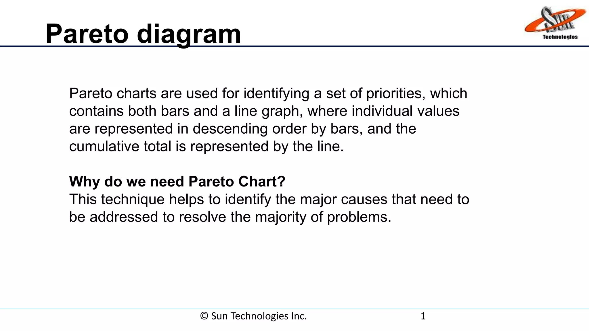
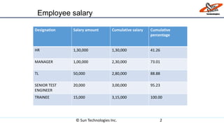
A Pareto chart is a type of chart that contains both bars and a line graph used to identify priorities. It arranges data in descending order by bars to show individual values and uses a line graph to show cumulative totals. This technique helps identify the major causes that need to be addressed to resolve most problems. For example, a Pareto chart shows employee salaries at a company with HR earning the most at $130,000 and accounting for 41.26% of the total salary amount.


![Qcl 14-v3 [pareto diagram]-[banathali_university]_[suyashi_rastogi]](https://cdn.slidesharecdn.com/ss_thumbnails/qcl-14-v3paretodiagrambanathaliuniversitysuyashirastogi-141231143056-conversion-gate01-thumbnail.jpg?width=640&height=640&fit=bounds)


![: QCL-14-v3_[pareto diagram]_[banasthali university]_[Radhika Sharma]](https://cdn.slidesharecdn.com/ss_thumbnails/chlng4-141231094904-conversion-gate01-thumbnail.jpg?width=640&height=640&fit=bounds)


![20260201 [FOSDEM] gomodjail - library sandboxing for Go modules.pdf](https://cdn.slidesharecdn.com/ss_thumbnails/20260201fosdemgomodjail-librarysandboxingforgomodules-260201225659-76609ec4-thumbnail.jpg?width=640&height=640&fit=bounds)


