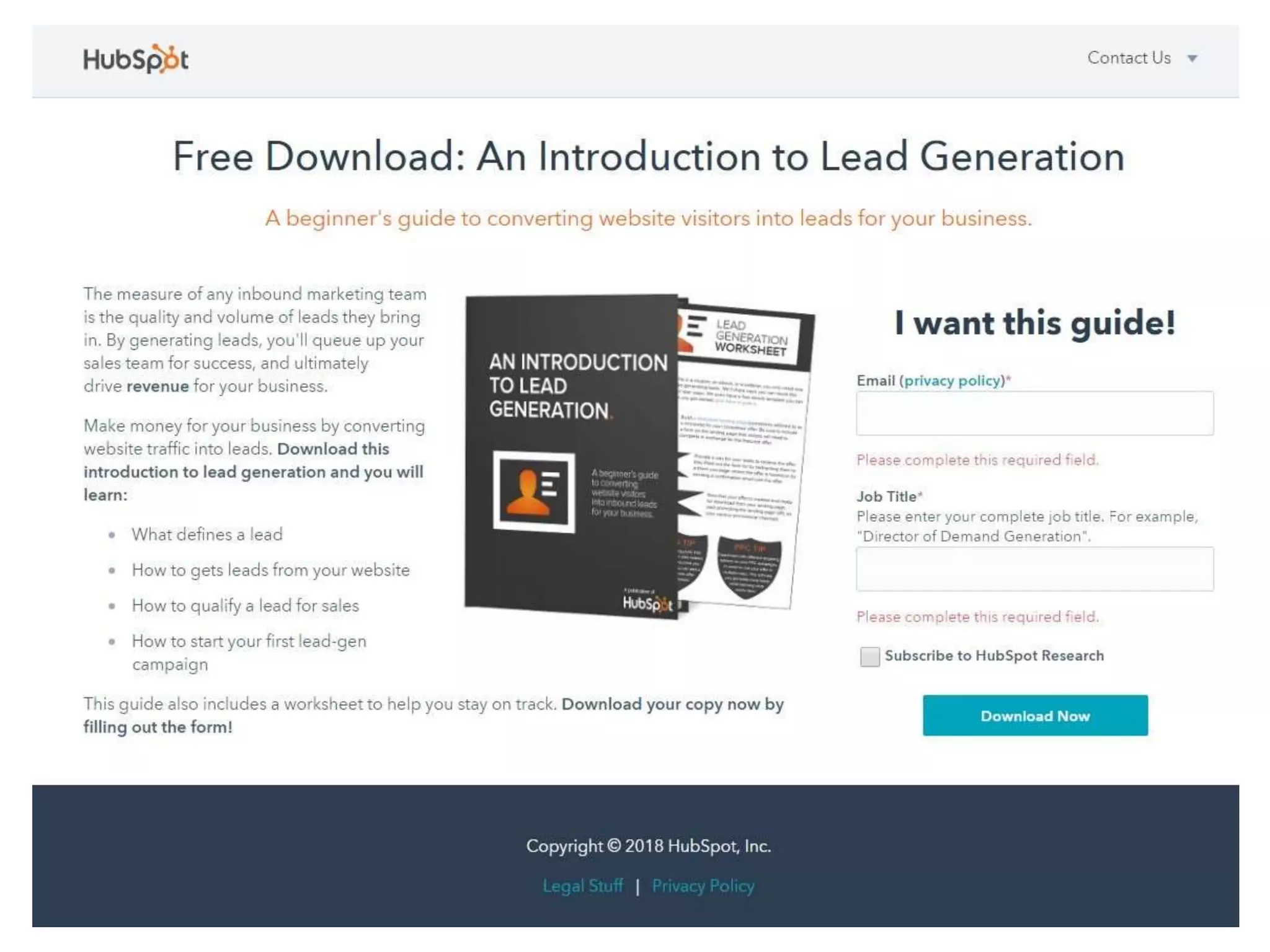
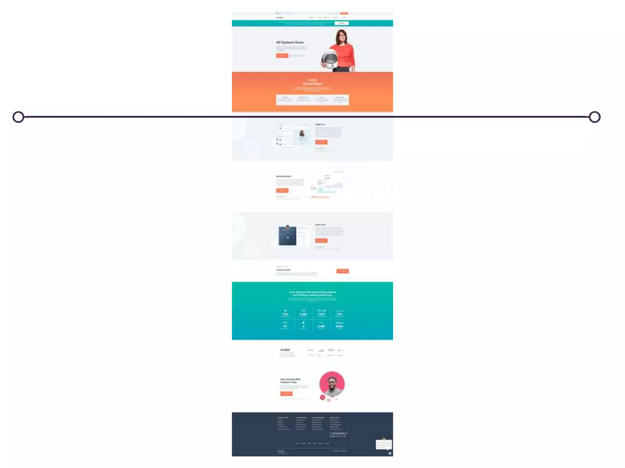
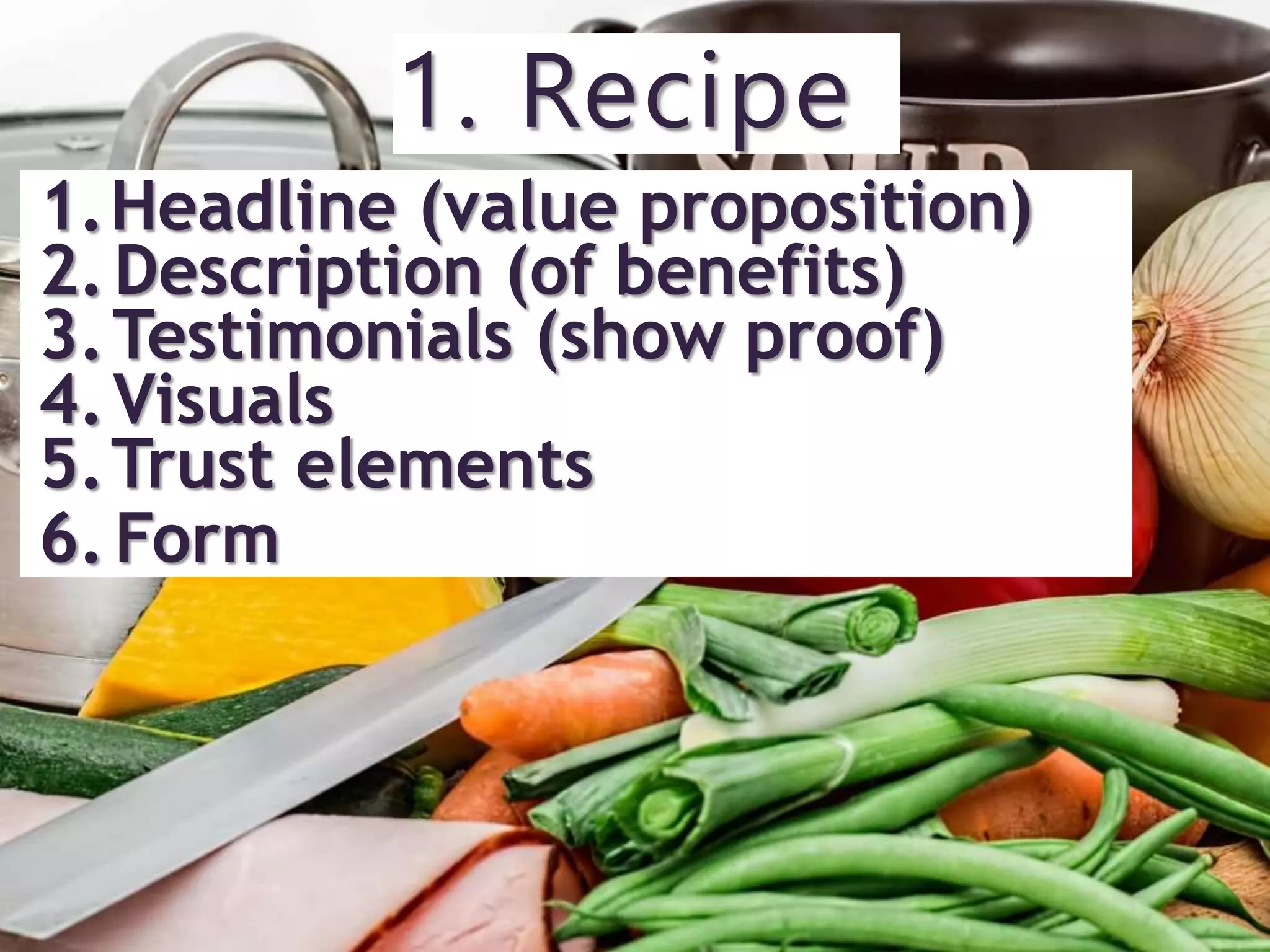
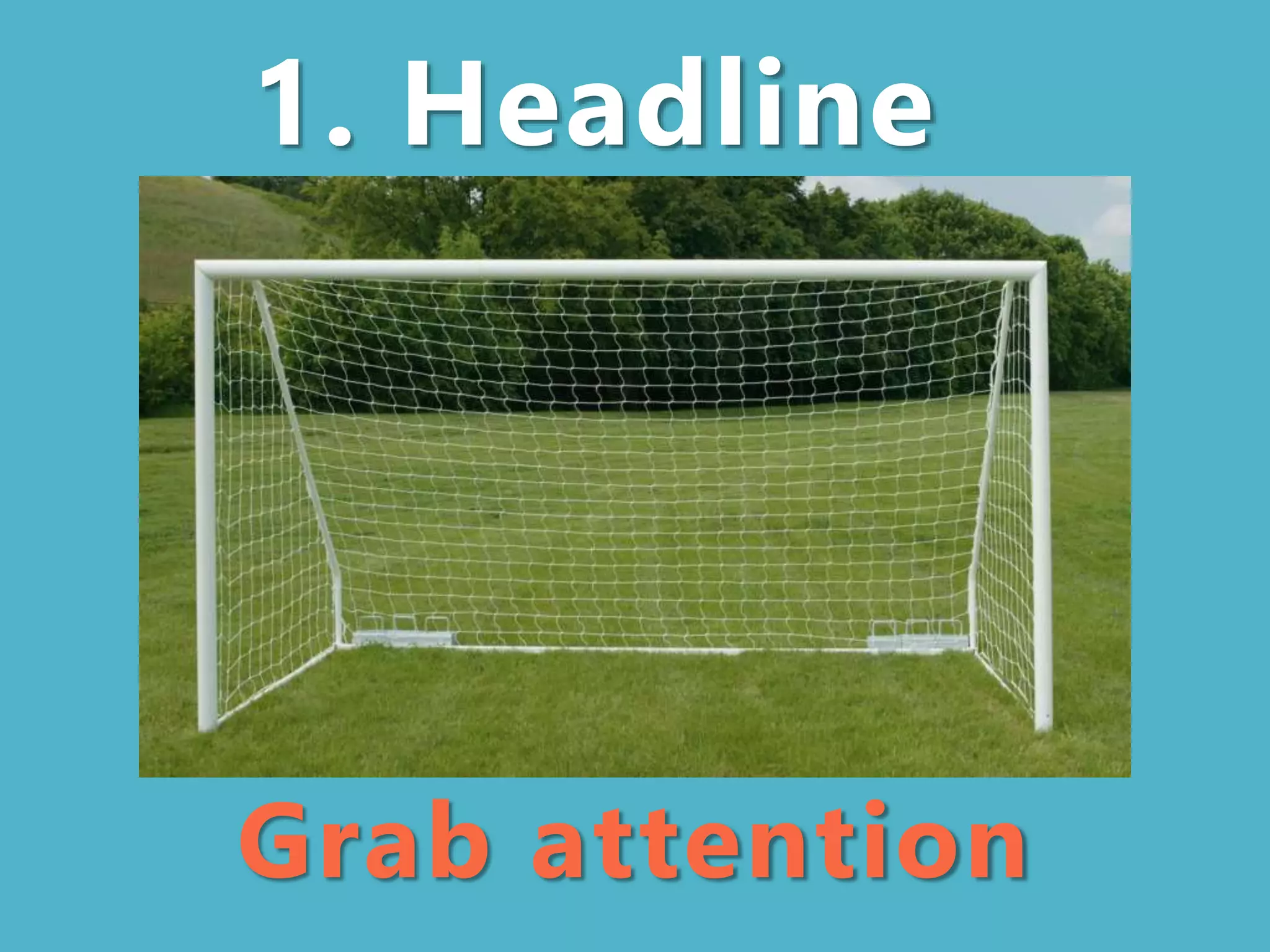
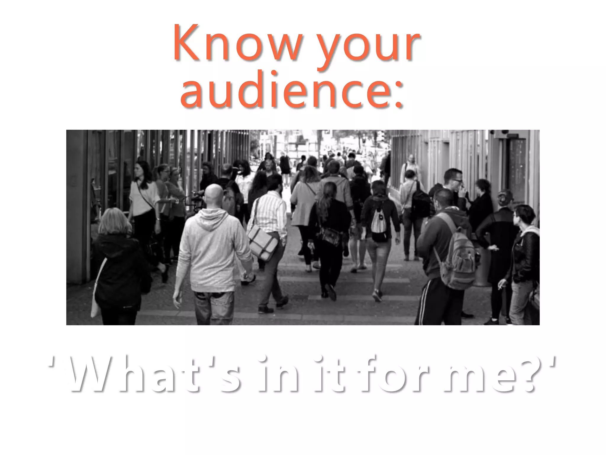
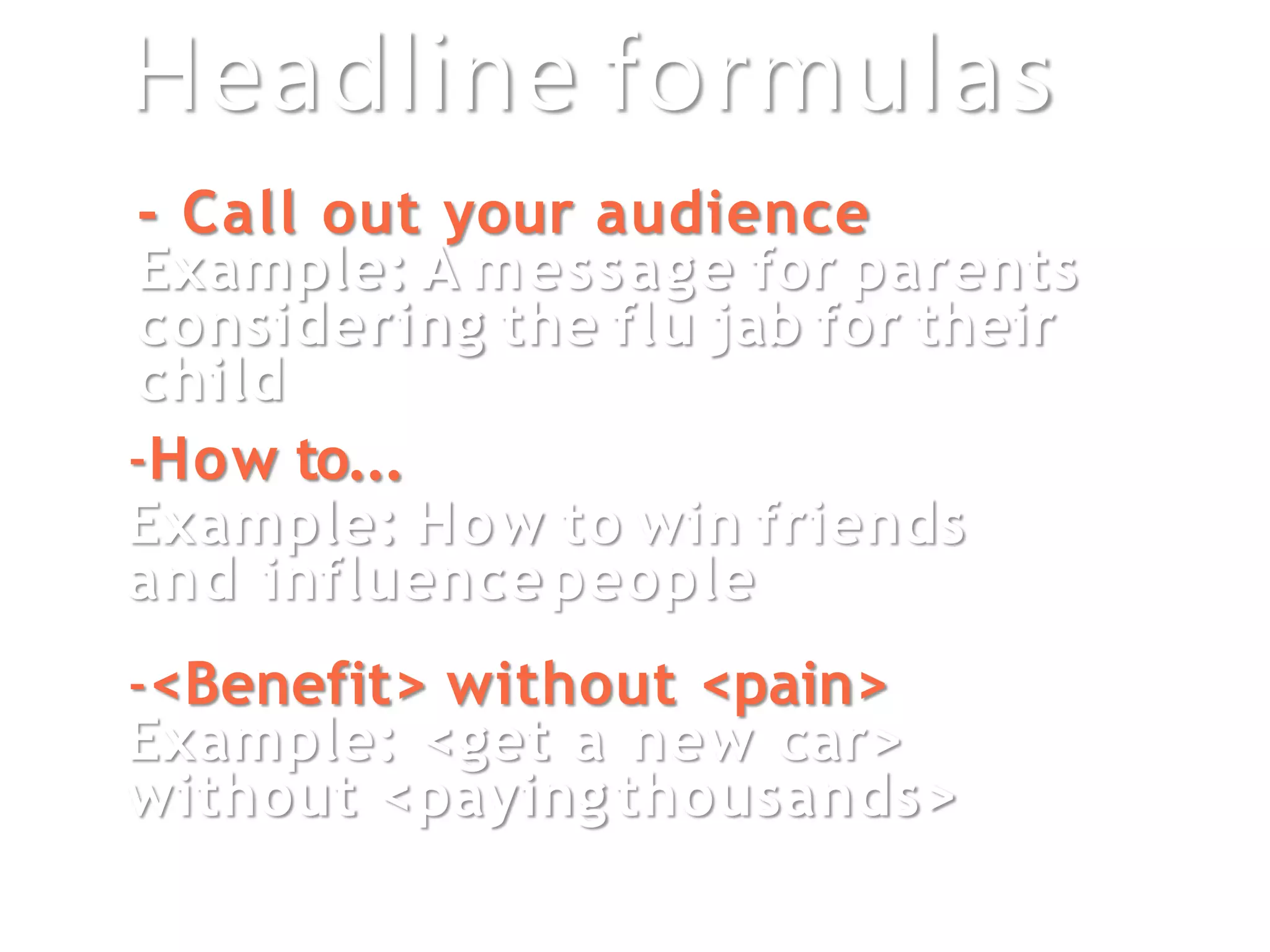
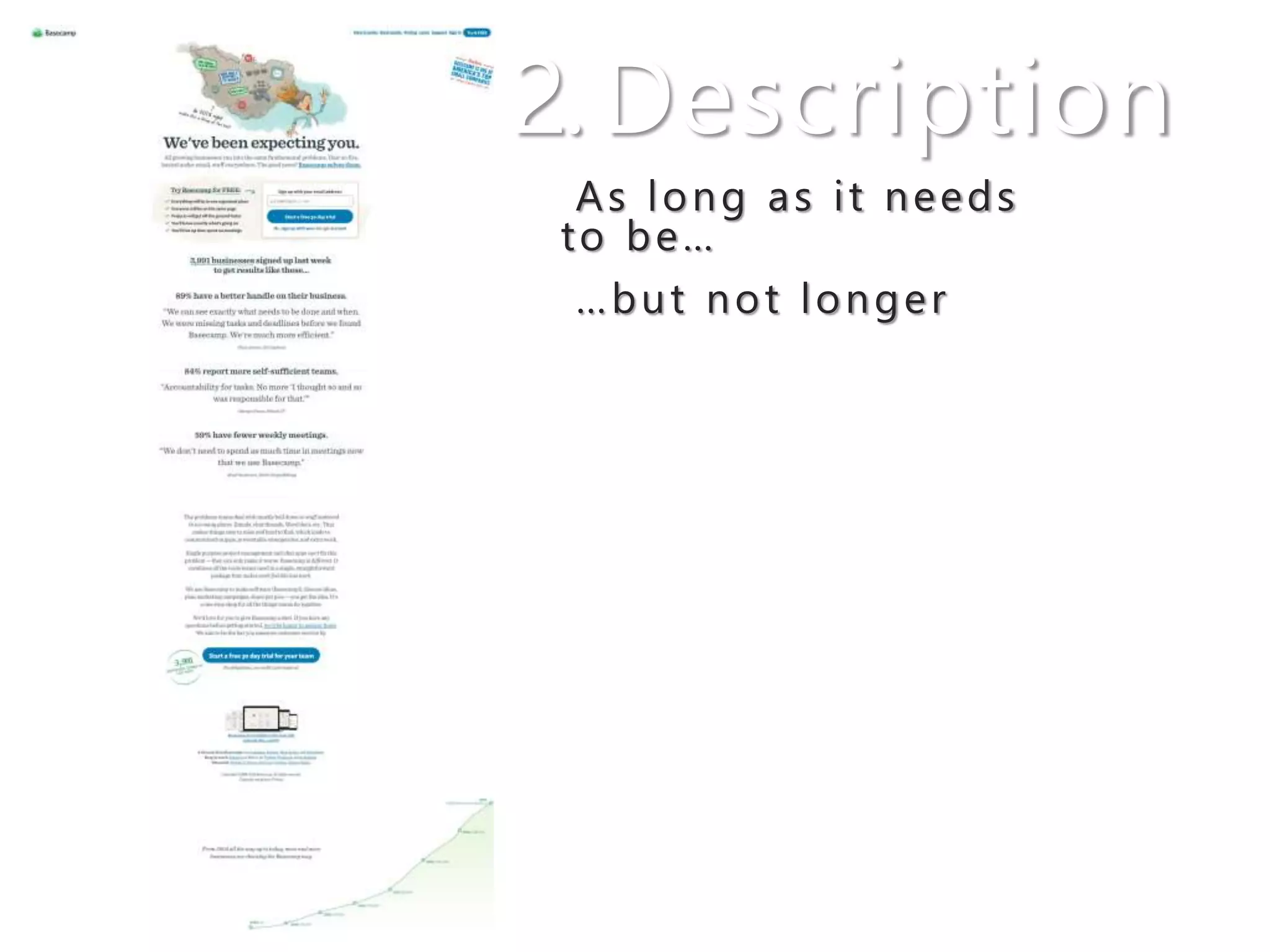
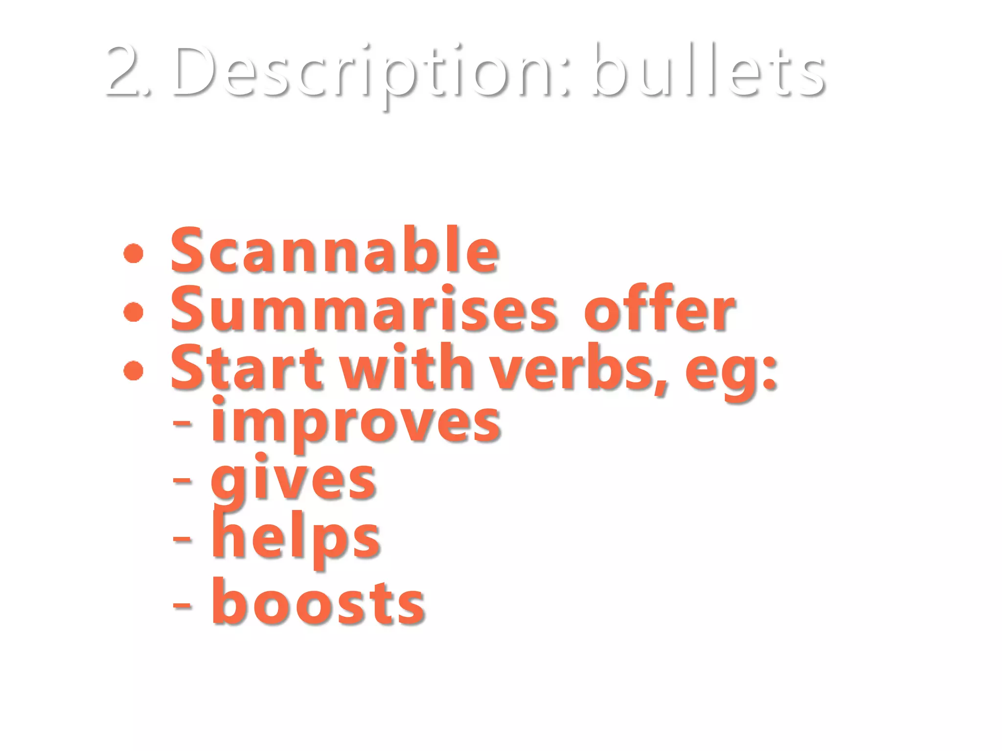
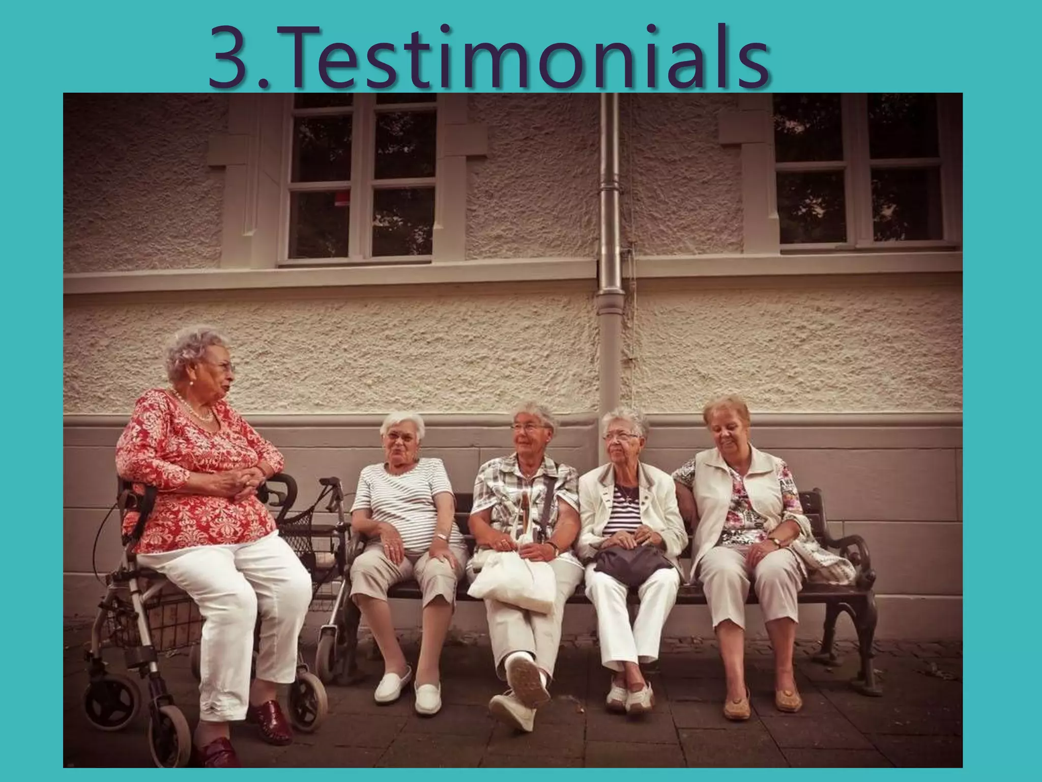
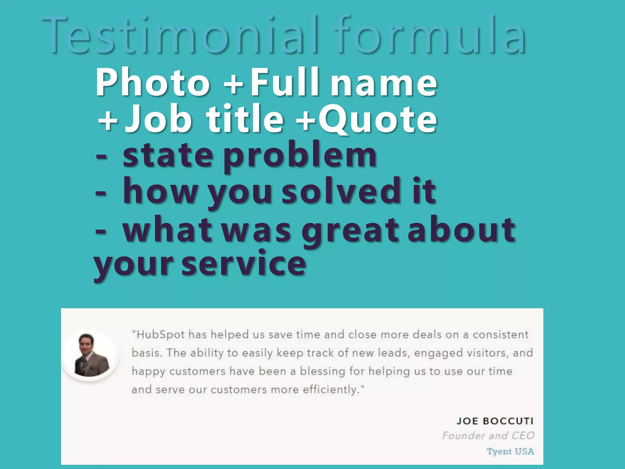
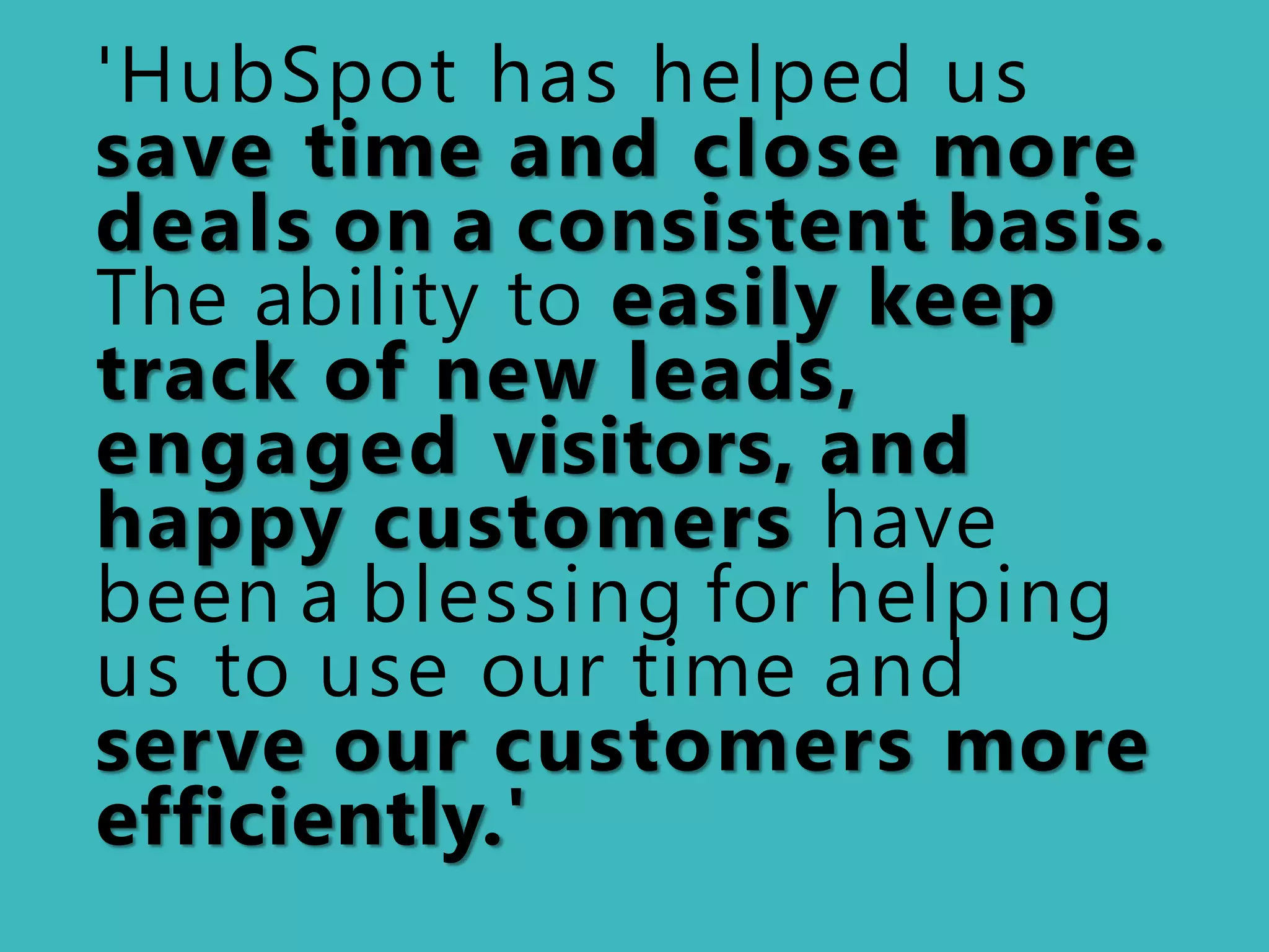
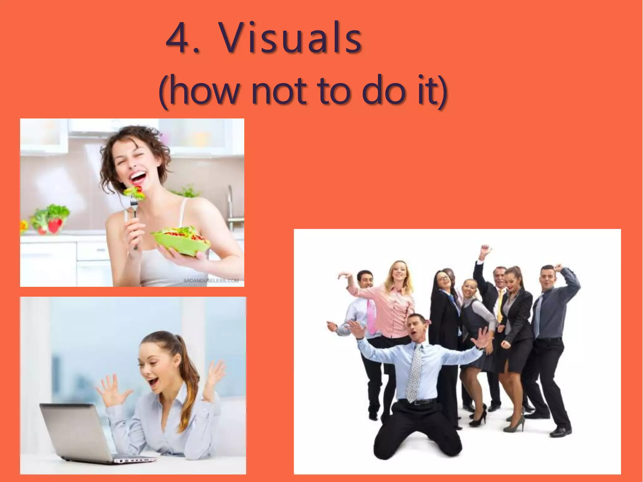
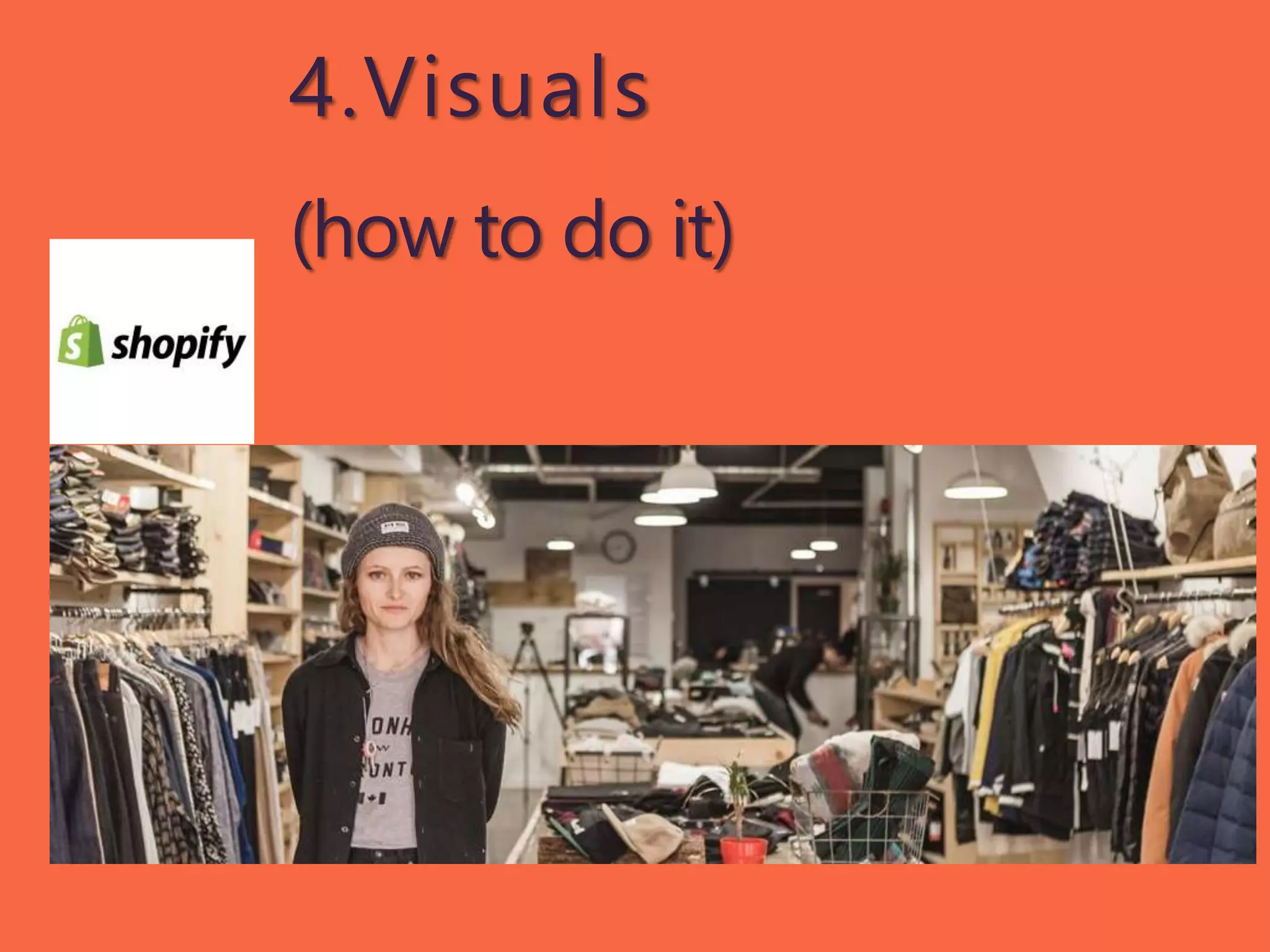
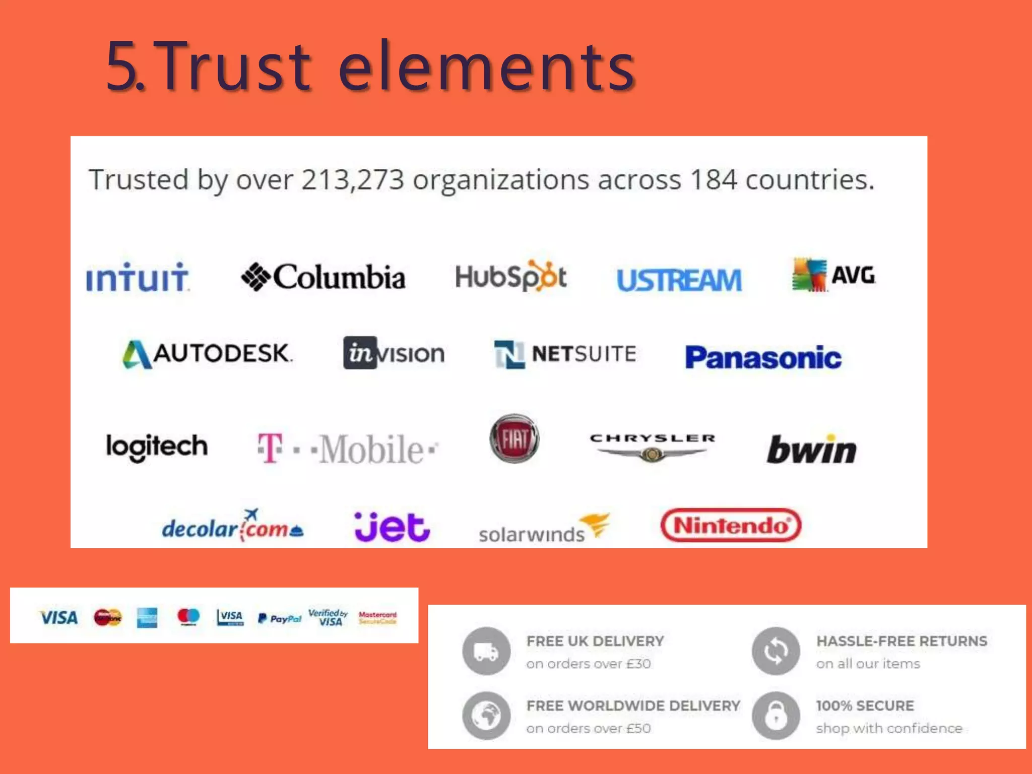
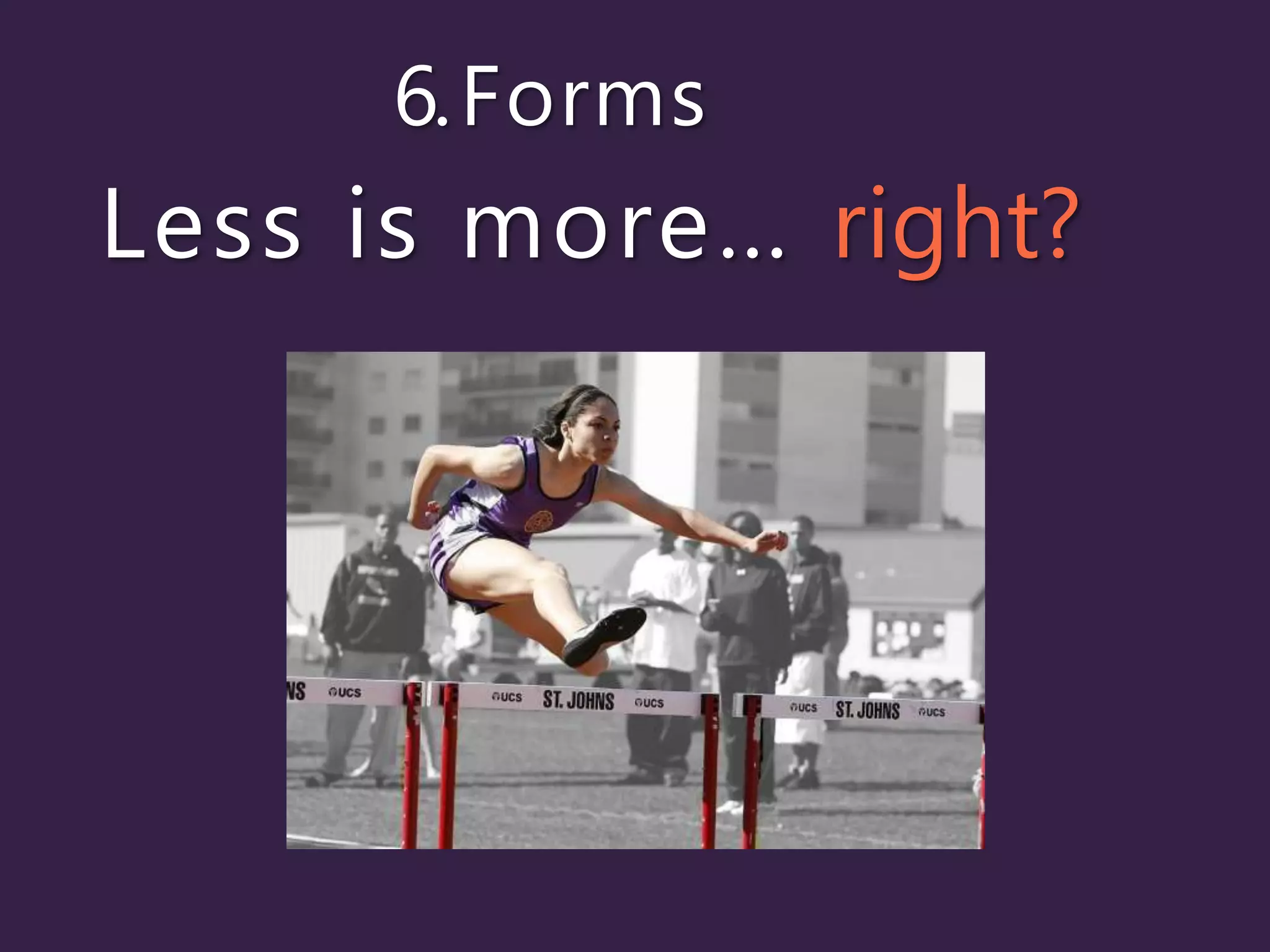
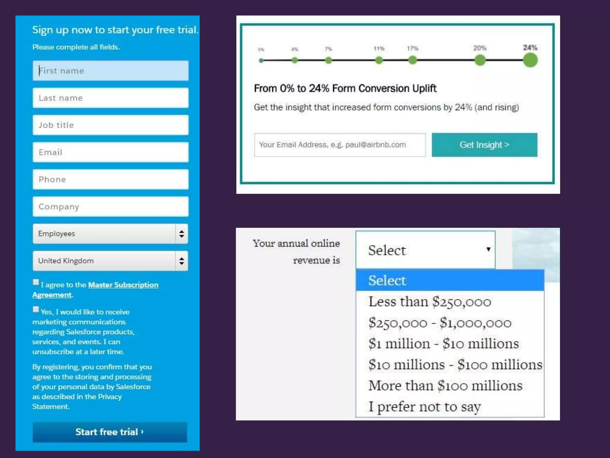
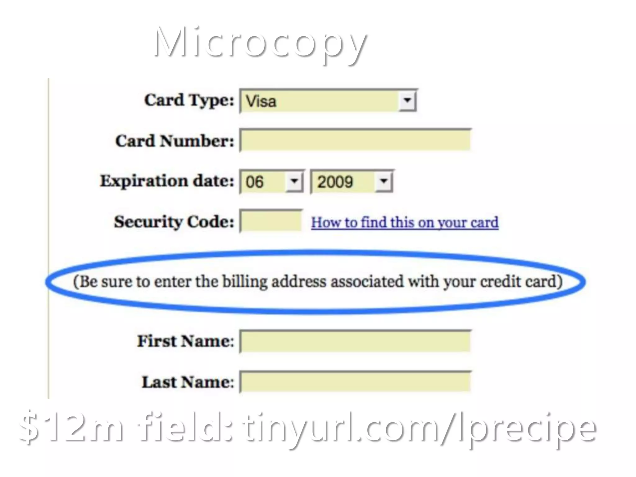
This document provides a recipe for creating highly converting landing pages with 6 key elements:
1. A headline that grabs attention by focusing on the audience's needs and benefits.
2. A description that summarizes the offer in scannable bullet points using active verbs.
3. Testimonials with photos, names, jobs, and quotes that state problems solved and benefits.
4. Visuals like stock photos to illustrate benefits and calls to action.
5. Trust elements like certifications or guarantees to build confidence.
6. Concise forms with only essential fields to simplify conversions.
13. Headline formulas
- Call out your audience
Example: A message for parents
considering the flu jab for their
child
-How to...
Example: How to win friends
and influencepeople
-<Benefit> without <pain>
Example: <get a new car>
without <paying thousands>
17. Photo +Full name
+Job title +Quote
- state problem
- how you solved it
- what was great about
your service
Testimonial formula
18. 'HubSpot has helped us
save time and close more
deals on a consistent basis.
The ability to easily keep
track of new leads,
engaged visitors, and
happy customers have
been a blessing for helping
us to use our time and
serve our customers more
efficiently.'
27. Follow upafter the
conversion
- send them to a thank you page (track conversions)
- get in their primary inbox (avoid spam filt ers)
- get ready for GDPR (28 May)
A home page has to be all things to all people. About us, what we do, why we’re great. The mentality of a user here is more likely to be ‘What is this website, what can I do, where should I go, why should I stay?”
The more goals a page has, the more distractions there are, which will reduce your conversion rate. Decide what you want the page to do, and remove anything irrelevant that may get in the way.
I search for Supra boots and see a Zalando ad. Which I click on…
…and here’s a landing page which matches the ad. So I know I’m in the right place. And I can get on with narrowing down my initial ‘Supra boots’ search.
If the ad had sent me to Zalando’s homepage, I’d be thinking ‘Hang on, where are the boots? What’s all this text? This isn’t what I want, bye’.
Another example…
This fits in with the copy of the ad I clicked. I can instantly see what’s on offer. If this is your page, and people don’t convert, you can start to look at how to improve it. Change the headline, swap the image for a video? Add a testimonial?
If you were sending people to HubSpot’s homepage and people weren’t converting, it’d be impossible to know where to start improving the page. Because there are so many things you could change. That’s why a landing page works, because it keeps things simple for your visitors and for you.
The only goal of a headline is grab your user’s attention. In a way that makes them want to read on.
The only way to do that is to understand your target audience. What are their motivations, fears, desires? What makes them wake up at 3am worrying? What problem can you solve? We all will read something if we believe it’s worth our while.
Facing writer’s block? Want something to get your creative juices flowing? Need to choose a headline quickly? Try these formulas.
The more complicated or less well-known your product, the more explaining and persuading you need to do. Use bold and headings to split up the text. Limit the width of your lines so they’re easy to read (especially for mobile). Here are some guidelines: https://baymard.com/blog/line-length-readability. Want to track how far people scroll and what they click on? Use Google Tag Manager and www.hotjar.com
‘Front load’ bullets by putting benefits and positive words at the beginning.
Word of mouth recommendations are the most powerful. So add testimonials where possible. If you’re launching a new product, add some use cases, eg ‘John a teacher, uses this app to keep track of his student’s performance’ etc
When asking for a testimonial, make sure it goes into detail.
Here’s another advantage of asking for testimonials. The words can often by used to craft your headlines and subheadings.
Argh – avoid these sorts of cheesy images. Your business will seem as fake as their smiles.
Use images of real people, that match your target audience.
This depends on your brand, but video doesn’t have to always look polished and as if it was produced in Hollywood. Authenticity can boost conversions.
Increase trust in your brand by showing logos of your customers. For e-commerce, the more ways to pay, the more sales you’ll make.
How many fields should your form have? Fewer doesn’t always mean better.
If you want to filter out people from your landing page, include fields that help qualify them. Your sales team will thank you.
If there’s any chance of a field confusing your visitors, add microcopy. It might boost your revenue by $12 million a year, like for Expedia.
Microcopy also works for branding. It can also soften the blow of agreeing to terms and conditions. And on buttons, it can be used to show a benefit (free, securely). Just avoid generic words like ‘submit’ or ‘download’.
Congratulations! You’ve got the conversion. Now what? If you want to build a customer base, grow your community, or stay in touch, do these 3 things. Sending them to a thank you page means they stay on your website, and means you can track conversions in Google Analytics. Send them an email, ideally with some important/useful info, and ask them to add you to their safe sender list/drag to their primary inbox. And get to know about GDPR (https://ico.org.uk/for-organisations/guide-to-the-general-data-protection-regulation-gdpr) – it will affect how you follow up with people who’ve converted.