Downloaded 26 times
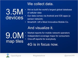
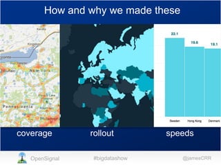
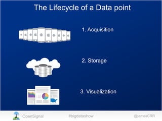
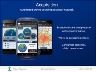
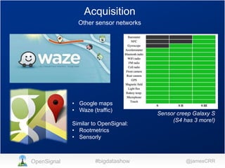
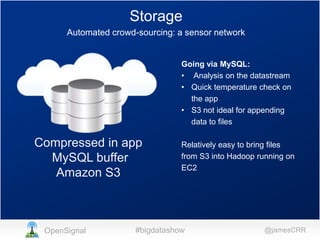
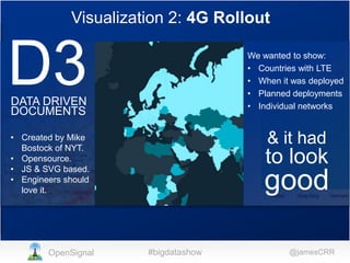
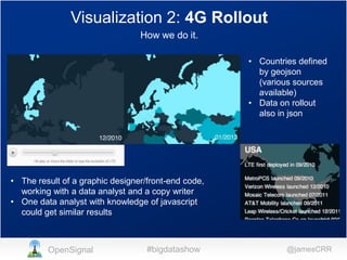
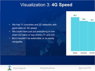
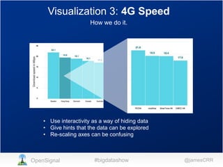
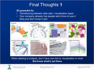
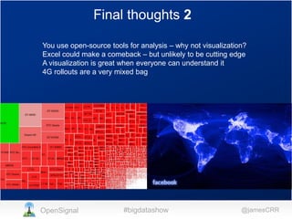

James Robinson discusses how OpenSignal collects cellular network data from millions of devices through their app, stores the data in databases and Amazon S3, and visualizes it through maps, timelines, and charts. They use Google Maps to show 4G coverage comparisons across networks, D3 to visualize 4G rollout timelines by country, and interactive charts to compare 4G speeds in different countries and networks. The visualizations are designed to be easily understood while showcasing the rich data.


