The document analyzes the design elements of a magazine article about Florence Welch of Florence and the Machine. It summarizes that the masthead promotes Florence's popularity in America and her hit song "You Got the Love". The main image features a sensual pose of Florence that will attract both female and male readers. The target audience is mainly teenage girls aged 16 and over, but males will also be interested due to the provocative image. The design places the large image of Florence on the left and the body text on the right to direct attention first to the visual and then the written content.
1. Emily Thomas
Masthead
The mast head is spread out across both of the pages in large font. ‘USA got the love’
this portrays that Florence has a lot of support from her fans in America. It also
represents her song, ‘you got the love’ which was a big hit. ‘Got the love’ is in bold,
italics which makes it stand out more over than ‘USA’.
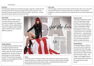
Main Image
The main image is of Florence from Florence and the machine. She is sat on a box with a
red and white throw over it. Because she has her arm rested on her knee which is
propped up, it creates a sensual look to the image and also the use of direct address add
to this.
House Style
The house style for NME is usually
the colours black and red which is
consistent throughout the magazine.
This creates a formal, sophisticated
look to the magazine which will grab
reader’s attention from a variety of
different audiences.
Target Audience
The target audience would be mainly
teenage girls aged 16 and over
however her sensual pose will attract
males as well. The article is about her
abusing herself, ‘so why is Florence
welsh lying on her floor attacking
herself?’ This will attract the target
audience as many people will be able
to relate to her story.
Colour
The colours used are red, black and white. We associate the colour red with lust which
shows that Florence is a symbol of lust and love. The black connotates death and danger
which associate with the article however white is associated with peace which could
foreshadow the fact the article has a good outcome.
Design Balance
The design balance is informal
as the main article is placed on
the right hand side of the page
with the main image on the left
which allows the reader to know
what the article is about. The
image is much bigger than the
article which puts more focus on
the image than the actual
article.
Design Principle
The design principle which is being
used is the Guttenberg’s design
principle. In the primary optical
area is Florence which enables the
reader to immediately establish
what the article is about. In the
strong fallow area in the masthead
‘you got the love’ this is associated
with Florence’s’ song which again
helps the reader establish what the
article is about. In the terminal
area is the article itself which is
where the reader will look last.