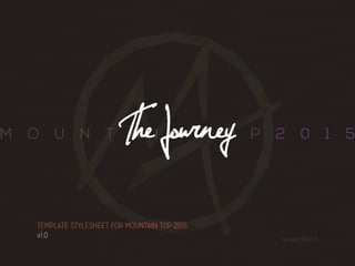
Stylesheet created for the 2015 Mountain Top, a regional Christian Youth Conference held in Cleveland, OH. Stylesheet includes directions for logos, print material, color swatches, and more.
Logo design for MOGIC, an Chinese consumer audio company. Client was presented with three different designs, each one reflecting a different aspect of their identity. The first design was a mix of both a volume indicator and a wireless symbol since the majority of their products are bluetooth wireless audio products. The second was geared more to resemble audio waves, in the shape of an "M." And the last, on their request, was a design based on a dolphin.
Mountain Top 2017 - Wherever The River FlowsJulian Taylor
Logo and Branding for the 2017 Mountain Top entitled "Wherever The River Flows." Branding package included logo, color swatches, fonts, and style rules.
The brand is inspired by the glamorous beauty of Gisella Anastasia, in sync with her individual rhythms.
After analyzing the competitors, the logo is designed to stand out and exceed the competition.
Why do children go to school? You’re probably thinking, “That’s obvious. To learn, of course!” But is academic knowledge, alone, the end goal of the learning experience? What if the educational process could deliver on more than just one outcome? A Catholic education is a one-of-a-kind learning experience because it focuses on more than just academics. And we are the only Catholic school here in Paniqui who can you that. We believe that nurturing the entire person in mind, body, and spirit is necessary for a happy, healthy, and balanced life. Catholic Schools provide children with the invaluable opportunity to expand their knowledge, explore their passions, create community, strengthen their sense of self and come to know God all in one place.
Complete branding style guide for WV TRAIL, a nonprofit organization in West Virginia focused on increasing awareness and stimulating community involvement with all West Virginia non-motorized trails of all kinds. Branding included a logo, typography set, color swatches, and graphic assets.
Brand standards for Distribion to help the company understand the use of logos, colors, and typography. This helps keep collateral cohesive for brand recognition when sales and marketing teams produce items to clients during sales calls and events.
Slides of the Git GitHub workshop conducted by Grejo Joby for ACM DBIT.
Learn about repositories, branches, commit, push, pull and other git commands and how to make your account on GitHub and maintain your repos.
Unleash Your Inner Demon with the "Let's Summon Demons" T-Shirt. Calling all fans of dark humor and edgy fashion! The "Let's Summon Demons" t-shirt is a unique way to express yourself and turn heads.
https://dribbble.com/shots/24253051-Let-s-Summon-Demons-Shirt
Expert Accessory Dwelling Unit (ADU) Drafting ServicesResDraft
Whether you’re looking to create a guest house, a rental unit, or a private retreat, our experienced team will design a space that complements your existing home and maximizes your investment. We provide personalized, comprehensive expert accessory dwelling unit (ADU)drafting solutions tailored to your needs, ensuring a seamless process from concept to completion.
7 Alternatives to Bullet Points in PowerPointAlvis Oh
So you tried all the ways to beautify your bullet points on your pitch deck but it just got way uglier. These points are supposed to be memorable and leave a lasting impression on your audience. With these tips, you'll no longer have to spend so much time thinking how you should present your pointers.
Hello everyone! I am thrilled to present my latest portfolio on LinkedIn, marking the culmination of my architectural journey thus far. Over the span of five years, I've been fortunate to acquire a wealth of knowledge under the guidance of esteemed professors and industry mentors. From rigorous academic pursuits to practical engagements, each experience has contributed to my growth and refinement as an architecture student. This portfolio not only showcases my projects but also underscores my attention to detail and to innovative architecture as a profession.
White wonder, Work developed by Eva TschoppMansi Shah
White Wonder by Eva Tschopp
A tale about our culture around the use of fertilizers and pesticides visiting small farms around Ahmedabad in Matar and Shilaj.
4. CONTENTS
4
LOGOS . . . . . . . . . . . . . . . . . . . . . . . . . .15
MOUNTAIN TOP LOGOS 16
STANDARD MT LOGOS: 16
ALTERNATE MT LOGOS: 16
USAGE 17
‘THE JOURNEY’ LOGO & THEME 18
THE JOURNEY MAN 18
THE MOUNTAIN BACKGROUND 19
USAGE 20
FONTS . . . . . . . . . . . . . . . . . . . . . . . . . .21
FONT FAMILIES 22
NEXA LIGHT 22
JELLYKA - NATHANIEL, A MYSTERY 22
LANE B 22
SF OLD REPUBLIC SC 22
MISSION GOTHIC 23
5. CONTENTS
5
COLORS . . . . . . . . . . . . . . . . . . . . . . . . . 24
MT 2015 - PRIMARY COLORS 25
MT 2015 - SECONDARY COLORS 26
MT 2015 - NEUTRAL COLORS 27
EXAMPLES . . . . . . . . . . . . . . . . . . . . . . . .28
EXAMPLE 1 29
TEXT ON A DARK BACKGROUND 29
EXAMPLE 2 30
TEXT ON A LIGHT BACKGROUND 30
EXAMPLE 3 31
MT LOGO 31
EXAMPLE 4 32
THE JOURNEYMAN LOGO 32
6. INTRO
6
Introduction
WELCOME TO MOUNTAIN TOP 2015 - THE JOURNEY
GREETINGS
If you’re looking at this, then clearly you must be designing some cool picture, document,
or graphic for this year’s Mountain Top. Well, in this document, you will find all the artistic
guidelines needed to create your material, both print and digital, that will help make
Mountain Top look and feel awesome by creating a visually stunning environment.
THE GOAL
The hope with this document is to unify all the media under an umbrella of graphical
specifications in order to create a set of fonts, colors, and styles that ‘brand’ an event,
making it recognizable and familiar. This also makes for quite an impressive appearance
to those attending. DO NOT think of these rules as a box or prison, squashing all creativity
and artistic freedom! Instead, use these guidelines as a framework for your imagination to
go wild!
So ... have at it!
8. THEME
8
THE JOURNEY
Ahh yes. The theme. This year’s theme is entitled, The Journey. It is about the spiritual
journey of one who is living their life for God. We are often told that, “It is not about the
destination, it’s about how you get there.” But with the Christian life, where you are going
is actually more important than how you get there. “The Journeyman,” the main graphic
scene for this year’s theme is meant to encapsulate this thought:
9. THEME
9
THE STORY
The journeyman seems to be looking away from his past while turning resolutely towards
the destination in sight. His destination is far away and while the smaller details are
impossible to make out, it still seems beautiful and full of splendor. It will not be an
easy journey, nor a short one, but the end of it all makes it seem worth it. The words of
Paul echo this sentiment, But one thing I do: forgetting what lies behind and straining
forward to what lies ahead, I press on toward the goal for the prize of the upward call
of God in Christ Jesus. Phillipians 3.13-14.
THE STYLE
Many graphic styles / genres were explored, but the geomtric and vector-based style
were chosen to reflect the more ‘hipster’ sub culture prevalent in today’s pop media. It
also lends itself to a youthful and yet calming mood with a vibrant set of colors.
ok. let’s get this partay started!
10. G.RULES
10
Ground Rules
The Ground Rules are easy enough to follow while still allowing lots of freedom. Stick to
these, and everything should turn out awesome! Let’s check out our first Ground Rule:
11. G.RULES
11
it doesn’t matter what it is: web, print, video ...
whatever. Just slap on one of the designated
Mountain Top logos into your design so that
everyone knows what it’s for!
»» ALWAYS, ALWAYS, ALWAYS, USE
THE MT LOGO
GROUND RULE #1
MT LOGOS
Click to check out all the
available Mountain Top
logos and their usage.
12. G.RULES
12
»» USE THE “MT 2015 PRIMARY
COLORS” FOR ALL OF THE
IMPORTANT STUFF
GROUND RULE #2
important stuff uses the
MT 2015 Primary Colors.
for less important stuff,
you can use the MT 2015
Secondary Colors.
COLORS
Click to see all the
selected color swatches.
13. G.RULES
13
»» STICK WITH THE SELECTED FONTS
GROUND RULE #3
Yeah... Everybody loves to fool around with the fonts. But do your best to use the fonts
that have already been picked out. Of course, the colors and the graphics have been
carefully selected, but even the fonts have been thoughtfully chosen to further reinforce
the aura and character of the entire event. But it’s totally fine because there are plenty of
options to play with! And of course, remember to follow this rule: For the rest of your days
on earth, never, never, NEVER, ever use COMIC SANS!!!! Ever.
FONTS
Click to see all the
selected fonts.
14. G.RULES
14
»» GET APPROVAL
GROUND RULE #4
Hold on to your pantaloons! Send all your media to Julian Taylor for approval at
jmltaylor@gmail.com first before sending in your designs for production or uploading
those pics to the website. Again, this is just to make sure everything is in tip-top shape
before unleashing your jaw-dropping, eye-popping art into the world!
Well that’s about it! Just stick to these four basic guidelines, and everything will look
spectacular!!!
16. LOGOS
16
MOUNTAIN TOP LOGOS
STANDARD MT LOGOS:
mt logo A mt logo B mt logo C
mt logo C-amt logo B-a
ALTERNATE MT LOGOS:
These logos were designed
to match the geometric style
of the theme
17. LOGOS
17
USAGE
»» Associated font: NEXA LIGHT
»» Positioning: Place associated font to the right of or underneath the logo. If incorporating the
date, font can be place on either side of the logo (“mountain” on the left side; “top” and [year] on
the right side). When used as a watermark or background, place logo on the bottom left-hand
corner or very center of the document.
»» Alternates: standard logos or alternate logos can be used interchangeably
EXAMPLES
Click to see examples of
the MT Logos
20. LOGOS
20
USAGE
»» Associated Font: Jellyka - Nathaniel, a Mystery
»» Positioning: Always place the Journeyman in a prominent position, either in the center or on the
right-hand side of the composition, like it is in the thematic graphic.
»» Variant usage: Either the vectorized journeyman (“Journeyman A”) or the sillhouette
(“Journeyman B”) can be used interchangeable, whichever best fits the application.
»» Colors: guess what? No color restrictions. yup. go free, Willy!
EXAMPLES
Click to see examples of
the Journeyman Logos
21. The Journey
2015
M O U N T A
A I N
this is a super awesome paragraph that i wrote in one
sitting. it’s not entirely that interesting or enriching, but
t’s to help add to the cool typographical background
that’s going on over here.HEDEERANDTHEFO
THETALEOFASINGLEMOUNTAIN,RISINGOUTOFTHESHROUD
T NO MOUNTAIN HIGH ENOUGH
T O Panother fantastically drab paragraph, but this time I’m using BOLD ITALIC weight.
How exciting! never thought a completley useful verbiage could so entertaining..
J o u r n e y M a n
thisyear’smountaintopwillbeheldatoberlin
collegefromjuly21-25.it’sactuallyadaylonger
thisyear,comparestootheryears.somarkiton
yourcalendars.it’sgonnabeanawesomeride.
Fonts
22. FONTS
22
FONT FAMILIES
NEXA LIGHT
»» Variants: Regular
»» Usage: Always use in ALL CAPS. Best if used with roughly 200 - 1000 tracking. Also, this font has
one usage and one usage only! This is the font that gets used for the Mountain Top title text. See
Mountain Top Logo.
Jellyka - Nathaniel, a Mystery
»» Variants: Regular
»» Usage: Crazy name, right? This font is used for two things: The text for this year’s theme title,
and for really big headings.
LANE B
»» Variants: Regular
»» Usage: Only headings. Plus it’s an ALL CAPS font anyway, so you can’t use it for much else.
SF OLD REPUBLIC SC
»» Variants: Regular, Italic, Bold, Bold Italic
»» Usage: Again, being an ALL CAPS font, it is really only best for headings. But use this one
sparingly, such as small headings, or flags, etc.
there’s more!
23. FONTS
23
MISSION GOTHIC
»» Variants: Thin, Thin Italic, Light, Light Italic, Regular, Italic, Bold, Bold Italic, Black, Black
Italic
»» Usage: This is going to be your bread and butter paragraph text. It’s wonderfully simple, yet
whimsical, condensed serif font family. There are a lot of variants, so it should give you enough
to work with. As such, you could even use it for headings and subtitles.
29. EXAMPLES
29
EXAMPLE 1:
TEXT ON A DARK BACKGROUND
Super Big Heading
HEADING 2
Heading 3
HEADING 4
This will be your most basic paragraph font. The font weight that is being used for this
is Mission Gothic: Thin. Also, on a dark background (like this one), use the color “MT15 Dry
Ice” for the paragraph color, and any other color for the titles, subtitles, headings, and
highlights.
A FLAG
SF REPUBLIC
color: white
color: mango
color: aqua grass
color: dry ice
color: wet clay
color: muddied ink
font: Mission Gothic
font: sf old republic sc
font: lane B
font: Jellyka - Nathaniel, a Mystery
color: bowtie coral
30. EXAMPLES
30
EXAMPLE 2:
TEXT ON A LIGHT BACKGROUND
Super Big Heading
HEADING 2
Heading 3
HEADING 4
This will be your most basic paragraph font. The font weight that is being used for this is
Mission Gothic: Thin. Also, on a light background (like this one), use the color “MT15 Muddied
Ink” for the paragraph color, and any other color for the titles, subtitles, headings, and
highlights.
A FLAG
SF REPUBLIC
color: muddied ink
color: dry ice
color: mango color: aqua grass
color: wet clay
font: Mission Gothic
font: sf old republic sc
font: lane B
font: Jellyka - Nathaniel, a Mystery
color: bowtie coral
color: grape jelly
31. EXAMPLES
31
EXAMPLE 3:
MT LOGO
M O U N T A I N T O P
M O U N T A I N T O P 2 0 1 5
M O U N T A I N T O P
font: NEXA LIGHT
color: dry ice
logo: mt logo B
color: bowtie coral
color: mango
logo: mt logo C-a