2. Waterbury, Vermont | I D E N T I T Y G U I D E L I N E S2
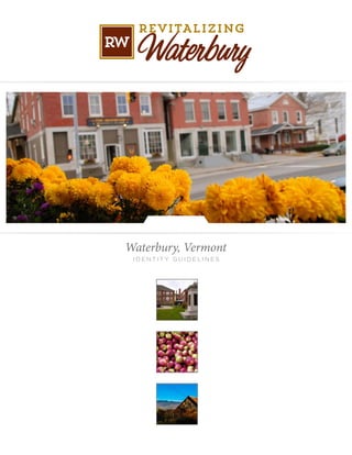
Waterbury, Vermont
BRAND STATEMENT
The complimentary tools and
information found in these
Community Brand Identity Guidelines
are designed to help promote
Waterbury and its businesses
and organizations.
For further information, questions
or access to the files please contact
Laura Parette, Brand Steward
laura@lauraparette.com or
802.233.0576.
TABLE OF CONTENTS
1) Brand statement . . . . . . . . . . . . . . . . . . . . . . . . 3
2) Graphic Standards
a. Logo color palette . . . . . . . . . . . . . . . . . . . . . 4
b. Typography . . . . . . . . . . . . . . . . . . . . . . . . . . 5
c. File format . . . . . . . . . . . . . . . . . . . . . . . . . . . 6
3) Logo catalog
a. Community image approval . . . . . . . . . . . . 8
b. Logo variations . . . . . . . . . . . . . . . . . . . . . . . 9
c. Correct logo sizing and usage . . . . . . . . . . 10
4) Brand extension . . . . . . . . . . . . . . . . . . . . . . . 12
5) Usage control. . . . . . . . . . . . . . . . . . . . . . . . . . 13
6) Photography options . . . . . . . . . . . . . . . . . . . 14
7) Advertising . . . . . . . . . . . . . . . . . . . . . . . . . . . 20
a. Anatomy of an ad . . . . . . . . . . . . . . . . . . . . 21
b. Ad templates . . . . . . . . . . . . . . . . . . . . . . . . 22
8) Collateral . . . . . . . . . . . . . . . . . . . . . . . . . . . . . 26
3. I D E N T I T Y G U I D E L I N E S | Waterbury, Vermont 3
We are Waterbury, Vermont.
We are a place of uncommon ideas. Our innovations range from a small coffee roaster introduc-
ing the world to single serving warmth to ice cream scoops with funny names and strange flavors
known all over the world. We are sculptors, artists, snowboard makers, chefs, farmers, and tea
blenders connected to this place where your all-access pass is the passion you bring.
We are a place of uncommon energy. We are rethinking the way we power our businesses, homes,
and buildings; exploring ways to have a bigger impact on our economy with a smaller footprint
on the environment; and forging partnerships to become the greenest community in the Green
Mountain State.
We are a place of uncommon welcome. Native Vermonters mix with newcomers that have discov-
ered what a special place this is. They share a common purpose and a common belief – that this
community will nurture our families, educate our children, and cultivate our friendships. We are
an authentic place that is far from remote or isolated but at the very crossroads of life in the Green
Mountain State.
We are a place of uncommon recreation. Our mountain bike trails, river walk, parks, and reservoir
are unrivaled places to satisfy your greatest outdoor pursuits. Here, you can leave work and be on
the slopes in less time than it takes to commute home in most places. Here, you can even engage in
a friendly game of croquet in the dead of winter.
We are a place of uncommon connections. The food on the plates of our restaurants comes from
the bounty of nearby farms and the beer in the glass at our pubs is brewed with a dose of magic
just up the road. Food and farms make us a gathering place for people near and far who converge
here to connect with one another and reconnect with what living in Vermont is all about.
We are a place of uncommon caring. Concern for our neighbors is built into our history as a place
where those with challenging needs found help. Through a great flood we bound together with
common purpose and brought our community back from devastation. Neighbors helping neigh-
bors is simply part of who we are no matter how we found our way here.
We invite you to experience this place and feel the warmth of a genuine community. Savor our
farm to table food; sip a glass of beer, a mug of coffee, or a cup of cider; travel our trails on foot or
by bike; immerse yourself in our art; get a gift in our stores or food from our farms.
Experience our special place and our home: we are
Waterbury, Uncommonly Vermont
4. Waterbury, Vermont | I D E N T I T Y G U I D E L I N E S4
Color Palette
Use the primary palette on all branded materials such as
logos, corporate identity, web site, advertising, collateral,
and imprintables. The colors printed here are NOT guar-
anteed to be matches. The use of a Pantone Swatch book is
the best way to work with your vendors and assure color
correctness. Always proof anything before production
runs begin to assure that the colors are satisfactory.
Dealing With Consistent Color Using Pantones:
The accuracy of color is critical in design. Because what you see on your
monitor is never what will appear on a printed sheet, designers need a
standardized color key.
It can be very frustrating to see the logo you worked hard to create look deep
blue on the client’s letterhead, blue-greenish on his business card, and light
blue on his very expensive envelopes.
A way to prevent this is by using a standardized color matching system,
such as the PANTONE MATCHING SYSTEM (PMS). Though PANTONE is not the
only color standardization system, it is the most widely used and the one
that most printers understand. Aside from being able to have consistency,
PMS colors allow you to use colors that cannot be mixed in CMYK.
GRAY PURPLE BLUE MUSTARD
GREEN GOLD TERICOTTA BRICK
5. I D E N T I T Y G U I D E L I N E S | Waterbury, Vermont 5
Typography
To add consistency to the logo, the following fonts
have been chosen as the approved typefaces.
Sonora Pro OT
abcdefghijklm
nopqrstuvwxyz
ABCDEFGHIJKLM
NOPQRSTUVWXYZ
123456789
Trend Slab
abcdefghijklm
nopqrstuvwxyz
ABCDEFGHIJKLM
NOPQRSTUVWXYZ
123456789
Trend Sans
abcdefghijklm
nopqrstuvwxyz
ABCDEFGHIJKLM
NOPQRSTUVWXYZ
123456789
Thirsty Rough
abcdefghijklm
nopqrstuvwxyz
ABCDE F G HIJK L M
NOPQRS T UVWX Y Z
123456789
Installing Opentype or Truetype Fonts
in Windows:
We recommend installing only one format - OpenType, TrueType, or
PostScript - of a font. Installing two or more formats of the same font
may cause problems when you try to use. view, or print the font.
Choose Start > Settings > Control Panel. Note: In Windows XP choose
Start > Control Panel Double-click the Fonts folder. Choose File > Install
New Font. Locate the fonts you want to install. In the drivers list, select
the drive and the folder containing the fonts you want to install. In the
Folders list, select a folder that contains the fonts you want to install.
(Make sure you have unzipped them first.) The fonts in the folder appear
under List of Fonts.
Select the fonts to install. To select more than one font, hold down the
CTRL key and click each font.
To copy the fonts to the Fonts folder, make sure the Copy fonts to the
Fonts folder check box is selected .
Note: If installing fonts from a floppy disk or a CD-ROM, you should make
sure this check box is selected. Otherwise, to use the fonts in your
applications, you must always keep the disk in the disk drive.
Click OK to install the fonts.
Use of the word Waterbury
in the font Sonora Pro OT
CORRECT USE (NOTE THE LETTER B):
Waterbury
INCORRECT USE (NOTE THE LETTER B):
Waterbury
To get the correct “b” in Adobe Illustrator or InDe-
sign use the “glyphs” function. Choose Type>Glyphs.
A window will open with character options. Choose
the correct letter b.
6. Waterbury, Vermont | I D E N T I T Y G U I D E L I N E S6
File Format Guide
All of the included graphic files might not work on your
machine, but that does not mean that the file is corrupted
or that there is something wrong with your machine.
These files address all of the normal uses that a commu-
nity implemented design would require. Always make
sure to inform vendors that you have these different file
formats available.
File Type: Adobe Illustrator File
Category: Vector Image Files
File Description: Vector image file created by Adobe
Illustrator; composed of paths, or lines connected by
points, instead of bitmap data; may include objects,
color, and text; often referred to as a Illustrator
drawing. Illustrator documents can be opened with
Photoshop, but the image will be rasterized, meaning
it will be converted from a vector image to a bitmap.
Program(s) that open ai files
Mac OS Adobe Illustrator, Acrobat, Reader
Adobe Photoshop (rasterized)
Apple Preview
Windows Adobe Illustrator, Acrobat, Reader
Adobe Photoshop (rasterized)
File Type: JPEG Image File
Category: Raster Image Files
File Description: Compressed graphic format
standardized by the JPEG (Joint Photographic Experts
Group) group; commonly used for storing digital
photos since the format supports up to 24-bit color;
also a common format for publishing Web graphics;
compressed using lossy compression, which may
noticeably reduce the image quality if a high amount
of compression is used.
File Type: Encapsulated PostScript
Category: Vector Image Files
File Description: PostScript (.PS) file that may contain
vector graphics, bitmap images, and text; includes
an embedded preview image in bitmap format; often
used for transferring between different operating
systems.
Program(s) that open eps files
Mac OS Apple Preview
Adobe Illustrator, Acrobat, or Photoshop
QuarkXpress
Windows CorelDRAW, Adobe Illustrator, Acrobat,
or Photoshop, QuarkXpress
File Type: Portable Document Format
Category: Page Layout Files
File Description: Cross-platform document created by
Adobe Acrobat or a program with the Acrobat plug-in;
commonly used for e-mail attachments or for saving
publications in a standard format for viewing on
mulitple computers; usually created from another
document instead of from scratch.
Program(s) that open pdf files
Mac OS Adobe Reader to view (free)
Adobe Acrobat to edit (commercial)
Apple Preview
Windows Adobe Reader to view (free)
Adobe Acrobat to edit (commercial)
Brava! Reader
File Type: Graphical Interchange Format
Category: Raster Image Files
File Description: Image file that may contain up to 256
indexed colors; color palette may be a predefined set of
colors or may be adapted to the colors in the image;
lossless format, meaning the clarity of the image is not
compromised with GIF compression. GIFs are common
format for Web graphics, epecially small images and
images that contain text, such as navigation buttons;
however, JPEG (.JPG) images are better for showing
photos because they are not limited in the number of
colors they can display.
7. I D E N T I T Y G U I D E L I N E S | Waterbury, Vermont 7
Waterbury, Vermont
L O G O T H U M B N A I L C ATA L O G
8. Waterbury, Vermont | I D E N T I T Y G U I D E L I N E S8
Community Image Approval
In order to ensure consistent use of the Waterbury,
Vermont brand, we ask that you submit a sample of each
project for approval. Please specify your deadline require-
ments. We will reply promptly to your request for ap-
proval. Contact Laura Parette, laura@lauraparette.com
or 802.233.0576.
9. I D E N T I T Y G U I D E L I N E S | Waterbury, Vermont 9
Logo Variations
Below are the logo variations for the Waterbury,
Vermont brand. They are presented in two color, one
color, reversed and black and white usages. Any color
combinations within the color palette (see page 4) may be
used. All logos are created in vector art and are infinitely
scalable and available for any use.
Uncommonly VERMONT
Uncommonly VERMONT
Uncommonly VERMONT
ncommonly VERMONT
ncommonly VERMONT
Uncommonly VERMONT
10. Waterbury, Vermont | I D E N T I T Y G U I D E L I N E S10
Logo Size & Spacing
The size and spacing of the Waterbury, Vermont brand
is important in ensuring that the logo is displayed in a
positive and consistent way and helps to reinforce the
brand. The logo should always have enough open space
around it to have a clear and clean impact. Two “O”’s
should be used as the measurement guide for this open
space. In order to preserve legibility, maintain a mini-
mum of .5” height.
.5 inch
11. I D E N T I T Y G U I D E L I N E S | Waterbury, Vermont 11
Incorrect Usage
These are some examples of improper ways of presenting
the Waterbury, Vermont brand.
12. Waterbury, Vermont | I D E N T I T Y G U I D E L I N E S12
Brand Extension
Brand extension is the process of incorporating the brand
into events and activities going on in the community. By
adopting the look, feel and tone of the Waterbury, Ver-
mont brand, these events begin to be connected in the
consumers mind and begin to add strength to the pri-
mary brand and vice versa. The general approach of brand
extension is to select at least one of the members of the
color palette as the primary color of the logo, and expand
the color palette from there. The use of approved fonts
also connects the logo to the overall brand.
Vermont
13. I D E N T I T Y G U I D E L I N E S | Waterbury, Vermont 13
Usage Control
When to use the logo and when not to is often times a
judgement call. As the official keeper of the brand, Re-
vitalizing Waterbury has the final say in the usage of the
brand. The brand should be used in signage, advertising,
direct mail, event logos, merchandising, etc. Usage of the
brand in an individual business or in an application that
directly profits an individual business will be reviewed on
a case by case basis. Contact Laura Parette, 802.233.0576
or laura@lauraparette.com.
Waterbury-Duxbury
WAT
ERBURY
14. Waterbury, Vermont | I D E N T I T Y G U I D E L I N E S14
Waterbury, Vermont
P H OTO T H U M B N A I L C ATA L O G
15. _DSC5647.jpg
Arvads deck.jpg
Bolton Valley (4).jpg
CHCM ext.tif
DSCN1392.JPG
_GD35169 2.jpg
Ben & Jerrys.tif
Bolton Valley (6).jpg
DSCF0009.JPG
DSCN2283.JPG
Artemis 4 month Jersey Bull...
Bike Parade 2.jpg
Bolton Valley (18).JPG
DSCF0013_2-1.JPG
DSCN3051.JPG
Arvads 1.jpg
BJS-20070813_201018-16...
BW Back Yard.tif
DSCN1389.JPG
DSCN3052.JPG
Waterbury, Vermont | C O M M U N I T Y I M A G E S T Y L E G U I D E15
16. Flower barrels.jpg
Holiday Stroll Snowman.jpg
Kelley Taft talks with custo...
One Stowe Street.jpg
S&G.jpg
Great Pumpkin Give Away.j...
IMG_0646.JPG
MML.tiff
OSI breakfast_R.tif
Santa 8.jpg
Historic Stowe Street.jpg
IMG00302-20111011-0855....
New Annex.jpg
OSI room.tiff
SD Ireland Holiday cement ...
Holiday Artisans Boutique.jpg
Karen_Pike_Farmers_Mark...
Old Stagecoach Inn.jpg
Pumpkins Abbey Fish & Kid...
SSAF 4.jpg
C O M M U N I T Y I M A G E S T Y L E G U I D E | Waterbury, Vermont 16
17. SSAF 6.jpg
Wat station fireworks.jpg
Waterbury-3.jpg
Waterbury-7.jpg
Waterbury-11.jpg
SSAF cow.jpg
Wat station summer.jpg
Waterbury-4.jpg
Waterbury-8.jpg
Waterbury-12.jpg
SSE 18.jpg
Waterbury-1.jpg
Waterbury-5.jpg
Waterbury-9.jpg
Waterbury-13.jpg
SSE 45.jpg
Waterbury-2.jpg
Waterbury-6.jpg
Waterbury-10.jpg
Waterbury-15.jpg
Waterbury, Vermont | C O M M U N I T Y I M A G E S T Y L E G U I D E17
19. I D E N T I T Y G U I D E L I N E S | Waterbury, Vermont 19
Waterbury, Vermont
A D V E R T I S I N G C ATA L O G
20. Waterbury, Vermont | I D E N T I T Y G U I D E L I N E S20
Advertising
There are several fundamental design strategies that will
allow for connections to be made while also allowing your
business to reinforce its own identity. The use of clean de-
sign, similar color palettes, and a consistent logo element
can create an independently managed community image
campaign.
The following pages show some of the design fundamen-
tals that will be important to use when creating your
ads. The design of this ad series is based on the work by
advertising expert David Ogilvy who devised an ad layout
formula for some of his most successful ads that became
known as “The Ogilvy.” The illustration on the facing page
is the basic design that follows the classic visual, headline,
caption, copy, signature format. From this basic ad layout,
other variations are derived.
Try changing the margins, fonts, leading, size of the initial
cap, size of the visual, and placing the copy in columns to
customize the basic format of this ad layout.
Insert a visual at the top of the page. If you are using a
photo, bleed it to the edge of the page or add space for
maximum impact.
For photos, place a descriptive caption below.
Put your headline next.
Follow with your main ad copy. Consider a drop cap as a
lead-in to help draw the reader into the copy.
Place your contact information (signature) in the lower
right corner. That’s generally the last place a reader’s eye
gravitates to when reading an ad.
21. I D E N T I T Y G U I D E L I N E S | Waterbury, Vermont 21
Anatomy of an Ad.
Ads come in all shapes and sizes but they have a common goal – to sell
a product, a service, a brand. Text, visuals, or a combination of the two
are the main elements of any print ad.
Contact
The contact or signature of an ad may appear
anywhere in the ad although it is usually near
the bottom. It consists of one or more of: Logo,
Advertiser Name, Address, Phone Number, Map or
Driving Directions, Web Site Address, Extras.
Some print ads may have additional special
elements such as an attached business reply
envelope, tear-out portion with a coupon, tip
sheet, product sample.
Body
The copy is the main text of the ad. Some ads may
take a minimalist approach, a line or two or a single
paragraph. Other ads may be quite text-heavy with
paragraphs of information, possibly arranged in
columns newspaper style. While the words are the
most important part of the copy, visual elements such
as indentation, pull-quotes, bullet lists, and creative
kerning and tracking can help to organize and empha-
size the message of the body of the ad.
Headlines
The main headline may be the
strongest element of the ad
or it may be secondary to a
strong visual. Some ads may
have subheads and other title
elements as well.
Artwork
Photographs, drawings, and graph-
ic embellishments are a key visual
element of many types of ads. Some
ads may have only a single visual
while others might have several
pictures. Even text-only ads might
have some graphics in the form of
decorative bullets or borders. When
included with visuals the caption is
one of the first things most readers
look at after the visual. It’s not in
all ads.
23. I D E N T I T Y G U I D E L I N E S | Waterbury, Vermont 23
24. Waterbury, Vermont | I D E N T I T Y G U I D E L I N E S24
If you would like to use any of the print ads
displayed on these pages or elements of these
files to promote Waterbury or your business,
contact Laura Parette
for the high resolution files.
laura@lauraparette.com or 802.233.0576.
In some cases restrictions or a photo credit
may be required.
25. I D E N T I T Y G U I D E L I N E S | Waterbury, Vermont 25
Waterbury, Vermont
C O L L AT E R A L C ATA L O G
26. Waterbury, Vermont | I D E N T I T Y G U I D E L I N E S26
Wayfinding Signage
A wayfinding system should be introduced as part of the
brand because it plays such an important role in percep-
tion and flow in the downtown district. The wayfinding
system could include the following pieces.
P r i m a r y G a t e w a y s - These gateways are the
primary intersection points and main entry ways to town.
They need to be highly visible and introduce the brand.
Tr a i l b l a z e r s - Trailblazers are the directing signs
leading motorists to the main attractions in the area.
These should have between three and four locations per
sign and should carry motorists from gateway to parking
lot. Colors can be used to distinguish between different
districts and can become smaller as the scale and speed
of the roadway narrows. These Trailblazers include cattail
sculptures, thus blurring the line between signage and
public art.
S t r e e t B a n n e r s - Banners are very popular and
help to add color and movement to the lanes of travel,
acting as a speed control. They too can be color coded by
district and can promote local events as well as promoting
the brand.
B u i l d i n g M a r k e r s - the markers can be either wall
mounted or monument style and denote important land-
marks in the downtown district.
P a r k i n g S i g n a g e - Identifying parking is impor-
tant in creating a parking system in downtown. Visi-
tors are more likely to walk a block or two to shop if the
signage system leads them directly to a public parking lot
and tells them how to proceed. The parking markers can
be by themselves or as attachments to Trailblazer signs.
I n f o r m a t i o n a l K i o s k - The final piece of the plan
is the informational kiosk, which serves as the transi-
tion point for vehicular traffic to pedestrian traffic. These
kiosks should be located at major public parking lots and
should include the Waterbury Discovery Map, Dining
& Shopping Guide and Lodging Guide, along with the
Waterbury Historical Tour brochures.
Parking Signage
Pedestrian-Scale
Destination Identification
Visitors
Center
Hours
Monday-Friday 11am-4pm
Saturday 10am-6pm
Closed Sundays
Attraction A Attraction A Attraction A Attraction A Attraction A
Attraction A Attraction A Attraction A Attraction A Attraction A
Attraction A Attraction A Attraction A Attraction A Attraction A
Attraction A Attraction A Attraction A Attraction A Attraction A
Attraction A Attraction A Attraction A Attraction A Attraction A
Attraction A Attraction A Attraction A Attraction A Attraction A
Attraction A Attraction A Attraction A Attraction A Attraction A
Attraction A Attraction A Attraction A Attraction A Attraction A
Attraction A Attraction A Attraction A Attraction A Attraction A
Attraction A Attraction A Attraction A Attraction A Attraction A
Attraction A Attraction A Attraction A Attraction A Attraction A
Attraction A Attraction A Attraction A Attraction A Attraction A
Attraction A Attraction A Attraction A Attraction A A ttraction A
Attraction A Attraction A Attraction A Attraction A Attraction A
Attraction A Attraction A Attraction A Attraction A Attraction A
Attraction A Attraction A Attraction A Attraction A Attraction A
District Map Sign
More to Explore
Business A
Business B
Business C
Business D
Visitor Center
Downtown
Public
Parking
Trailblazer
Front Back
27. I D E N T I T Y G U I D E L I N E S | Waterbury, Vermont 27
IT’S A
7 MINUTE
WALK TO
FOODIE
HEAVEN
uncommonlyvermont.com
IT’S A
14 MINUTE
WALK TO
ICE CREAM
uncommonlyvermont.com
IT’S AN
8 MINUTE
WALK TO
THE RIVER
uncommonlyvermont.com
IT’S A
3 MINUTE
WALK TO
SWINGS
uncommonlyvermont.com
WALK
YOUR
CITY
Back Pocket Guide
WALK [YOUR CITY]
Planning/Production 3hrs
Execution 2hrs
We recommend that anyone planning to install signs
should check with the local planning office to see
what type of sign ordinances are already in place.
However, asking for foregiveness seemed to work too.
1 Back Pocket Guide (5g)
Time Cost 5hrs
20%% Daily HoursImpact per Serving
Walkers Raised
Obesity Battled
12%
8%
Signs (5)
Zip Ties (6)
Intersection (1)
~$40
Expected Cost
~$35
~$5
A foldable guide to starting your
own guerilla wayfinding campaign
Now, let’s
talk strategy.
Public / Open Space
BR
a
D
a
What’s your plan for
getting in, getting the
signs up, and getting out?
www.walk-yourcity.com
TEAMWORK!
WHATIFI’M
STOPPED?
ANATOMY OF
IT’S
18 MINUT
ON FOOT
GLENWO
SOUTH
Civic / Institutional
Commercial Center
WHOIS
YOURAUDIENCE?
WHICH
DESTINATIONS?
HOW
MANYSIGNS?
Soyouwantto
startacampaign!
Great!Hereareafew
thingstoconsiderbefore
yougetstarted...
“WalkYourCity™
changedmylife.
Like,forever.”
-BARACKOBAMA*
www.walk-yourcity.com