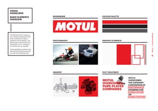
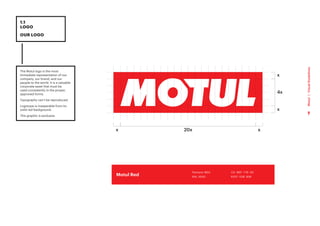
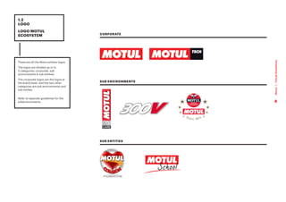
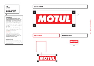
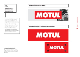
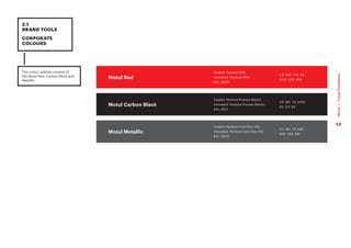
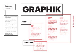
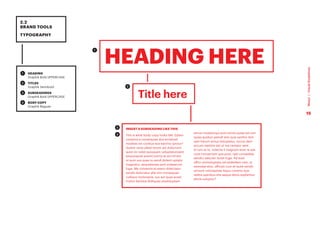
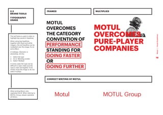
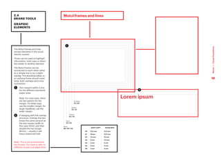
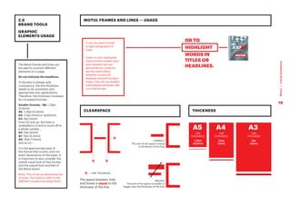
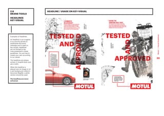
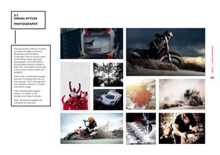
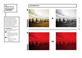
VISUAL
GUIDELINES
2018
These guidelines are designed to assist you
in reaching key audiences with a consistent
message of Motul brand. It outlines the
basic elements of the identity system – logo,
colours, typeface and visual style. They all
play a vital role in forming the Motul identity.
Please follow the guidelines carefully. We have
developed these guidelines to help and inspire
you to build and maintain a clear, consistent
and successful brand.
VISUAL
GUIDELINES
INTRODUCTION
2
Motul
|
Visual
Guidelines
The Motul logo proved to be over the years a
very strong identification tool which conveys
perfectly our values:
INGENIOUS, PASSIONATE, BROTHERLY,
SPECIALIST, AUTHENTIC & PREMIUM.
MOTUL
is POWERFUL BOLD &
DYNAMIC
Like many premium brands, the logo should
live on its own to embrace all its strength.
The Motul ecosystem is vast, rich and
complex. The logo will is supported by brand
messages conveyed by various headlines
instead of one single tagline that would be
limiting.
VISUAL
GUIDELINES
THE STRATEGY
- LOGO +
HEADLINES
3
Motul
|
Visual
Guidelines
3
Motul
|
Visual
Guidelines
MOTUL IS NOT ONLY A CORPORATE STORY.
MOTUL IS AN UNMATCHED BREADTH OF
STORIES OF EMPLOYEES, PARTNERS, RACERS,
MECHANICS AND FANS. EACH OF THOSE
ARE AMBASSADORS OF THE BRAND. THEIR
STORIES SHOULD BE PLACED AT THE HEART
OF OUR COMMUNICATION AS PROOF OF
INGENUITY OF THE PEOPLE DEDICATED TO
MOTUL.
VISUAL
GUIDELINES
THE STRATEGY -
INGENUITY
4
Motul
|
Visual
Guidelines
4
Motul
|
Visual
Guidelines
VISUAL
GUIDELINES
BASIC ELEMENTS
OVERVIEW
The Motul brand is made up
of a number of elements that
when combined create a
powerful brand identity. The
Motul logo is the world’s first
impression of our company,
our brand and our people.
These guidelines explain how
these brand elements should
be used and implemented.
BRANDMARK
PHOTOGRAPHY
IMAGERY
COLOUR PALETTE
GRAPHIC ELEMENTS
TEXT TREATMENT
MOTUL
OVERCOMES
THE CATEGORY
CONVENTION OF
PERFORMANCE
STANDING FOR
GOING FASTER
OR
GOING FURTHER
5
Motul
|
Visual
Guidelines
1
LOGO
6
Motul
|
Visual
Guidelines
The Motul logo is the most
immediate representation of our
company, our brand, and our
people to the world. It is a valuable
corporate asset that must be
used consistently in the proper,
approved forms.
Typography can’t be reproduced.
Logotype is inseparable from its
solid red background.
This graphic is exclusive.
1.1
LOGO
OUR LOGO
x
4x
x
x
20x
x
C0 M91 Y76 K0
R237 G28 B36
Pantone 185C
RAL 3020
Motul Red
7
Motul
|
Visual
Guidelines
1.2
LOGO
LOGO MOTUL
ECOSYSTEM
These are all the Motul entities logos.
The logos are divided up in to
3 categories: corporate, sub
environments & sub entities.
The corporate logos are the logos at
the brand level, and the two other
categories are sub environments and
sub entites.
Refer to separate guidelines for the
subenvironments.
SUB ENVIRONMENTS
CORPORATE
SUB ENTITIES
8
Motul
|
Visual
Guidelines
CLEAR SPACE
Our logo deserves to stand apart,
as an expression of our integrity and
commitment. For maximum impact
and legibility, always maintain ample
clear space around the Motul logo.
This ensures an impression of clarity,
strength and simplicity that supports
our brand.
The clearspace refers to the area
which is entirely clear of copy of any
other graphic elements.
Exception:
When the logo stands alone, the
clearspace must be applied.When
connecting to product or boxes, the
clearspace does not apply.
MINIMUM SIZE
To maintain optimum legibility in all
circumstances, the minimum size has
been established.
1.3
LOGO
CLEAR SPACE &
MINIMUM SIZE
11mm
CLEAR SPACE
MINIMUM SIZE
EXCEPTION
2x
2x
2x
2x
x
9
Motul
|
Visual
Guidelines
1.4
LOGO
MOTUL LOGO
ON COLOURED
BACKGROUND
The primary Motul logo has white
letters with red background. The
Motul logo is also allowed to sit on an
image. As long as nothing is covering
the Motul logo, this is allowed.
When the logo sits on a red Motul
background, the red box is removed,
since the red background should
always be the Motul red colour.
The clearspace is the same for the
secondary logo as it is for the primary.
For more details see section 1.3.
PRIMARY LOGO ON AN IMAGE
SECONDARY LOGO — ON A RED BACKGROUND
2x
2x
2x
2x
x
Printing technique limitations:
The engravement of the logo directly
on the material is allowed only when it
is hard to print the standard red-white
Motul logo
10
Motul
|
Visual
Guidelines
Ensure the logo is clearly
recognisable by using it properly, and
do not alter it in any circumstances.
Consider the background it is placed
on to provide best legibility.
The examples show various uses to
avoid.
1.5
LOGO
INCORRECT
USAGE
Do not change the colour
Do not use shadow under the letters
Do not use shadow on the box
Do not place elements within
the logo clearspace
Do not use the logotype without
the red box
Do not change the typeface
of the logo
Do not distort the logo Do not fill the logo with an image
or texture
Do not add a dropshadow
to the logo
Do not place the logo within text
Do not extent the red box
Do not add text to the logo
Do not distort the logo Do not add other graphic elements
to the logo
Do not add other graphic elements
to the logo
Do not change the typeface style
of the logo
11
Motul
|
Visual
Guidelines
2
BRAND
TOOLS
12
Motul
|
Visual
Guidelines
The colour palette consists of
the Motul Red, Carbon Black and
Metallic.
2.1
BRAND TOOLS
CORPORATE
COLOURS
C0 M91 Y76 K0
R237 G28 B36
Coated: Pantone 185C
Uncoated: Pantone 185U
RAL: 3020
Motul Red
Motul Carbon Black
Motul Metallic
C0 M0 Y0 K100
R0 G0 B0
Coated: Pantone Process BlackC
Uncoated: Pantone Process BlackU
RAL: 9011
C0 M0 Y0 K80
R88 G89 B91
Coated: Pantone Cool Grey 10C
Uncoated: Pantone Cool Grey 10U
RAL: 9023
13
Motul
|
Visual
Guidelines
Graphik is the new communication
typeface of Motul.
Graphik has to be used in any
communication material that is
developed and in any document
when possible.
We only use five variations of the
Graphik font: Bold, Semi Bold,
Medium, Regular and Regular
Italic.
If you do not own a legal version of
the typeface Graphik, please use
the default secondary typeface,
Arial.
In e-mails, Open Sans should be
used.
Download Open Sans
www.google.com/fonts
2.2
BRAND TOOLS
TYPOGRAPHY
GRAPHIK
GRAPHIK
Bold
ABCDEFGHIJKLM
NOPQRSTUVXYZ
abcdefghijklmno
pqrstuvxyz
GRAPHIK
Semi Bold
ABCDEFGHIJKLM
NOPQRSTUVXYZ
abcdefghijklmno
pqrstuvxyz
Graphik
Medium
A B C D E F G H I J K L M
N O P Q R S T U V X Y Z
a b c d e f g h i j k l m n
o p q r s t u v x y z
Graphik
Regular
A B C D E F G H I J K L
M N O P Q R S T U V X
Y Z
a b c d e f g h i j k l m n
o p q r s t u v x y z
Graphik
Regular Italic
A B C D E F G H I J K L
M N O P Q R S T U V X
Y Z
a b c d e f g h i j k l m n
o p q r s t u v x y z
ARIAL
Bold
A B C D E F G H I J K L M
N O P Q R S T U V X Y Z
ARIAL
Regular
A B C D E F G H I J K L M
N O P Q R S T U V X Y Z
a b c d e f g h i j k l m n o
p q r s t u v x y z
OPEN SANS
Normal 400
A B C D E F G H I J K L M
N O P Q R S T U V X Y Z
a b c d e f g h i j k l m n
o p q r s t u v x y z
WEB
OUTLOOK
14
Motul
|
Visual
Guidelines
1 	
HEADING
Graphik Bold UPPERCASE
2 	
TITLES
Graphik Semibold
3 	
SUBHEADINGS
Graphik Bold UPPERCASE
4 	
BODY COPY
Graphik Regular
2.2
BRAND TOOLS
TYPOGRAPHY
HEADING HERE
Title here
INSERT A SUBHEADING LIKE THIS
This is what body copy looks like. Ediam
coraeroLa consequias dus eiciatiost
moditas nis coribus eos earchic ipictur?
Quiam renis ullest rerum ani dolorrovit
quist im nobit quisquam voluptatuinvent
emporeprat premComnis et am hil ent
ut eum sus quas re vendi dolent optatis
magnatur, sequiatecea sant volesecum
fuga. Me consento et exero dolectatur
sandis doloriatur alia nim nonsequae
culliquo molorepre, sus aut quas acest
molori beristia dolliquas utadoluptam
simos mostemqui sunt omnis autas est ium
quias quiduci piendi tem quia sanihic tem
sam harum simus doluptatur, occus dem
accum reptinis est ut ma nempor sent.
Si ium ut re, volectis il magnam eost re sae
core nonsernam que post, opti consediae
sendici aescien isciet fuga. Ad eost
offici ommoluptata vel ipidelitem rest, ut
evendae stiur, officati cum et laute vendit
od eum voloreptate iliquo coremo que
velitia speribus sita seque denis explantiur
aliciis soluptur?
1
2
3
4
15
Motul
|
Visual
Guidelines
The red frame is used in order to
highlight key words in headines.
When using big headlines
together with black and white
imagery, the red headline can be
multiplied over the image, for an
extra effect.
In indesign, illustrator or
photoshop, do this:
1. Select the type
2. Go to ‘Blending modes’
3. Select ‘Multiply’
In some cases the type can be
difficult to read, make sure the
type is clear and legible. If not,
simply move the image or do not
select multiply.
When writing Motul, only
capitalize the M. When refering to
MOTUL Group, please capitalize
all letters.
2.3
BRAND TOOLS
TYPOGRAPHY
USAGE
MOTUL
OVERCOMES
THE CATEGORY
CONVENTION OF
PERFORMANCE
STANDING FOR
GOING FASTER
OR
GOING FURTHER
FRAMED
CORRECT WRITING OF MOTUL
MULTIPLIED
Motul MOTUL Group
16
Motul
|
Visual
Guidelines
2.4
BRAND TOOLS
GRAPHIC
ELEMENTS
The Motul texture can be applied to solid
backgrounds and over images.
It should always just be a subtle filter
and never too obvious.
When printing (whenever possible) it
should appear as varnish or coat over
the images/backgrounds, to add an
extra layer of premiumness.
The texture is always covering the entire
format, you should never crop or distort
the texture.
1 	
ON WHITE
The texture is 10% black
2 	
ON BLACK
Option 1: The texture is 10% black.
Option 2: The background colour is
95% black, with a 100% texture.
Option 2 is used for printing with
colour. Option 1 is only used then
the texture can be printed in clear
varnish.
3 	
ON RED
The texture is:
C20 M100 Y100 K13
TEXTURE USAGE:
The texture is a very important element
of Motul brand ID, thus, it is strongly
recommended to use it in all marketing
support. However, it should be really
discreet where there is some text not to
disturb the readability.
Option 1
Option 2
1 2 3
17
Motul
|
Visual
Guidelines
2.4
BRAND TOOLS
GRAPHIC
ELEMENTS
Lorem ipsum
Motul frames and lines
The Motul frames and lines
are key elements in the visual
identity system.
Those can be used to highlight
information, hold copy or direct
the reader to another element.
The Motul frames can be
connected to each other either
by a simple line or by a slight
overlap. This should be either, or :
an outlying frame should never
have both overlaps and a line
connection.
1 	
Text margins within a box
for the different standards
paper sizes.
Note. For most sizes, there
are two options for the
margin. For body copy,
use the smaller margin; for
larger headlines, use the
wider margin.
2 	
If desiging with the overlap
structure: Overlap the text
boxes the same amount as
the text margin width (in
this case 3mm), and then
double the top margin
(6mm) — visually it will
have a balanced look.
Note: This is not an exhaustive
list of sizes. You have to refer to
different visuals and adapt them.
1
2
3mm
A6 / A5 / A4
5mm
A4 / A3
7,5mm
A3 / A2
10mm
A2 / A1
12,5mm
A1 / A0
A0 12,5 mm 12,5 mm
A1 10mm 12,5 mm
A2 7,5 mm 10 mm
A3 5 mm 7,5 mm
A4 3 mm 5 mm
A5 3 mm 3 mm
A6 3 mm 3 mm
BODY COPY HEADLINES
18
Motul
|
Visual
Guidelines
2.5
BRAND TOOLS
GRAPHIC
ELEMENTS USAGE
It can be used to hold
longer paragraphs of
copy.
Osam ni non resersped
maximinvent audam eum
que natusam aut aut
perorerferum corerum
aut faccaest plibus
dolenem re perovit
ibeaque volorere lacepro
totae. Olor sim qui audam
volorisquae sumquas rate
con nihil et que
MOTUL FRAMES AND LINES — USAGE
CLEARSPACE THICKNESS
The Motul frames and lines can
be used to connect different
elements on a page.
Do not enframe the headlines.
To be able to design with
consistency, the line thickness
needs to be consistent and
appropriate over applications.
Therefore, the thickness increases
for increased formats.
Smaller formats - A6: 1,25pt
(0,5mm)
A5: 1,25pt (0,5mm)
A4: 2,5pt (1mm) or 5pt(2mm)
A3: 5pt (2mm)
From A3 and up, the lines is
multiplied x1,4 and is round off to
a whole number...
A2: 11pt (4mm)
A1: 15pt (5,2mm)
A0: 21pt (7,4mm)
and so on...
It is the approximate area of
the format that counts, and not
exact dimensions of the sides. It
is important to also consider the
overall visual look of that format,
and the overall look and feel of
the Motul brand.
Note: This is not an exhaustive list
of sizes. You have to refer to the
different visuals and adapt them.
OR TO
HIGHLIGHT
WORDS IN
TITLES OR
HEADLINES.
X
X
X
X
A5 A4 A3
LINE
THICKNESS:
1.25pt
(0,5mm)
= LINE THICKNESS
The space between links
and boxes is equal to the
thickness of the line
CORRECT:
The size of the space is equal
to thickness of the line.
WRONG:
The size of the space is smaller or
bigger than the thickness of the line.
LINE
THICKNESS:
2.5pt
(1mm)
LINE
THICKNESS
5pt
(2mm)
19
Motul
|
Visual
Guidelines
2.6
BRAND TOOLS
HEADLINES
KEY VISUAL
HEADLINE / USAGE ON KEY-VISUAL
Examples of headlines.
An headline is not a tagline.
It is a punchy phrase to
emphasise the brand
message and is used on
key visuals. Headlines
are not limited to the
ones presented in these
guidelines. You are free to
create your own according
to our values.
The headlines are always
written in Graphik Bold, and
all in CAPS.
When the headline is
placed over an image or on
a red background, where it
becomes illegible, a white
version should be used.
The headlines are never
enframed.
20
Motul
|
Visual
Guidelines
You can play with the
different words of the
headline. You have to mix
the horizontal and vertical
way to have a dynamic
visual.
EXAMPLES OF HEADLINES STRUCTURE
2.6
BRAND TOOLS
HEADLINES
STRUCTURE
EXCEPTION:
Depending on the support, an all
horizontal format for headlines is
also accepted.
However please favor the
horizontal and vertical way in
order to enhance the brand’s DNA.
INVENT
NEW SOLUTIONS FIX ANY SITUATION
21
Motul
|
Visual
Guidelines
ONE ELEMENT BEING COLOURED
PCMO
Double exposure
Clean surroundings
Technical
Unstructured
Motion
NO double exposure
POWERSPORT
2.7
BRAND TOOLS
COLOURED
TREATMENT
22
Motul
|
Visual
Guidelines
PCMO
Double exposure
Clean surroundings
Technical
Unstructured
Motion
NO double exposure
POWERSPORT
2.7
BRAND TOOLS
B/W TREATMENT
23
Motul
|
Visual
Guidelines
3
VISUAL
STYLES
24
Motul
|
Visual
Guidelines
ALWAYS MAKE SURE YOU HAVE THE RIGHTS
TO USE A PHOTOGRAPH ON THE MEDIA YOU
PLAN ON USING IT.
WE HAVE SIX VALUES
INGENIOUS
PASSIONATE
BROTHERLY
SPECIALIST
AUTHENTIC
PREMIUM
VISUAL
STYLES
Photo illustrating one’s way around the unachievable /Photo illustrating inventiveness
A mechanic setting a specific part of the racing car/bike. Etc.
People with glowing eyes at a motorsport event /Riders/drivers concentrating
Drivers/riders going on against all odds.
A group of people cheering at an event / People with eye gloring at a motorsport event
Photo illustrating sportmanship /Photo illustrating teamwork
Mechanic using Motul oil / Mechanic adjusting a part of the car/bike/quad/jetski, etc.
Mechanics on track ready to intervene at the pitstop
Classic car details / Classic events / Oldtimer alongside classic car or sitting in it
Oldtimer equipment
300V in a very refined environment /High performing car / ride using Motul product
25
Motul
|
Visual
Guidelines
The personality of Motul is easily
achieved through movement.
Movement and the Motul
Corporate Colours are key parts
of the Motul visual style and
photography. All of the Motul
photographs should include at
least one of the Motul Corporate
Colours (red, carbon black and
metallic)
Avoid over complicated images
that are confusing and have no
real purpose. Poor photography
can severely reduce our impact
and brand image.
Over complicated imagery
means, no clutter in the
background, keep it simple.
Note: These photographs are
indicative of style only.
3.1
VISUAL STYLES
PHOTOGRAPHY
26
Motul
|
Visual
Guidelines
3.2
VISUAL STYLES
PHOTOGRAPHY
TREATMENT
If the photography does not
include the necessary Motul
corporate colours, or if an extra
effect is needed, there are four
image treatments in the Motul
style. These styles can be used
freely as wanted but try to mix
it up and use all of them in
combination if possible (not on the
same spread or format though)
TREATMENT NO.1
Convert the photo in black  white
and then apply the red filter
1 	
Process:
Turn the colour photograph
into black and white — apply
a red filter — and if relevant,
the Motul texture.
2 	
Result:
— 
B/W photo + red filter
— 
B/W photo + red filter +
Motul texture
OR
RESULT
PROCESS
TREATMENT NO.1
1
2
27
Motul
|
Visual
Guidelines
3.2
VISUAL STYLES
PHOTOGRAPHY
TREATMENT
28
Motul
|
Visual
Guidelines
TREATMENT NO.2
RESULT
PROCESS
1
2
TREATMENT NO.2:
1 	
Process:
Cut out the elements in the
photograph (in this case,
the man). Turn the colour
photograph into black and
white — apply a red filter —
and if relevant, the Motul
texture.
2 	
Result:
— 
Cut out + B/W + red filter
— 
Cut out + B/W + red filter +
Motul texture
OR
3.2
VISUAL STYLES
PHOTOGRAPHY
TREATMENT
29
Motul
|
Visual
Guidelines
RESULT
PROCESS
TREATMENT NO.3
1
2
TREATMENT NO.3:
1 	
Process:
Tweak the colour tones in
the photograph. Make sure
the red colour reference the
Motul red, and make sure the
black is black and the white
is white. Add the white Motul
pattern as a final step.
2 	
Result:
— 
Colour photo + Motul
texture
PROCESS
RESULT
3.2
VISUAL STYLES
PHOTOGRAPHY
TREATMENT
30
Motul
|
Visual
Guidelines
PROCESS
PROCESS
TREATMENT NO.4
1
2
RESULT
RESULT
TREATMENT NO.4:
For certain images, it’s nice to
keep the original colors, just
slightly toned down.
When there’s a photo which has a
simple color palette (but maybe
not enough red), just add a warm
red tone and slightly desaturate
the image.
1 	
Process:
Warm filter In Photoshop:
1. Press ‘Image’
2. Press ‘Adjustments’
3. Press ‘Photo Filter’
4. Select ‘Color’
5. Enter C0 M91 Y76 K0
6. Pull the ‘Density’ bar
2 	
Result:
— 
A more premium and
consistent Motul look
Additionally to the Motul
photography, certain textures,
patterns and visuals that can be
used.
3.3
VISUAL STYLES
IMAGERY 
TEXTURES
31
Motul
|
Visual
Guidelines
The textures can be used as
full-page backgrounds
3.3
VISUAL STYLES
IMAGERY 
TEXTURES
BACKGROUND TEXTURES
32
Motul
|
Visual
Guidelines
To create an ‘ingenious’ feeling
to the brand, technical drawings
plays a vital part. The technical
drawings can be of anything
related to Motul; a car, motor,
motorcycle etc. Note. It is vital
that the drawing is connected to
the sub-section/content.
Drawings can be used in
combination with images, copy
and/or the Tagline.
There are two options for the
technical drawings:
1 	
Simple ‘exploded sketch’
— when all the parts are
separated to get a clear
view of the construction
and the details of an object.
The sketches are used as a
design element only — and
does not have to be related
to a specific topic, yet, they
do need to relate to the sub-
environments of Motul (auto
/ moto / tech etc.)
2 	
3D illustration — a digital
illustrated x-ray effect to an
element or object. These
illustrations are used more
practically — and need to
showcase a related object to
a topic.
The drawings and 3D illustrations
should always be black or white.
3.3
VISUAL STYLES
IMAGERY 
TEXTURES
DRAWINGS
1 2
2
2
33
Motul
|
Visual
Guidelines
Cut-out images can be used in
color or black  white.
For key visuals and other similar
applications, a “double exposure”
effect may be used.
Simply take two similar images
and use multiply (as seen
previously page 14 ) and let the
images sit above each other.
Always try to use two slightly
different images when doing this,
instead of using one image, twice.
3.3
VISUAL STYLES
IMAGERY 
TEXTURES
CUT-OUT IMAGES
34
Motul
|
Visual
Guidelines
3.4
VISUAL STYLES
ICONOGRAPHY
ICONOGRAPHY
Whenever is possible, using icons
is recommended for the related
topics.
SERVICES PROVIDED
Exhaust analysis
Air conditioning
Error diagnostic / Electric
Accident repair
Tyres
Bodywork
Mechanics
Maintenance
LPG conversion
Oil service
Spare parts
4-wheel-alignment
Windshield change
Brakes
VEHICLES
All brands all
models
Motorcycle
Road
Motorcycle
Off Road
Snowmobile
Watercraft
Scooter
ATV
Go-Kart
SPECIFIC EXPERTISES
300V Expert
Hybrid Vehicles Expert
Historic Vehicles
Expert
300V Expert
Asian market
35
Motul
|
Visual
Guidelines

Motul_Guidelines_UPDATE_external version.pdf

  • 1.
  • 2.
    These guidelines aredesigned to assist you in reaching key audiences with a consistent message of Motul brand. It outlines the basic elements of the identity system – logo, colours, typeface and visual style. They all play a vital role in forming the Motul identity. Please follow the guidelines carefully. We have developed these guidelines to help and inspire you to build and maintain a clear, consistent and successful brand. VISUAL GUIDELINES INTRODUCTION 2 Motul | Visual Guidelines
  • 3.
    The Motul logoproved to be over the years a very strong identification tool which conveys perfectly our values: INGENIOUS, PASSIONATE, BROTHERLY, SPECIALIST, AUTHENTIC & PREMIUM. MOTUL is POWERFUL BOLD & DYNAMIC Like many premium brands, the logo should live on its own to embrace all its strength. The Motul ecosystem is vast, rich and complex. The logo will is supported by brand messages conveyed by various headlines instead of one single tagline that would be limiting. VISUAL GUIDELINES THE STRATEGY - LOGO + HEADLINES 3 Motul | Visual Guidelines 3 Motul | Visual Guidelines
  • 4.
    MOTUL IS NOTONLY A CORPORATE STORY. MOTUL IS AN UNMATCHED BREADTH OF STORIES OF EMPLOYEES, PARTNERS, RACERS, MECHANICS AND FANS. EACH OF THOSE ARE AMBASSADORS OF THE BRAND. THEIR STORIES SHOULD BE PLACED AT THE HEART OF OUR COMMUNICATION AS PROOF OF INGENUITY OF THE PEOPLE DEDICATED TO MOTUL. VISUAL GUIDELINES THE STRATEGY - INGENUITY 4 Motul | Visual Guidelines 4 Motul | Visual Guidelines
  • 5.
    VISUAL GUIDELINES BASIC ELEMENTS OVERVIEW The Motulbrand is made up of a number of elements that when combined create a powerful brand identity. The Motul logo is the world’s first impression of our company, our brand and our people. These guidelines explain how these brand elements should be used and implemented. BRANDMARK PHOTOGRAPHY IMAGERY COLOUR PALETTE GRAPHIC ELEMENTS TEXT TREATMENT MOTUL OVERCOMES THE CATEGORY CONVENTION OF PERFORMANCE STANDING FOR GOING FASTER OR GOING FURTHER 5 Motul | Visual Guidelines
  • 6.
  • 7.
    The Motul logois the most immediate representation of our company, our brand, and our people to the world. It is a valuable corporate asset that must be used consistently in the proper, approved forms. Typography can’t be reproduced. Logotype is inseparable from its solid red background. This graphic is exclusive. 1.1 LOGO OUR LOGO x 4x x x 20x x C0 M91 Y76 K0 R237 G28 B36 Pantone 185C RAL 3020 Motul Red 7 Motul | Visual Guidelines
  • 8.
    1.2 LOGO LOGO MOTUL ECOSYSTEM These areall the Motul entities logos. The logos are divided up in to 3 categories: corporate, sub environments & sub entities. The corporate logos are the logos at the brand level, and the two other categories are sub environments and sub entites. Refer to separate guidelines for the subenvironments. SUB ENVIRONMENTS CORPORATE SUB ENTITIES 8 Motul | Visual Guidelines
  • 9.
    CLEAR SPACE Our logodeserves to stand apart, as an expression of our integrity and commitment. For maximum impact and legibility, always maintain ample clear space around the Motul logo. This ensures an impression of clarity, strength and simplicity that supports our brand. The clearspace refers to the area which is entirely clear of copy of any other graphic elements. Exception: When the logo stands alone, the clearspace must be applied.When connecting to product or boxes, the clearspace does not apply. MINIMUM SIZE To maintain optimum legibility in all circumstances, the minimum size has been established. 1.3 LOGO CLEAR SPACE & MINIMUM SIZE 11mm CLEAR SPACE MINIMUM SIZE EXCEPTION 2x 2x 2x 2x x 9 Motul | Visual Guidelines
  • 10.
    1.4 LOGO MOTUL LOGO ON COLOURED BACKGROUND Theprimary Motul logo has white letters with red background. The Motul logo is also allowed to sit on an image. As long as nothing is covering the Motul logo, this is allowed. When the logo sits on a red Motul background, the red box is removed, since the red background should always be the Motul red colour. The clearspace is the same for the secondary logo as it is for the primary. For more details see section 1.3. PRIMARY LOGO ON AN IMAGE SECONDARY LOGO — ON A RED BACKGROUND 2x 2x 2x 2x x Printing technique limitations: The engravement of the logo directly on the material is allowed only when it is hard to print the standard red-white Motul logo 10 Motul | Visual Guidelines
  • 11.
    Ensure the logois clearly recognisable by using it properly, and do not alter it in any circumstances. Consider the background it is placed on to provide best legibility. The examples show various uses to avoid. 1.5 LOGO INCORRECT USAGE Do not change the colour Do not use shadow under the letters Do not use shadow on the box Do not place elements within the logo clearspace Do not use the logotype without the red box Do not change the typeface of the logo Do not distort the logo Do not fill the logo with an image or texture Do not add a dropshadow to the logo Do not place the logo within text Do not extent the red box Do not add text to the logo Do not distort the logo Do not add other graphic elements to the logo Do not add other graphic elements to the logo Do not change the typeface style of the logo 11 Motul | Visual Guidelines
  • 12.
  • 13.
    The colour paletteconsists of the Motul Red, Carbon Black and Metallic. 2.1 BRAND TOOLS CORPORATE COLOURS C0 M91 Y76 K0 R237 G28 B36 Coated: Pantone 185C Uncoated: Pantone 185U RAL: 3020 Motul Red Motul Carbon Black Motul Metallic C0 M0 Y0 K100 R0 G0 B0 Coated: Pantone Process BlackC Uncoated: Pantone Process BlackU RAL: 9011 C0 M0 Y0 K80 R88 G89 B91 Coated: Pantone Cool Grey 10C Uncoated: Pantone Cool Grey 10U RAL: 9023 13 Motul | Visual Guidelines
  • 14.
    Graphik is thenew communication typeface of Motul. Graphik has to be used in any communication material that is developed and in any document when possible. We only use five variations of the Graphik font: Bold, Semi Bold, Medium, Regular and Regular Italic. If you do not own a legal version of the typeface Graphik, please use the default secondary typeface, Arial. In e-mails, Open Sans should be used. Download Open Sans www.google.com/fonts 2.2 BRAND TOOLS TYPOGRAPHY GRAPHIK GRAPHIK Bold ABCDEFGHIJKLM NOPQRSTUVXYZ abcdefghijklmno pqrstuvxyz GRAPHIK Semi Bold ABCDEFGHIJKLM NOPQRSTUVXYZ abcdefghijklmno pqrstuvxyz Graphik Medium A B C D E F G H I J K L M N O P Q R S T U V X Y Z a b c d e f g h i j k l m n o p q r s t u v x y z Graphik Regular A B C D E F G H I J K L M N O P Q R S T U V X Y Z a b c d e f g h i j k l m n o p q r s t u v x y z Graphik Regular Italic A B C D E F G H I J K L M N O P Q R S T U V X Y Z a b c d e f g h i j k l m n o p q r s t u v x y z ARIAL Bold A B C D E F G H I J K L M N O P Q R S T U V X Y Z ARIAL Regular A B C D E F G H I J K L M N O P Q R S T U V X Y Z a b c d e f g h i j k l m n o p q r s t u v x y z OPEN SANS Normal 400 A B C D E F G H I J K L M N O P Q R S T U V X Y Z a b c d e f g h i j k l m n o p q r s t u v x y z WEB OUTLOOK 14 Motul | Visual Guidelines
  • 15.
    1 HEADING Graphik BoldUPPERCASE 2 TITLES Graphik Semibold 3 SUBHEADINGS Graphik Bold UPPERCASE 4 BODY COPY Graphik Regular 2.2 BRAND TOOLS TYPOGRAPHY HEADING HERE Title here INSERT A SUBHEADING LIKE THIS This is what body copy looks like. Ediam coraeroLa consequias dus eiciatiost moditas nis coribus eos earchic ipictur? Quiam renis ullest rerum ani dolorrovit quist im nobit quisquam voluptatuinvent emporeprat premComnis et am hil ent ut eum sus quas re vendi dolent optatis magnatur, sequiatecea sant volesecum fuga. Me consento et exero dolectatur sandis doloriatur alia nim nonsequae culliquo molorepre, sus aut quas acest molori beristia dolliquas utadoluptam simos mostemqui sunt omnis autas est ium quias quiduci piendi tem quia sanihic tem sam harum simus doluptatur, occus dem accum reptinis est ut ma nempor sent. Si ium ut re, volectis il magnam eost re sae core nonsernam que post, opti consediae sendici aescien isciet fuga. Ad eost offici ommoluptata vel ipidelitem rest, ut evendae stiur, officati cum et laute vendit od eum voloreptate iliquo coremo que velitia speribus sita seque denis explantiur aliciis soluptur? 1 2 3 4 15 Motul | Visual Guidelines
  • 16.
    The red frameis used in order to highlight key words in headines. When using big headlines together with black and white imagery, the red headline can be multiplied over the image, for an extra effect. In indesign, illustrator or photoshop, do this: 1. Select the type 2. Go to ‘Blending modes’ 3. Select ‘Multiply’ In some cases the type can be difficult to read, make sure the type is clear and legible. If not, simply move the image or do not select multiply. When writing Motul, only capitalize the M. When refering to MOTUL Group, please capitalize all letters. 2.3 BRAND TOOLS TYPOGRAPHY USAGE MOTUL OVERCOMES THE CATEGORY CONVENTION OF PERFORMANCE STANDING FOR GOING FASTER OR GOING FURTHER FRAMED CORRECT WRITING OF MOTUL MULTIPLIED Motul MOTUL Group 16 Motul | Visual Guidelines
  • 17.
    2.4 BRAND TOOLS GRAPHIC ELEMENTS The Motultexture can be applied to solid backgrounds and over images. It should always just be a subtle filter and never too obvious. When printing (whenever possible) it should appear as varnish or coat over the images/backgrounds, to add an extra layer of premiumness. The texture is always covering the entire format, you should never crop or distort the texture. 1 ON WHITE The texture is 10% black 2 ON BLACK Option 1: The texture is 10% black. Option 2: The background colour is 95% black, with a 100% texture. Option 2 is used for printing with colour. Option 1 is only used then the texture can be printed in clear varnish. 3 ON RED The texture is: C20 M100 Y100 K13 TEXTURE USAGE: The texture is a very important element of Motul brand ID, thus, it is strongly recommended to use it in all marketing support. However, it should be really discreet where there is some text not to disturb the readability. Option 1 Option 2 1 2 3 17 Motul | Visual Guidelines
  • 18.
    2.4 BRAND TOOLS GRAPHIC ELEMENTS Lorem ipsum Motulframes and lines The Motul frames and lines are key elements in the visual identity system. Those can be used to highlight information, hold copy or direct the reader to another element. The Motul frames can be connected to each other either by a simple line or by a slight overlap. This should be either, or : an outlying frame should never have both overlaps and a line connection. 1 Text margins within a box for the different standards paper sizes. Note. For most sizes, there are two options for the margin. For body copy, use the smaller margin; for larger headlines, use the wider margin. 2 If desiging with the overlap structure: Overlap the text boxes the same amount as the text margin width (in this case 3mm), and then double the top margin (6mm) — visually it will have a balanced look. Note: This is not an exhaustive list of sizes. You have to refer to different visuals and adapt them. 1 2 3mm A6 / A5 / A4 5mm A4 / A3 7,5mm A3 / A2 10mm A2 / A1 12,5mm A1 / A0 A0 12,5 mm 12,5 mm A1 10mm 12,5 mm A2 7,5 mm 10 mm A3 5 mm 7,5 mm A4 3 mm 5 mm A5 3 mm 3 mm A6 3 mm 3 mm BODY COPY HEADLINES 18 Motul | Visual Guidelines
  • 19.
    2.5 BRAND TOOLS GRAPHIC ELEMENTS USAGE Itcan be used to hold longer paragraphs of copy. Osam ni non resersped maximinvent audam eum que natusam aut aut perorerferum corerum aut faccaest plibus dolenem re perovit ibeaque volorere lacepro totae. Olor sim qui audam volorisquae sumquas rate con nihil et que MOTUL FRAMES AND LINES — USAGE CLEARSPACE THICKNESS The Motul frames and lines can be used to connect different elements on a page. Do not enframe the headlines. To be able to design with consistency, the line thickness needs to be consistent and appropriate over applications. Therefore, the thickness increases for increased formats. Smaller formats - A6: 1,25pt (0,5mm) A5: 1,25pt (0,5mm) A4: 2,5pt (1mm) or 5pt(2mm) A3: 5pt (2mm) From A3 and up, the lines is multiplied x1,4 and is round off to a whole number... A2: 11pt (4mm) A1: 15pt (5,2mm) A0: 21pt (7,4mm) and so on... It is the approximate area of the format that counts, and not exact dimensions of the sides. It is important to also consider the overall visual look of that format, and the overall look and feel of the Motul brand. Note: This is not an exhaustive list of sizes. You have to refer to the different visuals and adapt them. OR TO HIGHLIGHT WORDS IN TITLES OR HEADLINES. X X X X A5 A4 A3 LINE THICKNESS: 1.25pt (0,5mm) = LINE THICKNESS The space between links and boxes is equal to the thickness of the line CORRECT: The size of the space is equal to thickness of the line. WRONG: The size of the space is smaller or bigger than the thickness of the line. LINE THICKNESS: 2.5pt (1mm) LINE THICKNESS 5pt (2mm) 19 Motul | Visual Guidelines
  • 20.
    2.6 BRAND TOOLS HEADLINES KEY VISUAL HEADLINE/ USAGE ON KEY-VISUAL Examples of headlines. An headline is not a tagline. It is a punchy phrase to emphasise the brand message and is used on key visuals. Headlines are not limited to the ones presented in these guidelines. You are free to create your own according to our values. The headlines are always written in Graphik Bold, and all in CAPS. When the headline is placed over an image or on a red background, where it becomes illegible, a white version should be used. The headlines are never enframed. 20 Motul | Visual Guidelines
  • 21.
    You can playwith the different words of the headline. You have to mix the horizontal and vertical way to have a dynamic visual. EXAMPLES OF HEADLINES STRUCTURE 2.6 BRAND TOOLS HEADLINES STRUCTURE EXCEPTION: Depending on the support, an all horizontal format for headlines is also accepted. However please favor the horizontal and vertical way in order to enhance the brand’s DNA. INVENT NEW SOLUTIONS FIX ANY SITUATION 21 Motul | Visual Guidelines
  • 22.
    ONE ELEMENT BEINGCOLOURED PCMO Double exposure Clean surroundings Technical Unstructured Motion NO double exposure POWERSPORT 2.7 BRAND TOOLS COLOURED TREATMENT 22 Motul | Visual Guidelines
  • 23.
    PCMO Double exposure Clean surroundings Technical Unstructured Motion NOdouble exposure POWERSPORT 2.7 BRAND TOOLS B/W TREATMENT 23 Motul | Visual Guidelines
  • 24.
  • 25.
    ALWAYS MAKE SUREYOU HAVE THE RIGHTS TO USE A PHOTOGRAPH ON THE MEDIA YOU PLAN ON USING IT. WE HAVE SIX VALUES INGENIOUS PASSIONATE BROTHERLY SPECIALIST AUTHENTIC PREMIUM VISUAL STYLES Photo illustrating one’s way around the unachievable /Photo illustrating inventiveness A mechanic setting a specific part of the racing car/bike. Etc. People with glowing eyes at a motorsport event /Riders/drivers concentrating Drivers/riders going on against all odds. A group of people cheering at an event / People with eye gloring at a motorsport event Photo illustrating sportmanship /Photo illustrating teamwork Mechanic using Motul oil / Mechanic adjusting a part of the car/bike/quad/jetski, etc. Mechanics on track ready to intervene at the pitstop Classic car details / Classic events / Oldtimer alongside classic car or sitting in it Oldtimer equipment 300V in a very refined environment /High performing car / ride using Motul product 25 Motul | Visual Guidelines
  • 26.
    The personality ofMotul is easily achieved through movement. Movement and the Motul Corporate Colours are key parts of the Motul visual style and photography. All of the Motul photographs should include at least one of the Motul Corporate Colours (red, carbon black and metallic) Avoid over complicated images that are confusing and have no real purpose. Poor photography can severely reduce our impact and brand image. Over complicated imagery means, no clutter in the background, keep it simple. Note: These photographs are indicative of style only. 3.1 VISUAL STYLES PHOTOGRAPHY 26 Motul | Visual Guidelines
  • 27.
    3.2 VISUAL STYLES PHOTOGRAPHY TREATMENT If thephotography does not include the necessary Motul corporate colours, or if an extra effect is needed, there are four image treatments in the Motul style. These styles can be used freely as wanted but try to mix it up and use all of them in combination if possible (not on the same spread or format though) TREATMENT NO.1 Convert the photo in black white and then apply the red filter 1 Process: Turn the colour photograph into black and white — apply a red filter — and if relevant, the Motul texture. 2 Result: — B/W photo + red filter — B/W photo + red filter + Motul texture OR RESULT PROCESS TREATMENT NO.1 1 2 27 Motul | Visual Guidelines
  • 28.
    3.2 VISUAL STYLES PHOTOGRAPHY TREATMENT 28 Motul | Visual Guidelines TREATMENT NO.2 RESULT PROCESS 1 2 TREATMENTNO.2: 1 Process: Cut out the elements in the photograph (in this case, the man). Turn the colour photograph into black and white — apply a red filter — and if relevant, the Motul texture. 2 Result: — Cut out + B/W + red filter — Cut out + B/W + red filter + Motul texture OR
  • 29.
    3.2 VISUAL STYLES PHOTOGRAPHY TREATMENT 29 Motul | Visual Guidelines RESULT PROCESS TREATMENT NO.3 1 2 TREATMENTNO.3: 1 Process: Tweak the colour tones in the photograph. Make sure the red colour reference the Motul red, and make sure the black is black and the white is white. Add the white Motul pattern as a final step. 2 Result: — Colour photo + Motul texture PROCESS RESULT
  • 30.
    3.2 VISUAL STYLES PHOTOGRAPHY TREATMENT 30 Motul | Visual Guidelines PROCESS PROCESS TREATMENT NO.4 1 2 RESULT RESULT TREATMENTNO.4: For certain images, it’s nice to keep the original colors, just slightly toned down. When there’s a photo which has a simple color palette (but maybe not enough red), just add a warm red tone and slightly desaturate the image. 1 Process: Warm filter In Photoshop: 1. Press ‘Image’ 2. Press ‘Adjustments’ 3. Press ‘Photo Filter’ 4. Select ‘Color’ 5. Enter C0 M91 Y76 K0 6. Pull the ‘Density’ bar 2 Result: — A more premium and consistent Motul look
  • 31.
    Additionally to theMotul photography, certain textures, patterns and visuals that can be used. 3.3 VISUAL STYLES IMAGERY TEXTURES 31 Motul | Visual Guidelines
  • 32.
    The textures canbe used as full-page backgrounds 3.3 VISUAL STYLES IMAGERY TEXTURES BACKGROUND TEXTURES 32 Motul | Visual Guidelines
  • 33.
    To create an‘ingenious’ feeling to the brand, technical drawings plays a vital part. The technical drawings can be of anything related to Motul; a car, motor, motorcycle etc. Note. It is vital that the drawing is connected to the sub-section/content. Drawings can be used in combination with images, copy and/or the Tagline. There are two options for the technical drawings: 1 Simple ‘exploded sketch’ — when all the parts are separated to get a clear view of the construction and the details of an object. The sketches are used as a design element only — and does not have to be related to a specific topic, yet, they do need to relate to the sub- environments of Motul (auto / moto / tech etc.) 2 3D illustration — a digital illustrated x-ray effect to an element or object. These illustrations are used more practically — and need to showcase a related object to a topic. The drawings and 3D illustrations should always be black or white. 3.3 VISUAL STYLES IMAGERY TEXTURES DRAWINGS 1 2 2 2 33 Motul | Visual Guidelines
  • 34.
    Cut-out images canbe used in color or black white. For key visuals and other similar applications, a “double exposure” effect may be used. Simply take two similar images and use multiply (as seen previously page 14 ) and let the images sit above each other. Always try to use two slightly different images when doing this, instead of using one image, twice. 3.3 VISUAL STYLES IMAGERY TEXTURES CUT-OUT IMAGES 34 Motul | Visual Guidelines
  • 35.
    3.4 VISUAL STYLES ICONOGRAPHY ICONOGRAPHY Whenever ispossible, using icons is recommended for the related topics. SERVICES PROVIDED Exhaust analysis Air conditioning Error diagnostic / Electric Accident repair Tyres Bodywork Mechanics Maintenance LPG conversion Oil service Spare parts 4-wheel-alignment Windshield change Brakes VEHICLES All brands all models Motorcycle Road Motorcycle Off Road Snowmobile Watercraft Scooter ATV Go-Kart SPECIFIC EXPERTISES 300V Expert Hybrid Vehicles Expert Historic Vehicles Expert 300V Expert Asian market 35 Motul | Visual Guidelines