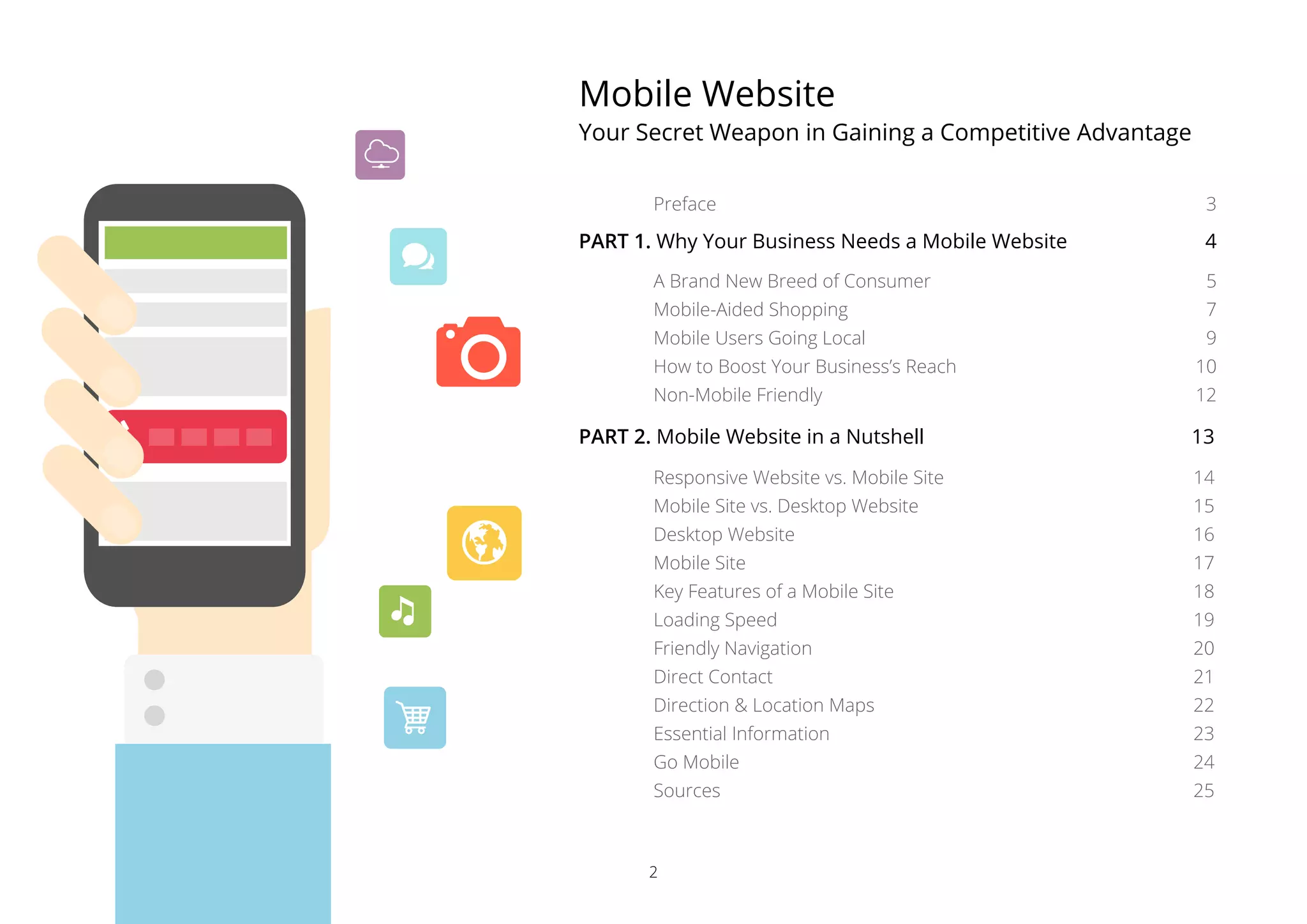
Download as PDF, PPTX


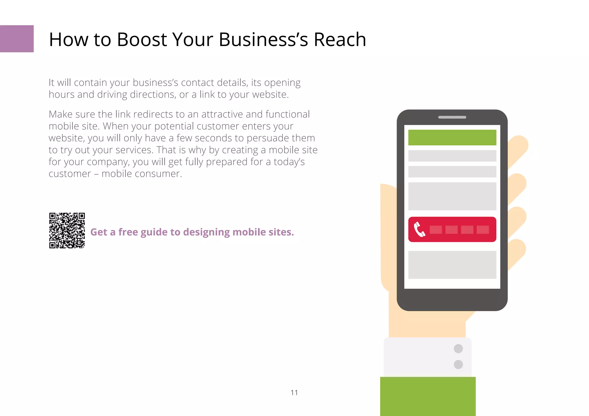
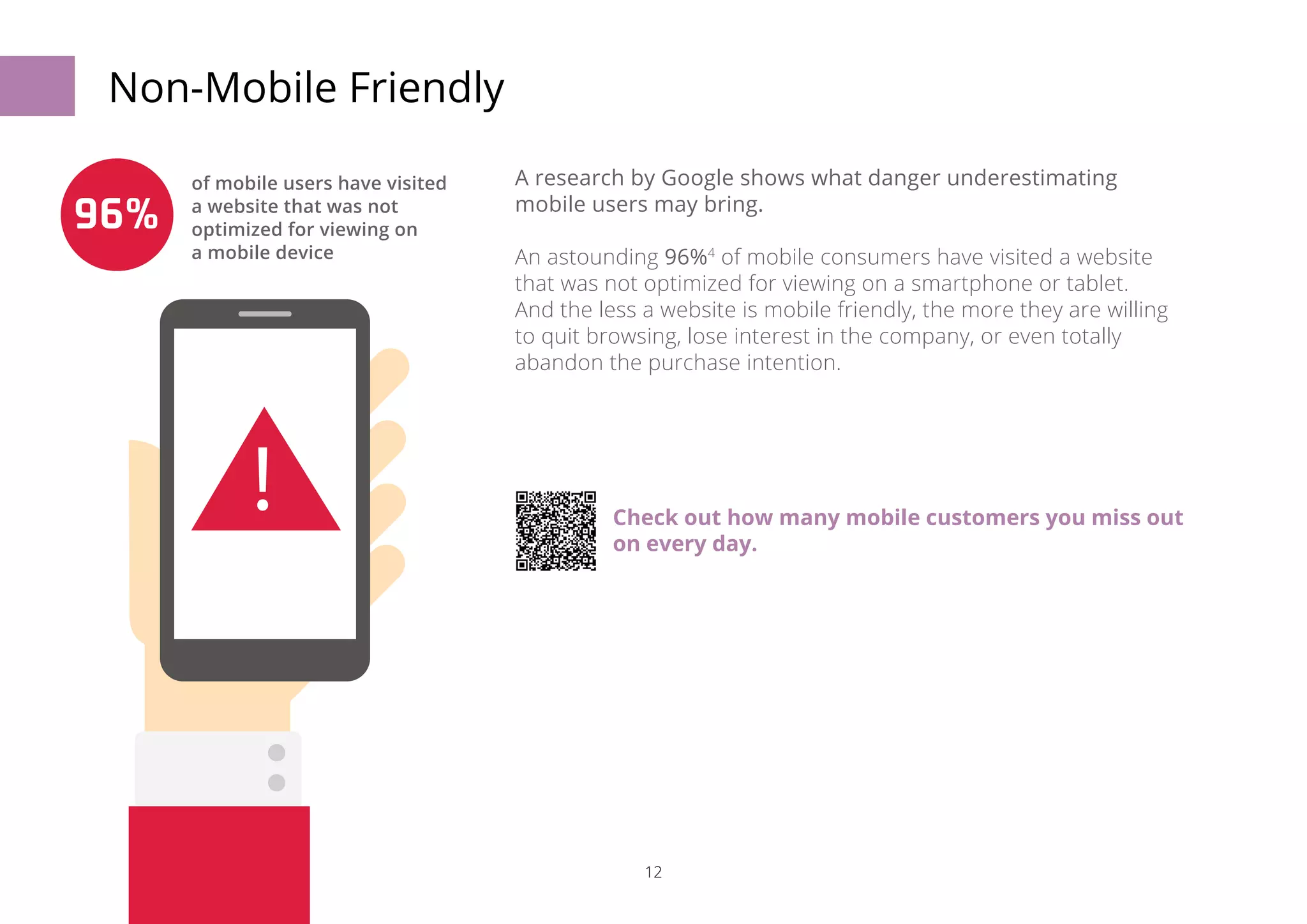

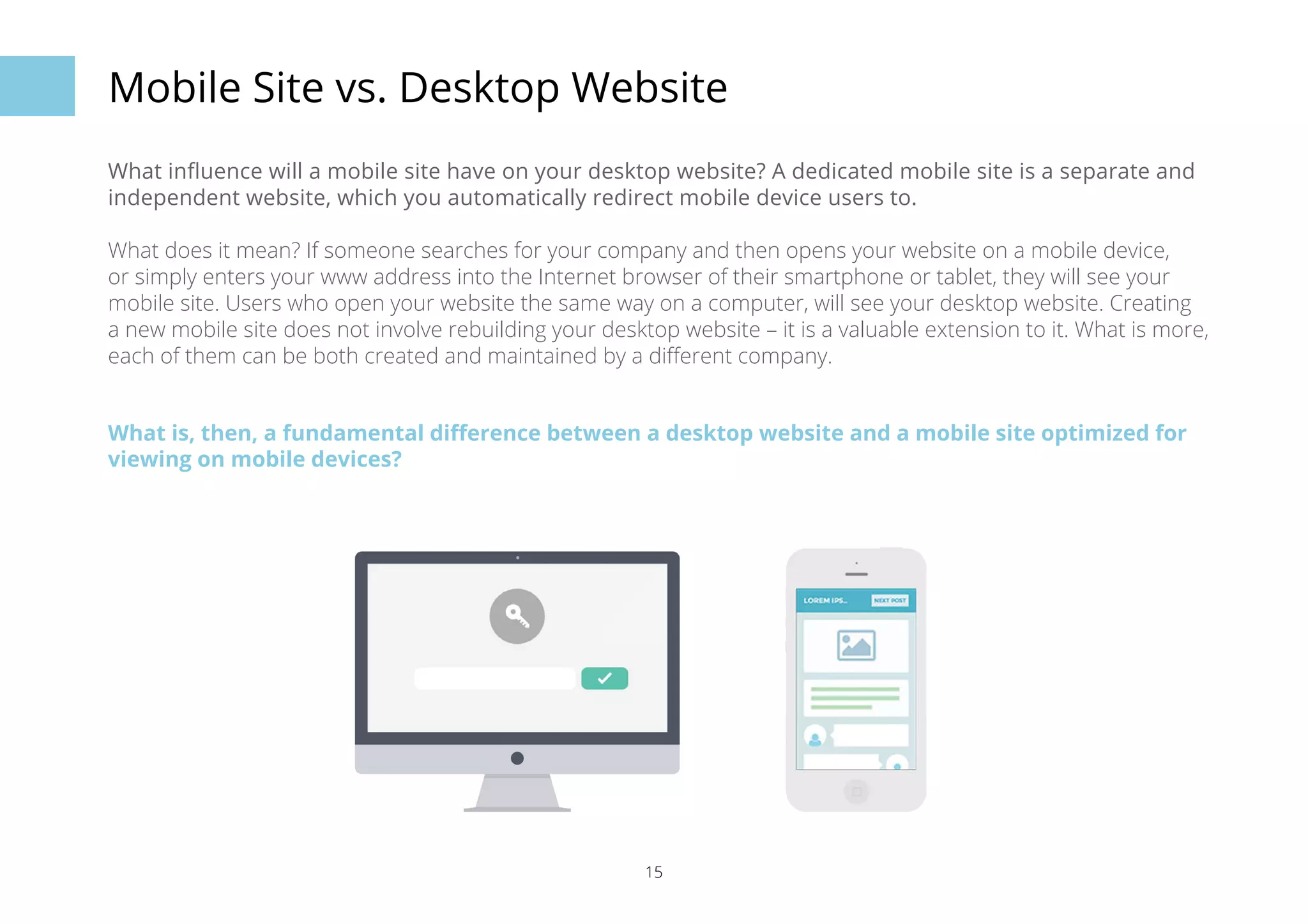
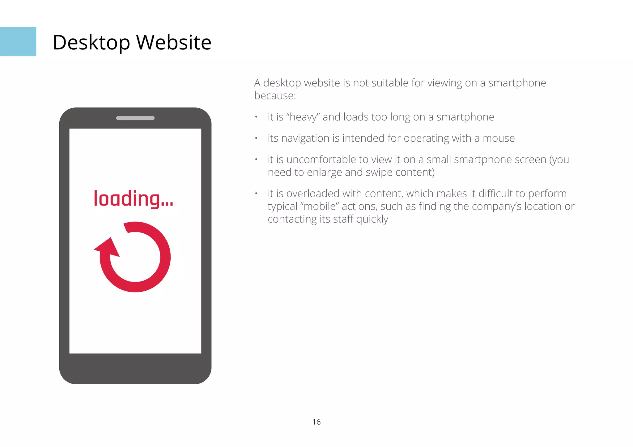
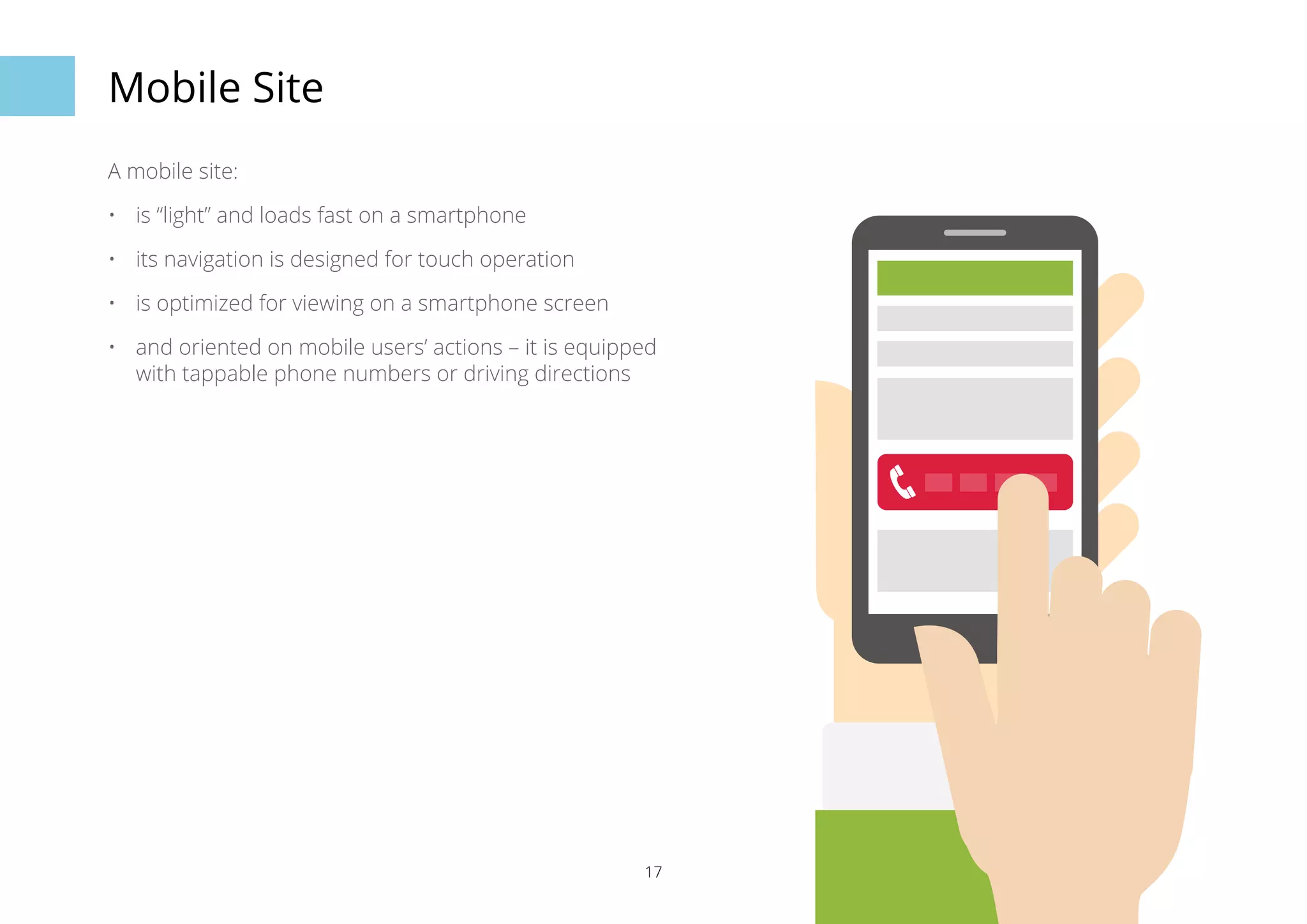
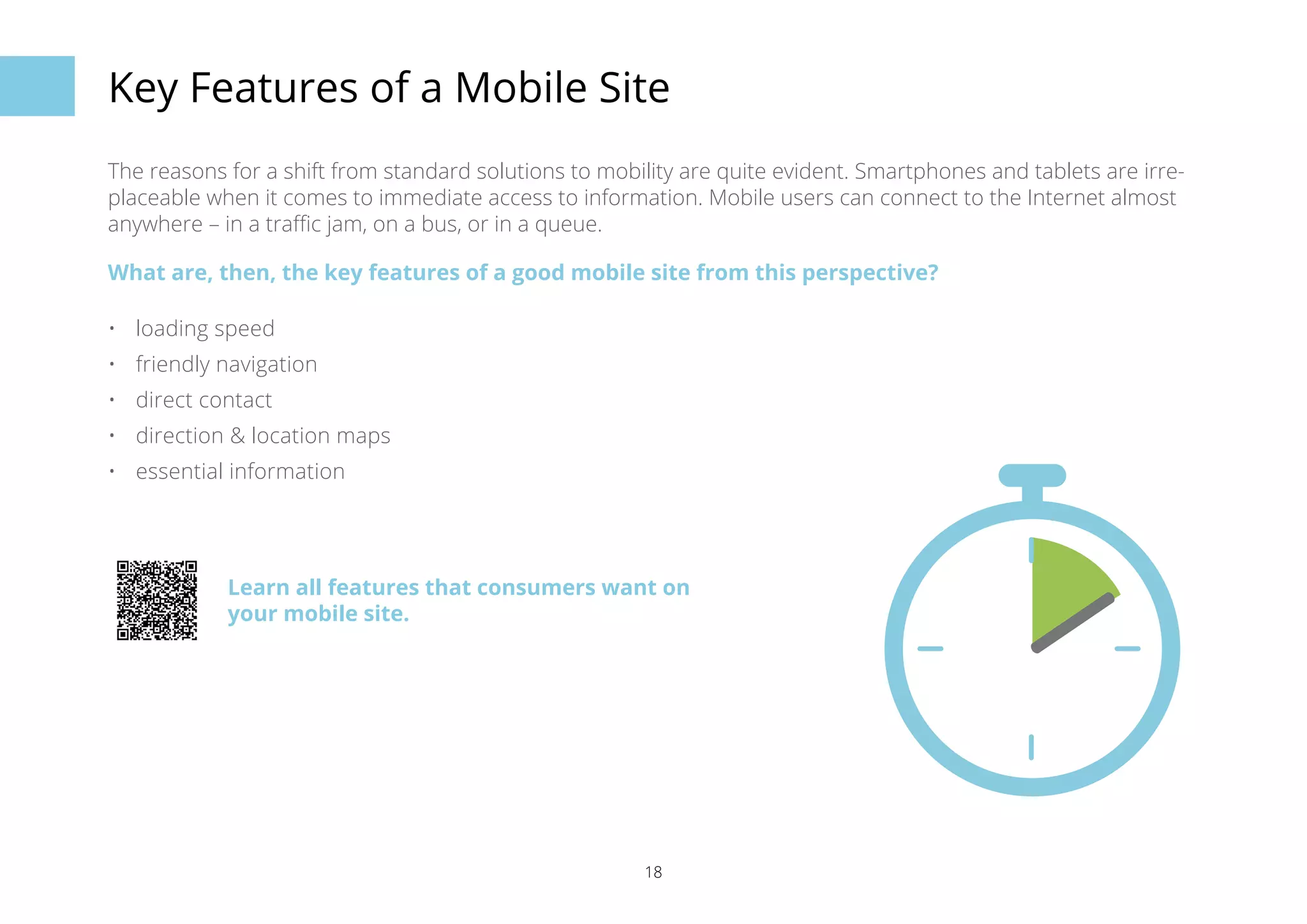
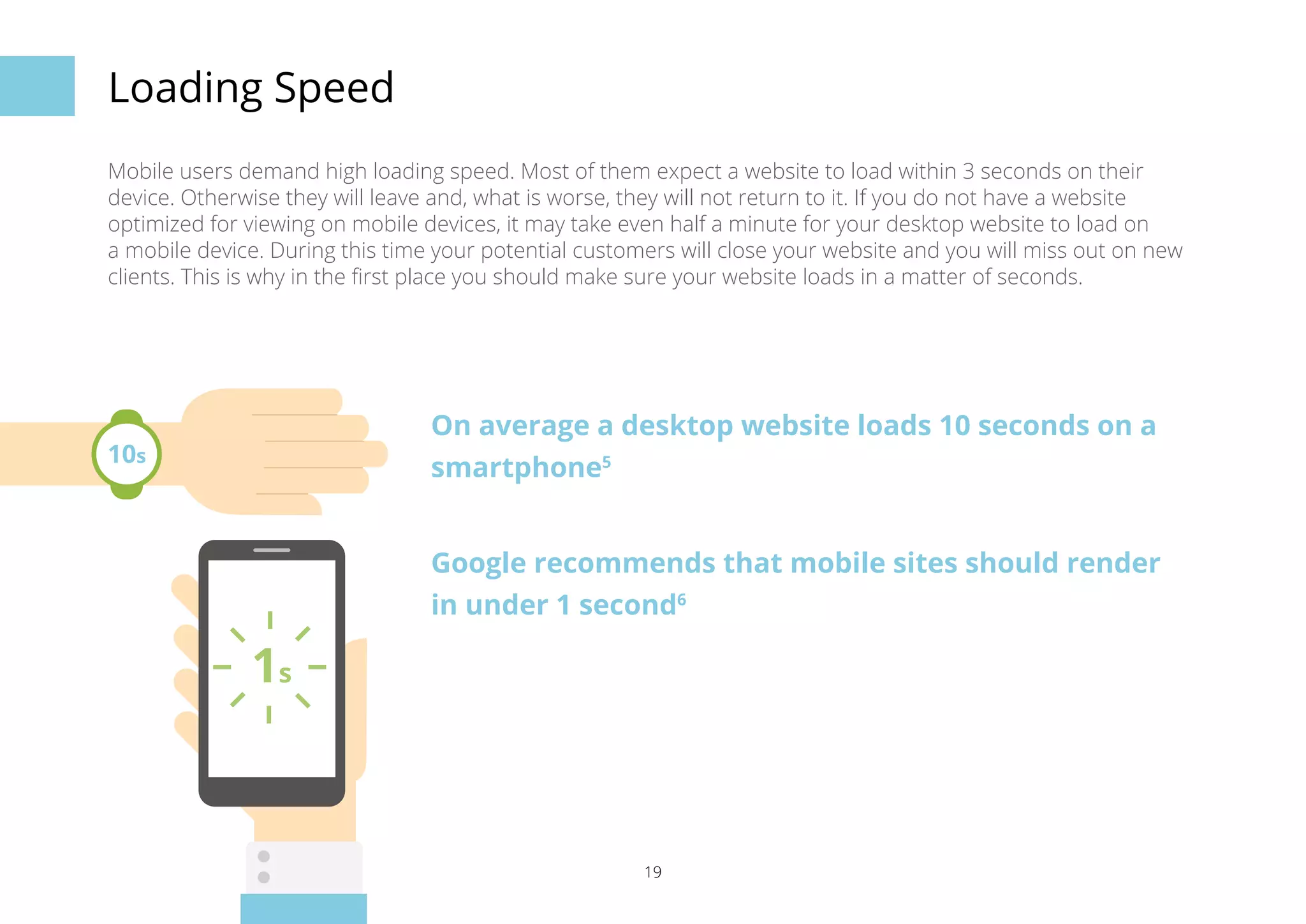
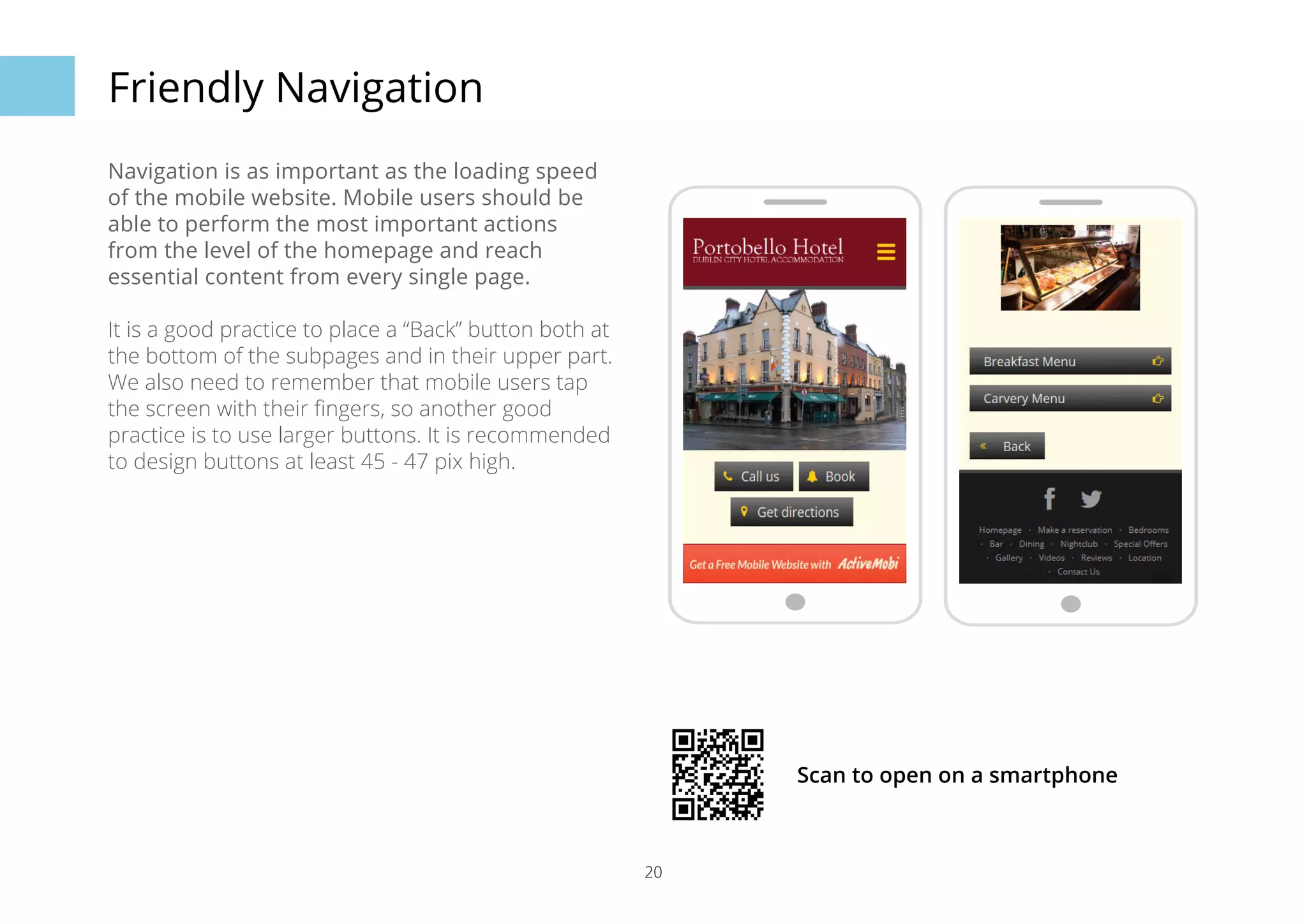
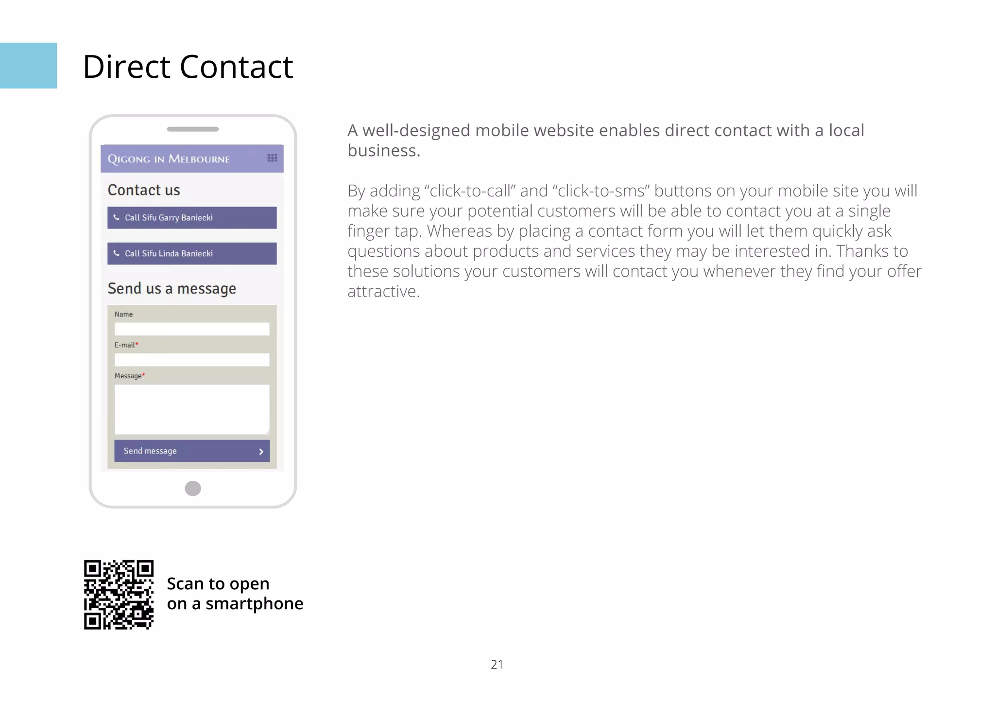
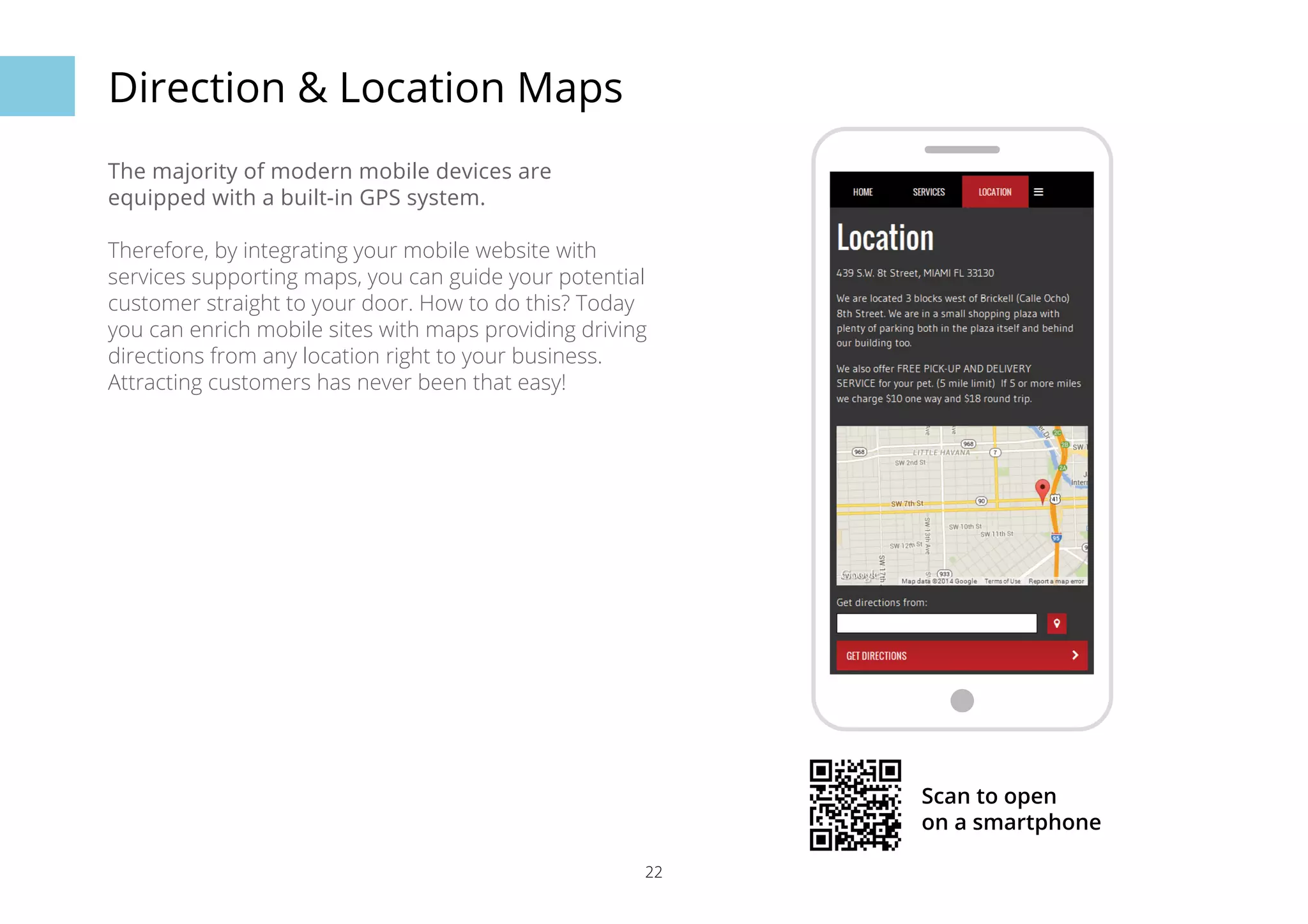

Mobile devices are increasingly used for shopping and finding local businesses. Most smartphone users search for nearby businesses and take action like contacting them. However, many businesses still have non-mobile friendly websites, missing out on these customers. A good mobile site loads quickly, has simple navigation, and provides contact info and maps. While a desktop site is fine, a separate mobile site optimised for smartphones gives customers what they need on the go.


