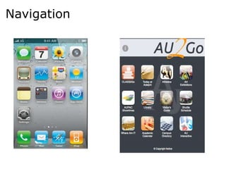
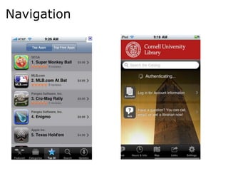
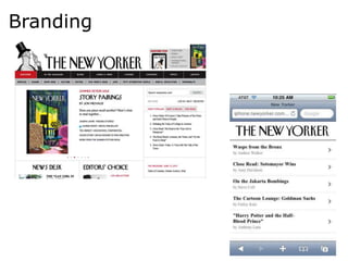
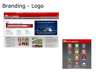
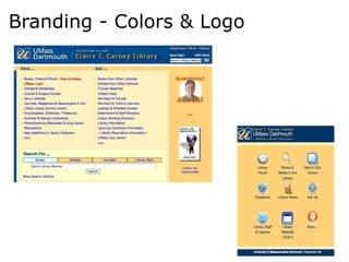
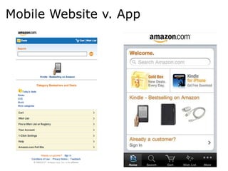
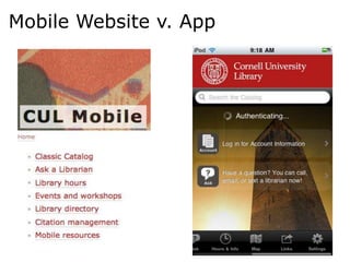
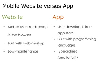
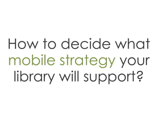
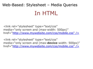
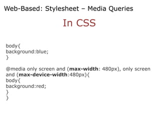
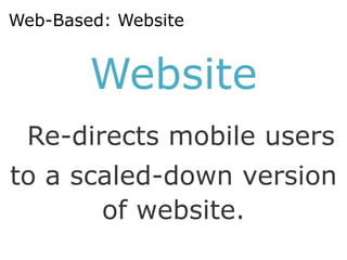
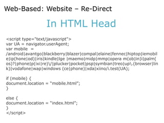
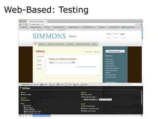
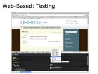
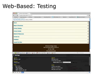
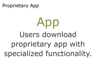
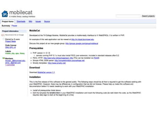
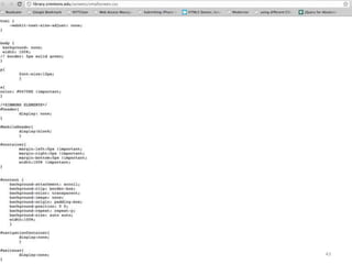
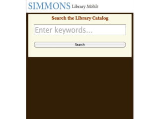
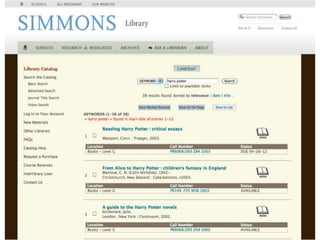
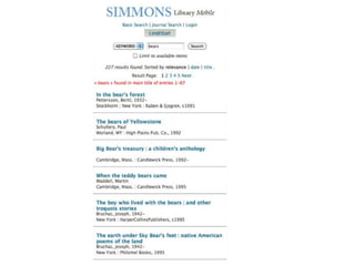
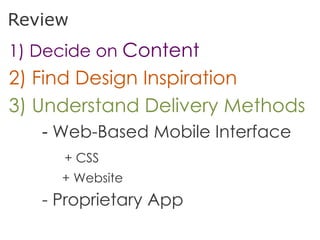
Introduction to
Building for the
 Mobile Web
Agenda
  * Content
  * Design
  * Delivery Method
   - Web-Based Mobile Interface
      + CSS
      + Website
   - Proprietary App
Libraries Need to Be Mobile
 • Mike Teets (OCLC VP), mobile services are
  “critical to the long-term existence of
  libraries and librarianship” (Hadro, 2010)
Content:
What will your mobile
   site include?
General Trends: Mobile and Libraries
 •   Contact information
 •   Opening hours
 •   Directions to the library
 •   Catalog/OPAC
 •   Library news
 •   Loan information and renewals
 •   Links to mobile enabled databases
 •   Ability to check computer availability
 •   Booking discussion/meeting rooms
 •   Links to Mobile search engines
 •   Webcams to check congestion
                                              Krishnan 2011
What is accessed via mobile devices?
Design:
What will your mobile
 interface look like?
Navigation
Navigation
Navigation
Branding
Branding - Logo
Branding - Colors & Logo
Delivery:
How will you deliver
 content to users?
Mobile Website v. App
Mobile Website
Mobile App
Mobile Website versus App

Website                      App
• Mobile users re-directed   • User downloads from
                                 app store
  in the browser
                             • Built with programming
• Built with web-markup
                                 languages
• Low-maintenance            •   Specialized
                                 functionality
How to decide what
mobile strategy your
 library will support?
Considerations


• Resources
• Needs of Community
• Web Environment
Web-Based
 Options
Web-Based


  Stylesheet
       or
 Mobile Website
Web-Based: Stylesheet


     Stylesheet
   Applies appropriate
       style rules
    for mobile users.
Web-Based: Stylesheet


     CSS3
 Media Queries
Web-Based: Stylesheet – Media Queries

                    In HTML

<link rel="stylesheet" type="text/css”
media=“only screen and (max-width: 500px)”
href=“http://www.mywebsite.com/css/mobile.css" />

<link rel="stylesheet" type="text/css”
media=“only screen and (max-device-width: 500px)”
href=“http://www.mywebsite.com/css/mobile.css" />
Web-Based: Stylesheet – Media Queries

                     In CSS

body{
background:blue;
}

@media only screen and (max-width: 480px), only screen
and (max-device-width:480px){
body{
background:red;
}
}
Web-Based: Website


        Website
 Re-directs mobile users
to a scaled-down version
       of website.
Web-Based: Website – Re-Direct

                  In HTML Head
<script type="text/javascript">
var UA = navigator.userAgent;
var mobile =
/android|avantgo|blackberry|blazer|compal|elaine|fennec|hiptop|iemobil
e|ip(hone|od)|iris|kindle|lge |maemo|midp|mmp|opera m(ob|in)i|palm(
os)?|phone|p(ixi|re)/|plucker|pocket|psp|symbian|treo|up.(browser|lin
k)|vodafone|wap|windows (ce|phone)|xda|xiino/i.test(UA);

if (mobile) {
document.location = “mobile.html”;
}

else {
document.location = “index.html”;
}
</script>
Web-Based: Testing
Web-Based: Testing
Web-Based: Testing
Proprietary App


              App
    Users download
  proprietary app with
specialized functionality.
Proprietary App


            Buy
              vs.
           Build
Proprietary App: Buy – Vendors
Proprietary App: Build – Code
Simmons College:
Making the Mobile
  Catalog Work
43
Re-Design,
    Re-Think,
        Re-Test
47
Review
1) Decide on Content
2) Find Design Inspiration
3) Understand Delivery Methods
   - Web-Based Mobile Interface
     + CSS
     + Website
   - Proprietary App

Mobile Web for Libraries