Download to read offline


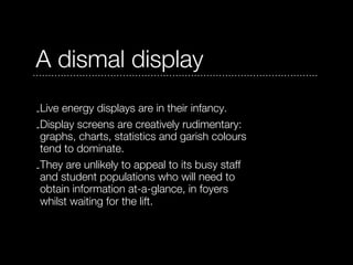
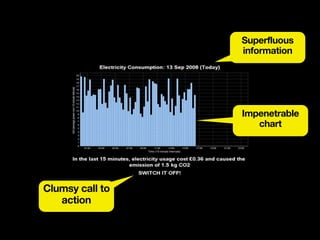
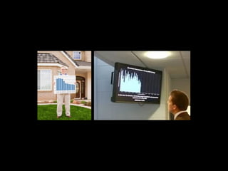
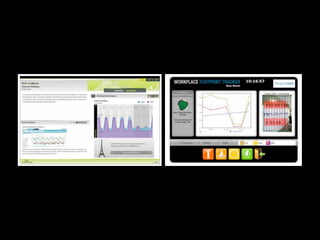
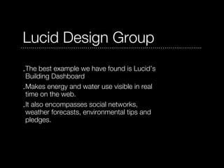
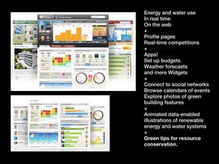


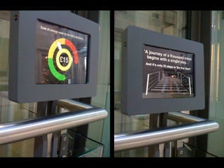
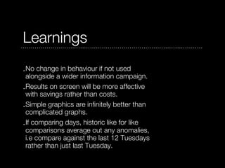

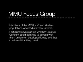
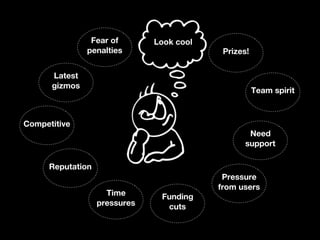
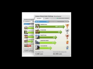


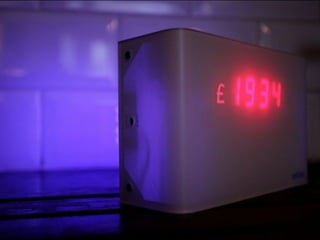
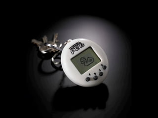
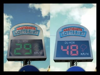


- Live energy displays are currently basic and not very engaging for users. A better example is Lucid's Building Dashboard, which displays energy/water use in real time alongside social features, apps, and tips. - A pilot at Manchester Art Gallery displayed lift energy costs to encourage stair use, but staff soon ignored it. A second pilot using happy/sad face icons to show usage changes was more successful. - Focus groups at MMU suggested potential ideas like characters, graphs, color changes, audio cues, games, and competitions could make displays more engaging if designed persuasively and emotionally connecting.


