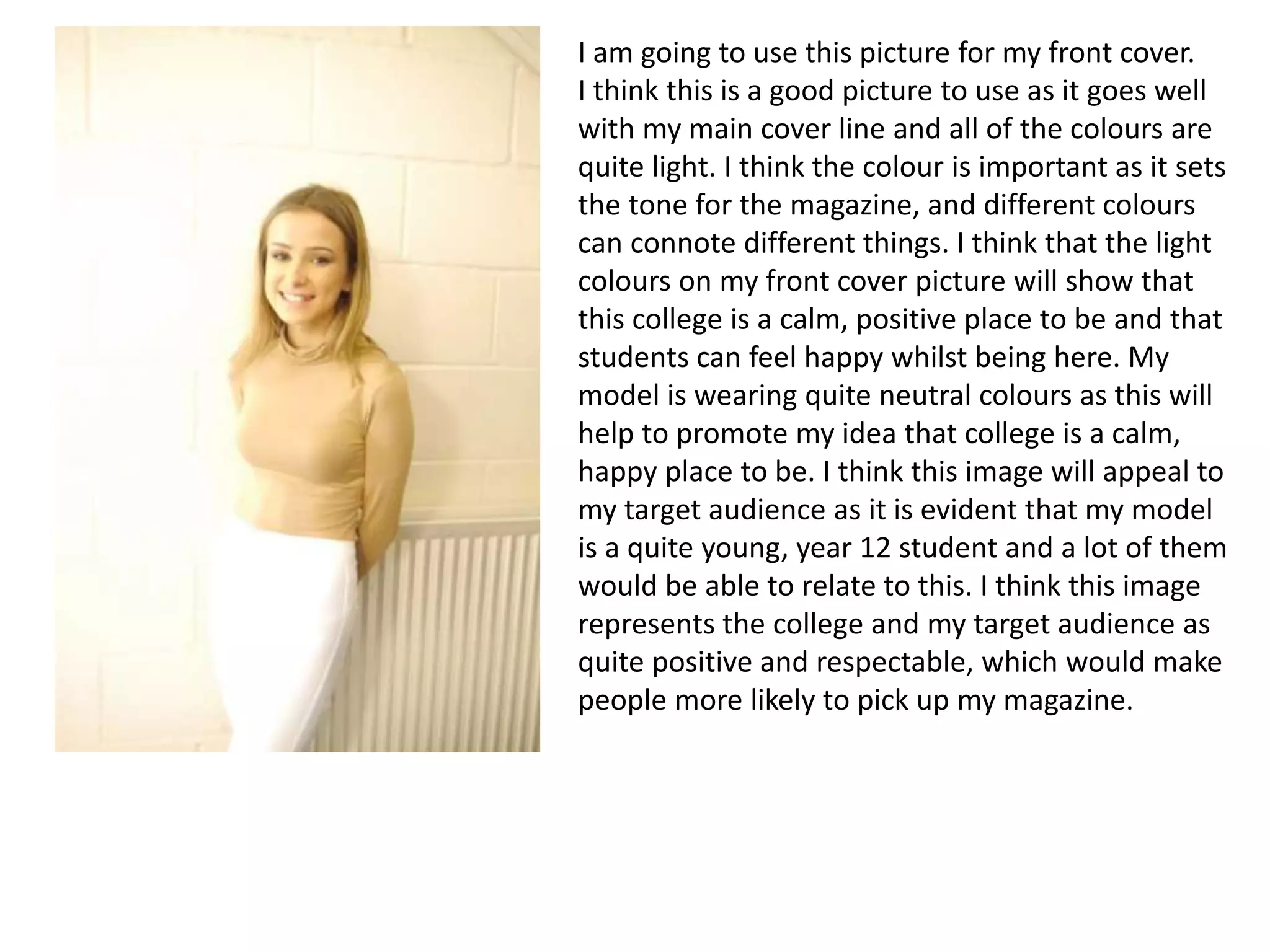
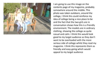
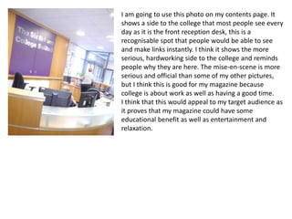
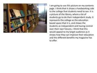
I am going to use this picture for my front cover.
I think this is a good picture to use as it goes well
with my main cover line and all of the colours are
quite light. I think the colour is important as it sets
the tone for the magazine, and different colours
can connote different things. I think that the light
colours on my front cover picture will show that
this college is a calm, positive place to be and that
students can feel happy whilst being here. My
model is wearing quite neutral colours as this will
help to promote my idea that college is a calm,
happy place to be. I think this image will appeal to
my target audience as it is evident that my model
is a quite young, year 12 student and a lot of them
would be able to relate to this. I think this image
represents the college and my target audience as
quite positive and respectable, which would make
people more likely to pick up my magazine.
I am going to use this image on the
contents page of my magazine, probably
somewhere around the middle. This
photo was taken outdoors, around the
college, I think this could reinforce my
idea of college being a nice place to be
and the fact that the two girls are in
conversation shows how this is a friendly
environment. The models are in ordinary
clothing, showing the college as quite
casual and calm. I think this would look
good to my target audience as they don’t
want to be overloaded with the more
serious side of college whilst they read my
magazine. I think this represents them as
friendly and easy-going which would
appeal to my target audience
I am going to use this photo on my contents page. It
shows a side to the college that most people see every
day as it is the front reception desk, this is a
recognisable spot that people would be able to see
and make links instantly. I think it shows the more
serious, hardworking side to the college and reminds
people why they are here. The mise-en-scene is more
serious and official than some of my other pictures,
but I think this is good for my magazine because
college is about work as well as having a good time.
I think that this would appeal to my target audience as
it proves that my magazine could have some
educational benefit as well as entertainment and
relaxation.
I am going to use this picture on my contents
page. I think that it shows a hardworking side
to the college that students need to see. It is
a picture of the library, where a lot of
students go to do their independent study. It
represents the college as the education
based space that it is, and shows the
students as independent and having control
over their own futures. I think that this
would appeal to my target audience as it
shows how they can improve their education
and the different benefits my magazine has
to offer.

Mise en-scene powerpoint

  • 1.
    I am goingto use this picture for my front cover. I think this is a good picture to use as it goes well with my main cover line and all of the colours are quite light. I think the colour is important as it sets the tone for the magazine, and different colours can connote different things. I think that the light colours on my front cover picture will show that this college is a calm, positive place to be and that students can feel happy whilst being here. My model is wearing quite neutral colours as this will help to promote my idea that college is a calm, happy place to be. I think this image will appeal to my target audience as it is evident that my model is a quite young, year 12 student and a lot of them would be able to relate to this. I think this image represents the college and my target audience as quite positive and respectable, which would make people more likely to pick up my magazine.
  • 2.
    I am goingto use this image on the contents page of my magazine, probably somewhere around the middle. This photo was taken outdoors, around the college, I think this could reinforce my idea of college being a nice place to be and the fact that the two girls are in conversation shows how this is a friendly environment. The models are in ordinary clothing, showing the college as quite casual and calm. I think this would look good to my target audience as they don’t want to be overloaded with the more serious side of college whilst they read my magazine. I think this represents them as friendly and easy-going which would appeal to my target audience
  • 3.
    I am goingto use this photo on my contents page. It shows a side to the college that most people see every day as it is the front reception desk, this is a recognisable spot that people would be able to see and make links instantly. I think it shows the more serious, hardworking side to the college and reminds people why they are here. The mise-en-scene is more serious and official than some of my other pictures, but I think this is good for my magazine because college is about work as well as having a good time. I think that this would appeal to my target audience as it proves that my magazine could have some educational benefit as well as entertainment and relaxation.
  • 4.
    I am goingto use this picture on my contents page. I think that it shows a hardworking side to the college that students need to see. It is a picture of the library, where a lot of students go to do their independent study. It represents the college as the education based space that it is, and shows the students as independent and having control over their own futures. I think that this would appeal to my target audience as it shows how they can improve their education and the different benefits my magazine has to offer.