MGrelis_CV_Sept2016_sm
•
1 like•90 views

This document is Murray Grelis' resume, which summarizes his career experience and qualifications. It outlines his employment history working at various graphic design, advertising, and art director roles over nearly 30 years. It also lists his technical skills, education, referees, and personal interests. Examples of his work are provided for branding, print design, advertising, illustration, and packaging projects.

Recommended
More Related Content
What's hot
Similar to MGrelis_CV_Sept2016_sm
Similar to MGrelis_CV_Sept2016_sm (20)
MGrelis_CV_Sept2016_sm
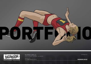
- 1. MURRAY GRELIS GRAPHIC DESIGNER ILLUSTRATOR ART DIRECTOR 0425 226 767 murray@badaboom.com.au SEPTEMBER 2016 BADABOOM.COM.AU
- 2. 2 BADABOOM.COM.AU CONTENTS 03 C.V. 04 BRANDING 07 PRINT DESIGN 11 ADVERTISING 13 ILLUSTRATION 15 LARGE FORMAT 17 PACKAGING 18 DIGITAL ONLINE 2
- 3. BADABOOM.COM.AU MURRAY GRELIS GRAPHIC DESIGNER ILLUSTRATOR ART DIRECTOR EMPLOYMENT HISTORY April 2013 – Present Badaboom Graphic Design Director As Director of my own freelance graphic design business, I handle all aspects of the design process from initial brief through design to presentation, art and print production. Work includes logos & branding, illustration, brochures, flyers, posters, advertising, signage, packaging, electronic documents and art assets for online applications. Brands include Actors Centre Australia, Spectrum Design, Accounting Evolution, AdPost, Sydney Grammar Prep. May 1991 – April 2013 Spectrum Design Creative Director / Art Director / Graphic Designer As the Creative Director I was responsible for all projects from initial concepts & presentation through to design, finished art and final print production. Finished art was handled by myself and other designers under my supervision. Work was mostly for print although there were also many online projects. Brands include Daiwa Australia, Disney Channel, Brita Water Filters, Disney Parks & Resorts, Wonderland, Travel Alberta. 1990 – 1991 Adcel Advertising Art Director Working as part of a creative team of designers and writers; I was responsible for the development of design concepts, presentation mock-ups, finished art and Illustration. Brands included Jewel Supermarkets, Formica, CSR. 1989-1990 Yared Perry Dimension Advertising Finished Artist Mock-Ups, Finished Art and Bromide Camera Operation (remember those?). Brands included Wella, Valvoline. 1987-1989 Foremost Typesetters (now One Creative) Graphic Designer / Finished Artist The page layout and production of various magazines and newspapers and the advertising within. Duties included Design, Finished Art, Bromide Camera Operation, early Mac desktop publishing programmes such as Quark Xpress v.1 and Adobe Illustrator 88. Brands included St. Ives Village News, Contact Magazine. TECHNICAL SKILLS (MACINTOSH) Indesign – Advanced PhotoShop – Advanced Adobe Illustrator – Advanced Quark Xpress – Advanced WordPress – Intermediate Word – Intermediate PowerPoint – Intermediate EDUCATION & TRAINING Graphic Design – KVB School of Visual Com. 1988 Associate Diploma Fine Art – Seaforth TAFE 1986-87 Majoring in Drawing and Painting HSC (Maj Art) – St Augustines 1985 REFEREES Tony Gamble Managing Director – Spectrum Design 0412 198 904 Denis Ledwidge Account Manager – AdPost Group 0412 654 378 Allan Rendell Business Manager – Actors Centre Australia 0477 640 552 HOBBIES Cartooning Painting Theatre, Acting Set Design, Scenic Art & Prop Making Gaming & Game Design 0425 226 767 murray@badaboom.com.au 1/16 McLennan Ave Randwick NSW 2031 au.linkedin.com/in/mgrelis So it all started at art school... I was doing the whole painting, drawing thing – design too, of course. It seems I do better following a brief than working a blank canvas so my teacher reccommends graphic design over a career in fine art. I like to eat regularly so I followed the advice. Next thing I’m working in a studio and studying design part-time. I’m lucky to find a variety of workplaces from the rapid fire efficiency of publishing to the big budget quality of advertising. This breadth of experience helps create a blend of quality and efficiency giving my clients maximum bang for their buck. After decades as a studio employee, with many happy colleagues and satisfied clients, I started my own business as a freelance designer. The aim - greater control over schedules and artistic direction. So far so good.
- 5. ACCOUNTING EVOLUTION The client wanted a set of 3 logos to represent the different divisions of their business. Their tagline is “Traditional Values, Progressive Ideas”. I wanted to express this idea somehow in the logo, however the modern, hi-tech nature of their business was the primary focus. I looked for a clean modern font with a difference possibly with a serif as a nod to the traditional. When I found the Ainslie font I knew I was on a winner. The colours were inspired by Gold, Silver and the American Dollar, however that was just a point of departure, the focus was finding a unique combination that worked well together. The 3 stripes when rotated one way become an ‘E’ for ‘Evolution’, rotated the other way they become a bar graph representing growth. BADABOOM.COM.AU5
- 6. ACTORS CENTRE AUSTRALIA The client had a logo they’d been using for some years but it was a constant source of difficulty. The text became illegible at small sizes, it’s shape made many formats difficult, and there had been very little consistency in it’s use with various designers solving it’s problems in different ways. I was asked to tidy it up and to develop a style guide for future use. It quickly became apparent that the logo needed a complete overhaul with only the red colour and ‘energy’ lines remaining as a link to the past. The overall shape was simplified, the font was changed to a modern, legible and minimalist font. I created landscape, portrait and reversed versions of the logo to allow for greater flexibility. BADABOOM.COM.AU6
- 7. DAIWA 2016 PRODUCT GUIDE This 148 page A4 brochure showcases the fishing products of Daiwa Australia. It was essential to present the product in an attractive way whilst following the strict style guide set down by head office in Tokyo. The challenge was doing this in a way that differentiated it from previous years. The layout had to be flexible enough to present the various types of fishing product in the Daiwa range. I designed and created the finished art for the entire catalogue. BADABOOM.COM.AU7
- 9. ACTORS CENTRE YOUTH BROCHURE As part of the development of the ACA brand I designed a series of brochures and other documents. This 6 page DL introduces a new series of courses for kids. I also made a version of this brochure as an emailable digital file. BADABOOM.COM.AU9
- 10. EXCEL HSC STUDY GUIDES There are 14 study guides in this series, each representing a different HSC English text. The challenge was to devise a layout that could link the series together whilst also representing the spirit of each text. It also had to sit within the existing Excel branding. I was also contracted to create templates for all of the inside page styles. BADABOOM.COM.AU10
- 11. DISNEY CHANNEL FINDING NEMO AD This print advertisement ran in the cable TV programme guides such as Foxtel and Optus. I had to combine the Finding Nemo and Disney Channel brands in a complimentary way. I also created a Finding Nemo variant of the Disney Channel logo, such brand tinkering was rarely allowed. BADABOOM.COM.AU11
- 12. DAIWA INTERLINE FOLD-OUT ADVERT This ad appeared in various fishing magazines across Australia. The fold-out version was positioned on the inside front cover of Fishing World. The challenge was to present the product in an attractive way whilst also including the detailed text and specifications. When closed the left hand flap displayed the obscured hero image but without the specifications. There were matching double page and single page versions of the ad designed for other fishing publications also. BADABOOM.COM.AU12
- 13. THE BALD ARCHYS LET THEM EAT CAKE This satirical portrait of Joe Hockey was a finalist in the 2015 Bald Archy exhibition. It was inspired by Mr Hockey’s unfortunate gaffs concerning the poor whilst he was Treasurer. Acrylic on canvas, 36”x48”. ST. GOODSY AND THE BOOGAN This portrait of Adam Goodes was inspired by the booing he received from some AFL supporters and the trial by social media that went with it. I was appalled by the act and also bemused by the way people were polarized on social media - either demonizing or beatifying their targets. This painting is a finalist in the 2016 Bald Archys. Acrylic on canvas, 60”x30”. BADABOOM.COM.AU13
- 14. VIRTUALLY BELLE The client requested an illustration of a Personal Assistant, in a 40’s pin-up style but with a modern, confident and professional air. The challenge was to combine these seemingly contradictory concepts. Belle was used on business cards, the website and other marketing material. I also designed the logo and the business cards. BADABOOM.COM.AU14
- 15. MACH 5 CAR WRAP Fitting all the branding elements, tag lines, URLs and messages around the lights, joins and other automotive paraphenalia was a challenge on this project. The QR code was not my idea! BADABOOM.COM.AU15
- 16. LARGE FORMAT CAMPAIGNS I have worked on many campaigns for Disney Channel (and other clients) putting promotional messages on variety of objects and surfaces. Busbacks and sides, posters and billborads, hanging signs of various sizes in shopping centres and malls. Pull-up banners, floor signs, chair backs, elevator doors and even escalators. Many of these campaigns had a large number of odd shaped items rolling out to several different signage & promotional suppliers - this required a lot of logistical planning and attention to detail. BADABOOM.COM.AU16
- 17. DAIWA PACKAGING The Daiwa Sealine range covers about a dozen different weights of fishing line. The client required a simple, flexible design which could be used for all of these weights and be inexpensive to reprint. This design is in in 4 colours, cyan, warm red, black and opaque white on a silver foil stock. Only the black plate differs between weights. The challenge of the TD Sensor was to design packaging that would suit a large range of fishing line products. The box had to represent the product’s distinctive orange colour, allow for a window to display the product and be easily adaptable to suit the wide variety of fishing line weights within the product line. This was achieved by putting all weight and barcode details on a sticker which was applied to the outside of the box. The box design incorporates the sticker making it an integral part of the overall look. A matching sticker was also applied to the spool (not pictured). BADABOOM.COM.AU17
- 18. WEBSITES I have worked on many web sites, both constructing them myself or collaborating with web developers. I have coded directly in HTML and have also used WordPress. The Shottobits site was constructed almost entirely by me in Wordpress. The Daiwa site was designed by me but built by a web developer. I have also created web banners, EDMs and other online graphics for social media and the like. BADABOOM.COM.AU18
- 19. ELECTRONIC DIRECT MAIL The client, a reinsurance agent, regularly hosts events for clients, staff and potential business partners. They wanted to inject some life and excitement into their established but rather staid branding. These EDM invitations follow the brand guidelines whilst adding movement, energy and colour. BADABOOM.COM.AU19
- 20. MURRAY GRELIS GRAPHIC DESIGNER ILLUSTRATOR ART DIRECTOR 0425 226 767 murray@badaboom.com.au SEPTEMBER 2016 BADABOOM.COM.AU