Media evaluation
•Download as ODP, PDF•
0 likes•206 views

The document discusses the design choices made for magazine covers and content pages. For the covers, a two-color scheme and column layout was used to give it a professional look. Medium close-up photos were chosen. For the content pages, a column layout was also used for ease of navigation. The color scheme and fonts were modified to match the magazine's house style. Photographs of different genres of rock music were chosen to showcase its variety.

Recommended
More Related Content
What's hot
What's hot (18)
Viewers also liked
Viewers also liked (19)
Similar to Media evaluation
Similar to Media evaluation (20)
More from Andrew Clements
Media evaluation
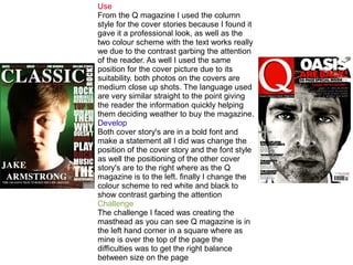
- 1. Use From the Q magazine I used the column style for the cover stories because I found it gave it a professional look, as well as the two colour scheme with the text works really we due to the contrast garbing the attention of the reader. As well I used the same position for the cover picture due to its suitability. both photos on the covers are medium close up shots. The language used are very similar straight to the point giving the reader the information quickly helping them deciding weather to buy the magazine. Develop Both cover story's are in a bold font and make a statement all I did was change the position of the cover story and the font style as well the positioning of the other cover story's are to the right where as the Q magazine is to the left. finally I change the colour scheme to red white and black to show contrast garbing the attention Challenge The challenge I faced was creating the masthead as you can see Q magazine is in the left hand corner in a square where as mine is over the top of the page the difficulties was to get the right balance between size on the page
- 2. Use I used the general layout of the magazine content page due to the professional look and the ease on navigation they both use a column style layout. Develop I changed the colour scheme used to match the house style of my magazine as well as the text font and size to a smaller font to allow for all text to fit in. Q magazine has their masthead in the box at the top of the page where I placed it just on top for a larger font to tell which page they are on. Challenge The photographs I used are different from the other magazine I wanted to show the different sub-genres that rock provides from the concerts and festivals to the Indi rockers like the one at the bottom of the page I also change the camera positions to a very long shot and a worm angle.
- 3. Use Both magazines split there double page into one of text and one for a picture I find it looks very professional and easy to read compared when the text is overlay the image as well as that both us a columns for the text to fit the page. Both magazines used an interview for the double page spread I find it will appeal to more of the target audience because its the artist answering the questions. Develop I chose to make the opening statement to be larger font size and to use capitals to give the impression its very import article, initially the image I chosen was full colour but I decided to use black and white to reflect the models mood this goes with the facial expressions as well pink is laughing and has a bright background suggesting a fun article where as he looks a little annoyed and the black and white adds to the mood. Challenge The font used are slightly different and a little smaller on my page this is because of the amount of writing and the larger opening statement as well my artist name is larger that the Q magazine suggesting its a more serious article and the mood he’s in. I decided to use a medium close up due to the clothing he's wearing and his body language,i chose to show his clothing due to his style of clothing are fashionable now so the reader could take inspiration from him.