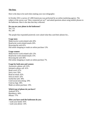
MATH-220 Statistics 
Dr Dave Powell – Intercollege, Larnaca 
dave@davepowell.org 
Project: Statistical Representation – Infographics 
Hand-Out: December 19th 2012 
Hand-In: January 9th 2013 
Introduction 
• Your assignment is to make an infographic from the provided statistical data. 
• You will present your infographic to the rest of the class on January 9th 2013 
• Your presentation will last for 5 minutes 
• You will be marked for this assignment as follows: 
◦ 50% for the quality of your infographic 
◦ 50% for the quality of your presentation 
Please read all of this handout very carefully. It contains all of the information you need to be 
successful in your assignment. 
Infographics 
Information graphics or infographics are graphic visual representations of information, data or 
knowledge. These graphics present complex information quickly and clearly, such as in signs, maps, 
journalism, technical writing, and education. With an information graphic, computer scientists, 
mathematicians, and statisticians develop and communicate concepts using a single symbol to process 
information. 
Infographics is a term for illustrations and charts that instruct people, which otherwise would be 
difficult or impossible with only text. Infographics are used worldwide in every discipline from road 
maps and street signs to the many technical drawings. 
Infographics are an easy-to-read illustration that helps tell a story and makes data points easier to 
understand. And it doesn’t hurt when infographics are not only clear and straightforward but also 
beautiful and engaging. The aesthetic design draws the viewer in; the information helps the viewer 
analyze and understand the data being presented. 
Examples of Infographics 
It would be ironic to try and explain infographics using only words. There are some examples of 
infographics included with this assignment, however they are too large to fit onto a single page. They 
are included on the website for download. 
On the next page there is an infographic that is attempting to answer the question: “What is an 
infographic?”. As you can see, it is a method of presenting information visually.
Figure 1: What is an Infographic? (Source: hotbutterstudio.com)
Critique of Example Infographics 
Included in the project documentation are three example infographics: 
Example-Infographic-1: 
The first example infographic shows data taken from a survey about gun ownership and safety in the 
USA. The survey data is presented using the statistical representations that we have learned about 
during our classes – e.g. pie charts, line graphs and Pareto charts. However, the author has used 
pictures, colours and fonts to great effect to get the message across to the reader in a very efficient and 
pleasant way. 
The first pie charts show how many guns people have in their houses in the USA. The colours have 
been chosen for high contrast, and the data in the charts is supported by the words “Yes” and “No” on 
the graphic. The numerical percentages are written next to the pie slices too, to enhance the 
understanding of the reader. 
The second line of charts uses pictures in the middle of the graphs to show the ideas “protection”, 
“target shooting”, “hunting”, etc. The pictures add to the immediate understanding of what the data 
means and helps the reader to gain context very quickly. 
The third segment of the infographic is a line graph. But, instead of making a simple 'Excel' style line 
graph, the author has used pictures of guns and bullets to show the length of the lines which represent 
the data. This is very visually appealing and adds to the theme that has been developed in the graphic. 
Example-Infographic-2: 
The second example infographic is a visual representation of some research data, not a survey. 
Although the author of this graphic has used appealing colours and a comfortable theme, the choice of 
fonts in this graphic makes it difficult to read in places. The author has included a 'standard' time-series 
line graph showing the number of online courses that are being offered in the world per year. This 
graph uses numbers that are too small to read comfortably and the line is too thin to see properly. 
The second time-series chart has labels 2008, 2011 and 2012 – this seems confusing because the time 
line is not linear. Also, the choice of font size and style in the red boxes on the time line are not very 
easy to read. 
Finally, the thing that this author has done very well is to include the sources of the research at the 
bottom. All of the data can be verified and found independently. 
Example-Infographic-3: 
The third example infographic is about champagne and fizzy wine. There are a lot of pictures and not 
much raw numerical data. It is very easy to look at, and has some humour – for example the picture of 
the “extra brut” half way down. The fonts and colours have been chosen to be easy to read and 
understand. But, this infographic feels a bit confused because some of the pictures and the data cross 
over each other in the middle of the page – e.g. the champagne cork. 
This author has used different background colours and boxes to separate the data sections from each 
other. This is clever because it guides the readers eye very well and helps to associate some pieces of 
data with others.
The Data 
Here is the data to be used when making your own infographic: 
In October 2011 a survey of 1,000 Americans was performed by an online marketing agency. The 
subject of the survey was "How connected are we?" and asked questions about using mobile phones in 
the bathroom. Here is the data that they collected: 
Do you use your phone in the bathroom? 
Yes: 751 
No: 249 
The people that responded positively were asked what they used their phones for... 
Usage men: 
Make/receive work-related calls 20% 
Read/write work-related emails 26% 
Browsing the web 41% 
Did online shopping or made an online purchase 13% 
Usage women: 
Make/receive work-related calls 13% 
Read/write work-related emails 15% 
Browsing the web 36% 
Did online shopping or made an online purchase 7% 
Usage for both men and women: 
Answered a phone call: 63% 
Initiated a phone call: 41% 
Read a text: 67% 
Sent a text: 59% 
Read an email: 42% 
Sent an email: 32% 
Surfed the web: 38% 
Used social networking: 29% 
Used an App: 38% 
Made an online purchase: 10% 
Which type of phone do you have? 
Android: 87% 
Blackberry: 84% 
iPhone: 77% 
After you have used the bathroom do you: 
- wash your hands: 92% 
- wash your phone: 14%
The Assignment 
Make an infographic that will visually explain the data above. You can use any graphics tools or 
presentation software that you think is appropriate. 
Here are some tools, ideas and web links that you may find useful: 
Infographics Sites and Background Reading: 
http://www.graphicnews.com/ - The news in infographics 
http://www.infographicsarchive.com/ - Archive of infographics, many from before computerized data 
http://www.coolinfographics.com/ - A blog about infographics 
http://dailyinfographic.com/ - A new infographic every day 
Free Online Infographics Tools: 
http://www.visual.ly/create – infographics and social networking, good tools and good archive 
http://app.piktochart.com – very useful online tool 
http://infogr.am – data representation and social networking 
Free Online Charting Tools: 
http://charts.hohli.com 
http://extra.amcharts.com/editor/ 
https://developers.google.com/chart/ 
Graphics etc.: 
http://www.wordle.net/ - for making word clouds 
http://www.iconarchive.com/ - free icons and pictures 
http://images.google.com/ - Google image search 
http://www.fontsquirrel.com/ - free fonts 
http://www.colourlovers.com/ - free colour palettes and patterns 
The Presentation 
Once you have made your infographic, you need to plan what you will talk about for 5 minutes during 
the class presentation. 
The presentation will be informal and it is up to you to choose how you will present your data to the 
rest of the class. You may choose from: 
• bring your own laptop and plug it into the projector in the classroom 
• bring a USB with the graphic on it (Powerpoint, PDF, jpeg, etc.) 
• bring enough printed copies for the rest of the class to see your work as you talk about it (10 
copies) 
• any other suitable method
Finally... 
This assignment is for some of the students that have joined the course later to make up extra marks. It 
is optional, but it will be worth an additional 20%. 
It is not possible to score more than 100% in the statistics course, so if you do this extra assignment, 
and your total mark for the course adds up to more than 100%, then it will be submitted to 
administration as 100% even though you have done additional work. 
The assignment is to make a visually appealing graphic, and then come to the class and present it to the 
others. You will be marked on HOW WELL YOU DELIVER THE INFORMATION, not on your skills 
as an artist. 
If you can find a visually appealing way to get the reader to understand the data shown above in about 
one minute without any misunderstandings, then you have succeeded in making a great infographic. 
If you have any problems or questions, then email me – do not wait for the first week of term. 
Email: dave@davepowell.org 
Best of luck, 
Dave

Math220 project-infographics

  • 1.
    MATH-220 Statistics DrDave Powell – Intercollege, Larnaca dave@davepowell.org Project: Statistical Representation – Infographics Hand-Out: December 19th 2012 Hand-In: January 9th 2013 Introduction • Your assignment is to make an infographic from the provided statistical data. • You will present your infographic to the rest of the class on January 9th 2013 • Your presentation will last for 5 minutes • You will be marked for this assignment as follows: ◦ 50% for the quality of your infographic ◦ 50% for the quality of your presentation Please read all of this handout very carefully. It contains all of the information you need to be successful in your assignment. Infographics Information graphics or infographics are graphic visual representations of information, data or knowledge. These graphics present complex information quickly and clearly, such as in signs, maps, journalism, technical writing, and education. With an information graphic, computer scientists, mathematicians, and statisticians develop and communicate concepts using a single symbol to process information. Infographics is a term for illustrations and charts that instruct people, which otherwise would be difficult or impossible with only text. Infographics are used worldwide in every discipline from road maps and street signs to the many technical drawings. Infographics are an easy-to-read illustration that helps tell a story and makes data points easier to understand. And it doesn’t hurt when infographics are not only clear and straightforward but also beautiful and engaging. The aesthetic design draws the viewer in; the information helps the viewer analyze and understand the data being presented. Examples of Infographics It would be ironic to try and explain infographics using only words. There are some examples of infographics included with this assignment, however they are too large to fit onto a single page. They are included on the website for download. On the next page there is an infographic that is attempting to answer the question: “What is an infographic?”. As you can see, it is a method of presenting information visually.
  • 2.
    Figure 1: Whatis an Infographic? (Source: hotbutterstudio.com)
  • 3.
    Critique of ExampleInfographics Included in the project documentation are three example infographics: Example-Infographic-1: The first example infographic shows data taken from a survey about gun ownership and safety in the USA. The survey data is presented using the statistical representations that we have learned about during our classes – e.g. pie charts, line graphs and Pareto charts. However, the author has used pictures, colours and fonts to great effect to get the message across to the reader in a very efficient and pleasant way. The first pie charts show how many guns people have in their houses in the USA. The colours have been chosen for high contrast, and the data in the charts is supported by the words “Yes” and “No” on the graphic. The numerical percentages are written next to the pie slices too, to enhance the understanding of the reader. The second line of charts uses pictures in the middle of the graphs to show the ideas “protection”, “target shooting”, “hunting”, etc. The pictures add to the immediate understanding of what the data means and helps the reader to gain context very quickly. The third segment of the infographic is a line graph. But, instead of making a simple 'Excel' style line graph, the author has used pictures of guns and bullets to show the length of the lines which represent the data. This is very visually appealing and adds to the theme that has been developed in the graphic. Example-Infographic-2: The second example infographic is a visual representation of some research data, not a survey. Although the author of this graphic has used appealing colours and a comfortable theme, the choice of fonts in this graphic makes it difficult to read in places. The author has included a 'standard' time-series line graph showing the number of online courses that are being offered in the world per year. This graph uses numbers that are too small to read comfortably and the line is too thin to see properly. The second time-series chart has labels 2008, 2011 and 2012 – this seems confusing because the time line is not linear. Also, the choice of font size and style in the red boxes on the time line are not very easy to read. Finally, the thing that this author has done very well is to include the sources of the research at the bottom. All of the data can be verified and found independently. Example-Infographic-3: The third example infographic is about champagne and fizzy wine. There are a lot of pictures and not much raw numerical data. It is very easy to look at, and has some humour – for example the picture of the “extra brut” half way down. The fonts and colours have been chosen to be easy to read and understand. But, this infographic feels a bit confused because some of the pictures and the data cross over each other in the middle of the page – e.g. the champagne cork. This author has used different background colours and boxes to separate the data sections from each other. This is clever because it guides the readers eye very well and helps to associate some pieces of data with others.
  • 4.
    The Data Hereis the data to be used when making your own infographic: In October 2011 a survey of 1,000 Americans was performed by an online marketing agency. The subject of the survey was "How connected are we?" and asked questions about using mobile phones in the bathroom. Here is the data that they collected: Do you use your phone in the bathroom? Yes: 751 No: 249 The people that responded positively were asked what they used their phones for... Usage men: Make/receive work-related calls 20% Read/write work-related emails 26% Browsing the web 41% Did online shopping or made an online purchase 13% Usage women: Make/receive work-related calls 13% Read/write work-related emails 15% Browsing the web 36% Did online shopping or made an online purchase 7% Usage for both men and women: Answered a phone call: 63% Initiated a phone call: 41% Read a text: 67% Sent a text: 59% Read an email: 42% Sent an email: 32% Surfed the web: 38% Used social networking: 29% Used an App: 38% Made an online purchase: 10% Which type of phone do you have? Android: 87% Blackberry: 84% iPhone: 77% After you have used the bathroom do you: - wash your hands: 92% - wash your phone: 14%
  • 5.
    The Assignment Makean infographic that will visually explain the data above. You can use any graphics tools or presentation software that you think is appropriate. Here are some tools, ideas and web links that you may find useful: Infographics Sites and Background Reading: http://www.graphicnews.com/ - The news in infographics http://www.infographicsarchive.com/ - Archive of infographics, many from before computerized data http://www.coolinfographics.com/ - A blog about infographics http://dailyinfographic.com/ - A new infographic every day Free Online Infographics Tools: http://www.visual.ly/create – infographics and social networking, good tools and good archive http://app.piktochart.com – very useful online tool http://infogr.am – data representation and social networking Free Online Charting Tools: http://charts.hohli.com http://extra.amcharts.com/editor/ https://developers.google.com/chart/ Graphics etc.: http://www.wordle.net/ - for making word clouds http://www.iconarchive.com/ - free icons and pictures http://images.google.com/ - Google image search http://www.fontsquirrel.com/ - free fonts http://www.colourlovers.com/ - free colour palettes and patterns The Presentation Once you have made your infographic, you need to plan what you will talk about for 5 minutes during the class presentation. The presentation will be informal and it is up to you to choose how you will present your data to the rest of the class. You may choose from: • bring your own laptop and plug it into the projector in the classroom • bring a USB with the graphic on it (Powerpoint, PDF, jpeg, etc.) • bring enough printed copies for the rest of the class to see your work as you talk about it (10 copies) • any other suitable method
  • 6.
    Finally... This assignmentis for some of the students that have joined the course later to make up extra marks. It is optional, but it will be worth an additional 20%. It is not possible to score more than 100% in the statistics course, so if you do this extra assignment, and your total mark for the course adds up to more than 100%, then it will be submitted to administration as 100% even though you have done additional work. The assignment is to make a visually appealing graphic, and then come to the class and present it to the others. You will be marked on HOW WELL YOU DELIVER THE INFORMATION, not on your skills as an artist. If you can find a visually appealing way to get the reader to understand the data shown above in about one minute without any misunderstandings, then you have succeeded in making a great infographic. If you have any problems or questions, then email me – do not wait for the first week of term. Email: dave@davepowell.org Best of luck, Dave