Mastheads i have chosen
•Download as DOCX, PDF•
0 likes•168 views
The document discusses the design choices for a magazine masthead. The author chose the word "voice" for the masthead to represent artists expressing opinions through music. A black and white design was selected to appeal to both male and female readers. The contrasting colors and bold font are intended to attract attention and persuade audiences to look at the masthead. The masthead will stretch across the entire top of the page to make it a prominent focal point, differing from the approach of the reference magazine Q.
Report
Share
Report
Share
Recommended
CAN PERFORMING ARTS BE A GOOD CAREER OPTION?
The document discusses various types of performing arts careers, including performers, artists, musical theater artists, drama therapists, music therapists, movement therapists, theater directors, scriptwriters, expression directors, broadcast moderators, performing arts instructors, and careers in higher education teaching. It provides brief descriptions of the roles and responsibilities for each type of performing arts career and notes that these careers allow using performing arts passions to help others and require creativity, talent, practice, and in some cases further education.
Final plan LO3
The document outlines the final plan for a poster and billboard to help raise awareness for a charity called SASH that helps stop youth homelessness. It describes the color scheme, fonts, images, layout, copy, and products that will be used for the poster and billboard, which include using green and white colors, a quirky font, composite images of sad and happy faces, simple layouts, impactful statements and questions as the copy, and distributing posters in public areas while using billboards on roads for maximum visibility.
Power Point
This lesson teaches 9th-12th grade students about modern technology. Students will research causes of global warming using computers and present solutions in a presentation. They will also use simulations on blood types and determine possible offspring genotypes and phenotypes from parent genotypes. Students will take pictures using devices to document environmental impacts of littering and make a slideshow presenting solutions. They will research recycling using various sources and write a paper with pictures, citations, and a reference list using APA format.
The effects of modern technology
Modern technology has negatively impacted people's lives in several ways. It has made kids more socially isolated as they interact online rather than in person. They have also become addicted to devices and music players, which causes distractions in school and makes kids more impatient. Additionally, overuse of computers and phones has led kids to socialize less face to face and be lazier as they prefer staying inside rather than being active. While technology enables connectivity, it can easily be misused and has serious unintended consequences, especially among youth.
Effects of Technological Device to Students
This document discusses a study on the effects of technological devices on the learning performance of information technology students. It begins with an introduction describing the increasing role of technological devices like cellphones, laptops, and computers in students' lives. It then discusses the statement of the problem, which aims to determine the negative and positive effects of technological devices on IT student performance. The document also presents the study's scope, limitations, theoretical framework based on cognitive learning theory, and reviews related literature both from foreign and local sources on the role of technology in education.
Brainstorming of ideas & Audience research
The document outlines the planning process for designing a new music magazine, including brainstorming ideas for the colour scheme, layout, title, fonts, and cover artist. It discusses potential options for each element, including different title designs. It then shows the results of a questionnaire given to the target audience to gather their preferences. Based on the feedback, the designer chose a colour scheme of black, orange, and green; the title "Fixx"; and a cover artist. The summary provides an overview of the key decisions made in planning the new magazine's design.
How did you attract
The author addressed their target audience of 14-19 year old girls and boys for their music magazine in several ways. They chose an informal font that would appeal to teenagers and used bold colors like black, white, yellow, and red throughout the design. For the cover photo, they showed a band dressed casually yet seriously to appeal to both female interest in fashion and male interest in music. The language in the magazine was informal without being childish to respect the teenage audience.
How did you attract
The document discusses how the author designed a magazine to appeal to their target audience of 14-19 year old boys and girls. They used an informal font that stood out and wasn't too masculine or feminine. They chose a black background with yellow and white text for contrast that appealed to both genders. Images and language were casual but not childish to engage teenagers without patronizing them. The cover photo showed a band dressed casually and seriously to attract both female and male readers.
Pitch plan for magazine
Cameron Loftus created a pitch plan for a proposed dance music magazine. The plan included possible names like "Dance Mag" and "Dance Nation", with a working title of "DanceMag". It outlined the magazine's style as bright and colorful to represent the genre, and featured mockups of potential front covers. The magazine would focus on genres like deep house and future house, and include articles, interviews, charts and free posters. Its target audience is ages 18-30 interested in dance music.
Media last
My media product challenges conventions of music magazines by targeting women. While most music magazines have a predominantly male readership, I saw an opportunity to fill the gap by appealing to women through design choices like using a female artist on the cover and a burgundy color scheme. I also challenge magazines like Rolling Stone that use more masculine fonts and colors by making my magazine appealing to both genders.
Evaluation Question 5
The document discusses how the author addressed their audience when constructing a magazine. They used Blumler and Katz's Uses and Gratifications media theory to understand that people choose media and messages that benefit themselves. To appeal to different readers, the author included subliminal messages and used a gender-neutral color scheme. For the cover, they featured an attractive 18-year-old female model in order to appeal to their target audience. They also used a combination of pastel and dark colors to appeal to both sides of indie music. Feedback showed that readers liked the color scheme and link between the purple lips and masthead, and the author updated the cover lines to make them more legible against the busy background image.
My Masthead
The document discusses the design of a magazine masthead. It describes using two different fonts to appeal to both male and female audiences. One font is described as masculine with sharp edges, while the other has a softer, more feminine style. Color choices and layout are also discussed in the context of representing and appealing to both genders. The masthead design is analyzed in terms of how it develops conventions from real media products through its use of typography, color, and layout to effectively communicate with the target audience.
Evaluation q1
The document discusses the layout and design choices made for a magazine called TEMPO. It summarizes how conventions from other magazines like VIBE were used but also made unique. Dark colors, images of rappers in dark backgrounds, and fonts were chosen to reflect the rap genre. Artists from rap were featured to appeal to the target audience. The layout of the front cover, contents page, and double page spread followed conventions but also included original elements.
Presentation3 (2)
The document discusses how the media product Music4you magazine both uses conventions from real magazines like NME and Q, but also challenges some conventions. Some key points:
1) The magazine uses conventions like a bold masthead in multiple colors and sticking to a signature color on the front cover, inspired by NME and Q.
2) However, it challenges conventions by focusing predominantly on male artists rather than a mix of male and female, atypical for music magazines.
3) Photographs of artists in realistic settings like a recording studio rather than plain backdrops also aim to challenge conventions.
4) Interview formats using informal language and pull quotes as headlines emulate real magazines while aiming to appeal to the
In what way does your media product use
This document summarizes how a media product uses, develops, and challenges conventions of real music magazines. It discusses:
1) The music magazine "Grunge" was modeled after Kerrang! and Q magazines, using similar layouts, covers, and content types but with a unique color scheme and focus on grunge music.
2) Photographs were styled like images in Kerrang! to look professional but featured a grunge band to challenge conventions.
3) Elements like coverlines, banners, and contents pages borrowed formats from real magazines but used different colors and fonts or informal language to develop conventions.
4) The double page spread interviewed an imaginary grunge band "
Music magazine Evaluation
The document provides details on how the author incorporated conventions from Kerrang magazine into their music magazine design. Some key points:
- The author used Kerrang's color scheme of black, red, and white for their masthead to make it eye-catching.
- They followed Kerrang's convention of placing the headline across the bottom of the front cover in white text for prominence.
- Research showed magazines typically have plugs flushed left or right, so the author aligned their plugs like Kerrang for a professional look.
- Photos on the contents page and using different fonts/sizes helped achieve Kerrang's grid structure and reference multiple articles.
Music Magazine Pre Production Ideas
The document discusses pre-production ideas for a music magazine, including masthead designs, photo shoot concepts for bands, a reader profile based on a survey, and an early flat plan. It also provides details on the target demographic of 16-24 year olds and the magazine's focus on rock/indie music, live events, and interviews with up-and-coming bands.
Evaluation Q5.
- The document discusses how the magazine addressed its target audience of 15-20 year old males and females interested in rock music.
- A questionnaire was used to determine the audience's favorite bands, interests, and preferences for magazine design aspects like color.
- The front cover uses a model with direct eye contact and rock-inspired clothing in red, yellow, black, and blue colors preferred by the audience.
- The contents page also uses these colors along with images that create an edgy vibe while still making the audience feel welcomed. It promotes subscriber discounts and highlights various article headings.
- A double page spread article about an up-and-coming band is presented in the audience's preferred colors with a
Evalutaion Q5.
- The document discusses how the author addressed their target audience of 15-20 year old males and females interested in rock music for their rock music magazine.
- They conducted a questionnaire to understand what their audience wanted from a magazine in terms of content, colors, bands, etc. This informed the magazine's design.
- The front cover uses a model with an "edgy and angry" look, rock-inspired clothing, and colors like red, black, yellow, and blue that were preferred by respondents.
- The contents page continues the color scheme and includes images of rock musicians to appeal to the audience while also promoting content and a subscription.
- A double-page spread article profiles an up-and
Evaluation Q5.
- The document discusses how the magazine addressed its target audience of 15-20 year old males and females interested in rock music.
- A questionnaire was used to understand the audience's preferences in terms of colors, bands, and content. This informed the magazine's design.
- The front cover uses a model with an "edgy and angry" look, rock-inspired clothing, and the colors red, yellow, black and blue that were preferred by the audience.
- The contents page continues the color scheme and includes images that create an "edgy vibe" to appeal to the rock music audience. It promotes a subscription.
- A double-page spread article is about an up-and-coming band
Evaluation question five
The document discusses various ways the author attracted and addressed their target audience for their music magazine. Through research of existing magazines, the author looked at layout, genres, and conventions to attract readers. A questionnaire determined the audience preferred pop music, wanted the magazine biweekly for £1.50, and desired artist interviews as content. Using this feedback, the author designed the magazine with a unique masthead, bright colors, varied fonts, and informal language to engage readers. The layout and choice of attractive female representations also aimed to attract the target audience.
Evaluation powerpoint
This document discusses how the author designed their magazine cover and contents pages to attract their target audience. They used a minimal black and white color scheme on the cover to appeal to a more mature audience. Inside the magazine they incorporated more color, like purple, which they felt was gender neutral but may attract more female readers based on survey feedback. They used various fonts throughout for visual interest and consistency. The content and features, like competitions and events, were tailored to keep readers engaged. Overall the design choices were made intentionally to represent the music genre and lifestyle while drawing in the target 18-24 year old demographic.
My evaluation
This document evaluates Karis Hays' final media product, which is a music magazine. It discusses various aspects of the magazine's design and how it uses conventions of real music magazines. It describes the masthead, color scheme, fonts, and layout used throughout the magazine. It also discusses the target audience, how the magazine represents social groups, and what media institution might distribute it. Overall, the evaluation shows how the magazine challenges conventions by using a gender-neutral design and lower price point to attract a wide audience.
My evaluation
Karis Hays evaluated her media product, a music magazine. She discussed how her magazine used conventions of real magazines through its masthead design, consistent colors, and fonts. She modeled her magazine after publications like Q and NME. Karis also addressed representing social groups, her target audience of teens and young adults, and how she attracted readers through promotional techniques and an affordable price. She learned new technologies like InDesign, Photoshop, and SurveyMonkey in creating her magazine.
Media evaluation question 5
The document discusses the design choices made for a magazine about acoustic music. It was inspired by the layout and vocabulary of the magazine Acoustic. It aims to attract a target audience of 16-25 year olds in the same contemporary style as Acoustic. Elements like a bold but relaxing masthead, varied color scheme, tidy vocabulary, and advertising a free CD were intended to appeal to readers and sway their decision to read the magazine. Images on the contents page and a double page article spread featuring pull quotes were designed to draw the audience in and express the acoustic genre. Social media links and calls to action encourage readers to learn more online.
Main Task All My Planning x
Victoria Summers is planning a photo shoot for her new music magazine at Emmer Green Park. She chose this location because it is spacious, allows for different types of shots, and presents a calm atmosphere that will appeal to her target female audience. She lists several props she will use at the shoot - a white floral dress, blue lead guitar, camera, black cardigan and shoes - and how each will contribute to the magazine's style and message of female representation in music. She also discusses font choices, color schemes, language use, and potential shot types for the photo shoot that will target her audience and differentiate her magazine from competitors.
How did i attract my audience
The document provides details on how the author appealed to their target audience through the design elements used in a magazine for a mainly male readership interested in rock music. The author used conventional colors like red, black, and white that signify aggression and masculinity. Bold, sans-serif fonts were used to appear masculine and easy to read. Images featured conventional costumes like black outfits and accessories to relate to the audience. Settings and poses also aimed to appeal to the psychographic of the target demographic. Consistency across elements like color and fonts helped maintain the magazine's style and brand identity.
Q7 what i have learnt from the progression…
The document discusses conventions for magazines, including using bold mastheads with colored text and lines, buzz words to attract audiences, including barcodes and prices to look realistic on store shelves. It also discusses using proportional images of artists to look realistic, choosing artists similar in age to the target audience, and using a chatty tone. The summary discusses changing the front cover image from a long shot to a medium shot of the artist folding his arms with a neutral expression to better represent the indie rock theme and make the artist appear powerful and masculine.
QUESTIONNAIRE RESULTS
This document appears to be the results of a survey about music magazine readership. It contains respondents' demographics of gender and age and questions about how often they read music magazines, what interests them most in magazines, what price they would pay, special offers that attract them, article topics they would find interesting, parts they find boring, magazines they read, preferences for magazine covers, and music genres they listen to. It shows the number of people who selected each answer option in bar graph format.
More Related Content
Similar to Mastheads i have chosen
How did you attract
The document discusses how the author designed a magazine to appeal to their target audience of 14-19 year old boys and girls. They used an informal font that stood out and wasn't too masculine or feminine. They chose a black background with yellow and white text for contrast that appealed to both genders. Images and language were casual but not childish to engage teenagers without patronizing them. The cover photo showed a band dressed casually and seriously to attract both female and male readers.
Pitch plan for magazine
Cameron Loftus created a pitch plan for a proposed dance music magazine. The plan included possible names like "Dance Mag" and "Dance Nation", with a working title of "DanceMag". It outlined the magazine's style as bright and colorful to represent the genre, and featured mockups of potential front covers. The magazine would focus on genres like deep house and future house, and include articles, interviews, charts and free posters. Its target audience is ages 18-30 interested in dance music.
Media last
My media product challenges conventions of music magazines by targeting women. While most music magazines have a predominantly male readership, I saw an opportunity to fill the gap by appealing to women through design choices like using a female artist on the cover and a burgundy color scheme. I also challenge magazines like Rolling Stone that use more masculine fonts and colors by making my magazine appealing to both genders.
Evaluation Question 5
The document discusses how the author addressed their audience when constructing a magazine. They used Blumler and Katz's Uses and Gratifications media theory to understand that people choose media and messages that benefit themselves. To appeal to different readers, the author included subliminal messages and used a gender-neutral color scheme. For the cover, they featured an attractive 18-year-old female model in order to appeal to their target audience. They also used a combination of pastel and dark colors to appeal to both sides of indie music. Feedback showed that readers liked the color scheme and link between the purple lips and masthead, and the author updated the cover lines to make them more legible against the busy background image.
My Masthead
The document discusses the design of a magazine masthead. It describes using two different fonts to appeal to both male and female audiences. One font is described as masculine with sharp edges, while the other has a softer, more feminine style. Color choices and layout are also discussed in the context of representing and appealing to both genders. The masthead design is analyzed in terms of how it develops conventions from real media products through its use of typography, color, and layout to effectively communicate with the target audience.
Evaluation q1
The document discusses the layout and design choices made for a magazine called TEMPO. It summarizes how conventions from other magazines like VIBE were used but also made unique. Dark colors, images of rappers in dark backgrounds, and fonts were chosen to reflect the rap genre. Artists from rap were featured to appeal to the target audience. The layout of the front cover, contents page, and double page spread followed conventions but also included original elements.
Presentation3 (2)
The document discusses how the media product Music4you magazine both uses conventions from real magazines like NME and Q, but also challenges some conventions. Some key points:
1) The magazine uses conventions like a bold masthead in multiple colors and sticking to a signature color on the front cover, inspired by NME and Q.
2) However, it challenges conventions by focusing predominantly on male artists rather than a mix of male and female, atypical for music magazines.
3) Photographs of artists in realistic settings like a recording studio rather than plain backdrops also aim to challenge conventions.
4) Interview formats using informal language and pull quotes as headlines emulate real magazines while aiming to appeal to the
In what way does your media product use
This document summarizes how a media product uses, develops, and challenges conventions of real music magazines. It discusses:
1) The music magazine "Grunge" was modeled after Kerrang! and Q magazines, using similar layouts, covers, and content types but with a unique color scheme and focus on grunge music.
2) Photographs were styled like images in Kerrang! to look professional but featured a grunge band to challenge conventions.
3) Elements like coverlines, banners, and contents pages borrowed formats from real magazines but used different colors and fonts or informal language to develop conventions.
4) The double page spread interviewed an imaginary grunge band "
Music magazine Evaluation
The document provides details on how the author incorporated conventions from Kerrang magazine into their music magazine design. Some key points:
- The author used Kerrang's color scheme of black, red, and white for their masthead to make it eye-catching.
- They followed Kerrang's convention of placing the headline across the bottom of the front cover in white text for prominence.
- Research showed magazines typically have plugs flushed left or right, so the author aligned their plugs like Kerrang for a professional look.
- Photos on the contents page and using different fonts/sizes helped achieve Kerrang's grid structure and reference multiple articles.
Music Magazine Pre Production Ideas
The document discusses pre-production ideas for a music magazine, including masthead designs, photo shoot concepts for bands, a reader profile based on a survey, and an early flat plan. It also provides details on the target demographic of 16-24 year olds and the magazine's focus on rock/indie music, live events, and interviews with up-and-coming bands.
Evaluation Q5.
- The document discusses how the magazine addressed its target audience of 15-20 year old males and females interested in rock music.
- A questionnaire was used to determine the audience's favorite bands, interests, and preferences for magazine design aspects like color.
- The front cover uses a model with direct eye contact and rock-inspired clothing in red, yellow, black, and blue colors preferred by the audience.
- The contents page also uses these colors along with images that create an edgy vibe while still making the audience feel welcomed. It promotes subscriber discounts and highlights various article headings.
- A double page spread article about an up-and-coming band is presented in the audience's preferred colors with a
Evalutaion Q5.
- The document discusses how the author addressed their target audience of 15-20 year old males and females interested in rock music for their rock music magazine.
- They conducted a questionnaire to understand what their audience wanted from a magazine in terms of content, colors, bands, etc. This informed the magazine's design.
- The front cover uses a model with an "edgy and angry" look, rock-inspired clothing, and colors like red, black, yellow, and blue that were preferred by respondents.
- The contents page continues the color scheme and includes images of rock musicians to appeal to the audience while also promoting content and a subscription.
- A double-page spread article profiles an up-and
Evaluation Q5.
- The document discusses how the magazine addressed its target audience of 15-20 year old males and females interested in rock music.
- A questionnaire was used to understand the audience's preferences in terms of colors, bands, and content. This informed the magazine's design.
- The front cover uses a model with an "edgy and angry" look, rock-inspired clothing, and the colors red, yellow, black and blue that were preferred by the audience.
- The contents page continues the color scheme and includes images that create an "edgy vibe" to appeal to the rock music audience. It promotes a subscription.
- A double-page spread article is about an up-and-coming band
Evaluation question five
The document discusses various ways the author attracted and addressed their target audience for their music magazine. Through research of existing magazines, the author looked at layout, genres, and conventions to attract readers. A questionnaire determined the audience preferred pop music, wanted the magazine biweekly for £1.50, and desired artist interviews as content. Using this feedback, the author designed the magazine with a unique masthead, bright colors, varied fonts, and informal language to engage readers. The layout and choice of attractive female representations also aimed to attract the target audience.
Evaluation powerpoint
This document discusses how the author designed their magazine cover and contents pages to attract their target audience. They used a minimal black and white color scheme on the cover to appeal to a more mature audience. Inside the magazine they incorporated more color, like purple, which they felt was gender neutral but may attract more female readers based on survey feedback. They used various fonts throughout for visual interest and consistency. The content and features, like competitions and events, were tailored to keep readers engaged. Overall the design choices were made intentionally to represent the music genre and lifestyle while drawing in the target 18-24 year old demographic.
My evaluation
This document evaluates Karis Hays' final media product, which is a music magazine. It discusses various aspects of the magazine's design and how it uses conventions of real music magazines. It describes the masthead, color scheme, fonts, and layout used throughout the magazine. It also discusses the target audience, how the magazine represents social groups, and what media institution might distribute it. Overall, the evaluation shows how the magazine challenges conventions by using a gender-neutral design and lower price point to attract a wide audience.
My evaluation
Karis Hays evaluated her media product, a music magazine. She discussed how her magazine used conventions of real magazines through its masthead design, consistent colors, and fonts. She modeled her magazine after publications like Q and NME. Karis also addressed representing social groups, her target audience of teens and young adults, and how she attracted readers through promotional techniques and an affordable price. She learned new technologies like InDesign, Photoshop, and SurveyMonkey in creating her magazine.
Media evaluation question 5
The document discusses the design choices made for a magazine about acoustic music. It was inspired by the layout and vocabulary of the magazine Acoustic. It aims to attract a target audience of 16-25 year olds in the same contemporary style as Acoustic. Elements like a bold but relaxing masthead, varied color scheme, tidy vocabulary, and advertising a free CD were intended to appeal to readers and sway their decision to read the magazine. Images on the contents page and a double page article spread featuring pull quotes were designed to draw the audience in and express the acoustic genre. Social media links and calls to action encourage readers to learn more online.
Main Task All My Planning x
Victoria Summers is planning a photo shoot for her new music magazine at Emmer Green Park. She chose this location because it is spacious, allows for different types of shots, and presents a calm atmosphere that will appeal to her target female audience. She lists several props she will use at the shoot - a white floral dress, blue lead guitar, camera, black cardigan and shoes - and how each will contribute to the magazine's style and message of female representation in music. She also discusses font choices, color schemes, language use, and potential shot types for the photo shoot that will target her audience and differentiate her magazine from competitors.
How did i attract my audience
The document provides details on how the author appealed to their target audience through the design elements used in a magazine for a mainly male readership interested in rock music. The author used conventional colors like red, black, and white that signify aggression and masculinity. Bold, sans-serif fonts were used to appear masculine and easy to read. Images featured conventional costumes like black outfits and accessories to relate to the audience. Settings and poses also aimed to appeal to the psychographic of the target demographic. Consistency across elements like color and fonts helped maintain the magazine's style and brand identity.
Similar to Mastheads i have chosen (20)
More from amybrain
Q7 what i have learnt from the progression…
The document discusses conventions for magazines, including using bold mastheads with colored text and lines, buzz words to attract audiences, including barcodes and prices to look realistic on store shelves. It also discusses using proportional images of artists to look realistic, choosing artists similar in age to the target audience, and using a chatty tone. The summary discusses changing the front cover image from a long shot to a medium shot of the artist folding his arms with a neutral expression to better represent the indie rock theme and make the artist appear powerful and masculine.
QUESTIONNAIRE RESULTS
This document appears to be the results of a survey about music magazine readership. It contains respondents' demographics of gender and age and questions about how often they read music magazines, what interests them most in magazines, what price they would pay, special offers that attract them, article topics they would find interesting, parts they find boring, magazines they read, preferences for magazine covers, and music genres they listen to. It shows the number of people who selected each answer option in bar graph format.
Audience feedback
The document describes changes made to a magazine based on audience feedback. It discusses adjustments to the front cover including changing the artist shot from long to medium and having the artist fold their arms by the masthead. It also describes making the masthead stand out more with red lines. Changes to the contents page included adding an issue number in a red circle and making the page headings red. For a double page spread, questions were highlighted in red, spacing was added between questions and answers, and the artist's name was made to stand out with a red line.
Images i chose for magazine
The document discusses edits made to images for a magazine cover and layout. Several images of artists were edited by:
- Removing the original backgrounds and replacing them with black or darker backgrounds to make the images look more professional and match other magazine elements.
- Cropping images to medium shots rather than long shots for clearer views of artists' expressions and features.
- Adjusting brightness and contrast on one image to make the artist look darker and more realistic.
- Merging multiple images of an artist into one large image showing them in different positions playing guitar to represent their music genre.
More from amybrain (6)
Recently uploaded
The History of Stoke Newington Street Names
Presented at the Stoke Newington Literary Festival on 9th June 2024
www.StokeNewingtonHistory.com
BÀI TẬP BỔ TRỢ TIẾNG ANH 8 CẢ NĂM - GLOBAL SUCCESS - NĂM HỌC 2023-2024 (CÓ FI...
BÀI TẬP BỔ TRỢ TIẾNG ANH 8 CẢ NĂM - GLOBAL SUCCESS - NĂM HỌC 2023-2024 (CÓ FI...Nguyen Thanh Tu Collection
https://app.box.com/s/y977uz6bpd3af4qsebv7r9b7s21935vdAzure Interview Questions and Answers PDF By ScholarHat
Azure Interview Questions and Answers PDF By ScholarHat
How to Setup Warehouse & Location in Odoo 17 Inventory
In this slide, we'll explore how to set up warehouses and locations in Odoo 17 Inventory. This will help us manage our stock effectively, track inventory levels, and streamline warehouse operations.
What is Digital Literacy? A guest blog from Andy McLaughlin, University of Ab...
What is Digital Literacy? A guest blog from Andy McLaughlin, University of Aberdeen
Executive Directors Chat Leveraging AI for Diversity, Equity, and Inclusion
Let’s explore the intersection of technology and equity in the final session of our DEI series. Discover how AI tools, like ChatGPT, can be used to support and enhance your nonprofit's DEI initiatives. Participants will gain insights into practical AI applications and get tips for leveraging technology to advance their DEI goals.
Main Java[All of the Base Concepts}.docx
This is part 1 of my Java Learning Journey. This Contains Custom methods, classes, constructors, packages, multithreading , try- catch block, finally block and more.
Natural birth techniques - Mrs.Akanksha Trivedi Rama University
Natural birth techniques - Mrs.Akanksha Trivedi Rama UniversityAkanksha trivedi rama nursing college kanpur.
Natural birth techniques are various type such as/ water birth , alexender method, hypnosis, bradley method, lamaze method etcWalmart Business+ and Spark Good for Nonprofits.pdf
"Learn about all the ways Walmart supports nonprofit organizations.
You will hear from Liz Willett, the Head of Nonprofits, and hear about what Walmart is doing to help nonprofits, including Walmart Business and Spark Good. Walmart Business+ is a new offer for nonprofits that offers discounts and also streamlines nonprofits order and expense tracking, saving time and money.
The webinar may also give some examples on how nonprofits can best leverage Walmart Business+.
The event will cover the following::
Walmart Business + (https://business.walmart.com/plus) is a new shopping experience for nonprofits, schools, and local business customers that connects an exclusive online shopping experience to stores. Benefits include free delivery and shipping, a 'Spend Analytics” feature, special discounts, deals and tax-exempt shopping.
Special TechSoup offer for a free 180 days membership, and up to $150 in discounts on eligible orders.
Spark Good (walmart.com/sparkgood) is a charitable platform that enables nonprofits to receive donations directly from customers and associates.
Answers about how you can do more with Walmart!"
How to Make a Field Mandatory in Odoo 17
In Odoo, making a field required can be done through both Python code and XML views. When you set the required attribute to True in Python code, it makes the field required across all views where it's used. Conversely, when you set the required attribute in XML views, it makes the field required only in the context of that particular view.
Hindi varnamala | hindi alphabet PPT.pdf
हिंदी वर्णमाला पीपीटी, hindi alphabet PPT presentation, hindi varnamala PPT, Hindi Varnamala pdf, हिंदी स्वर, हिंदी व्यंजन, sikhiye hindi varnmala, dr. mulla adam ali, hindi language and literature, hindi alphabet with drawing, hindi alphabet pdf, hindi varnamala for childrens, hindi language, hindi varnamala practice for kids, https://www.drmullaadamali.com
Your Skill Boost Masterclass: Strategies for Effective Upskilling
Your Skill Boost Masterclass: Strategies for Effective UpskillingExcellence Foundation for South Sudan
Strategies for Effective Upskilling is a presentation by Chinwendu Peace in a Your Skill Boost Masterclass organisation by the Excellence Foundation for South Sudan on 08th and 09th June 2024 from 1 PM to 3 PM on each day.RPMS TEMPLATE FOR SCHOOL YEAR 2023-2024 FOR TEACHER 1 TO TEACHER 3
RPMS Template 2023-2024 by: Irene S. Rueco
Chapter 4 - Islamic Financial Institutions in Malaysia.pptx
Chapter 4 - Islamic Financial Institutions in Malaysia.pptxMohd Adib Abd Muin, Senior Lecturer at Universiti Utara Malaysia
This slide is special for master students (MIBS & MIFB) in UUM. Also useful for readers who are interested in the topic of contemporary Islamic banking.
clinical examination of hip joint (1).pdf
described clinical examination all orthopeadic conditions .
Recently uploaded (20)
BÀI TẬP BỔ TRỢ TIẾNG ANH 8 CẢ NĂM - GLOBAL SUCCESS - NĂM HỌC 2023-2024 (CÓ FI...
BÀI TẬP BỔ TRỢ TIẾNG ANH 8 CẢ NĂM - GLOBAL SUCCESS - NĂM HỌC 2023-2024 (CÓ FI...
Azure Interview Questions and Answers PDF By ScholarHat
Azure Interview Questions and Answers PDF By ScholarHat
How to Setup Warehouse & Location in Odoo 17 Inventory
How to Setup Warehouse & Location in Odoo 17 Inventory
What is Digital Literacy? A guest blog from Andy McLaughlin, University of Ab...
What is Digital Literacy? A guest blog from Andy McLaughlin, University of Ab...
Executive Directors Chat Leveraging AI for Diversity, Equity, and Inclusion
Executive Directors Chat Leveraging AI for Diversity, Equity, and Inclusion
Natural birth techniques - Mrs.Akanksha Trivedi Rama University
Natural birth techniques - Mrs.Akanksha Trivedi Rama University
Walmart Business+ and Spark Good for Nonprofits.pdf
Walmart Business+ and Spark Good for Nonprofits.pdf
Digital Artefact 1 - Tiny Home Environmental Design
Digital Artefact 1 - Tiny Home Environmental Design
Your Skill Boost Masterclass: Strategies for Effective Upskilling
Your Skill Boost Masterclass: Strategies for Effective Upskilling
RPMS TEMPLATE FOR SCHOOL YEAR 2023-2024 FOR TEACHER 1 TO TEACHER 3
RPMS TEMPLATE FOR SCHOOL YEAR 2023-2024 FOR TEACHER 1 TO TEACHER 3
Chapter 4 - Islamic Financial Institutions in Malaysia.pptx
Chapter 4 - Islamic Financial Institutions in Malaysia.pptx
Pride Month Slides 2024 David Douglas School District
Pride Month Slides 2024 David Douglas School District
Mastheads i have chosen
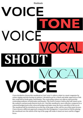
- 1. I have decided to choose this masthead as I feel ‘voice’ is able to relate to a music magazine by artists singing and also having an opinion. I decided to go for a black and white approach as I felt this could attract both males and females. The contrasting colours are able to represent the contrasting audience of both males and females. The font is Couture-bold as this will stand out to the audience and persuade them to look at it. I feel this masthead is more effective compared to a coloured background as the coloured background takes away the focus and effect of the wo rd. The masthead will be stretched across the top of the page, as this will be one of the main focuses. I have chosen a different approach compared to the Q magazine I researched as I felt by placing the masthead over the whole of the top of the page will make it stand out more and be a bigger focus. Mastheads