The document provides guidelines for creating effective PowerPoint presentations including:
- Keep presentations relevant and convey critical information simply
- Consider handouts for large amounts of information
- Avoid abbreviations
- Use images, graphics, fonts and colors to support data, not have data support graphics
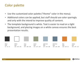
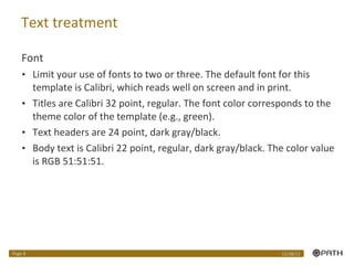
- Limit colors and use theme palette
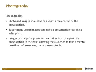
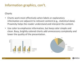
- Ensure images are relevant and of high quality
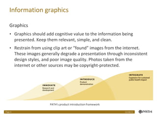
- Use simple, clean charts with labels close to data
- Limit fonts to 2-3 and use styles consistently


![[EMPOWERMENT TECHNOLOGIES]-ADVANCED PRESENTATION SKILLS](https://cdn.slidesharecdn.com/ss_thumbnails/et-advancedpresentationskills-211128024220-thumbnail.jpg?width=640&height=640&fit=bounds)


![5G Explained! A High Level Overview [Introduction]](https://cdn.slidesharecdn.com/ss_thumbnails/5gexplainedahighleveloverview-260119165306-cc137a3e-thumbnail.jpg?width=640&height=640&fit=bounds)


