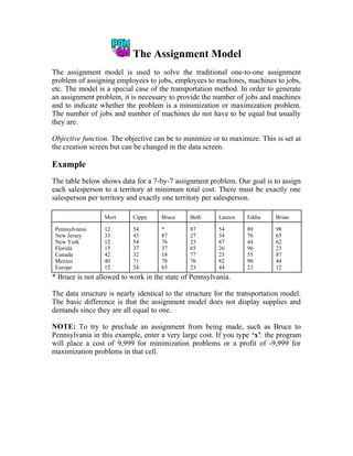
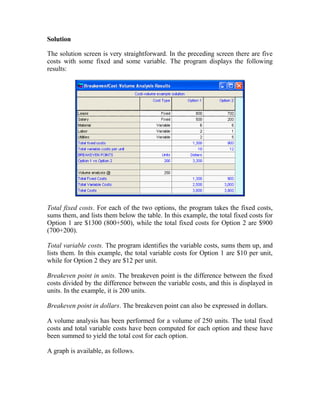
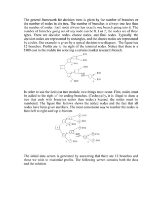
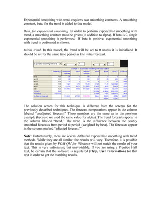
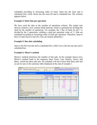
This document provides an overview and summary of the new version 3 of the POM-QM for Windows software. Key enhancements include expanded functionality in modules for aggregate planning, assembly line balancing, decision analysis, forecasting, inventory, job shop scheduling, location analysis, linear programming, project management, quality control, and statistics. Formatting and printing options have also been improved. Overall, the goal is to provide a more user-friendly interface and additional models to supplement teaching production/operations management, quantitative methods, management science, and operations research.


![POM-QM for Windows
When we use boldface, we are indicating something that you type or press.
When we use a bracket, [ ], we are naming a key on the keyboard or a command
button on the screen. For example [F1] means Function key F1, while [OK] means
the ‘Okay’ button on the screen.
We will use [Return], [Enter], or [Return/Enter] to mean the key on your
keyboard that has one of those names. The name of the key varies on different
keyboards and some even have both keys.
We will use boldface and capitalize only the first letter to refer to a Windows
menu command. For example, File refers to the menu command.
5. We will use all capitals to refer to a toolbar command such as SOLVE.
Installing the Software
We assume in the directions that follow that the hard drive is named C: and that
the CD-ROM is drive D:. The software is installed in the manner that most
programs designed for Windows are installed. For all Windows installations,
including this one, it is best to be certain that no programs are running while you
are installing a new one.
Insert the CD with POM-QM for Windows in drive D:. After a little while the
installation program should begin automatically. If it does not then:
From the Windows Start Button select, Run.
Browse the CD for D:setup.pomqmv3.exe (case does not matter).
Press [Enter] or click on [OK].
Follow the setup instructions on the screen. Generally speaking, it is simply
necessary to click [NEXT] each time that the installation asks a question.
Default values have been assigned in the setup program, but you may change them
if you like. The default folder is C:Program FilesPOMQMV3.
The setup program will ask you for registration information such as your name,
university, professor, and course. All items are optional except for the student/user
name that must be given. This name cannot be changed later! To change the other
information from within the program, use Help, User Information.
If you have the CD from the Operations Management, 8e textbook by Heizer and
Render the software will automatically be installed as POM for Windows and
customized to the textbook. In the future, if you have other Prentice-Hall Decision
Science textbooks then the software will be on the CD in the back of the textbook
4](https://image.slidesharecdn.com/manual-180221162052/85/Manual-12-320.jpg)


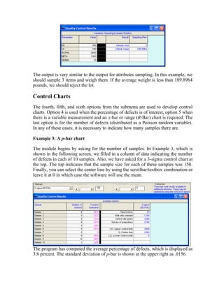
![POM-QM for Windows
explanation of the tool (balloon help) will appear on the screen. As with most
software packages, the toolbar can be hidden if you so choose (right click on any
of the toolbars or use View, Toolbars, Customize). Hiding the toolbar, allows for
more room on the screen for the problems. As is the case with most toolbars, we
allow the toolbar to float. In order to reposition any of the toolbars, simply click
on the handle on the left and drag.
One very important tool on the standard toolbar is the SOLVE tool on the far
right of the toolbar. This is what you press after you have entered the data and you
are ready to solve the problem. Alternatively, you may use File, Solve or press the
[F9] key. Please note that after pressing the SOLVE tool, this tool will change to
an EDIT tool. This is how you go back and forth from entering data to viewing
the solution. For two modules, linear programming and transportation, there is one
more command that will appear on the standard toolbar. This is the STEP tool
(not displayed in the figure), and it enables you to step through the iterations,
displaying one iteration at a time.
Below the standard toolbar is a format toolbar. This toolbar is very similar to the
toolbars found in Excel, Word, and WordPerfect. It too can be customized, moved,
hidden, or floated.
There is one more toolbar, and its default location is at the bottom of the screen.
This bar is a utility bar and it contains six tools. The tool on the left is named
MODULE. A module list can appear in two ways - either by using this tool or the
Module option on the main menu. The next tool is named PRINT SCREEN, and it
is there to emulate the old print screen function in DOS. The next two tools will
load files in alphabetical order either forward or backwards. This is very useful
when reviewing a number of problems in one chapter such as the sample files that
accompany this manual. The two remaining tools allow files to be saved as Excel
or HTML files.
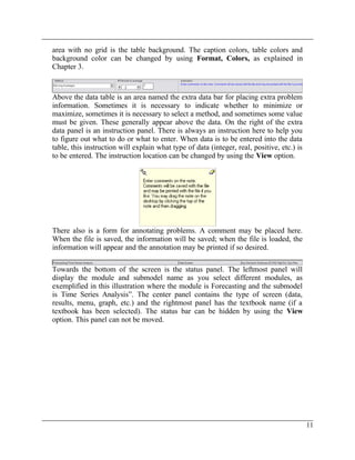
In the center are two areas, one of which is the main data table. The table contains
a heading or title and then simply rows and columns. The number of rows and
columns depends on the module, problem type, and specific problem. The large
10](https://image.slidesharecdn.com/manual-180221162052/85/Manual-18-320.jpg)

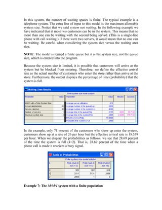
![Chapter 2: A Sample Problem
have the option on this menu to display only the POM modules or only the QM
modules.
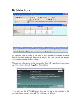
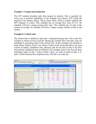
Creating a New Problem
Generally, the first menu option that will be chosen is File, followed by either
New to create a new data set or Open to load a previously saved data set. In the
figure that follows, we show the creation screen that is used when a new problem
is started. Obviously, this is an option that will be chosen very often. The creation
screens are similar for all modules, but there are slight differences that you will
see from module to module.
The top line contains a text box into which the title of the problem can be entered.
The default title for problems is initially “(untitled)”. The default title can be
changed by pressing the button [Modify Default Title]. For example, if you
change the default title to “Homework Problem” then every time you start a new
problem the title will appear as Homework Problem, and you would simply need
to add the problem number to complete the title. If you want to change the title
after creating the problem, this can easily be done by using the Format, Title
option from the main menu bar or from the toolbar.
For many modules, it is necessary to enter the number of rows in the problem.
Rows will have different names depending on the module. For example, in linear
programming, rows are “constraints”, while in forecasting, rows are “past
periods”. At any rate, the number of rows can be chosen with either the scroll bar
or the text box. As is usually the case in Windows, they are connected. As you
move the scroll bar, the number in the text box changes; as you change the text,
the scroll bar moves. In general, the maximum number of rows in any module is](https://image.slidesharecdn.com/manual-180221162052/85/Manual-21-320.jpg)
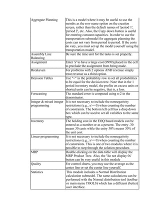
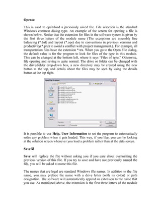
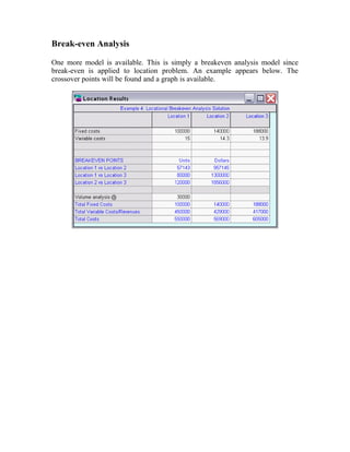
![POM-QM for Windows
90. There are three ways to add or delete rows or columns after the problem has
been created. You may use the options in the Edit menu, you may right click on
the data table which will bring up both copy and insert/delete options or, to insert
a row or insert a column , you may use the tools on the toolbar.
This program has the capability to allow you different options for the default row
names. Select one of the six option buttons in order to indicate which style of
default naming should be used. In most modules, the row names are not used for
computations, but you should be careful because in some modules (most notably
Project Management and MRP) the names might be relevant to the computations.
In most modules, the row names can be changed by editing the data table.
Many modules require a number of columns. This is given in the same way as the
number of rows. The program gives you a choice of default values for column
names in the same fashion as row names but on the tab named Column Names.
We have added an overview tab to the creation screen in this version of the
software. The overview tab gives a brief description of the models that are
available and also gives any important information regarding the creation or data
entry for that module.
Some modules, such as the linear programming example displayed on the previous
page, will have an extra option box, such as for choosing minimize or maximize or
selecting whether distances are symmetric or not. Select one of these options. In
most cases, this option can be changed later on the data screen.
When you are satisfied with your choices, click on the [OK] button. At this point,
a blank data screen will appear as given in the following figure. Screens will differ
module by module but they will all resemble the screen on the following page.](https://image.slidesharecdn.com/manual-180221162052/85/Manual-22-320.jpg)
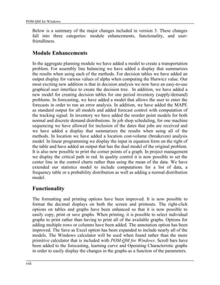
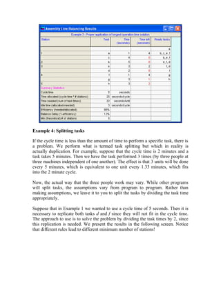
![Chapter 2: A Sample Problem
The Data Screen
The data screen was described briefly in Chapter 1. It has a data table and, for
many models, there is extra information that appears above the data table as shown
in the figure below.
Entering and Editing Data
After a new data set has been created or an existing one has been loaded, the data
can be entered or edited. Every entry is in a row and column position. You
navigate through the spreadsheet using the cursor movement keys (or the mouse).
These keys function in a regular way with one very useful exception - the [Enter]
key.
The [Enter] key takes you to the next cell in the table, first moving to the right and
then moving down. When a row is finished, the [Enter] key goes to the first cell in
the next row that contains data rather than a row name. For example, in the screen
above, if you are at the end of the row named “Source 1" and you press [Enter],
the cursor will move to the cell with a “0" in the next row. It is possible to set the
cursor to go to the first cell, the one with the name in it, by using Help, User
Information.](https://image.slidesharecdn.com/manual-180221162052/85/Manual-23-320.jpg)
![POM-QM for Windows
In addition, if you use the [Enter] key to enter the data, after you are done with
the last cell the program will automatically solve the problem (saving you the
trouble of clicking on the SOLVE tool). This behavior can be adjusted by using
Help, User Information and, in addition, if you want the program to
automatically prompt you to save the file when you are done entering data, this
too can be accomplished through Help, User Information.
The instruction frame on the screen will contain a brief instruction describing what
is to be done. There are essentially three types of cells in the data table.
One type is a regular data cell into which you enter either a name or a number.
When entering names and numbers, simply type the name or number; then press
the [Enter] key or one of the direction keys or click on another cell. If you type an
illegal character, a message box will be displayed indicating so.
A second type is a cell that cannot be edited. For example, the empty cell in the
upper left hand corner of the table can not be edited. (You actually could paste
into the cell.)
A third type is a cell that contains a drop-down box. For example, the signs in a
linear programming constraint are chosen from this type of box, as shown in the
following illustration. To see all of the options, press the arrow on the drop-down
box.
When you are finished entering the data, press the SOLVE tool on the toolbar or
use [F9] or File, Solve and a solution screen will appear as given in the following
illustration. The original data is in black and the solution is in a color. Of course,
these are only the default values, as all colors may be set by using Format,
Colors.](https://image.slidesharecdn.com/manual-180221162052/85/Manual-24-320.jpg)


![Print will display a Print Setup screen. Printing options are described in Chapter
4. Both Save and Print will act slightly differently if a graph is being displayed at
the time that you use Print or Save.
Print Screen
This will print the screen as it appears. Different screen resolutions may affect the
printing. Printing the screen is more time consuming than a regular print. Use this
option if you need to demonstrate to your instructor exactly what was on the
screen at the time.
Solve
There are several ways to solve a problem. Clicking on File, Solve is probably the
least efficient way to solve the problem. The toolbar icon may be used, as well as
the [F9] key. Also, if the data is entered in order (top to bottom, left to right, using
[Enter]), the program will solve the problem automatically after the last cell.
After solving, the Solve option will change to an Edit option on both the menu
and the toolbar. This is the way to go back and forth between data and solutions.
Note that Help, User Information may be used to set the program to
automatically maximize the solution windows if so desired.
Exit
The next option on the File menu is Exit. This will exit the program. You will be
asked if you want to exit the program. You can eliminate this question by using
Help, User Information.
Last Four Files
The File menu contains a list of the last four files that you have used. Clicking on
one of these will load the file.](https://image.slidesharecdn.com/manual-180221162052/85/Manual-31-320.jpg)


![Integer and Mixed Integer Programming
Any integer or mixed integer linear program is defined by the number of variables
and the number of constraints. As with linear programming, do not count the non-
negativity restrictions as constraints. Most student linear programming packages
(except Excel’s Solver) assume that the variables must be non-negative.
Consider the following integer programming example:
maximize
subject to
350x1
x1
-x1
x1, x2
x1, x2
+ 500x2
+ 1.5x2
+ 4x2
>= 0
integer
<=
>=
15
0
The components and the data entry are nearly the same as for linear programming.
The difference is that the input screen has one extra row for identifying the type of
variable as either real, integer or 0/1.
Objective function. The choice of minimization or maximization is made in the
usual way at the time of problem creation, but it can be changed on the data screen
using the objective options above the data.
Objective function coefficients. The coefficients (typically referred to as cj) are
entered as numerical values.
Constraint coefficients. The main body of information contains the constraint
coefficients, which typically are called the aijs. These coefficients may be positive
or negative.
The constraint sign. This can be entered in one of two ways. It is permissible to
press the [<] key, the [>] key, or the [=] key. When you go to a cell with the
constraint sign, a drop-down arrow appears in the cell and can be used.
Right-hand side coefficients. The values on the right-hand side of the constraints
are entered here. These are also termed the bis. They must be non-negative.](https://image.slidesharecdn.com/manual-180221162052/85/Manual-114-320.jpg)


![The constraint sign. This can be entered in one of two ways. It is permissible to
press the [<] key, the [>] key, or the [=] key. Alternatively, when you go to a cell
with the constraint sign, a drop-down arrow appears in the cell, as shown in the
following screen in constraint 2 in the column with the constraint signs.
You can click on the arrow bringing in a drop-down box as shown next:
Equation form. The column on the far right displays the equation form of the
constraint and can not be directly edited but changes as the coefficients, column
name, sign or right hand side change.
The Solution
Following is the solution to our example. Please note that the display varies
somewhat according to the textbook option selected in Help, User Information.
Optimal values for the variables. Underneath each column, the optimal values for
the variables are given. In this example, x should be .33 and y should be 3.25.
Optimal cost/profit. In the lower right hand corner of the table, the maximum
profit or the minimum cost is given. In this example, the maximum profit is
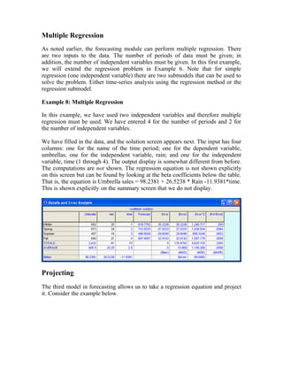
$10.75.](https://image.slidesharecdn.com/manual-180221162052/85/Manual-142-320.jpg)


![After pressing the [Compute] button, the solution appears as shown below:
We are 95 percent confident that the project will be completed in 31 to 51 days.](https://image.slidesharecdn.com/manual-180221162052/85/Manual-183-320.jpg)