
Recommended
Recommended
More Related Content
Recently uploaded
Recently uploaded (20)
Featured
Featured (20)
Manisha singh covid_19
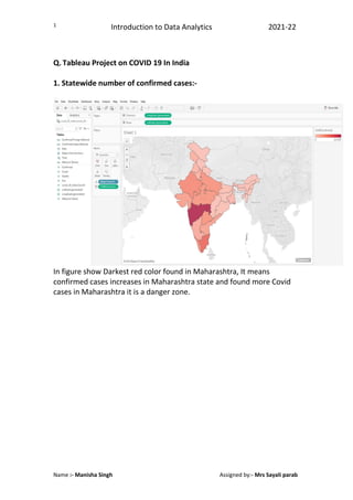
- 1. Introduction to Data Analytics 2021-22 Name :- Manisha Singh Assigned by:- Mrs Sayali parab 1 Q. Tableau Project on COVID 19 In India 1. Statewide number of confirmed cases:- In figure show Darkest red color found in Maharashtra, It means confirmed cases increases in Maharashtra state and found more Covid cases in Maharashtra it is a danger zone.
- 2. Introduction to Data Analytics 2021-22 Name :- Manisha Singh Assigned by:- Mrs Sayali parab 2 2. Separate analysis of Delhi, kerala and Maharashtra. I am using bar graph for separate analysis of delhi, kerala, and maharashtra. i)Figure show blue color for confirmed case in maharstra, delhi and kerala ii) figure show Orange color for cured cases in maharashtra , delhi and kerala. Iii) Figure show Red Color for death cases in maharastra, kerala and delhi. I have used bar graph to easily understand the analysis.
- 3. Introduction to Data Analytics 2021-22 Name :- Manisha Singh Assigned by:- Mrs Sayali parab 3 3. All over India :- Camparsion of cured Vs Death Data analysis on covid 19 cases in all over india , Figure show camparison of cured cases vs death cases in India. I have used line graph to show better comparison. Figure show light pin color for Death cases in India and blue color show cured cases of covid in India.