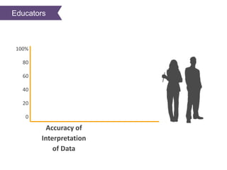
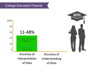
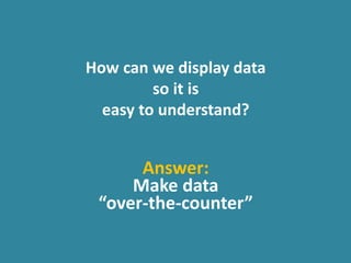
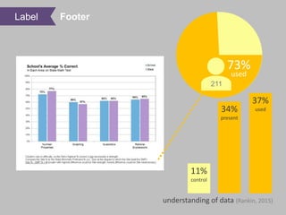
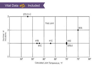
May 6, 2017
Jenny Grant Rankin, Ph.D. Ernesto Ongaro
University of Cambridge TIBCO Jaspersoft
@OTCData @not_a_poet
TIBCO Jaspersoft Webinar ● May 16, 2017
Learner Objectives
You’ll learn:
Learner Objectives
You’ll learn:
n What are the Over-the-Counter Data
Standards?
Learner Objectives
You’ll learn:
n What are the Over-the-Counter Data
Standards?
n What are the research based statistics
for using these standards? %
Learner Objectives
You’ll learn:
n What are the Over-the-Counter Data
Standards?
n What are the research based statistics
for using these standards?
n What can you do to your reports to
adhere to these standards?
%
Learner Objectives
You’ll learn:
n What are the Over-the-Counter Data
Standards?
n What are the research based statistics
for using these standards?
n What can you do to your reports to
adhere to these standards?
n Jaspersoft specific reporting features
to use :N
%
Your Data
Your Data
Accuracy of
Interpretation
of Data
100%
80
60
40
20
0
Educators
Accuracy of
Interpretation
of Data
100%
80
60
40
20
0
College-Educated Educators
Accuracy of
Interpretation
of Data
100%
80
60
40
20
0 Rankin, 2013
11%
College-Educated Educators
U.S. Dept. of Education
2009, 2011
Accuracy of
Interpretation
of Data
100%
80
60
40
20
0 Rankin, 2013
11-48%
College-Educated Educators
U.S. Dept. of Education
2009, 2011
Accuracy of
Interpretation
of Data
100%
80
60
40
20
0 Rankin, 2013
Accuracy of
Understanding
of Data
11-48%
College-Educated Parents
U.S. Dept. of Education
2009, 2011
Accuracy of
Interpretation
of Data
100%
80
60
40
20
0 Rankin, 2013
60%
Accuracy of
Understanding
of Data
11-48%
College-Educated Parents
U.S. Dept. of Education
2009, 2011
Accuracy of
Interpretation
of Data
100%
80
60
40
20
0
0%
Rankin, 2013
60%
Accuracy of
Understanding
of Data
Kannan, Zapata-Rivera,
& Leibowitz, 2016
11-48%
College-Educated Parents
U.S. Dept. of Education
2009, 2011
Accuracy of
Interpretation
of Data
100%
80
60
40
20
0
0-50%
Rankin, 2013
60%
Accuracy of
Understanding
of Data
Kannan, Zapata-Rivera,
& Leibowitz, 2016
Kannan, Zapata-Rivera,
& Leibowitz, 2016
11-48%
College-Educated Parents
How can we display data
so it is
easy to understand?
How can we display data
so it is
easy to understand?
Answer:
Make data
“over-the-counter”
Over-the-Counter Over-the-Counter
Medicine Data
Over-the-Counter Over-the-Counter
Medicine Data
Over-the-Counter Over-the-Counter
Medicine Data
Over-the-Counter Over-the-Counter
Medicine Data
Over-the-Counter Over-the-Counter
Medicine Data
Over-the-Counter Over-the-Counter
Medicine Data
Over-the-Counter Over-the-Counter
Medicine Data
Over-the-Counter Over-the-Counter
Medicine Data
Over-the-Counter Over-the-Counter
Medicine Data
Label
Participant Lifestyle’s Impact on Plant Growth 95%
(Outing & Ruel, 2006)
46
(Conner-Simons, 2015)
?
most
viewed
time
Title
73%
211
11%
control
34%
present
37%
used
used
understanding of data (Rankin, 2015)
Label Footer
50%
211
Supplemental Doc
11%
control
23%
present
33%
used
used
understanding of data (Rankin, 2015)
Reference Sheet
Reference Sheet
11%
control
30%
present
understanding of data (Rankin, 2015)
52%
used211
48%
used
Reference Guide
Supplemental Doc Reference Guide
60%
64
Help Lessons
training
time
50%
more
(van der Meij, 2008)
tasks completed
Package/Display
Package/Display & Content
1854
500
N
1854
500
N
1854
500
N
1854
500
N
1854
500
N
1854
500
N
1854
☤
500
N
1854
☤
Format Most Appropriate for Analysis
1855
1.1mil
N
1855
1.1mil
N
1855
1.1mil
N
1855
1.1mil
N
1855
1.1mil
N
1855
☤
1.1mil
N
1855
☤
Graph as Appropriate
1986
1986
1986
1986
1986
1986
7
N
1986
7
N
Vital Data Included
Vital Data Included
Vital Data Included
Over-the-Counter Over-the-Counter
Medicine Data
www.overthecounterdata.com
/s/OTCDStandards.pdf

Make your Reports Over The Counter

Editor's Notes

  • #13 researchers found teachers answered only 48% of questions correctly when interpreting data (USDEOPEPD, 2009).
  • #29 In a study where the eye movement of 46 people was monitored as they spent an hour viewing website and multimedia content, 95% of participants paid attention to the summary descriptions that led into more content (Outing & Ruel, 2006). In a paper from Harvard University's John A. Paulson School of Engineering and Applied Sciences and Massachusetts Institute of Technology's (MIT’s) Computer Science and Artificial Intelligence Laboratory at the IEEE Information Visualization Conference involving and an eye-tracking study, the researchers found people spend the most time on the text of data reports - even more than visual elements - and that the title is what people give the most attention of all (Conner-Simons, 2015). - “In a new study that analyzes people’s eye movements as they look at charts, graphs and infographics, researchers have been able to determine which aspects of visualizations make them memorable, understandable and informative. The findings reveal how to make sure your own graphics really pop”
  • #33 For example, a shorter, targeted manual - such as the lessons that a user-friendly Help system can provide - causes users to successfully complete 50% more tasks… and to need 40% less training time than they would have accomplished with only access to a full-sized manual (Hattie, 2010; van der Meij, 2008). Carroll, Smith-Kerker, Ford, Mazur-Rimetz, 1987; Hattie, 2010; van der Meij, 2008 In an examination of how to best design software instructions, van der Meij (2008) recounts two Minimal Manual experiments in which a shorter, targeted manual or user-friendly help system caused users to need 40% less training time and to successfully complete 50% more tasks than they would have accomplished with only access to a full-sized manual.
  • #36 In 1854 in London…
  • #37 …within a few square blocks over 500 people died mysteriously within just 10 days.
  • #38 Jon Snow came to the rescue. Does anyone recognize this guy? Those are my Game of Thrones fans.
  • #39 Well, the real Jon Snow looked more like this. He was a doctor who stopped any more of these mysterious deaths from happening, and he did this using data.
  • #40 Dr. Snow took a map of the area, and on it he made a small black mark where every death took place. Here, I’ll blow it up a bit for you.
  • #41 Because of this display of the data, you can see here, just as local officials could see then, that the closer people lived to this spot right here, the higher their household’s death rate. This spot right here is the water pump on broad street. Because of this map, London officials removed the handle from the pump, and the deaths stopped.
  • #42 The mysterious disease – which turned out to be cholera, and the worst cholera epidemic to ever hit Britain – was being distributed through this water pump. Snow ended this epidemic using data, but the data itself wasn’t what saved the day. It was the fact that Dr. Snow could effectively communicate this data in a way his target audience could understand.
  • #44 This story is from 1855, when Britain and her allies were battling Russia in the Crimean War.
  • #45 1.1 million soldiers – which was more than ½ of the nearly 2 million soldiers - died. But it’s war, right? Pretty normal, right?
  • #46 Well, along comes Florence Nightingale, who most people know as a nurse and social reformer. Well, she was also an astute statistician.
  • #47 She displayed the soldiers’ mortality data in some of the world’s first examples of pie charts. I’ll blow one of them up for you.
  • #48 Nightingale displayed the preventable disease in blue-grey. Now, you can see, as British government officials at the time could see, that preventable disease comprised the vast majority of deaths. In other words, the Russians weren’t what was killing British and allied soldiers. Poor healthcare conditions were what was killing the soldiers.
  • #49 Nightingale used this data – displayed effectively – to get Britain to take funds away from weapons and spend them on building a hospital and improving healthcare conditions. This effective communication of data caused the death rate to drop to 2% - a small fraction of what it had been.
  • #51 Now, one last story about data. This one is a bit different than the others.   You might recall the launching of the U.S. Challenger Space Shuttle in 1986.
  • #52 The night before the launch, there were still concerns about how the booster rocket’s O rings were functioning. The o ring is a seal that prevents hot, pressurized gases from making contact with other parts of the shuttle.
  • #53 To determine if it would be safe to launch, the space shuttle engineers and managers viewed charts and diagrams concerning O ring damage and launch temperatures.
  • #54 For example, they viewed this graph. But unlike the data displays of Dr. Jon Snow and Florence Nightingale, these charts were purely executed. Later we’ll look at why they were poorly executed. But for now, just now that had the available data been graphed effectively, the Challenger Space Shuttle never would have launched the following morning.
  • #55 A U.S. investigation after the launch even deemed these poor graphs the reason why the shuttle managers were not informed enough to know that the o-rings would not perform the following morning, that they would fail, allowing hot, pressurized gasses to escape…
  • #56 Which is what caused the Challenger Space Shuttle to explode within 73 seconds of its launch, killing all 7 crewmembers. This tragedy happened because NASA had all the data it needed, but that data was not presented to key people in effective ways.
  • #59 But what about the successful launches? What about data on the 17 cases where there were 0 problems with the shuttle’s launch? That data was missing from this graph shown to engineers and managers on the eve of the Challenger’s launch. They all occurred when the launch temperature was at least 66 degrees. There were a few outliers, but the significant trend was that… When the Challenger launched, the day was 31 degrees cold – so cold, it doesn’t even fit on the graph. But as we can see, O ring failure was highly likely at that temperature.