Download as PDF, PPTX


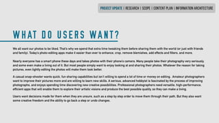


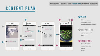

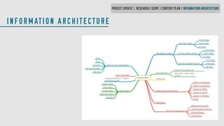
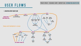
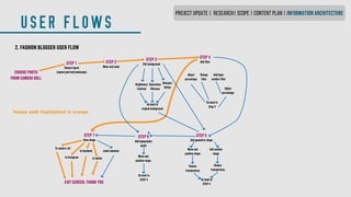


FunkItUp Editor is a photo editing app designed for social media that allows users to make their photos more visually striking and artistic. It aims to simplify the editing process compared to other apps that some find complicated. The app brings cutting edge design features to average social media users in a easy to use format. It seeks to fulfill users' fundamental desire to share beautifully preserved memories while also helping users promote brands and drive sales through powerful imagery on social media.