I. Intended audience A. American grandparentsB. Other Americ.docx
Textpert UI Report and Problem
1. TextpertUI Report andProblem-Solving
Author: Qing Jasmine Ye March 2016
Abstract:
Understanding of the product: Textpert is a mobile app that provides on-demand,
crowd-sourced advice for what to text back. It’s a modern-day Cyrano de Bergerac in
your pocket to help you communicate.
In this paper, I will discuss the strengths and drawbacks of the current version of
Textpert app, including the navigation layout, fonts and scripts, color selection, function
page layout. For the places that needed to be improved, I will provide my suggestions.
This paper also contains problem solving part to discuss some specific problem in this
app and provide solutions that I recommend.
My style and intend: from my personal point of view, I want to design an app as simple
as possible. This is my First Law of Designing products follow the belief of minimalism.
And my Second Law is to make the product I designed to be user-friendly.
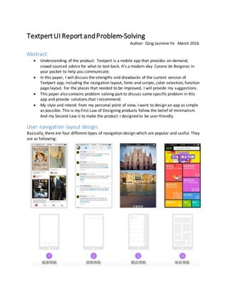
User navigation layout design:
Basically, there are four different types of navigation design which are popular and useful. They
are as following:
2. For Textpert, I would recommend to use the first type of design, the reasons are as following:
This design will give prominence to the core functions of this app: asking questions by sending
picture to peers. Navigation bar at the bottom of the cell phone leave enough space for the
picture and the texts. This designworks really well to emphasize the most powerful core function,
weaken the edge functions. And textpert is currently using this design, which I think it is wise
choice.
The third navigation is also worth considering. First, let me briefly explain how the third design
works. The third design is called “side navigation”. By clicking the button at the top left of the
screen, the navigation bar will show up. And the navigation bar composes a brief summary of the
user information and a list of feathers that this app has. A good example of this kind of design is
Uber. The advantage of this design is that the navigation bar actually takes no space from the
screen. However, the disadvantage is very obvious, too. The user has to click a bottom to see the
navigation bar, this is inconvenient for users, contradicting my First Law of Design. Given this
drawbacks, I still think this is worth thinking for our product because Textpert provides on-
demand, crowd-sourcing advice. In the coming future, the users and the questions posted on
Textpert will be incredible large. Therefore, what we must do in the future is to sort the questions
posted on our database by category. In this way, we will need more items in our navigation bar
to help our users find the information they need quickly and easily. At that time, the advantage
of side navigation over bottom navigation will become very obvious.
Fonts and Scripts:
I would recommend to use Helvetica because it is sans-serif, which provides the feeling of
simplicity. Also, Helvetica is similar to the fonts used by IOS system, which will narrow the gap
between the IOS operating systemand our product. Doing so, users will feel more pleased
when using Textpert.
Color Selection
One main reason that Textpert looks like a just finished app is because there is serious lack
good UI design, especially color selection and function page layout, which I will move on to
discuss in the following two sections.
For color selection, there is only one color picked up for this app. However, a well-designed app
requires at least four main color:dominant hue, secondary color, highlight color, and shadow
color. The main color that is already selected for this app—aquamarine is quite popular these
years especially among young people: the main group of people we are serving. However, the
3. senior people may not like this color as aquamarine represents element of fashion.
More importantly, by looking thought the contrasted color map, we can see the contrast color
for aquamarine is red, which is one of the ugliest combination of colors. To sum up, although
aquamarine is a wise choice of color, it has many drawbacks at the same time and it is
extremely hard to pick up a secondary color for aquamarine.
What’s I suggest to do is change the dominant hue into blue. First, blue has a wide range of
gradient color that we can use for different layer of our app. Second, the combination of blue
with other colors, both the bright color (like white) and dark color (like dark blue, black, purple)
is very comfort for people to see simply because the sky is blue and people’s eyes are used to
that kind of style. Therefore, there is more freedom for us to pick up our secondary color,
4. highlight and shadow color. Third, blue is an all-purpose color. It can serve users from any age,
with any kind of job, using this app for any reason.
Former experience has shown us that blue is the color that is used for the most times for social
app: Facebook uses ink blue, Piazza uses ink blue, Skype uses blue, Linkedin uses ink blue, QQ
uses bright blue, Wechat uses dark blue, Paypal and Venmon use dark blue, Google docs and
Google+ uses blue, Skype uses blue. It has been proven that blue is the selection with least risk.
And we can pick up another from cold colors like purple, green as the secondary and the third
color. Pick up the contrasted color of blue as highlight and shadow. #54C7FC and #0076FF fits
the IOS9 best.
If we want to make some innovations in this field, and stay different from others, purple is also
a good choice and purple is better than aquamarine because there are more combinations with
purple than aquamarine.
Function Page Layout
The page layout of Textpert is the place that needs to be improved most. The current version of
design makes Textpert looks like a student project rather than a professional social mobile app.
The routine of upgrading the user interface in order to provide more friendly user experience
needs a long time of investigation and keeping on finding out a better solution. I always believe,
Good better best,
Never let it rest.
Till good is better,
But better best.
The profile page
5. Compare to the well-designed profile page on the right, it is obvious that there are serious
problems within our UI design in Textpert.
First, like I said in the former part, Textpert only has one main color, which is not enough to
giver our users the sense of different layers.
Solution: pick up a suitable main color and secondary color, highlight and shadow.
After settling down the main color and secondary color, we can choose an appropriate picture
like the forest in the example picture and use layer effect: adding the secondary color overlay
effect to produce different layer of our background for our profile page.
Then another design pattern need to be fixed is to put all the function button in a list. The
profile page should not be merged together. Profile page should focus on the personal
information about a user. Too many information in one page will be annoying to user. My
suggestion is to add a setting button at the right top of this page to direct user to another page
with a list of setting functions. For the profile page, we can use our own algorithm to calculate
the score or EXP for effectively answering the questions as a tool of rewarding answering
questions seriously and bring fun of competing with peers. The second part of profile page
should use graph-user-interface (GUI) to record the growth of the user.
The Give page
The most significant problem with the give page is that one page of app is now holding 4
different post. Since the canvas is 750*1334 px, the height of each post is about 250 px which is
too narrow to hold the most important information in each post. This bad design causes that it
is really hard for users to know what each question is asking about by simply a glimpse. This
contradicts the Second Law of Design.
There are some well-designed examples from Linkedin, Facebook and Baidu Tieba.
6. Solution:
First, we need to add a feature of cutting down picture when users are trying to upload the
picture. Let the user to upload only the most significant part of a
photo.
Here in this page, we can add a crop down function for user to select
the most significant part of the picture. For example, in this picture,
only the part of the two women’s face is useful. Another important
reason is that adding these features will protect the privacy of the
users as when taking pictures, there is always sometime that we
take on something don’t want other to see. If possible, we also need
to add mosaic function.
Second, we need to change the design of each post. The first thing we need to do is to add a
caption of each post. We can simply use the question users enter in as the caption of each post.
In this way, we do not burden our users. However, by adding a caption, other users who see the
question for the first time can know what each post is about quickly and easily.
7. Third, the layout design that I strongly recommend is to use card design for each post. There
are some examples of card design.
there are many powerful advantages of card design.
1. Card design will accelerate the loading speed. Card design is good at cross-device, cross-
screen interface.
8. 2. Card is a wonderful container of information. Each card can hold many different types of
information: multimedia, text, caption, hyperlink and so on. Card is a unity of all these
types of information.
3. Card design is easy to understand, the layout is clear and cool, suitable for quick view,
and easy for gestures.
4. Card design is capable of expanding and contraction with the changing of the
framework. If Textpert wants to introduce a PC version in the coming future, card design
is the best choice.
These are the card design prototypes that I would recommend for Textpert give page: a
picture at the top of each card, with a caption with bigger fonts, and some details with
smaller fonts. Each card is about 600~800 px in height.
The Feed page
The feed page is basically a record of the history post. The design of
this page is similar to the Give page—using card design and writing
the best solution as details in each card. By clicking the card itself,
users can look through all the history responses.
When the number of questions posted on Textpert are bigger, we
may need to divide them by category or add a simple searching
widget at the top of the bar.
9. The Ask page
The ask page is the best designed page among all the pages. Just one quick suggestions: we can
add a function in this page. The person who ask the question need to reply to the answers that
others provided because sometimes others may misunderstand the question that is asked or
users want to ask further more about current problem. We can add this function in the bubble
of “ask”.
Summary
In order to make a professional User Interface design, we first need to pick the main color,
secondary color, auxiliary color, highlight color and shadow color for Textpert. After that, using
color overlay effect to create a background picture for Textpert to create sense of multiple
layers. Then uses the most fashion and effective user interface design like card design, graph
user interface design to stress the main function of each page and weaken the unimportant
functions in each page. The two general law of my style are: simplicity and user-friendly.
10. Problem-solving
Head portrait
Where this problem is from: During our focus group at
USC, every student said that they prefer to have avatars /
icons / emoticons as profile pictures instead of actual
pictures or the generic person profile icon that is
currently seen in the app.
My analyze: one possible solution is that we can provide a
handful of avatars or icons that people can choose from.
However, one problem of this solution is that it is really
hard to fulfill every single user’s taste. In this way, a finite
number of icons can not do this job perfectly.
My solution: when users are trying to set up head portrait, we can provide a hyperlink to refer
our users to FACEQ to generate personalized head portrait. This process is also like a game,
which will bring a lot of fun to our users when using Textpert.
Detailed information: http://www.frostclick.com/wp/index.php/2014/12/05/faceq/
The portrait users can make portraits whatever they like by picking up a huge amount of
choices on clothes, hair, facial features and accessories. This solution will solve the requirement
of being personalized for all users perfectly.
Also, there are also some users who are extremely satisfied with their facebook head portrait or
their autodyne. Therefore, I would recommend to keep the feature that users can upload
picture by themselves. This feature can also provide a wide range of personalized head portrait
that users are feeling comfortable with.