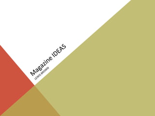
3. mASTHEADS
I have four ideas for my Masthead, these are;
SONIC
SONIC AUDIO
AUDIO
DANCE
DANCE SYNTH
SYNTH
CYBERTUNE
CYBERTUNE
4. SONIC
The word sonic sounds very futuristic and relates to sound waves
which means it is very appropriate for a EDM magazine. However, I
believe it could also give an incorrect message to the reader. This is
because Sonic is the protagonist from the series ‘Sonic the
Hedgehog’ by Sega, and may therefore connote to the reader that
my magazine is of the gaming genre. Although this was the most
popular masthead in my questionnaire, I have doubts whether this
is the most appropriate for my music magazine.
5. dance
I believe this masthead is less effective because it does not relate to
music as much as the other three mastheads. The word dance
could connote to the reader that the magazine is about dance and
choreography as opposed to its actual genre of electronic dance
music.
6. AUDIO
Audio also refers to music and sound but I do not believe the
masthead is as memorable as Sonic or Synth. It could also suggest
that the magazine is more about audio equipment than about
EDM.
7. CYBERTUNE
I think this masthead fits the EDM genre because it is comprised of the
words ‘cyber’ (meaning futuristic and referring to computers) and
‘tune’ (a melody). However I think using the word cyber could
connote the cybergoth culture who are more associated with the
industrial genre of music as opposed to EDM as a whole. Images of
cybergoth culture are shown below.
8. SYNTH
I believe this masthead is most suitable for an EDM magazine because
it refers to synthesizers, these are instruments that are extremely
popular in EDM. Readers that enjoy producing their own music will
understand this reference and want to purchase my magazine.
Therefore I have chosen the masthead “Synth” for my magazine.
12. Fat Sans
This typography looks very futuristic which would reflect on EDM as it is a relatively
new genre of music compared to others such as Jazz and Rock. ‘Fat Sans’ is also a very
bold and eye-catching typography.
However, the masthead could be hard to read for the audience as the ‘Y’ looks slightly
like the number four.
13. Biogalaxy
This typography looks very quirky and informal which could
connote to the audience that the magazine is easy to read with
a chatty style.
However, I don’t believe that ‘Biogalaxy’ gives the impression
of a music magazine as it looks slightly more suited to a
science or art magazine.
14. Carbon
This typography looks bold and easy to read as well as looking modern due
to the ‘N’ looking unconventional.
However, I don’t believe this font has any memorable qualities.
15. Advanced Dot Digital-7
This typography looks as if it is displayed on digital technology and therefore has
connotations of EDM; it looks like the masthead is made out of several buttons
on some audio equipment.
However, I am not sure whether the masthead will blend into the background as
it is less visible than some of the other typographies.
16. Ethnocentric
I think this typography is very bold and will catch the
audience’s attention. It also has a futuristic feel.
The negative side is that I don’t think it looks quirky and
informal which is what the language of my magazine is going
to be.
17. Fat Sans
I have chosen this typography because it is bold, electronic-
looking and is memorable as the Y looks like the number 4
(this could have connotations of an informal text message
style of writing). I believe my target audience will be able to
read this typography easily and it is reflective of the EDM
genre of magazine.
19. Here are my potential coverlines…
“The UK’s best electronic dance music magazine”
“Your number one source for electronic dance music and clubbing life”
“Discover the clubbing lifestyle”
“Read. Listen. DANCE.”
“The world’s greatest EDM magazine”
20. I have chosen “Read. Love. DANCE.” as my coverline because not only does it make
reference to EDM, its simple and memorable for my target audience. It also does not
state exactly what the magazine is about and therefore entices the reader into wanting
to know more about the magazine.
The cover line suggests that if the audience reads the magazine, they will find good
music, listen to it and it will make them want to dance.
22. Here are some ideas of stories for my magazine
“New Female Artist in the EDM Scene!”
“12 year old producer writes number one single!”
“The hottest gigs and tours in 2013…”
“A day in the life of DeadMau5”
“Tips and Tricks for producing filthy dubstep!”
“House music through the ages”
23. From the results of my poll, the most popular reasons why my classmates read music
magazines were for celebrity gossip and new artists/music. Therefore I believe my
story ideas were appropriate for my target audience.
I have chosen to have the story of my double page spread being “New Female Artist in
the EDM Scene!” because I believe my target audience will find this story
interesting, mostly because the EDM scene is dominated by male musicians so the
reader will find it refreshing to hear about a female artist, especially female
audiences.