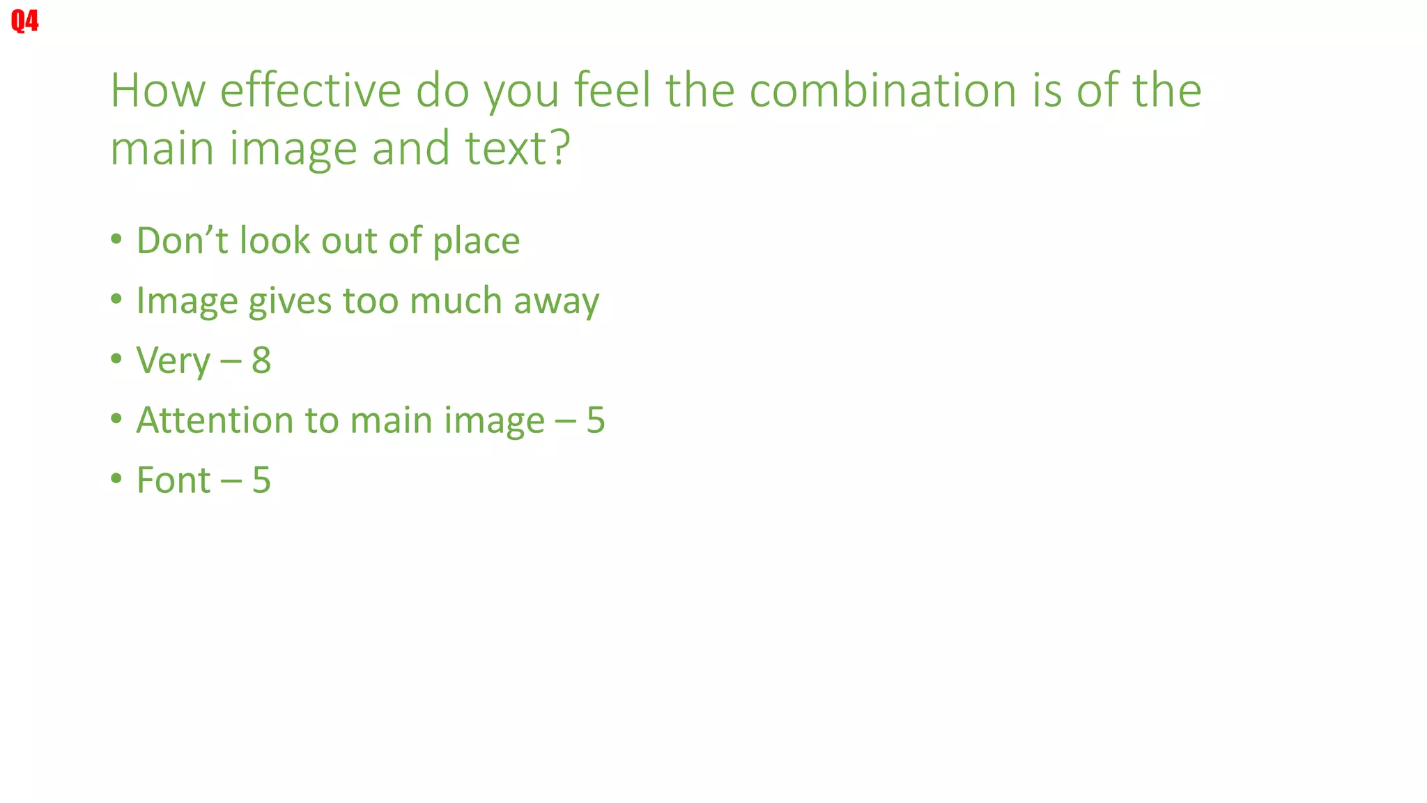
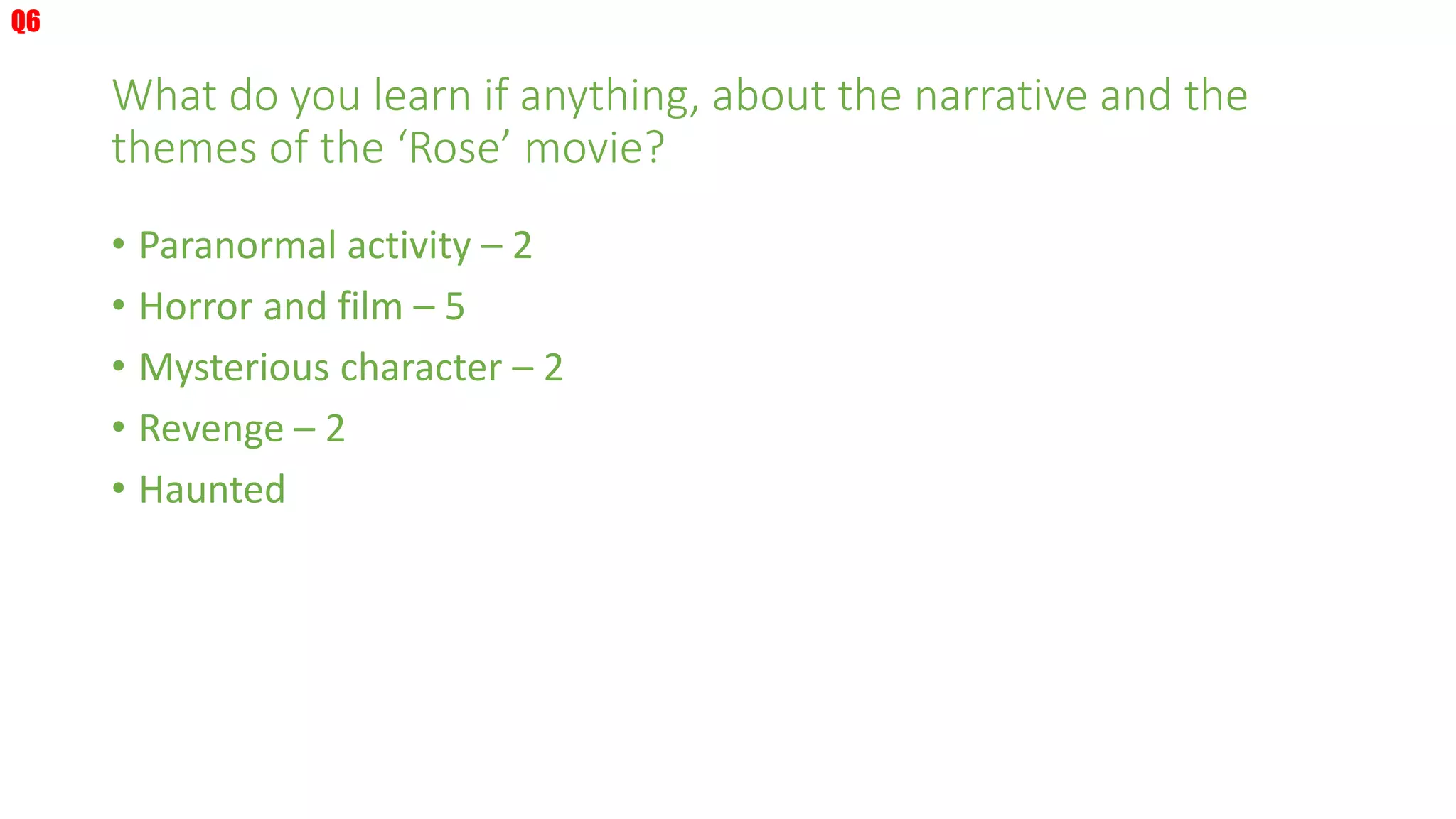
Magazine Feedback
What do you like about the magazine?
• Graphics of Rose – 9
• Professional look – 3
• Font & Image – 5
• Clear
• Informative
Q1
What would you improve about the magazine?
• Closer to girls face
• Not use character
• Enlarge smaller text
• Make Rose text thicker
• Twitter links
• ‘Horror’ to be moved on title
• Change font
• Change main character
• Too light for the background
Q2
What similarities can you notice about the magazine compared
to professional movie magazines?
• Usual layout – 2
• Titles – 3
• Side contents
• Magazine names
• Picture – 5
• Barcode – 2
• Buzz words – 3
• Professional – 3
• Font – 6
• Behind the scenes
• Little explanation
• Language use
Q3
How effective do you feel the combination is of the
main image and text?
• Don’t look out of place
• Image gives too much away
• Very – 8
• Attention to main image – 5
• Font – 5
Q4
What is your opinion of the layout of the cover?
• Nice layout – 5
• Credits a bit close to the edge
• Professional – 3
• Head of character covers ‘T’ in masthead
• Appropriate – 2
• Well balanced – 2
• Clear – 2
• Image is very good
Q5
What do you learn if anything, about the narrative and the
themes of the ‘Rose’ movie?
• Paranormal activity – 2
• Horror and film – 5
• Mysterious character – 2
• Revenge – 2
• Haunted
Q6
What similarities can you draw with the magazine,
poster and trailer?
• Throne
• Colours
• Rose
• Horror story
• Font – 5
• Doesn't show
• Contrast
• Ghost -2
• Atmosphere
Q7

Magazine feedback

  • 1.
  • 2.
    What do youlike about the magazine? • Graphics of Rose – 9 • Professional look – 3 • Font & Image – 5 • Clear • Informative Q1
  • 3.
    What would youimprove about the magazine? • Closer to girls face • Not use character • Enlarge smaller text • Make Rose text thicker • Twitter links • ‘Horror’ to be moved on title • Change font • Change main character • Too light for the background Q2
  • 4.
    What similarities canyou notice about the magazine compared to professional movie magazines? • Usual layout – 2 • Titles – 3 • Side contents • Magazine names • Picture – 5 • Barcode – 2 • Buzz words – 3 • Professional – 3 • Font – 6 • Behind the scenes • Little explanation • Language use Q3
  • 5.
    How effective doyou feel the combination is of the main image and text? • Don’t look out of place • Image gives too much away • Very – 8 • Attention to main image – 5 • Font – 5 Q4
  • 6.
    What is youropinion of the layout of the cover? • Nice layout – 5 • Credits a bit close to the edge • Professional – 3 • Head of character covers ‘T’ in masthead • Appropriate – 2 • Well balanced – 2 • Clear – 2 • Image is very good Q5
  • 7.
    What do youlearn if anything, about the narrative and the themes of the ‘Rose’ movie? • Paranormal activity – 2 • Horror and film – 5 • Mysterious character – 2 • Revenge – 2 • Haunted Q6
  • 8.
    What similarities canyou draw with the magazine, poster and trailer? • Throne • Colours • Rose • Horror story • Font – 5 • Doesn't show • Contrast • Ghost -2 • Atmosphere Q7