The document summarizes the design elements of a magazine cover. It features a red masthead in the shape of a "Q", with a color scheme of black, orange and white. The main image is of deceased singer Amy Winehouse, shown in a flattering light. Serif and sans serif fonts are used throughout headlines and body text. The cover utilizes the Gutenberg design principle to draw the eye across the page using text, images and empty space. The overall style is described as quirky, rebellious and appropriate for its rock music audience.
1. Salford City College
Eccles Centre
AS Media Studies
Foundation Portfolio
Masthead
Colour
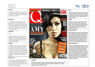
The masthead is a large bold white ‘Q’; on the left
of the page in a bright red box. This bright colour is
used to attract the target audience of teenagers and
young adults, and is unisex.
The colour scheme of the magazine is black, orange
and white with some red. These colours are typical
of the alternative rock genre and work well together
in order to grab the reader’s attention and also be
pleasing to the eye.
Main image
Typefaces
The main image is of deceased pop star Amy
Winehouse. She is on the right hand side of the
page and she is wearing a low cut leopard print top.
Her hair is backcombed which is her signature look
and she has a fringe covering one of her eyes. She is
wearing thick black eyeliner and a lip piercing. We
can also see her tattoo.
The typefaces used are a variety of serif and sans
serif. They are simple and classic computer font,
which is formal and looks sophisticated and official.
The use of these fonts is effective and they are
uncomplicated and do therefore not draw away
from the rest of the cover.
Photography Lighting
Model credit
This heading relates to the cover image of Amy
Winehouse. The font used for her name is the
largest font on the cover with the exception of the
masthead, suggesting that her story is the most
important in the magazine.
High key lighting is used on Amy’s face which shows
her in a positive way which has connotations with
innocence and beauty and make her appear almost
angelic which is a highly positive representation
following her death one year ago. The surrounding
area and background of the image uses a low key
lighting and is mainly dark, juxtaposing the two
areas of the cover and making her stand out more.
Coverlines
Design Principles Used?
The cover lines use a variety of serif and sans serif
font is different sizes and also different colours,
including white, orange and one example of red.
The cover lines also use a variety of bold and italic
font in order to make the cover more interesting
and pleasing to the eye. The contrast of colours and
sizes makes the magazine seems quirky and unique,
which is appropriate for the genre and target
audience.
The cover uses the Guttenburg Design Principle. This
is effective because the primary optical area and the
terminal area are filled with text and information,
which are the areas where the eye first and last
sees. The weak fallow area originally included a CD
which came free with the magazine. This is useful as
this area is the weakest area on the page which the
eye pays the least attention to. The cover image of
Amy fills the majority of the page, but mostly the
strong fallow area which is the second place the eye
will observe on the page.
‘AMY’
Main cover line
The main cover line uses large white bold serif font
which stands out against the dark background. It
also uses a smaller contrasting orange font in order
to grab the readers attention and draw their eye to
the main story in this magazine.
House Style
The overall house style of the cover is quirky and rebellious, with a rock and roll edge that
links to the genre of the magazine and the cover image. It is appropriate for the target
audience as it quite youthful and current.