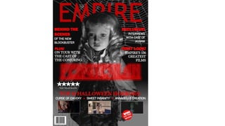
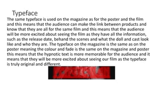
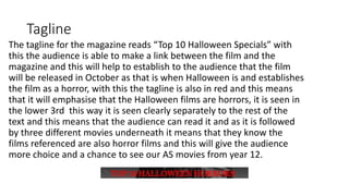
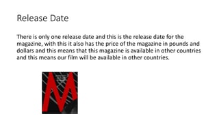
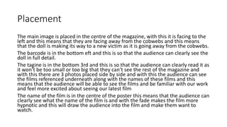
The document discusses the design choices for a magazine cover promoting a horror film about a doll. Key details include:
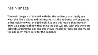
- The main image shows the creepy doll surrounded by cobwebs to establish it as old and eerie.
- The same font used on the poster and film is used to clearly link all promotional materials.
- The tagline "Top 10 Halloween Specials" associates the film with the horror genre and October release.
- Release date, price, and international availability help audiences know when and where they can see the film.