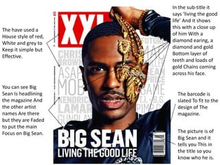
1. The have used a
House style of red,
White and grey to
Keep it simple but
Effective.
The picture is of
Big Sean and it
tells you This in
the title so you
know who he is.
In the sub-title it
says ‘living the good
life’ And it shows
this with a close up
of him With a
diamond earing, a
diamond and gold
Bottom layer of
teeth and loads of
gold Chains coming
across his face.
The barcode is
slated To fit to the
design of The
magazine.
You can see Big
Sean Is headlining
the magazine And
the other artist
names Are there
but they are Faded
to put the main
Focus on Big Sean.
2. The have used a
House style of red,
White and black to
Keep it simple but
Effective.
The Game is the
main artist because
there is a picture of
him on it.
The barcode is
just under the
title so it easy to
see.
Before the title
‘The Source’ the is
another title in
white because the
Magazine is under
new management
and this is what
the makers of the
Magazine want
you to see first
because in could
bring in new
buyers
The sub-title says
‘suicide is not an
option’ And in the
picture it has a
picture of The
Game with a gun
to his head, maybe
to Imply that he
was going to
commit suicide
At one point in his
life but didn't.
3. The have used a
House style of red,
White, black
and grey to
Keep it simple but
Effective.
The Title Vibe is faded
In with the picture of
Kendrick Lamar to
show He is the main
artist in The magazine.
Also his Name is the
biggest too.
The sub-title says
That Kendrick
Lamar is ‘the new
god mc’ and to
show that he is
this He is in a
serous pose and
when you See
people with hands
on there chin It
makes them look
more superior and
Smarter.
The barcode is
just under the
title so it easy to
see.
All the other content
featured in the
magazine is kept to
the Right so it is out
of the for the main
picture