Louisville real estate for sale
•
0 likes•31 views

The document provides feedback on the design and functionality of an app. It includes screenshots and suggestions for improvements. The key points made are: - The logo should be on the home page for branding. - Pictures on the home page don't function as buttons to navigate. - Consistency in design elements like text color and alignment would improve the aesthetic. - The two different home pages confuse navigation and messaging. Alignment of information and navigation across pages is needed.

Recommended
More Related Content
Similar to Louisville real estate for sale
Similar to Louisville real estate for sale (20)
Recently uploaded
Recently uploaded (20)
Louisville real estate for sale
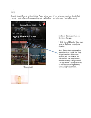
- 1. Dave, Sorry it took so long to get this to you. Please let me know if you have any questions about what I wrote. I tried to be as clear as possible and explain how I got to the page I am talking about. So this is the screen when you first open the app: I think it would be nice if the logo were on the home page, just a thought. Also, for the three pictures here scroll through, I think that they are great to have, but on the website you can click on the “shop items” or “shop homes” buttons and they take you there. The app doesn’t recognize them as buttons so nothing happens when you press on them.
- 2. This is the bottom of the page when you scroll all the way down on the home page. It would be nice if you could add in what is at the bottom of all the other pages throughout the app. (This is what I mean by the information at the bottom.) The top changed color, I’m not really sure why. I thought it was because I didn’t have service at the time, but then I regained service and it stayed that color. Both colors look good, if you want to keep the light blue, maybe change the words to black.
- 3. It cuts off the number a little bit here too.
- 4. When you click on “current estate sales” from the home page it takes you here: I’m guessing that you would prefer something different written here. When you click on the Holiday Sale, it brings you here, is this what you want written on the picture above?
- 5. Just to make it more aesthetically pleasing, if you could get these lines to match up it would look really good.
- 6. The logo appears if you are on any page besides the home page. If you click on the logo, it will take you to this page. It is almost like there are 2 separate home pages in the app. I actually prefer this home page because it gives you a little more information about the company that is easy to read and catches your eye. This home page has the same issues that the website did when scrolling through the items featured on the bottom of the page. Also, instead of “Legacy Home Estate” it has “Current Estate Sales a the top. Probably because it was under the estate sales section when I clicked on the logo.
- 7. Here is a comparison of the two home pages menus. I personally prefer the one that looks like the website (the one on the left) because it gives you more options. The one on the right just lists categories and quick links. (it omits the current sales and houses for sale)