
Recommended
More Related Content
What's hot
What's hot (20)
Recently uploaded
Recently uploaded (20)
A heuristic evaluation on Shopee's app UX for buyers
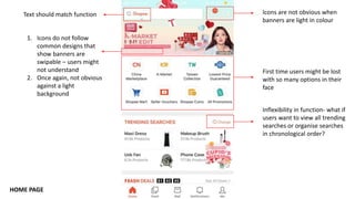
- 1. Icons are not obvious when banners are light in colour Text should match function 1. Icons do not follow common designs that show banners are swipable – users might not understand 2. Once again, not obvious against a light background Inflexibility in function- what if users want to view all trending searches or organise searches in chronological order? First time users might be lost with so many options in their face HOME PAGE
- 2. HOME PAGE (FURTHER DOWN) Not clear if discount is already applied or not Positioning of button might be too high as users scan the section from top down
- 3. HOME PAGE (FURTHER DOWN) Ambiguous wording. Top in terms of best selling? Quality? Useful button but blends with background
- 4. HOME PAGE (FURTHER DOWN) Filter function that should be moved further up before all the discovery functions
- 5. SEARCH Picture does not match text
- 6. FEED Feed looks cluttered with so many pictures of the same product. Users do not have the option to opt out from seeing likes of likes in their feed
- 7. MALL Placing their page category in the search bar might mislead users
- 8. MALL- CATEGORY PAGE No option for further filtering in the category page Eg. Skincare/makeup/haircare or filtering by ratings/price
- 9. PRODUCT PAGE Not eye-catching enough Not an important information to place at the top. Product details should be ordered in terms of importance to a user Out of?
- 10. SHOPPING CART The two functions should be split up to prevent confusion The two checkboxes look like separate items instead of the product being a sub-item of the shop. Positioning of checkboxes for the product should be placed more to the right.
- 11. CHATS Combining the two tabs by placing the unread messages at the top such as in a whatsapp chat would reduce the number of clicks a user would have to make.
- 12. ACCOUNT SETTINGS