Download to read offline

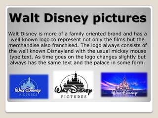
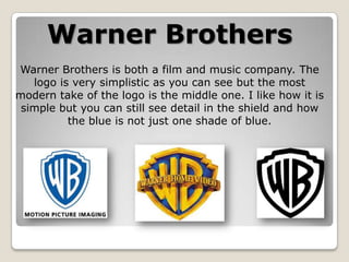
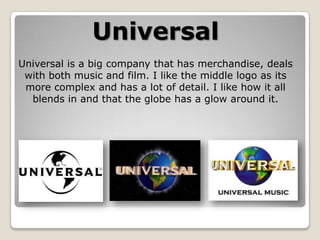
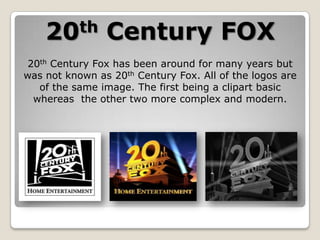
Walt Disney's logo consistently features Mickey Mouse text and an image of Disneyland palace to represent its family-oriented films and merchandise. Warner Brothers' simplistic logo centers on a shield and uses subtle color variations. Universal's logos progress from simple to more complex, with the author preferring the detailed middle version blending a globe with a glow. 20th Century Fox's logos all depict the same image but range from basic to more modern interpretations.


