Download to read offline


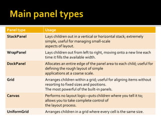

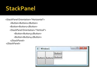

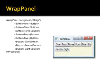
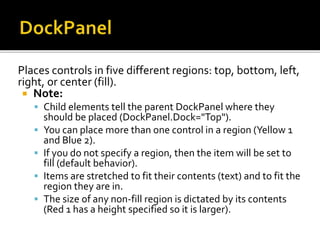
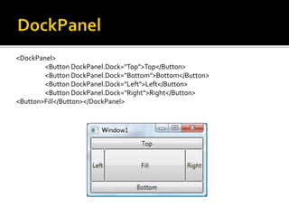

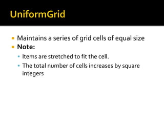
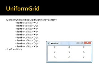

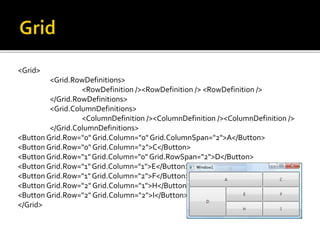

WPF provides several panel controls to define the layout of user interface elements, including StackPanel to arrange elements vertically or horizontally, WrapPanel to wrap elements to multiple lines, DockPanel to pin elements to specific edges, Grid to arrange elements in rows and columns, Canvas to manually position elements, and UniformGrid to arrange elements in equally sized cells in a grid. These panels allow positioning elements, stretching them to available space, and nesting layouts to create complex user interface designs.


![谷歌留痕技术教程[ 𝙩𝙤𝙥 𝟮𝟯𝟯. 𝙘 𝙤𝙢 ]](https://cdn.slidesharecdn.com/ss_thumbnails/top233-260130173900-2eb784f9-thumbnail.jpg?width=640&height=640&fit=bounds)