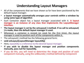
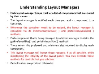
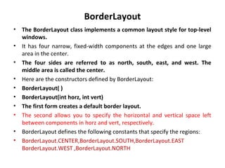
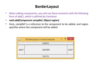
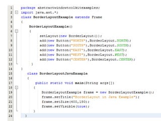
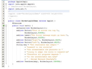
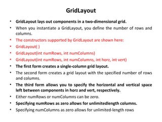
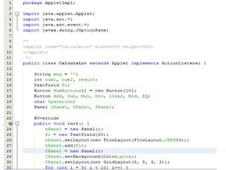
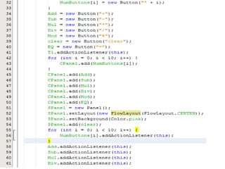
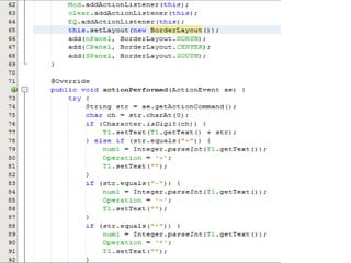
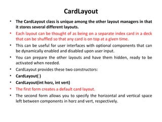
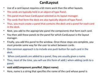
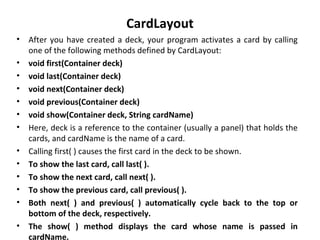
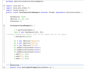
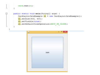
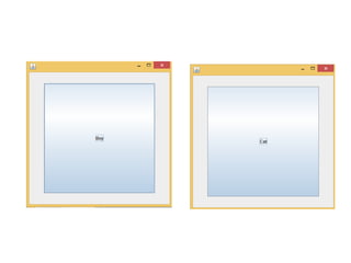
Understanding Layout Managers
By
Sana Mateen
Understanding Layout Managers
• All of the components that we have shown so far have been positioned by the
default layout manager.
• a layout manager automatically arranges your controls within a window by
using some type of algorithm
• Each Container object has a layout manager associated with it. A layout
manager is an instance of any class that implements the LayoutManager
interface.
• The layout manager is set by the setLayout( ) method. If no call to setLayout(
) is made, then the default layout manager is used.
• Whenever a container is resized (or sized for the first time), the layout
manager is used to position each of the components within it.
• The setLayout( ) method has the following general form:
• void setLayout(LayoutManager layoutObj)
• Here, layoutObj is a reference to the desired layout manager.
• If you wish to disable the layout manager and position components
manually, pass null for layoutObj.
• If you do this, you will need to determine the shape and position of each
component manually, using the setBounds( ) method defined by Component
Understanding Layout Managers
• Each layout manager keeps track of a list of components that are stored
by their names.
• The layout manager is notified each time you add a component to a
container.
• Whenever the container needs to be resized, the layout manager is
consulted via its minimumLayoutSize( ) and preferredLayoutSize( )
methods.
• Each component that is being managed by a layout manager contains the
getPreferredSize( ) and getMinimumSize( ) methods.
• These return the preferred and minimum size required to display each
component.
• The layout manager will honor these requests if at all possible, while
maintaining the integrity of the layout policy. You may override these
methods for controls that you subclass.
• Default values are provided otherwise.
FlowLayout
• FlowLayout is the default layout manager.
• This is the layout manager that the preceding examples have used.
FlowLayout implements a simple layout style, which is similar to how
words flow in a text editor.
• The direction of the layout is governed by the container’s component
orientation property, which, by default, is left to right, top to bottom.
• Therefore, by default, components are laid out line-by-line beginning at
the upper-left corner.
• In all cases, when a line is filled, layout advances to the next line.
• A small space is left between each component, above and below, as well
as left and right.
• Here are the constructors for FlowLayout:
• FlowLayout( )
• FlowLayout(int how)
• FlowLayout(int how, int horz, int vert)
FlowLayout
• The first form creates the default layout, which centers components and
leaves five pixels of space between each component.
• The second form lets you specify how each line is aligned.
• Valid values for how are as follows:
• FlowLayout.LEFT
• FlowLayout.CENTER
• FlowLayout.RIGHT
• FlowLayout.LEADING
• FlowLayout.TRAILING
• These values specify left, center, right, leading edge, and trailing edge
alignment, respectively.
• The third constructor allows you to specify the horizontal and vertical
space left between components in horz and vert, respectively
BorderLayout
• The BorderLayout class implements a common layout style for top-level
windows.
• It has four narrow, fixed-width components at the edges and one large
area in the center.
• The four sides are referred to as north, south, east, and west. The
middle area is called the center.
• Here are the constructors defined by BorderLayout:
• BorderLayout( )
• BorderLayout(int horz, int vert)
• The first form creates a default border layout.
• The second allows you to specify the horizontal and vertical space left
between components in horz and vert, respectively.
• BorderLayout defines the following constants that specify the regions:
• BorderLayout.CENTER,BorderLayout.SOUTH,BorderLayout.EAST
BorderLayout.WEST ,BorderLayout.NORTH
BorderLayout
• When adding components, you will use these constants with the following
form of add( ), which is defined by Container:
• void add(Component compRef, Object region)
• Here, compRef is a reference to the component to be added, and region
specifies where the component will be added.
GridLayout
• GridLayout lays out components in a two-dimensional grid.
• When you instantiate a GridLayout, you define the number of rows and
columns.
• The constructors supported by GridLayout are shown here:
• GridLayout( )
• GridLayout(int numRows, int numColumns)
• GridLayout(int numRows, int numColumns, int horz, int vert)
• The first form creates a single-column grid layout.
• The second form creates a grid layout with the specified number of rows
and columns.
• The third form allows you to specify the horizontal and vertical space
left between components in horz and vert, respectively.
• Either numRows or numColumns can be zero.
• Specifying numRows as zero allows for unlimitedlength columns.
• Specifying numColumns as zero allows for unlimited-length rows
CardLayout
• The CardLayout class is unique among the other layout managers in that
it stores several different layouts.
• Each layout can be thought of as being on a separate index card in a deck
that can be shuffled so that any card is on top at a given time.
• This can be useful for user interfaces with optional components that can
be dynamically enabled and disabled upon user input.
• You can prepare the other layouts and have them hidden, ready to be
activated when needed.
• CardLayout provides these two constructors:
• CardLayout( )
• CardLayout(int horz, int vert)
• The first form creates a default card layout.
• The second form allows you to specify the horizontal and vertical space
left between components in horz and vert, respectively.
CardLayout
• Use of a card layout requires a bit more work than the other layouts.
• The cards are typically held in an object of type Panel.
• This panel must have CardLayout selected as its layout manager.
• The cards that form the deck are also typically objects of type Panel.
• Thus, you must create a panel that contains the deck and a panel for each card
in the deck.
• Next, you add to the appropriate panel the components that form each card.
• You then add these panels to the panel for which CardLayout is the layout
manager.
• Finally, you add this panel to the window. Once these steps are complete, you
must provide some way for the user to select between cards.
• One common approach is to include one push button for each card in the
deck.
• When card panels are added to a panel, they are usually given a name.
• Thus, most of the time, you will use this form of add( ) when adding cards to a
panel:
• void add(Component panelRef, Object name)
• Here, name is a string that specifies the name of the card whose panel is
CardLayout
• After you have created a deck, your program activates a card by calling
one of the following methods defined by CardLayout:
• void first(Container deck)
• void last(Container deck)
• void next(Container deck)
• void previous(Container deck)
• void show(Container deck, String cardName)
• Here, deck is a reference to the container (usually a panel) that holds the
cards, and cardName is the name of a card.
• Calling first( ) causes the first card in the deck to be shown.
• To show the last card, call last( ).
• To show the next card, call next( ).
• To show the previous card, call previous( ).
• Both next( ) and previous( ) automatically cycle back to the top or
bottom of the deck, respectively.
• The show( ) method displays the card whose name is passed in
cardName.
GridBagLayout
• A good way to do this is to use a grid bag layout, which is specified by the
GridBagLayout class.
• What makes the grid bag useful is that you can specify the relative
placement of components by specifying their positions within cells
inside a grid.
• The key to the grid bag is that each component can be a different size,
and each row in the grid can have a different number of columns.
• This is why the layout is called a grid bag. It’s a collection of small grids
joined together.
• The location and size of each component in a grid bag are determined by
a set of constraints linked to it.
• The constraints are contained in an object of type GridBagConstraints.
• Constraints include the height and width of a cell, and the placement of a
component, its alignment, and its anchor point within the cell.
• The general procedure for using a grid bag is to first create a new GridBagLayout
object and to make it the current layout manager.
• Then, set the constraints that apply to each component that will be added to the
grid bag.
• Finally, add the components to the layout manager. Although GridBagLayout is a
bit more complicated than the other layout managers, it is still quite easy to use
once you understand how it works.
• GridBagLayout defines only one constructor, which is shown here:
• GridBagLayout( )
• GridBagLayout defines several methods, of which many are protected and not
for general use.
• There is one method, however, that you must use: setConstraints( ). It is shown
here:
• void setConstraints(Component comp, GridBagConstraints cons)
• Here, comp is the component for which the constraints specified by cons apply.
• This method sets the constraints that apply to each component in the grid bag.
• The key to successfully using GridBagLayout is the proper setting of the
constraints, which are stored in a GridBagConstraints object.
GridBagConstraints defines several fields that you can set to govern the size,
placement, and spacing of a component.
Understanding layout managers

Understanding layout managers

  • 1.
  • 2.
    Understanding Layout Managers •All of the components that we have shown so far have been positioned by the default layout manager. • a layout manager automatically arranges your controls within a window by using some type of algorithm • Each Container object has a layout manager associated with it. A layout manager is an instance of any class that implements the LayoutManager interface. • The layout manager is set by the setLayout( ) method. If no call to setLayout( ) is made, then the default layout manager is used. • Whenever a container is resized (or sized for the first time), the layout manager is used to position each of the components within it. • The setLayout( ) method has the following general form: • void setLayout(LayoutManager layoutObj) • Here, layoutObj is a reference to the desired layout manager. • If you wish to disable the layout manager and position components manually, pass null for layoutObj. • If you do this, you will need to determine the shape and position of each component manually, using the setBounds( ) method defined by Component
  • 3.
    Understanding Layout Managers •Each layout manager keeps track of a list of components that are stored by their names. • The layout manager is notified each time you add a component to a container. • Whenever the container needs to be resized, the layout manager is consulted via its minimumLayoutSize( ) and preferredLayoutSize( ) methods. • Each component that is being managed by a layout manager contains the getPreferredSize( ) and getMinimumSize( ) methods. • These return the preferred and minimum size required to display each component. • The layout manager will honor these requests if at all possible, while maintaining the integrity of the layout policy. You may override these methods for controls that you subclass. • Default values are provided otherwise.
  • 4.
    FlowLayout • FlowLayout isthe default layout manager. • This is the layout manager that the preceding examples have used. FlowLayout implements a simple layout style, which is similar to how words flow in a text editor. • The direction of the layout is governed by the container’s component orientation property, which, by default, is left to right, top to bottom. • Therefore, by default, components are laid out line-by-line beginning at the upper-left corner. • In all cases, when a line is filled, layout advances to the next line. • A small space is left between each component, above and below, as well as left and right. • Here are the constructors for FlowLayout: • FlowLayout( ) • FlowLayout(int how) • FlowLayout(int how, int horz, int vert)
  • 5.
    FlowLayout • The firstform creates the default layout, which centers components and leaves five pixels of space between each component. • The second form lets you specify how each line is aligned. • Valid values for how are as follows: • FlowLayout.LEFT • FlowLayout.CENTER • FlowLayout.RIGHT • FlowLayout.LEADING • FlowLayout.TRAILING • These values specify left, center, right, leading edge, and trailing edge alignment, respectively. • The third constructor allows you to specify the horizontal and vertical space left between components in horz and vert, respectively
  • 8.
    BorderLayout • The BorderLayoutclass implements a common layout style for top-level windows. • It has four narrow, fixed-width components at the edges and one large area in the center. • The four sides are referred to as north, south, east, and west. The middle area is called the center. • Here are the constructors defined by BorderLayout: • BorderLayout( ) • BorderLayout(int horz, int vert) • The first form creates a default border layout. • The second allows you to specify the horizontal and vertical space left between components in horz and vert, respectively. • BorderLayout defines the following constants that specify the regions: • BorderLayout.CENTER,BorderLayout.SOUTH,BorderLayout.EAST BorderLayout.WEST ,BorderLayout.NORTH
  • 9.
    BorderLayout • When addingcomponents, you will use these constants with the following form of add( ), which is defined by Container: • void add(Component compRef, Object region) • Here, compRef is a reference to the component to be added, and region specifies where the component will be added.
  • 13.
    GridLayout • GridLayout laysout components in a two-dimensional grid. • When you instantiate a GridLayout, you define the number of rows and columns. • The constructors supported by GridLayout are shown here: • GridLayout( ) • GridLayout(int numRows, int numColumns) • GridLayout(int numRows, int numColumns, int horz, int vert) • The first form creates a single-column grid layout. • The second form creates a grid layout with the specified number of rows and columns. • The third form allows you to specify the horizontal and vertical space left between components in horz and vert, respectively. • Either numRows or numColumns can be zero. • Specifying numRows as zero allows for unlimitedlength columns. • Specifying numColumns as zero allows for unlimited-length rows
  • 20.
    CardLayout • The CardLayoutclass is unique among the other layout managers in that it stores several different layouts. • Each layout can be thought of as being on a separate index card in a deck that can be shuffled so that any card is on top at a given time. • This can be useful for user interfaces with optional components that can be dynamically enabled and disabled upon user input. • You can prepare the other layouts and have them hidden, ready to be activated when needed. • CardLayout provides these two constructors: • CardLayout( ) • CardLayout(int horz, int vert) • The first form creates a default card layout. • The second form allows you to specify the horizontal and vertical space left between components in horz and vert, respectively.
  • 21.
    CardLayout • Use ofa card layout requires a bit more work than the other layouts. • The cards are typically held in an object of type Panel. • This panel must have CardLayout selected as its layout manager. • The cards that form the deck are also typically objects of type Panel. • Thus, you must create a panel that contains the deck and a panel for each card in the deck. • Next, you add to the appropriate panel the components that form each card. • You then add these panels to the panel for which CardLayout is the layout manager. • Finally, you add this panel to the window. Once these steps are complete, you must provide some way for the user to select between cards. • One common approach is to include one push button for each card in the deck. • When card panels are added to a panel, they are usually given a name. • Thus, most of the time, you will use this form of add( ) when adding cards to a panel: • void add(Component panelRef, Object name) • Here, name is a string that specifies the name of the card whose panel is
  • 22.
    CardLayout • After youhave created a deck, your program activates a card by calling one of the following methods defined by CardLayout: • void first(Container deck) • void last(Container deck) • void next(Container deck) • void previous(Container deck) • void show(Container deck, String cardName) • Here, deck is a reference to the container (usually a panel) that holds the cards, and cardName is the name of a card. • Calling first( ) causes the first card in the deck to be shown. • To show the last card, call last( ). • To show the next card, call next( ). • To show the previous card, call previous( ). • Both next( ) and previous( ) automatically cycle back to the top or bottom of the deck, respectively. • The show( ) method displays the card whose name is passed in cardName.
  • 26.
    GridBagLayout • A goodway to do this is to use a grid bag layout, which is specified by the GridBagLayout class. • What makes the grid bag useful is that you can specify the relative placement of components by specifying their positions within cells inside a grid. • The key to the grid bag is that each component can be a different size, and each row in the grid can have a different number of columns. • This is why the layout is called a grid bag. It’s a collection of small grids joined together. • The location and size of each component in a grid bag are determined by a set of constraints linked to it. • The constraints are contained in an object of type GridBagConstraints. • Constraints include the height and width of a cell, and the placement of a component, its alignment, and its anchor point within the cell.
  • 27.
    • The generalprocedure for using a grid bag is to first create a new GridBagLayout object and to make it the current layout manager. • Then, set the constraints that apply to each component that will be added to the grid bag. • Finally, add the components to the layout manager. Although GridBagLayout is a bit more complicated than the other layout managers, it is still quite easy to use once you understand how it works. • GridBagLayout defines only one constructor, which is shown here: • GridBagLayout( ) • GridBagLayout defines several methods, of which many are protected and not for general use. • There is one method, however, that you must use: setConstraints( ). It is shown here: • void setConstraints(Component comp, GridBagConstraints cons) • Here, comp is the component for which the constraints specified by cons apply. • This method sets the constraints that apply to each component in the grid bag. • The key to successfully using GridBagLayout is the proper setting of the constraints, which are stored in a GridBagConstraints object. GridBagConstraints defines several fields that you can set to govern the size, placement, and spacing of a component.