Download to read offline
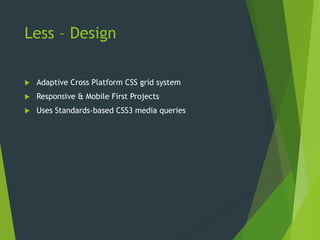
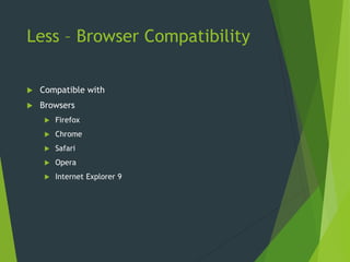
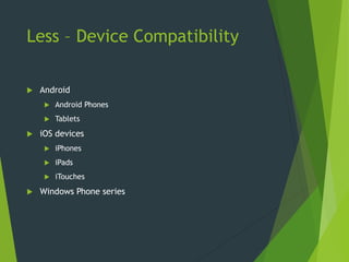
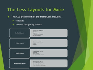
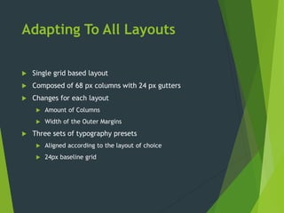
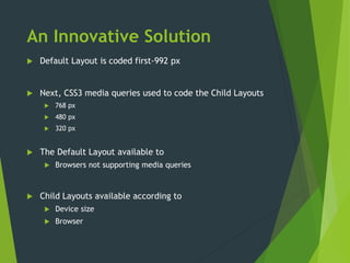


The document describes a CSS grid system called 'less' that is adaptive and works across various platforms, offering responsive layouts for different devices. It supports multiple browser and device compatibility, featuring four layouts with several typography presets suitable for desktops, tablets, and mobile devices. Additionally, it employs media queries to adjust layouts based on device sizes, ensuring accessibility for users with older browsers.


